- SALES / SUPPORT : 855-752-5503
If there’s one thing logo designers want more than anything in the world, even more than the chance to create the world’s next best logo, it’s the opportunity to design a logo that will never go out of style.
A timeless logo design so iconic that it will become an adjective more than a symbol.
Timeless logo designs
Think of Nike or Apple. Or even Coca-Cola or Nestle.
These designs represent more than their companies or products. Nike doesn’t sell great sneakers; it promises athletic excellence. Coca-Cola is more than a beverage. It’s a sign of good times, preferably with friends and those you love.
Brands logos that stand the test of time enjoy immense familiarity and recall from the public. Since the design never changes, it becomes a constant in a consumer’s life. Something familiar and trustworthy they can easily spot on the shelf, and put confidently in their cart.
Timeless logos remain easy to understand from generation to generation, thanks to their classic details and simple elements. The simple and friendly wordmark of Kellogg’s logo, for example, hasn’t changed since the 1900s and remains legible and straightforward to the present day.
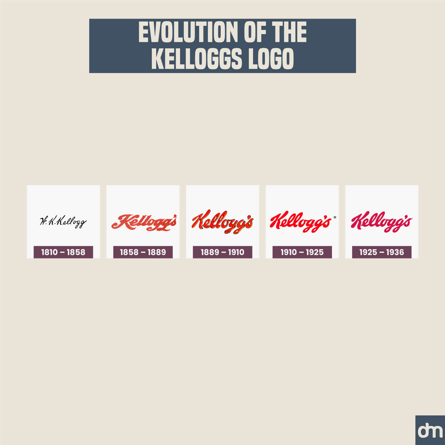
The Evolution of Kellogg’s logo
To understand what the world’s best timeless logos have in common, here’s a quick visual to help you out.
When we say timeless, we automatically think of vintage logo designs. Sepia tones, elaborate ribbons, and custom typefaces. But timeless logos don’t have to be old. Instead, what you’re looking for is a distinct quality that tells you this design has a long life ahead of it. It’s a design that will travel great lengths of time and remain logical, meaningful, and coherent wherever it goes.
What are those distinct details that make these logos immortal?
What qualities must be present for a logo design to be termed as ‘timeless’ and beyond the realm of old vs. new?
Timeless logos are simple.
IBM and Ford Logo
From Ford to IBM, timeless logo designs use fewer details, simpler shapes, and a clean overall aesthetic. They are banking on the design’s simplicity to render it greater memorability and recall.
They focus on making sure that people can instantly process the design and that it’s easy enough for them to remember.
Unlike intricate designs, whose merit lies in complexity and details, simple designs outshine the competition by being effortless, easy, and straightforward to remember.
Timeless logos are unique.
The Barbie logo, in its iconic pink color, is a fabulous example. Though it’s a toy logo design, it doesn’t look like one. There’s nothing childish about the logo. Even though the wordmark is simple enough, the cheeky pink sets it apart.
Barbie logo
It’s vibrant, girly, playful, and chic — setting up the Barbie logo eons apart from the general world of toy logo designs.
This specific shade of magenta pink has gained such worldwide fame that Pantone has given its own unique identity — PANTONE 219 C!
The distinct color and signature wordmark have allowed the Barbie brand to enjoy a timeless brand identity from its first day to the present.
Timeless logos are versatile.
They represent their brands successfully from print to digital and back.
Chanel logo
The classic logo design of Chanel, for example. It has that same strong personality on its branded handbags as on thousands of social media visuals, runway photographs, magazine shoots, and much more.
Not only does it retain its clarity on several different backgrounds and materials but looks exceptionally fashionable doing it. The simple typeface and interlocked Cs ensure the design is accessible and articulate no matter where it goes.
It’s great advice overall but especially pertinent to this discussion: create logo designs that align with what the brand is at its most fundamental. And move away from the superficial like is your brand friendly, casual, or traditional.
Instead, ask deeper questions:
Designs aligned with your values are powerfully resistant to trend influences since they are rooted in something much deeper than the pretty visuals of the time. They represent a promise, idea, and vision — things central to a brand’s identity and thus more enduring and long-lasting.
Everlasting logo designs are meaningful and purposeful. Elements are chosen because of their connection with the brand, not just the aesthetic value.
Wonka Logo
Consider the Wonka brand logo. The design has prevailed from its very first iteration in the 1970s on a Quaker Oats candy bar to its latest representation as the Wonka movie logo.
Its caramelized golden color palette, the rich purple, those elaborate curls in the typeface, and the squashed-in spacing, all talk of a brand character larger-than-life, friendly and interesting, someone who likes to do extraordinary things, and who isn’t afraid to go against the tide.
When you design a logo that fits the purpose of the brand, you create an everlasting design that won’t be swayed by temporary trends.
All timeless logos are made with a mixture of old and new. Traditional details with a modern twist give us designs that last generations, sometimes even centuries. (Looking at you, Tiffany & Co.)
Let’s now look at what those old vs. new logo design elements are.
These elements have existed in design for centuries and centuries. They carry a great sense of legacy, tradition, and generational understanding that doesn’t need additional hints.
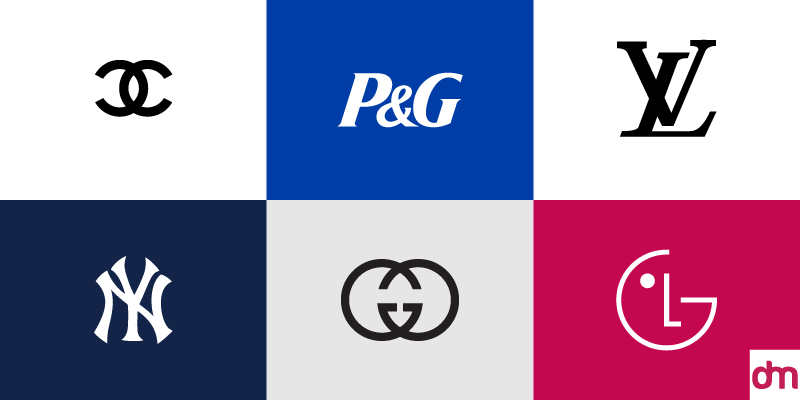
Monogram logos
Monograms have an ancient history. They originated in ancient Greece around 350 BC and were used on coins to identify the city and its ruler who had issued the coins. The use of monograms expanded in the Roman Empire where artisans and craftsmen used them to sign their work. During the Middle Ages, royalty around the world adopted them to mark possessions, clothing items, and official seals.
In identity design, monogram logos convey similar messages of authority, craftsmanship, and personal signature.
Brands that want to amplify their message of superior craft or highlight the brand name as a personal signature often go with monograms as their logos.
Shields and badge logos
A shield, as a shape, is another ancient symbol of authority and belongingness. Armies from ancient Rome to Persia had unique shield designs for practical and symbolic purposes. Infantry divisions in the Persian army had shields of a different design, shape, and inscription than, let’s say, someone in the archery division.
Empires around the world used shields to arm their guards with, to demonstrate power and regality through their designs, and to carve distinction and identity for the ruler and the country. The underlying message of the shield has always been organized power, institutionalized security, and enduring heritage.
To this day, universities around the world, as upper echelons of academic excellence, rely heavily on shield designs to mark their logos. Luxury car logos such as Lamborghini and BMW also trust shield designs to excuse their power and personality perfectly. Shield logos are also popular in sports branding, security logos, and the financial industry.
If you want a logo design to align instantly with your values of resilience and heritage, a shield logo is the best idea to go for.
Logos with serif fonts
Serif fonts are another symbol of classic logo designs. They have likely existed since the time people used to write with feathered quills or brushes. These instruments would naturally leave small marks at the end of each stroke, giving rise to the association of handwritten words having these recognizable flicks and swirls at the end.
When experts started developing typefaces for mass printing in the mid-15th century, serifs reigned the day as the most obvious choice because people were familiar with them and could read them easily. From Gutenberg’s letterforms that were based on Blackletter calligraphy to a much simpler typeface created by Nicolas Jenson, serif fonts were everywhere.
In the 1800s, cleaner and much sleeker serif fonts started to emerge. They improved readability, took up less space on the page, and infused tradition with the latest typeface trends of the time.
To this day, serif fonts are associated with vintage logo designs, traditional graphics, and aesthetics of a time gone by. Their distinctive ends have become synonymous with the authority and integrity that comes with written words.
Logos with rich color palettes
Classic logo designs are always resplendent in rich colors. Whether you look at the logos from the 1920s, to the 30s, to the 60s, or 70s, logo designs appear in grand schemes of colors, elaborate effects, and a rich mix of combinations to support their brand messages.
Color vibrancy, from eons past, has always been a thing of the rich upper class. Royalty and purple have a long connection in history. But so do other colors like dark blue, gold, and red. These were all dyes that were expensive to make so only the richest in the society could afford them.
In the early 20th century when a strong middle class started to emerge, these colors were taken from the royalty and adopted into people’s daily lives. Coca-Cola went from a black logo design to a vibrant red. Burberry emerged with its iconic red and gold equestrian knight logo. Cadbury also shifted from a greyish logo design to its world-famous indigo logo.
Rich colors allowed these logo designs to have a strong presence and instant appeal. In a time of great economic upheaval and cultural shifts, seeing these vibrant colors on everyday products was not only a great experience but also heralded the hope of a great tomorrow to come.
Logos with signature fonts
If you are looking at old logos vs. new, signature fonts are the most prominent difference you’ll notice.
Old and classic logos from Pepsi to General Electric used signature fonts — also called handwritten or hand-drawn fonts — to design their visual identities. These fonts were far from flawless but they infused a sense of personality and humanness in the design.
Modern logo designs tend to shy away from handwritten fonts — unless you’re designing something whimsical and crafty. Jewelry shop logos, beauty store logos, and daycare logos, kind of lean toward signature fonts in modern branding, but that’s about it.
Most other businesses prefer more conventional fonts — serifs as well as sans-serifs — to design their names and represent them more professionally on the world stage.
We know the classic elements of logo designs will never go out of style, but are there modern trends that too will have a long and enduring life? What design trends can we embrace to toe the line between old and new perfectly without ever risking our brand’s visual identity?
Let your design breathe in vast, open spaces.
Logos with ample white space
Wide stretches of open, blank, white space are the symbols of a modern logo. If vintage designs are known for their many details and jumbled elements, modern logo designs are known for their sparse aesthetics.
The idea is to focus on a single element as the hero and then give that element the entire stage to shine. Additional elements might be present but they play the secondary roles of support and uplifting — never daring to vie directly with the star of the show.
3D, even though it’s a raging logo design trend these days, is just a trend. While it’s okay and maybe great fun to release a 3D version of your logo to excite the audience and have a fun day at work, keep your eye on the big picture and avoid 3D-ing your logo for the sake of it.
Flat logo designs
Flat design has been around for decades now and will continue to remain a strong contender in the design market for several decades to come.
The reason?
It’s a simple way to design corporate identities. Modern audiences take up a lot of sensory load in their day-to-day. Constantly bombarded with thousands of logos and moving graphics on social media, they will react more favorably to brands with a restrained appeal, a relaxed presence, and a calm exterior.
Our tomorrow is digital. Experts have counted, and as per them, we spend over 6 hours consuming content online daily. On digital screens, sans-serif fonts reign supreme.
Sans-serif fonts without decorative flicks are easier to read on lit-up screens, reducing eyestrain and sensory load. Their versatility and straightforward strokes also look immensely chic on clean white spaces, rich backgrounds, and textured graphics.
Logos with san-serif fonts
Sans-serif fonts on modern logos are a match made in heaven and it's a font combination that is not going out of fashion any time soon.
When we say minimal colors, we mean fewer colors not less amount of colors or subdued colors.
If anything, modern logo designs are a great study in using one or two shades in the logo but making those colors the richest, most vibrant from the rainbow. Take the FedEx logo for example.
Logos with minimal color schemes
It uses only two colors — staying within the minimal design land — but makes those two colors dark purple and orange, two of the loudest in the realm, and creates a visual design identity that’s confident, optimistic, and assertive.
When working with minimal colors, it makes sense to use rich shades and imposing tones because you’re only working with fewer hues. Make the most of those hues by using their richest tones and the most vibrant expressions.
Classic logo designs always favored descriptive shapes with clear meanings. A barber logo design, for instance, may sport a shaving blade icon, a barber illustration, and a ribbon around the seal.
Modern logos, in comparison, prefer more symbolic visuals. So, a modern coffee shop logo may or may not have a steaming cup of coffee on its logo. Most likely, it will be a logotype, in a clean, understated font. And sometimes, it may be something completely abstract.
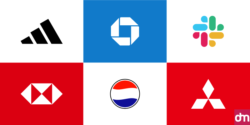
Abstract logos
Abstract shapes include geometric shapes like circles and squares, and they also include more organic shapes like curved lines or spirals. Patterns, interlocking shapes, shapes present between negative spaces, and natural things like plants, leaves, wings, etc. are all popular abstract shapes in logo designs.
Abstract shapes can be powerful symbols where meaning is conveyed less directly and hence can be interpreted in lots of different but relevant ways. Seeds, for example, can mean roots, growth, and ideas, all at the same time. Patterns can represent a culture, repetition, and character all rolled into one.
Here are 5 ways to do that:
If you want to start strong, start with a monogram in a minimal color palette. Chanel, Louis Vuitton, and GE can be your torchbearers. Or if you are looking for examples on this side of the 1950s, how about Fendi, Volks Wagon, and HP?
All these logo designs are recent creations and present the best side of monograms strutting confidently in simple colors
Classic logo designs such as Tiffany & Co., Mercedez-Benz, and Hermes are iconic examples of luxury branding in serif fonts with lots of white space in the background.
You can mimic these designs by choosing a sleek serif font and letting it have its day in the clear background of nothing. Quite like how Sony, Stranger Things, and J.P.Morgan have done.
Another great way you can put your brand firmly in the present with classic details and make it future-proof is by combining shields with flat design concepts. Some traditional examples are Heinz, John Deere, and Levis. But the enduring trend also manifests in the Starbucks logo, Warner Bros. logo, and Superman logo.
One of the best color styles for abstract logos is vibrant color combinations or gradients where color is the key element in the logo. Think of MasterCard or the Olympics logo. The designs use simpler, uncomplicated but abstract shapes and then infuse meaning with colors.
Talking about rich color palettes, it would be amiss not to mention sans-serif fonts which look exceptionally good when paired with dynamic and zesty colors. Google, Mobil, and FedEx are quick examples but also consider Slack, Spotify, and Netflix as more modern and recent examples.
Timeless logos are brand identities that are beyond the shackles of then and now.
These enduring visual marks contain design elements central to human acceptance, knowledge, and familiarity. Such as circular shapes, classic colors, and simple fonts.
These archetypical elements don’t rely on a space or time to convey their meaning, and thus fuel logo designs with identity and distinction for generations to come.
To create a timeless logo that looks from the past but makes total sense and is relevant in the present too, combines the best elements of both worlds. In this post, we have shown you how to do that.
So, use this post to help your next logo design become the stuff of dreams, and create a logo design that refuses to have an expiry date.