Simplicity, they say, is the answer to every problem out there. Such a simplistic (pardon the pun) approach to solving many of life’s greatest problems may seem great for storytellers to base their morals on, but simple isn’t the magic bullet that people make it out to be. There’s wheels within wheels, multiple shades of red or grey or any other color out there. And then there’s the need for subtlety in sensitive matters, another situation where simple doesn’t quite cut it.
As part and parcel of working with any business out there, designers are faced with a challenging situation – how to best sell your artfully curated pixels to clients, and that too without inviting a lot of fuss. Business owners, on the other hand are also worried, since they want someone with the visualization prowess to translate and communicate their business essence properly. Exactly like they need it to be.
The trouble starts brewing when it comes to the simplicity of design. The client doesn’t want simple whereas the designer swears by the mantra of simple design in their projects. We take a look at what goes on generally when simplicity in logo design is front and center.
How the Client views Simple Design
The client expects some highfalutin and free-flowing thingamabob that’s oozing with style, rainbow colored patterns, nifty visual tricks and what-not (maybe even a unicorn while we’re still at it). All in one logo design no less. A logo that needs to work like a Transformer from the Michael Bay flicks if we were to paint too pretty a picture.
“Most clients almost always want a lot going on in their logos. They want designers to make their logos as visually prominent as they can. In their passion, they risk projecting a rather brash image of their brands with wild designs.”
What the Designer aims to deliver with Simple Design
The designer, for their part, wants to play with the finer subtleties and the nuances that logo design affords them. They want people to appreciate the little touches, the all too clear attention-to-detail that they have put in crafting their erstwhile masterpiece.
“Perfection takes effort, even when all the hard work that goes into making design work is largely invisible. There’s the process of addition and then there’s the process of elimination. Just like in your favorite game shows.”
Where Simple Design becomes Complicated
To the untrained eye (read client’s eye), such restraint and adherence to simplicity on the designer’s part is perceived as nothing less than dishonest. And lazy. And awfully non-committal to their needs and requirements from the get-go.
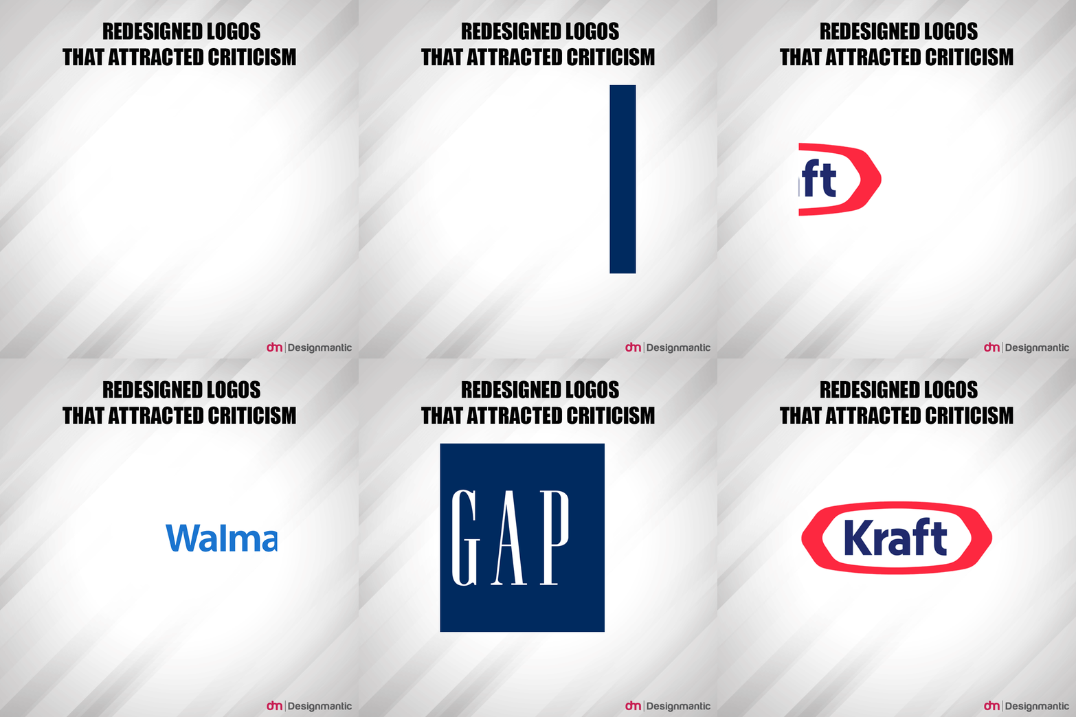
“Redesigning needs a lot of thought behind it. Redesigning succeeds when it strikes the right balance between the old and the new. It needs to feel fresh and retro at the same time.”
Their reasoning? Well its looks so….. simple and Spartan. Like those dudes from 300. Which is code speak for ‘barebones’ design work that they have sunk top dollar for. They think the designers are delivering cheap work.
Here’s why Simple Design Mostly Works.
In the mad, crazy world of commercial design, there are two sides of the coin i.e. the designer’s perspective, and the client’s perspective. The twain has their fair share of divergent views on a variety of subjects. But one way that this gulf of opinions and views can be expertly navigated is by cultivating an ambiance of simplicity in their projects. Such as in logos, brochures, posters, web sites et al.
“In the world of decreasing attention spans, simple is king.”
So without any further ado, let’s take a look at how simplicity of design gets rid of the crap and brings the designer and the client closer to success:
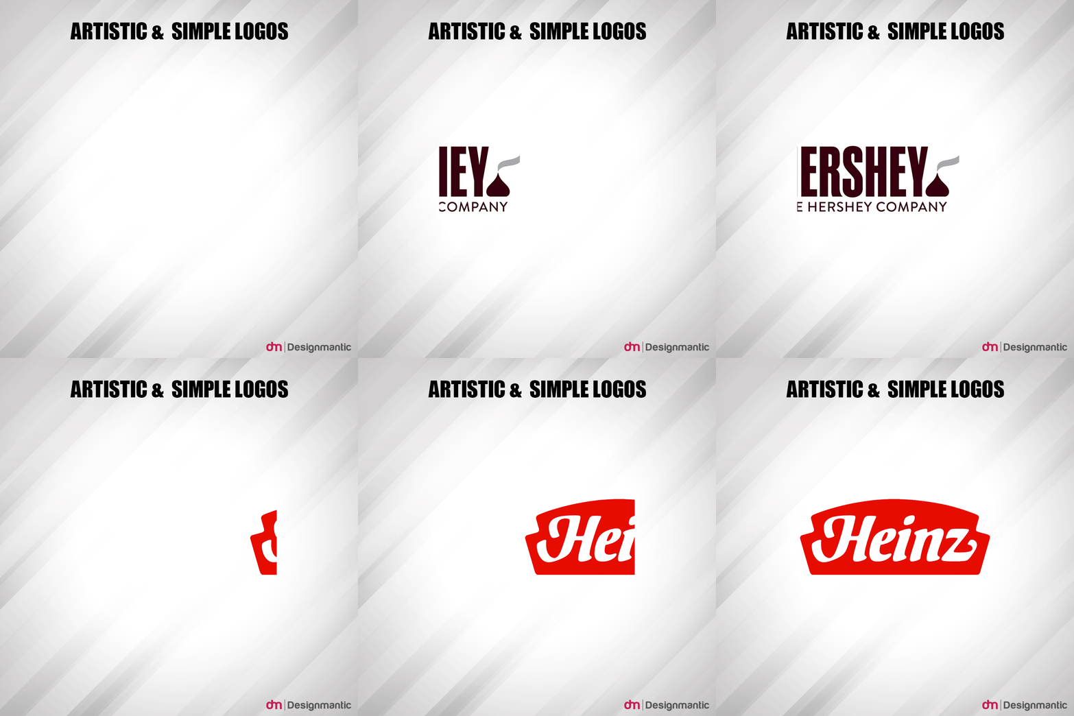
It’s not about how many colors or font styles you use. Sometimes just a few smart and confident choices for your logo design will result in a more imposing visage and brand visibility than a splash of colors or eclectic design styles will do. The Heinz Ketchup and Hershey’s chocolates logos are firm believers in simplicity, a characteristic that defines their logo and makes them memorable as well. There’s no additional clutter. There’s just a serious design choice conveying the majestic-ness of the brand.
“Simple design is an evolutionary process. There’s creation involved and then there’s destruction involved. No one gets it right the first time.”
Advice for Clients who can’t let go of the razzmatazz in logo design
Make no mistake about one thing. Just because a design looks simple, it doesn’t mean that a lot of thought and process hasn’t gone into it. Quite the contrary actually. For clients who are worried about not getting their money’s worth, they can always check out a designer’s portfolio to put their concerns at ease. Professional designers are as good as their repute and this works fabulously for both the sides.
And besides, wasn’t business about enticing the customers the right way? Aren’t the business owners of today interested in delivering their message to customers clearly? Surely no business worth their dime is in the business of keeping their customers guessing. They aren’t ones for interpretations. Or pondering-about-the-meaning-of-life musings. None of that stuff actually. They want their customers to get intrigued and check out their wares. It’s a simple proposition actually.
“Simple takes the guessing game out of the equation. It removes ambiguities and doubts. The same principal applies to simple design.”
Good design helps accomplish that. And that’s the only metric that awesome designers are judged by their clients. Keeps the playing field level and the whole design process a bit more oriented towards service delivery. It’s a win-win scenario for clients and designers alike. Designers who work for commercial clients adopt certain tried-and-tested principles of simplicity in their designs. Since they don’t go overboard with their logo designs, this can end up saving huge amounts of time and efforts as the designer almost always gets the results that the client is looking for. Save for just some minor
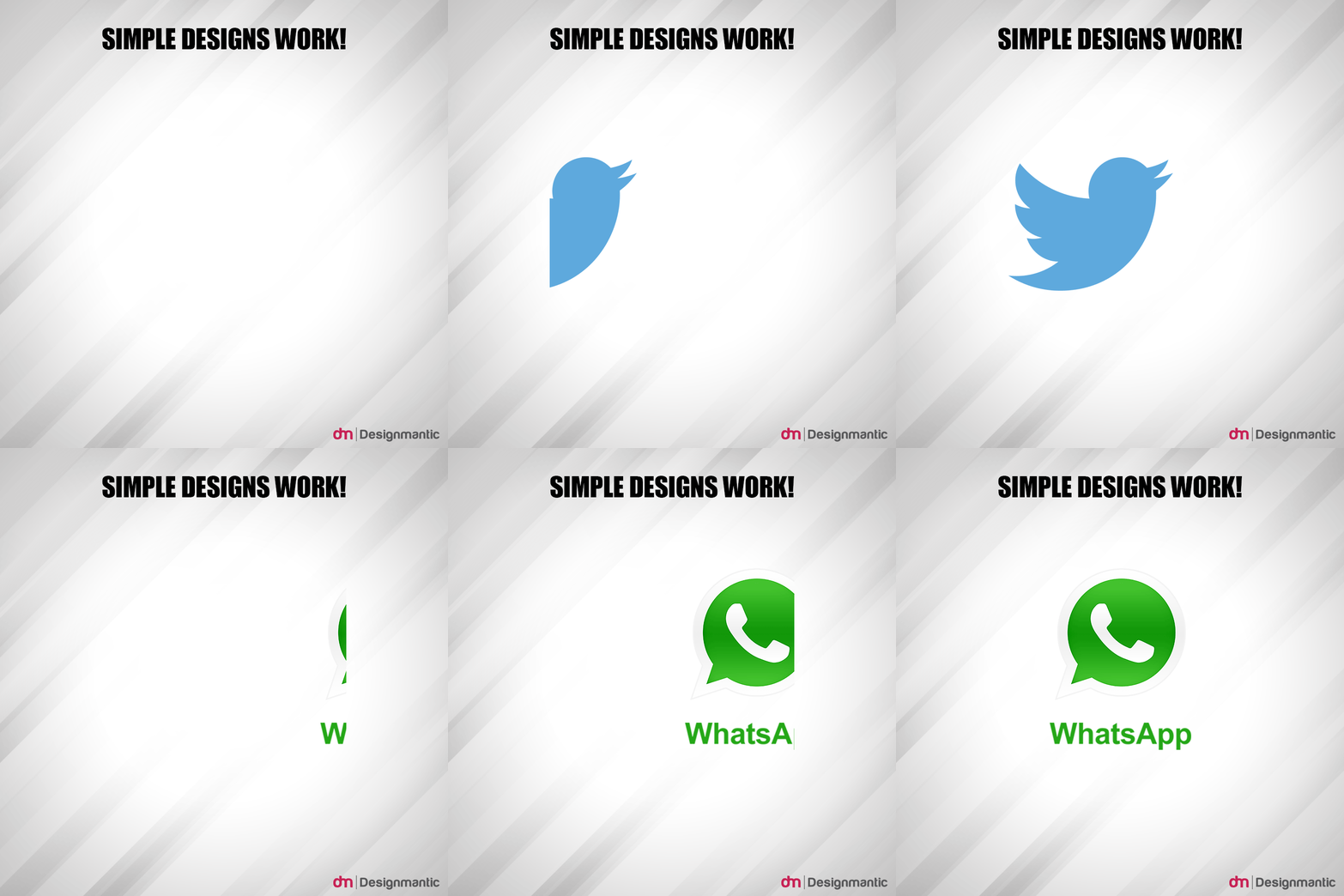
tinkering, simple design lends itself well in commercial as well as non-profit spheres both. To do this, graphic artists take care of the fluff, avoiding an overdose of flashy design elements in their projects. They let minimalism reign supreme. If a simple logo design gets the point across, then it’s super sophisticated in its restrained design. It succeeds on an aesthetically sublime level. Mission accomplished.



Nice Post !