Weddings are no longer the unpretentious, simple occasions of the past. These days, couples put in meticulous hours to make sure the tiniest of their wedding details sparkle with sheer perfection. From extravagant themes, over the top wedding dresses, exquisite cakes, and breathtaking décor, to getting the perfect wedding stationary designed, no task is overlooked or left to the last minute. As such, this industriousness extends to the wedding cards as well.
While some people may argue that the sole purpose of a wedding invite is to let the guests be aware of the particulars of the ceremony and thus any card will “do”, we believe it runs deeper than this! A wedding invite is akin to a teasing foreplay to what is yet to come, a direct reflection of the type of event you are planning. It lets your wedding guests know what they can expect from your ceremony. Be it selecting the perfect wedding font pairings, choosing the texture of the paper, or designing a wedding monogram, no detail is too small to let go of when designing a stunning wedding invite. Here we have collected 12 stunning wedding invites that speak volumes about the creativity and artistic aesthetics of their designers:
1. Alchemy Wedding Invitation By Nina Bell
From glitter and stripes, to floral and watercolor, the gorgeous trend of envelope liners make up the hottest additions to the wedding stationery suite. This lovely wedding card is a brainchild of Nina bell, a graphic designer, letterpress printer, print designer, and typography artist. We are enamored with the thought of the guests excitedly tearing open the invite and being enthralled at the inner layer of the envelope adorning the card.
The vintage floral sketches of the envelope liner is a perfect accruement to the stunning letterpress card, marked by fanciful flourishes, ornate calligraphy, and pretty penmanship. The card is bound with a rustic tag, bearing the wedding monogram of the couple, which provides the perfect finish to the card and celebrates the couple’s initials beautifully. So many budding wedding invitation trends seamlessly incorporated in one spectacular design!
2. Oval Vignette Invite By Kristal Roberts
Designed by Kristal Roberts, a graphic artist and wedding stationary designer, this beautiful wedding card is decked out with an Oval vignette that serves to draw the eye right where it needs to be; front and center! The designer has creatively worked this design to incorporate color and pattern into the wedding invite, while maintaining hierarchy and a clean layout.
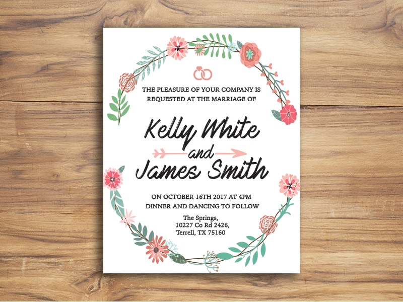
Image: Dribbble/Kristal Roberts
The fad of oval-framed wedding invitations works best for framing your text when you don’t want to go all minimal. The stunning foliage framing hints at garden weddings, barns, or venues heavily inspired by nature. In addition, the names of the couple take a center stage in this card by rendering them in an enlarged, flowery hand-lettered typeface, which grabs attentions at the fore.
3. Illustrated Wedding Invite By Melissa Laine Scotton
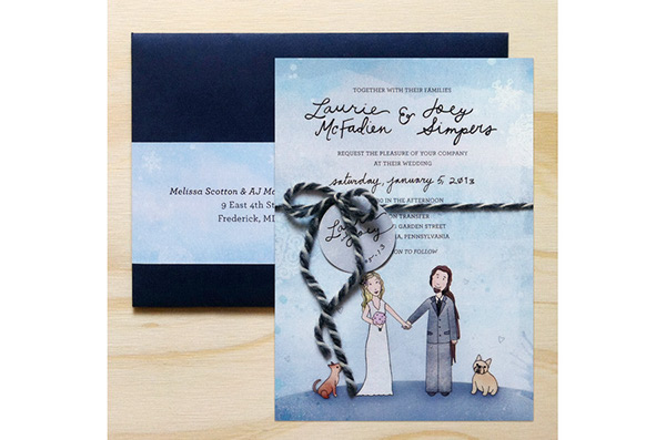
This heartwarming wedding card for a winter wedding is designed by Melissa, an illustrator and graphic designer. Her design aesthetic is an eclectic blend of endearing perfectionism and whimsical energy, as can be judged by this stunning illustrated invite. For a card that guests will want to frame and hang as a work of art, this design beautifully portrays a custom illustration of cartoons resembling the couple, even a depiction of their pets to complete the family portrait.
Keeping the backdrop monochrome in line with the season, a playful script font is chosen to create a more whimsical effect around the names of the couple, while a Serif font anchors the body text. The invite is tied around with a string of similar hues, bearing the monogram tag of the couple. Their monogram is not only in tune with the overall theme of the card, but also a reflection of the personalities of the couple.
4. Watercolor Wedding Invite By Tania Macarenco
Designed by Tania Macarenco, an independent graphic designer with a predilection for creative works and art, this wedding invite is done up spectacularly in stunning water colors. The designer has ingeniously employed watercolors to throw in texture and color to this wedding invite, transforming an otherwise simple design.
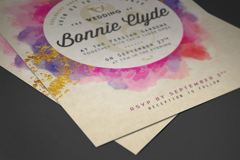
Image: Behance/LaVie1Blonde
Bursting with color and artistic panache, this card is brushed with vibrant hues to provide a wild and bold vibe. To provide a semblance of hierarchy and organization to this wild design, the designer has incorporated all the text within a circular enclosure, away from the kaleidoscope of colors outside.
5. Boarding Pass Wedding Invitation By Huilin Dai
For a couple planning to take their wedding guests on a sojourn to witness their big day, perhaps a thrilling weekend in the romantic streets of Paris or a fun soiree to the beach beneath a brilliant sun shimmering off the tides, this creative travel-themed card designed by Huilin Dai, a San Francisco based illustrator and designer, fits the bill!
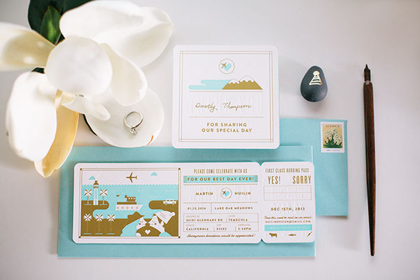
Image: Behance/Huilin Dai
After designing tons of stunning wedding cards for her clients, she decided to design her own. The wedding invite was designed to emulate a plane ticket since the couple is smitten with travel, and most of their guests were also flying in for the wedding. The card can be torn from the side to double as a RSVP card, and gets its inspiration from the pre-flight boarding tickets. Perfectly following the format of a boarding pass with a 3-color letterpress printing- blind, mint, and gold foil- the card is unique and incites an urge to travel in the guests!
6. Foliage Wedding Card By Raquel Kalil
This year, wedding cards have diverged from florals to include herbs and foliage as well. Designed by Raquel Kalil, a graphic designer based off San Francisco, this foliage inspired wedding invite is all about “all-green organic botanical elements just picked fresh from the garden”. Lush greenery, such as ferns, olive branches, vines, ivy, and magnolia leaf are all being perfectly illustrated in this invite to create the ultimate woodland vibe.
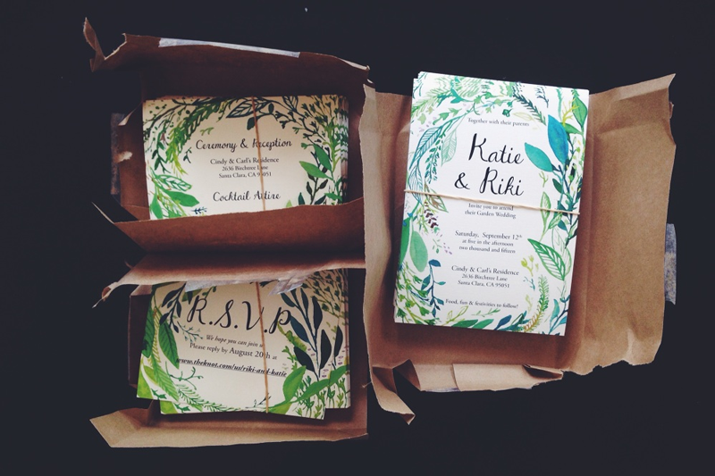
Image: Dribbble/Raquel Kalil
The stunning wedding stationary suite has a light and fresh feel, perfectly apt for a summer or spring wedding. By keeping the backdrop white, the design is balanced perfectly and the hierarchy is well maintained, despite the unruly nature of the border. The delicate and intricate monochrome botanical illustrations are paired with a flowery typeface for a name, and an elegant serif for the body text. All in all, a great design!
7. Foil Stamped Wedding Invite By Elizabeth Graciela
We can all agree that Metallic details are classy, decadent, and timeless. Designed by the cheerful art director and graphic designer from Indonesia, Elizabeth Graciela, this chic wedding invite drips with sheer elegance, sophistication, and grace, evoking images of coins, expensive jewelry, and buried treasure!
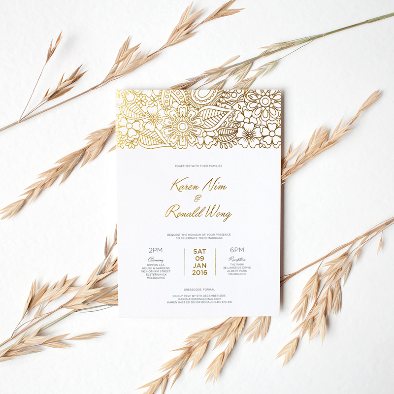
Image: WeddingWird/PaperLust
Akin to bold glittery designs we have been witnessing a lot of, albeit with a touch of sophistication and a bit more subtlety, the use of gold foil has touched up this invite with glamor. This modern and elegant invite with hints of delicate foil stamped and rose gold detailing, is perfect for couples who aspire for a glam wedding invite. A bold playful script font is employed for the names of the couple on this romantic and sweet wedding invitation. In addition to foil stamped patterns on the top of the card, the name of the couple and the wedding date are also highlighted using this technique.
8. Rustic Woodland Themed Wedding Invites By Ian Collins
Designed by Ian Collins, Creative Director for Simple in Portland, Oregon, this laser-cutout wedding invite is perfect for an outdoor wedding. This unpretentious, earthy woodland themed wedding invite, with popping out trees from the cutouts, makes for a perfect nature-inspired wedding invitation suite that your guests will fall head over heels for.
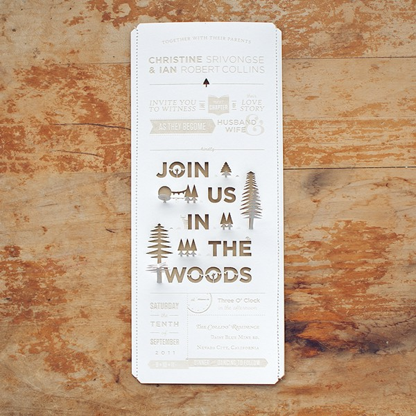
Image: FlatBrokeBride
This texture driven trend is great to transport the guests all the way to the woods, and reminisce the heady scent of pine and the feel of leaves crunching beneath their feet. In addition, the sturdy typefaces, a brown color palette, and the rustic design are all a prelude to a broader theme: throwing a hint to the guests for what they can expect from the ceremony.
9. Hand-Lettered Foil Invite By Liz Maute Cooke
Designed by the lettering artist, Liz Maute Cooke, this bold and contemporary wedding invite is a canvas for hand lettering and Calligraphy styled fonts! In an era where the art of typeface is facing a cultural moment, this pretty, free flowing, and modern typography flourished all over this wedding invite, is ornamental enough to suffice without explicit design elements.
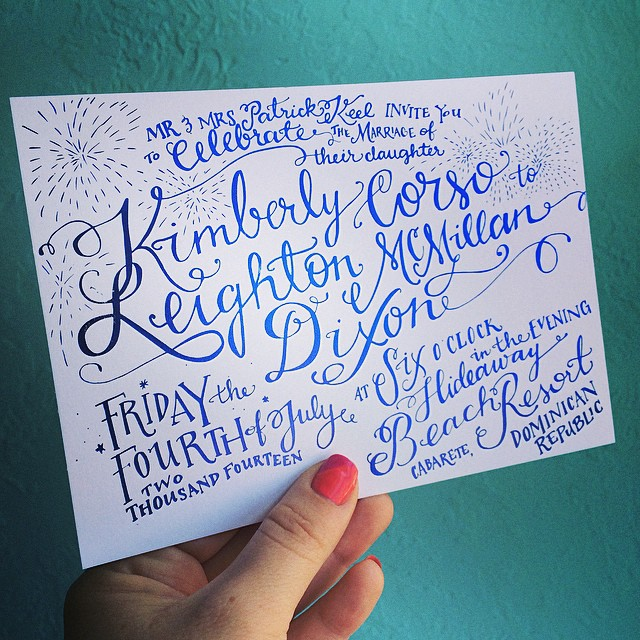
Image: Dribbble/Liz Maute Cooke
In this wedding invite, it’s ‘all about the font’, with large oversized fonts used as the main feature of the design. The blue foiled stamped lettering renders a fairy tale quality to this card, further augmented by the illustrations of fireworks sprouting from the curves of the letterings. Despite an elaborate lettering design, a clear hierarchy of information is maintained in the card to allow for easy readability, created through a grid layout, incorporation of space, and varying font sizes. Simple yet highly intricate, this wedding card is a feast for the eyes!
10. Spring Wedding Invite By Joyce Wan
Designed by Joyce Wan, Children’s book author, illustrator, greeting card and gift designer, this fresh and light pastel themed wedding invite is the ultimate card for a spring wedding. While bright and vibrant hues are fun, they can dominate your design. It’s better to stick with a single monochrome theme with occasional pops of colors to pay attention to imperative areas of the design, just like the designer has done.
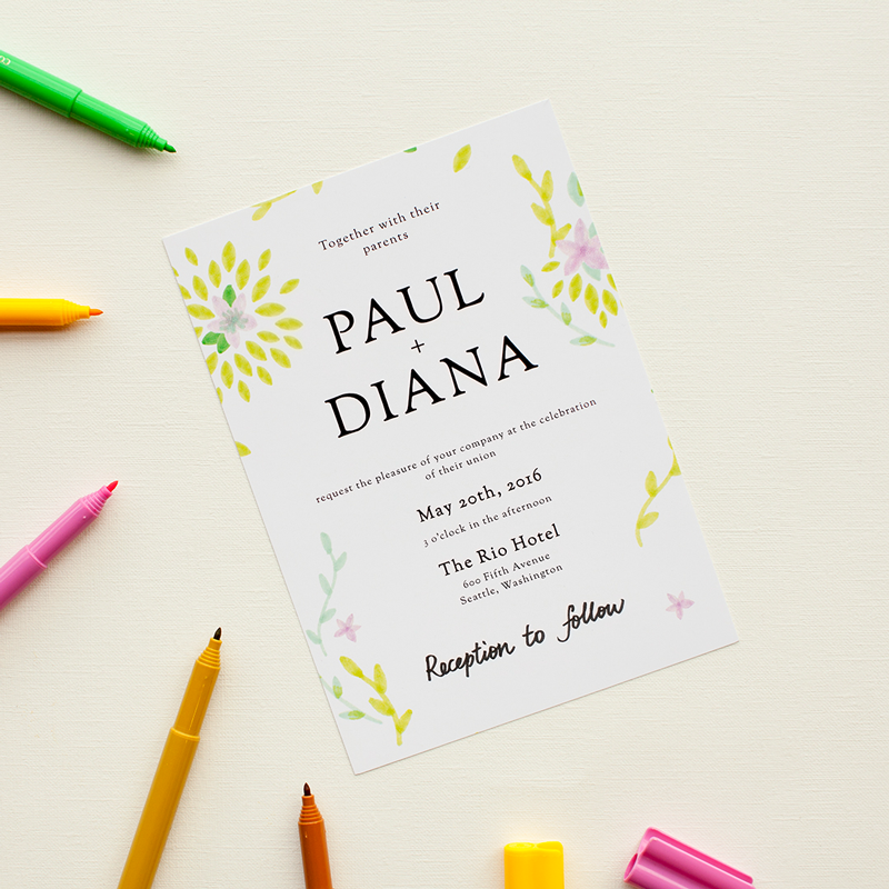
Image: PaperLust
In a way, this card is the epitome of minimalism; peppering the design with a little burst of color to add a little something extra to a design that is beautiful enough on its own. A minimal use of different fonts, plenty of negative space, and balance of design, keep this card well organized and neat.
11. Floral Canvas Invitation By Sinead O’Toole
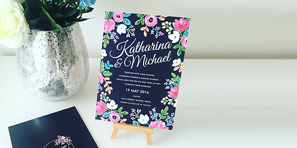
Designed by Sinead O’Toole, an artist, designer, and owner of the online stationery store Roco & Miley, this vibrant and animated wedding invite is pretty as a picture! There is something so beautiful and essentially pure about the union of two hearts and souls, and nothing embodies it to perfection than stunning floral patterns.
While floral patterns have always prevailed upon the wedding invite industry with their whimsical and sweet designs, dramatic floral stationary is the new facet adopted by these designs. The “less structured, and more wild” attention-grabbing blooms in this design, accentuated by a black backdrop, framed in outrageously beautiful patterns, and boasting a kaleidoscope of colors, go beautifully with the elegant scripted font of the couple’s name. Despite an extravagant design, this invite is readable and pretty organized.
12. Monogrammed Invite By Bria Busse
Designed by the graphic designer Bria Busse, the pretty blue tone of this card reminds us of “something old, something new, something blue, and something borrowed”! What we absolutely love about this card is the use of a beautiful monogram, both on the back of the card and a smaller version adorning the front.
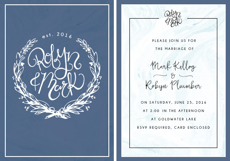
Image: Behance/Bria Busse
Not only meaningful and representative of the individual personalities of the to-be-weds, this wedding monogram perfectly binds this card with the couple. In addition, the neat and well-organized layout, ample use of negative space, and a balanced design makes this wedding invite somewhat of a design classic!
Now, handing the stage over to you! What will the New Year bring to the table in terms of wedding card trends? Do let us know in the comments below:




These wedding invitations are very lovely and beautiful.