2015 was a busy year for the banking sector, with top banks announcing their rebranding plans or executing them before the year’s end. As part of the procedure, everyone became busy planning, designing, and producing new bank logos, from the self-proclaimed, ‘America’s Most Exciting Bank’-Berkshire Bank, to the large financial institution HSBC.
Unfortunately, logo design rebranding can backfire. Instead of reaping the benefits of a good logo, financial institutions can take a nosedive without the right logo. Take for instance RBS’s decision to use a lower-case type in its logo. Though the bank wants to create a more modest image (in comparison with its current bold logo), the change (in light of the all its continued fraud scandals) may easily make clients re-think their decision of staying loyal to the bank. After all, the logo may not be the only thing it plans on cutting down on!
If you think banks can bounce back from a logo disaster anytime (RBS still exists right?), here are eight consequences you will realize years from the time of the logo change.
1. Alienating New Client Prospects
An ugly bank logo doesn’t necessarily mean that it wasn’t well-designed. It can be considered ineffective because it wasn’t properly designed for the bank’s target market. Similarly, if your logo is attracting the attention of people who won’t be using your services, your rebranding dollars have gone to waste. The lead cause of both issues is usually the establishment’s failure to understand who its customers really are. Without that information in hand, your logo won’t be able to speak directly to your customers and, eventually, it’ll fail to deliver results.
You know when a banks got it right….
• Bank of America’s Logo Won Americans’ Hearts
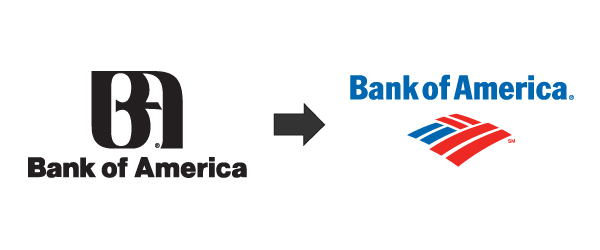
When the Bank of America created its new logo it kept its target audience in mind-the American people. The previous one had a bald eagle in the white space between the ‘B’ and ‘A’ in the logo. Meanwhile, the new one represents the U.S. flag, indicating patriotism and all the values the country was based on.
2. Delivering the Wrong Message
If your logo fails to relay the values your bank firmly believes in, it’s not the right one for you. You need to thoroughly analyze every aspect of your logo – shape, colors, images and text – to ensure that it doesn’t get the wrong message across. This is especially true for banks expanding beyond local borders as certain elements and colors can be misinterpreted. For instance, a red dragon for an Asian bank can be auspicious, whereas the same signifies danger and destruction in Europe.
• How SunTrust’s Logo Succeeded in Conveying its Values
The current logo of SunTrust includes a sun symbol, reflecting the warmth, energy and diversity of the financial institution. Choosing warmer shades of yellow and orange also signifies warmth, which is something customers would expect from the bank they trust with their money.
Related: 20 Top-Notch Banks & Their Logo Palettes
3. Logo Designs can suggest Poor Quality Standards
As your logo represents your institution, you need to ensure its high quality and professionalism. Otherwise, the image your customers will have of your brand won’t be as positive as you wanted. The old logo of the Australian Members Equity (ME) Bank is considered one of the bad bank logos because of its poor, sloppy design. Upon looking at it closely, the letters ‘m’ and ‘e’ are too close for comfort. Making things worse is the extension of the ‘m’, creating the appearance of a runny nose! These aspects made ME seem more childish and less serious, causing its prospects to wonder whether they should entrust their money to it in the first place.
• Why Barclays’ Logo is a Testament of the Bank’s High Quality
Barclays is one of the most respected banks in the world with a logo to match. Featuring a valiant looking bird that’s shaped like a shield, this expertly designed logo evokes feelings of safety and strength.
4. Failing to Make Your First Impression Last
Standing out from the crowd is vital for your bank’s success. Unfortunately, this isn’t easy to pull off, especially with a logo that’s too generic to be memorable. If your logo fails to make a first impression that lasts, you won’t succeed in winning and retaining your prospects. Besides, an unimpressive logo reflects badly on your institution, values, and everything you stand for. It even indicates that you didn’t put much time, thought, and budget into your rebranding efforts. As a result, people will take their accounts elsewhere.
• How ING Stays on Clients’ Minds with its Logo
The International Netherlands Group (ING) flaunts one of the most memorable bank logos. Everything about the logo is related to the Netherlands. The lion is the country’s national symbol whereas its color (orange) is the national color. Together, these design elements reflect the brand’s security, professionalism, and dependability.
5. Increasing Printing Costs
One of the biggest mistakes novice and expert graphic designers make is creating a logo in a non-scalable format. Not many banks detect this issue right away. It isn’t until they’ve printed out letterheads, billboards, shirts, etc. that they discover that the logo looks warped, fuzzy, pixelated, or unclear on these.
The typography of the logo can also be illegible if you don’t choose the right bank logo font or ensure its scalability. The first issue can be tackled if you use one of the fonts in the following infographic, but the latter is quite tricky.
Unfortunately, banks would have spent hundreds of thousands of dollars by then on printing their logos. The expenses will keep growing as financial institutions will need to pay for new cards, letterheads, and promotional merchandise. Considering the volatility of today’s banking sector, banks can’t afford to be footing the bills of these costs.
• Why KeyBank’s Scalable Logo is an Inspiration to Logo Designers
KeyBank’s logo is a great example of a scalable logo. Not only is it legible when reduced in size, it’s as effective in grabbing people’s attention when enlarged. It can also be printed in white and black as well as in color, making it very pocket-friendly.
6. Doubling the Cost of Rebranding and Redesigning
If you decide to cut the losses your bad logo caused, you may need to go through the process of redesigning your logo and rebrand your bank again. This is especially true if you don’t have an older logo to fall back on like other banks. You can end up paying thousands of dollars for a more professional-looking logo, but even that won’t mean your freedom from rebranding woes. Expenses aside, you’ll be losing a lot of potential earnings. Repeated redesigning can confuse your audience and damage your bank’s reputation.
• How Deutsche Bank Got its Logo Right from the Very Beginning
Deutsche Bank has one of the oldest bank logos. Known as ‘Slash in Square’, the logo looks like a square with a diagonal slash in the middle. However, a closer look at this simple design will allow you to see a stylized letter ‘D’.
7. Confusing Current Bank Employees
There are many messages a bad logo can relay to your employers – “We don’t care about the future”, “We don’t understand the value of our brand”, or “We don’t know where we’re headed”. All of these reflect badly on your employees’ morale, driving them to be less motivated to come to work. Some may even decide to quit their job at your institution, taking their talent, experience, and maybe even some of your clients to your competitors.
• Why Goldman Sachs’ Logo is the Pride of its Workforce
Since 1970, Goldman Sachs has flaunted the same logo: a blue square that contains the banking firm’s name in lowercase characters. The blue color in the logo symbolizes excellence, grace, reliability, and strength whereas the white signifies elegance, purity, and nobility. All of these are values employees would like to see in their employers.
8. Affecting Talent Recruitment
Not only can a bad logo drive away your experienced, trained employees, it can prevent your bank from getting talented professionals to join your bank. This is because a poorly executed logo tells them that you’re not going to put the effort into connecting with your employees let alone your customers. It also reflects badly on you, hinting that you have poor quality standards. Moreover, a bad logo makes your potential employees wonder whether or not you’ll invest in them since you clearly wouldn’t on your logo design.
• How UBS’s Logo Allows it to Reel New Talent
The Swiss global financial services company, UBS, is known as a talent magnet. Its logo is one of the most renowned bank logos around. The three keys featured in it represent the firm’s values: confidence, security, and discretion.
The Solution to These Issues? Design a GREAT Bank Logo
If you want to avoid these issues, all you need to do is get your bank logo right. As easy as this may sound, this process is VERY tricky. With your bank’s reputation, potential earnings, current workforce, and future recruitment on the line, the last thing you need is to wade through this process blindly.
Luckily, you can create your own bank logo and make sure that it’s a success. All you need is to download Logo Maker Guide For Banks. Combining the best practices of bank logo design with actionable tips and many design secrets from today’s top financial institutions, this is the right resource to begin conceiving and, ultimately, creating your own logo.
Today and mitigate these eight costly risks to ensure the growth, prosperity, and profitability of your bank.


