Logos have always worked hard for their brands but the digital innovation of the last twenty years has intensified their workload. These tiny symbols of a brand’s visual identity now have to jump from one print medium to the next (business card, flyer, letterhead) and from one digital channel to the other (website header, digital favicon, email signature), constantly repeating the cycle. The goal of these custom logo designs?
Make sure the brand is fully and accurately represented on all mediums and in all situations. Since there is such a huge variety in how all these different channels operate and the space constraints that they come with, brands have to innovate and keep themselves adaptable and responsive to every channel.
Versatile logo designs help brands achieve that goal.
Versatility In Custom Logo Designs
A custom logo design is a logo that is made to order for your brand. Unlike a premade logo template that we mostly deal with as an AI-backed logo maker program, custom logos are designed with your brand in mind, from conception to completion.
The reason we’re focusing heavily on custom logos in this article is that premade logo templates come with a lot of built-in adaptability. You customize them, download them, and they’re good to go on several marketing platforms. But a custom logo that you make from scratch has to add versatility to the design, and in large part that depends on the budget you have. The more variations you ask for, the higher the price tag goes.
It also requires you to know the basics of logo variations; how many there are, their use-case scenarios, and the best practices that create a custom logo that looks as good on screen as it does on paper (and everywhere else it goes).
As we properly start the discussion, we begin with the types of logo variations and their basics.
A Versatile Custom Logo Has 5 Basic Variations
Let’s take a quick look.
• Primary logo
This is the full version of your custom logo. The logo that people see the most often. It contains all the elements of your logo in full — brand name, tagline, everything.
Your primary custom logo needs a generous space to shine. That’s why you see them in somewhat larger spaces like website headers, product packaging, store signs, and such.
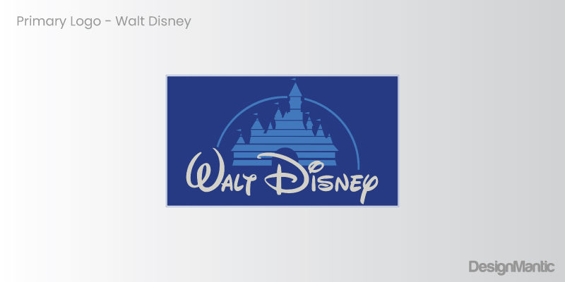
Most primary logos are in a horizontal format — placed side by side. However, a large variety of them comes in vertical or stacked formats, too. Icons on top and brand names underneath. Whichever way you go is fine since this is your full-scale version.
• Simplified primary logo
This is your logo’s pared-down version with some details removed but the original shape is kept intact. There are several ways you can achieve this variation. Turn your gradient logo into a single-color mark. Simplify a complicated mark and make it flat and easy. Take your full-name brand logo and transform it into a monogram (aka lettermark).
The goal of this version is to uphold the primary version as much as possible and only sacrifice a handful of details. A simplified custom logo is best suited for alternative environments where the primary version poses difficulties. For example, you might switch to your single-color mark on a colored background where your full-scale gradient logo is becoming illegible.
• Just the words
When you have an iconic brand name or if your brand goal is to make your name more powerful than the icon, you create a name-only version for spaces that don’t allow you to display your full logo.
A quick example that comes to mind is Disney, which foregoes its popular castle and stays with the name Disney in limited spaces such as the website menu bar.

Image Source: disney.com
Typographic logos, also called wordmark logos, use these variations the most. For example, Coca-Cola switches to Coke, Disney further scales down to a single large case ‘D’, Google does the same, and so does Skype. Urban Outfitters uses company initials to create a monogram with even more variations to show how versatile their brand is.
• Just the icon
Also called logo marks or pictorial marks, icon-only variations work best for logos that have both an icon and text. The benefit of using an icon over text is a simple icon is more communicative than words. It not only conveys the brand name but helps reinforce the brand image at every touch point.
Some logos are so well-designed that their icons are their all-season logos. Apple, for example. That half-bitten, single-color icon can be scaled up or down, go on print or screen, and still keep true to its full-form shape.
Icon-only logo variants are ideal for constrained spaces such as website favicons or mobile app containers. At a small scale, words might become unreadable, but the icon will remain clear and continue to promote the brand imagery.
• Reversed color version
Your graphic designer may create several color variations for a fully responsive custom logo. Some of these include mono-color, black and white, and grayscale. But the most promising is a reversed color variation where the background and foreground color switch places, creating a streamlined logo that doesn’t need more changes for more versatility.
This version is best for marketing purposes such as on a custom logo sticker for a print ad. On a vibrant background, this color variant gives you the freedom to present your logo with flexibility and control.
6 Benchmarks of a fully adaptable custom logo
While logo variations are necessary, is there a way to create a custom logo design that’s versatile from the word go? (Namely, the Apple logo?)
Here are 6 best practices that guarantee such a design.
1. Preferably work with a simple, flat image
The reason Apple’s half-bitten logo works is that it uses a simple, no-nonsense image. It’s not a mystical, complicated work of art that you have to unravel or declassify. It’s out there, doing its thing, being an iconic logo example to everyone.
![]()
Not only the shape of the logo is simple, its color palette is also minimal. Whether you color the logo black, white, or gray, it works in hundreds of different situations and backgrounds, never messing with the brand identity or the environment.
So, for your customizable logo to become iconic one day, keep things simple. A flat icon with an un-fussy color palette can do wonders for your brand.
2. Use fewer details
If you can’t use an openly descriptive logo that doesn’t require many details anyway, choose a concept where you have to add as few details as possible. Forget effects, shadowing, outlines, and such. Say no to gradients, no to decorative fonts, and no to over-the-top containers such as emblems or shields.
Abstract logos are a great alternative to consider. You can choose a one-color tone in an abstract logo shape and the design will be simple yet meaningful.
The fewer details you add, the fewer variations you’ll need to create. It not only results in a streamlined, polished logo but in a much lower designer fee, too.
3. Be very mindful of your color palette
We’ve talked about saying no to gradients or other explosive uses of colors. But this goes deeper. You also have to design with contrast in mind. How do your background and foreground colors work? Is there enough contrast for legibility, accessibility, and reverse color variation?
Do your chosen colors work in RGB and CMYK, both? Since they’re never going to match exactly, you’ll have to pick shades that resemble each other closely. The print-focused design relies on Pantone colors for the best results, so consult the Pantone book when you finalize your color choices.
Also, avoid using too dark colors as they never translate too well on the paper and may make your design look muddy. To ensure your design is print-ready, print a proof before saying the final yes to anything.
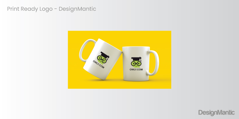
For a versatile custom logo, keep your color palette limited to two. Pick shades that contrast well with each other so you don’t have to struggle with 15 different color variations. A simple color palette will give you the best balance of flexibility and variety, allowing you to present a confident and flawless brand to the market without stumbling for the right variant.
4. Design in black and white
A logo design that’s perfect in all environments of print and screen is always going to make sense with or without color. An image that needs color to become a brand symbol is anything but a logo. So, start your design process with a black-and-white sketch.
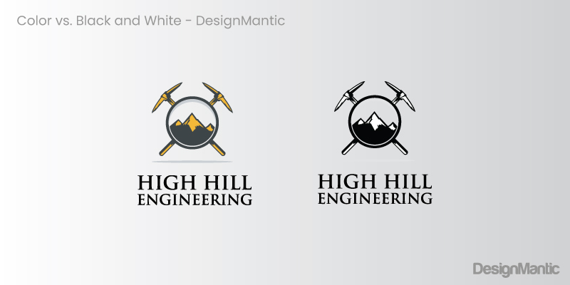
The reason it’s important is because in many cases, especially with print assets, your printer might not have the exact ink needed for the color. A mono-color logo will ensure that in such cases or when production costs are high, you have a mono-color variant to fall back on.
5. Check if it can be resized without losing shape or meaning
Another thing to pay attention to is your logo’s size and scale. If you maximize it to fill up a city billboard or scale it down to fit into an app container, will the logo continue representing the brand? Or will it lose all meaning?
Remember that the discussion is not about pixelation alone. You can fix a badly pixelated image back at the studio by vectorizing the logo. But if the design looks awkward in a too-large size or becomes illegible as a tiny mark, you have cause for concern.
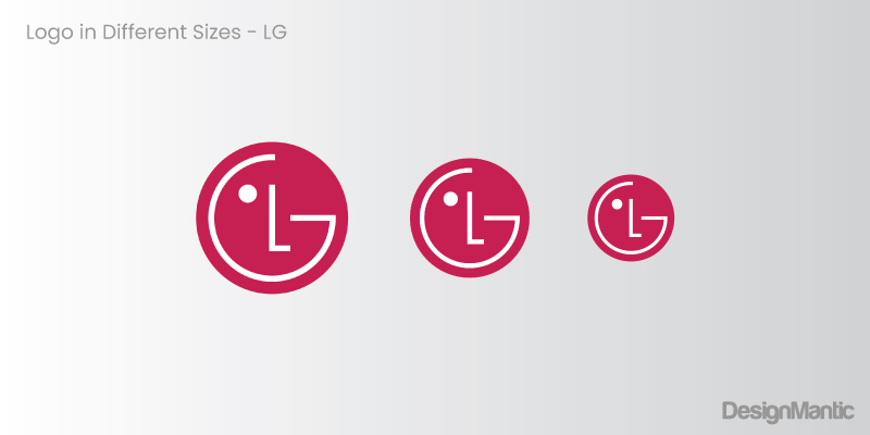
If you have created a minimal, descriptive logo from the start, you might not face this issue. But if you have made compromises along the way, this is where you fix it.
6. Choose appropriate typography
For successful custom logos, the design must also consider the typography it’s using. Sans serif fonts are ideal for a versatile logo that doesn’t require many alterations. Yet, if you are committed to a serif font design, it can work as long as the rest of your logo is clean and precise.
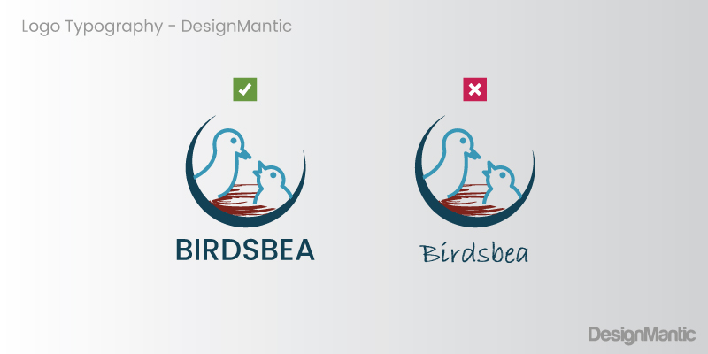
Again, resize your logo to see if your chosen type offers good readability at all sizes. While digital users might be able to zoom in (that’s bad UX, by the way) and see what you are saying on the logo, your print audience won’t be able to. If they can’t read or have to squint, they might pick up your competitor’s flyer from the stack and give them their business. And why would you want that to happen, right?
So choose fonts that are readable at all sizes and from all distances.
To sum up
Modern business logos represent their brands on a variety of channels and platforms, both print and digital. For a logo to remain impactful and meaningful in all those changing environments, brands often go for logo variations — slightly different versions of their main logo design.
While that is a necessity in some cases, small businesses that are just starting may benefit from a custom logo design that’s fully responsive from the word go. How do you make that happen? By following design principles that beget straightforward, great-looking logos that have simpler shapes, fewer colors, and no unnecessary details that need to be pared down in secondary versions.
We hope this article helps you create market-ready logos that look good and meaningful no matter where they are.

