A unique visual identity differentiates a brand from others and creates a strong impression. News is that visual elements regulate 55% of brand impressions or first impressions. Therefore, a distinct visual identity can really turn the sales tides in your favor.
However, it gets tougher to maintain ranking with ever-evolving concepts of branding and the needs of consumers, especially in today’s digital and highly competitive market. In order to stay relevant, you must understand and adapt to the demands of the audience and meet their expectations. Not embracing change in technologies and strategies can cause a brand to fall behind and eventually out of the race, take Nokia for example.
So, the end goal must be to keep strong research and maintain an effective visual identity. It can not only drive engagement, but also build genuine connections with the audience and turn visitors into returning customers.
With that being said, the question is how to go about it? Every year, new trends emerge and 2025 will not be any different. The new year is just around the corner, and if you haven’t started planning yet, this guide is for you (even if you have, a little extra knowledge never hurts). Here is our ultimate visual identity checklist to give your brand a distinct look for a fresh new year start.
8 Points Checklist To Build An Impactful Visual Identity
Below, we have mentioned 8 steps, along with examples, to increase your chances of success. You don’t have to follow these to the tee but integrate them into your current strategies.
Logo Family
Your brand’s visual identity starts with the logo, which creates the first impression. It must be unique, scalable, and recognizable. At the same time, it must be simple and align with your brand guidelines.
So, how to do that? First, explore the different types of logos and pick one that best suits your brand’s style. Don’t be afraid to experiment and filter out options before making the final decision.
Now, let’s come over to creating the logo. The two best ways are: research the latest logo design trends and gather inspiration from others. Over the 100 years history of logo evolution, there are many notable brands that transformed their identity through changes in logo design.
Here are some brands with truly iconic and inspirational logos:
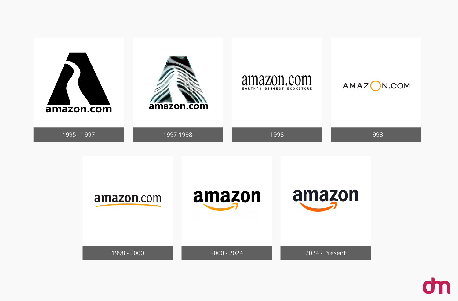
Amazon Logo Evolutions: Amazon has quite a unique logo design evolutions story. Initially, it was just an “A” in 1995, representing one of the first eCommerce platforms. After that, it changed to a more complex design in 1997, which was replaced with just the Amazon site address. After that, the black and orange design was introduced in 1998 and then once again in 1998, which later changed in 2000 to what we see now – the Amazon name with a smiley arrow from A to Z.
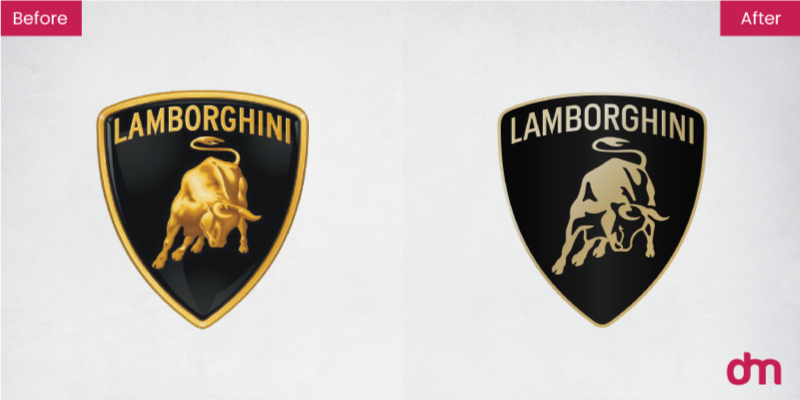
Lamborghini Logo Redesign: The supercars manufacturer, Lamborghini, had a more subtle golden and black logo, for many years. Now, after 20 years, it has evolved into a much more plain bull icon in a minimalistic and a bit dull golden color logo.
Color Palette
Next important thing after deciding on the logo family is the color palette. Before that, it is essential to understand the color psychology and how your choices can improve your brand impact.
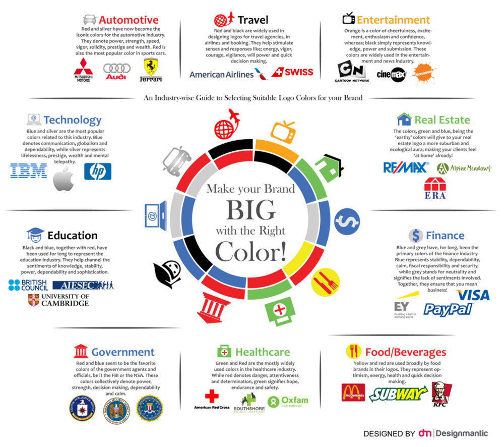
Each color is different and gives off different vibes. For example, Red is more suited for aggressive looks, while green is more nature and healing inclined. Therefore, it is best to choose colors according to your industry, products, services, and overall brand purpose. If your brand has a more refreshing theme, it may be better to go with summer colors, while remaining more heavy and dark with the respective theme.
Here are some brands that carefully selected their color palettes for maximum impact:
Nickelodeon: We all think of one name when we see the orange splash logo – Nickelodeon. It has a single color which makes it more distinctive as Orange showcases happiness and enthusiasm, which the people feel watching cartoons and shows.
WWOOF: The Worldwide Opportunities on Organic Farms is a non-profit organization that links visitors with organic farmers. Its Brown and Green color combination describes the trees of life and showcases sustainability, growth, and regeneration for everyone.
Typography Styling
The choice of typography and font settings is a huge difference maker. You can select a more clean and modern font like Helvetica, or a luxurious one like Grotesque, with respect to your brand.
Remember, you have to choose a single font family for your entire branding to ensure consistency in everything. If you have a logo with name or letters in it, you must use the same font, but you can choose the placement and styling according to your best judgement.
Here are some brands with the best typography:
Google: Who doesn’t know Google. Almost everyone visits Google at least once a day. From Google search engine to Google Chat and other products, you will see a high level of consistency in typography. Now, it is much more simple with Sans Serif, but easily recognizable.
Mailchimp: The very friendly handwritten-type typography of Mailchimp is a highly clever idea to showcase email writing vibes. It has been the same for many years, but has changed in colors and refinement, over the years.
Brand Pattern
Brand pattern is a design that continuously appears in branding and serves as a part of a visual identity of a brand. These can be abstract or stripes, and may also include different elements like colors, shapes, values, etc.
These are great to improve awareness and build a connection with the audience. It is completely your choice whether to include them or not. If you do, you can mix and match different patterns and elements to see which one best suits your brand style.
Here are some brands with one-of-a-kind brand patterns:
Pukka Herb: The beautiful flowers, leaves, and themed-pattern design of Pukka tea reflects the brand’s idea to connect their product with nature. The different fruits or flowers are respective to the flavor of tea, like the morning berry has different berries while the three mint includes mint leaves.
Warby Parker: The clean and simple illustrated patterns design of Warby Parker at their store gives the brand a unique and fun look. The contacts brand has chosen the right elements and colors to showcase its brand idea.
Brand Assets
The term brand assets encompasses everything that makes up a brand’s identity and enables it to be recognizable for the audience. These can be logos, typography, color palette or complementary colors for the logo, mascots, and other such elements. Since every brand is unique, so are its assets — whether it’s a global enterprise or a growing tech brand like BlueTally.
So, when you are designing the assets for your brand, you have to make sure they are not only unique and recognizable, but also consistent throughout your brand’s visual identity. This way, the elements will stick in the audiences’ minds and reflect your brand. The top three brand assets are Logo, Color Palette, and Tagline.
As you finalize your brand assets, remember to extend them to real-world touchpoints, too. Packaging and branded merchandise—like a custom tote bag that carries your logo, color palette, and tagline—turn everyday moments into brand impressions.
Here are some brands that shared their assets for usage and inspiration purposes:
Wistia: Wistia is a powerful video hosting platform. If you need, the Wistia brand assets are present on the website for viewing, inspiration, and usage purposes. However, Wistia has also shared the usage guidelines which you must follow in order to portray or feature the brand.
Vimeo: Vimeo is a video management platform. The Vimeo media kit, consisting of the brand assets, is present on the website, which you can see, get inspired from, or even use for varying purposes. However, Vimeo has also shared the guidelines for correct usage.
Photography
The photography element in a visual identity refers to the shots of products, services, and those in the marketing campaigns. It also includes the photos of any influencers and persons that appear in the brand’s work.
Photography, as part of the visual identity, has hugely evolved over the years. It beautifully ties in with the branding and copywriting, enabling you to set the right tone, connect with the audience, and deliver the message. Although the big sharks in the market have a professional team, top-tier gear, and a dedicated room with all the extras, it does not mean these things are mandatory. If you cannot afford such things, even a nice camera phone, blank papers for a backdrop, and a room with good lighting will do the job just fine. Alternatively, you can rely on Welpix, which specializes in product photography using CGI technology, to create polished, consistent visuals without the need for a physical shoot, while still emphasizing that creativity and technical skill remain essential. The absolutely necessary things are creativity and technical skills.
Here are some brands with the best photography:
Casper: Casper is a mattress selling brand with a strong and innovative marketing strategy, which ultimately built an impressive visual identity. Their incredible product photography effortlessly blends in their product with other elements, enabling comfort and connection.
Airbnb: Airbnb is a quite popular online platform connecting hosts and guests for short-term property or accommodation rentals. The brand’s photography mostly focuses on properties and people, but the breathtaking angles and settings create a sense of belonging and satisfaction.
Campaign Templates
Campaign templates are pre-formatted and structured documents to easily create marketing campaigns. These provide a list of coordinated activities that can help achieve brand goals.
Campaign templates can provide a decent head start, once you align it with your brand goals. You can make it your own with brand assets, configurations, and objectives. After that, you can save and manage it via the respective platform.
Here are some places to find powerful campaign templates.
Hubspot: Hubspot Knowledge Base has shared guidelines to create brand campaigns from templates, accessible via the Hubspot campaign tool. It helps set your campaign in motion and easily manage it or save for later.
Atlassian: Atlassian marketing campaign template is a simple and to-the-point plan which you can customize to your brand guidelines. The brand also has other templates and strategies for effective and efficient marketing.
Comprehensive Brand Guidelines
Once you have created the visual and branding assets, you must create the comprehensive brand guidelines. These are a set of rules and standards which helps you maintain a consistent brand image, across all channels.
With time, these guidelines will enable your brand to get bigger, better, and more recognizable. This includes the usage of your brand’s logos, color palette, typography, voice, tone, imagery, and everything else that represents your brand online.
Skype: The cheeky and somewhat friendly design style of the Skype brand book is a testament to the vision behind its creation. It is fun, creative, and colorful, and if you want to add a little humor to your own brand guidelines, this can be your inspiration.
Google: The Google identity design book is rich with information that defines the thoughtful thinking of the minds behind the search giant, or as the brand likes to call them – Googlers. If you can take time to read and understand, the Google branding book is the best inspiration.
Conclusion
Creating an impactful visual identity is a crucial aspect of brand awareness, which is one of the three steps for branding your business.
According to a Harvard Business Review, you and your brand have just about 7 seconds to make a first impression. Whether the customer will stay or leave after these 7 seconds, is up to you and the efforts you put in building your visual identity.
We have described everything you need to craft a strong visual identity for your brand, along with some examples for inspiration and ideas. Whether you run a brick-and-mortar shop or an online store, take your time to create the perfect logo, web design, and other aspects of the visual identity to truly stand out from your competitors and turn visitors into returning customers.


