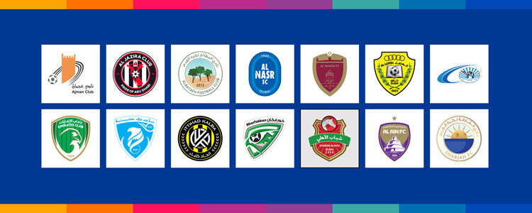
Fourteen clubs are participating in the UAE Pro League. A football league event that’s all about intense sports and passionate club rivalries. Which club is winning the best UAE pro league logo game? This article is going to be all about that.
We will list the major elements of sports logos that give each football club a unique brand identity. We will briefly touch upon the club’s history to give you sufficient context. We’ll then list the essentials that make each club logo different from the next. From icons to color choices, and typography to historical facts, we discuss everything that allows fans to rally behind their clubs with passion and vigor.
In the end, we leave it to you, the mightly audience, to decide which club has the best soccer logo design in the entire tournament.
UAE/ADNOC Pro League Logo
The UAE Pro League is officially known as the ADNOC Pro League after a record deal between the Abu Dhabi National Oil Company and the UAE’s primary football division.
The League’s logo is a visual testament to that.
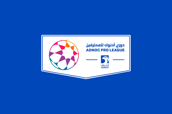
It’s a horizontally placed rectangle, kind of evenly separated into two visual sections.
One contains the rainbow-colored football symbolizing individual teams in the league, and the other has the ADNOC eagle looking on ahead from under the league name in bold text.
Blue has been used as the main color in the palette, as a symbol of professionalism, working as an institutional seal, and to ensure the bright rainbow in the football logo has a calming canvas against which it can shine.
UAE Pro League Teams Logos
What makes UAE Pro League logos unique?
If you have had a chance to check out our football logo maker, you’ll know that popular sports logo templates feature icons and imagery that convey speed, athleticism, intelligence, prestige, and passion. Animals feature prominently in sports logo design. Birds, too. Shields and emblems are other popular symbols.
But for the UAE Pro League Logos, designers rely on culturally relevant iconography too in designs to inspire a sense of ownership and nationalism in the audience.
Let’s see how.
1. Ajman
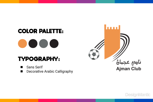
Ajman is one of the oldest football clubs participating in the league. It was established as a result of a merger between three clubs — Al Shoala, Al Hilal, and Al Nasr — shortly after the first season of the league, in 1973-74.
Icons:
The Ajman Club logo features an orange tower, a slanted, three-striped black semi-circle icon that surrounds the tower and finishes the design with a football icon.
The tower in the logo is a depiction of the tower of the Rashid bin Saeed Stadium, the official stadium of the Ajman Club. The stadium is commonly referred to as the Ajman Stadium.
Colors:
Orange, black, and grey feature prominently in the Ajman Club logo. Orange is used as a bright accent while black is the most dominant shade. The color combination allows the logo to convey energy steeped in substance.
The bright spot of orange has earned the club the nickname of ‘The Oranges’.
Typography:
The Ajman Club logo employs a sans serif typeface with decorative Arabic calligraphy to name its brand.
2. Al Ain
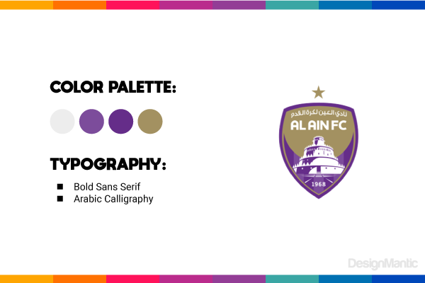
Al Ain FC, or how it’s simply known as Al Ain is the most successful club in the UAE Pro League. To date, the club has won 14 championships and has been the most consistent winner for many years. Originally, the club was formed by some exchange students from Behrain and a few Sudanese working in the UAE. The club was almost instantly successful and gained huge fandom.
It’s one of the oldest football clubs in the country, having been founded in 1968.
The club is also known by the nickname, The Boss (Al Zaeem).
Icon:
The Al Ain club logo is a crest — symbolizing eminence and elegance — with the Al Jahili Fort featuring prominently on it. The fort symbol reflects the history of the city and holds a special place in the community as it was the formal home of the beloved UAE ruler, Sheikh Zayed bin Sultan Al Nahyan.
The single star on top of the Al Ain shield symbolizes their victory in the AFC Champions League, a prestigious football event played by national league champions of their respective national associations.
Colors:
Purple is the main color of the Al Ain club, its player kits, and its branding. In color psychology, the color purple signifies creativity, royalty, extravagance, and exclusivity.
Typography:
Al Ain uses sans serif typography in the logo design to spell out its name. The Arabic on top translates into ‘Al Ain Football Club’. So if you thought it was a slogan, it’s not.
3. Al Bataeh
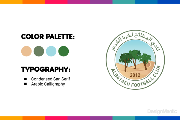
It’s one of the newcomers in the UAE Football League system. The team joined the league in the 2019-20 season and performed exceptionally during that season and the next. Their performance earned them a quick promotion into the UAE Pro Football League.
Icon:
The Al Bataeh club is situated in a circular crest, with the club’s name surrounding the crest in English and Arabic.
The logo features desert slopes plus a few tree icons with the club’s establishment date — 2012 — a part of the design.
Colors:
The Al Bataeh logo is heavy on traditional Arab visuals. There is desert, palm trees, and the shade of green that you’d typically associate with the desert vibe.
Typography:
The typography is again standard sans serif style to ensure easy visibility for the club’s identity.
4. Al Jazira
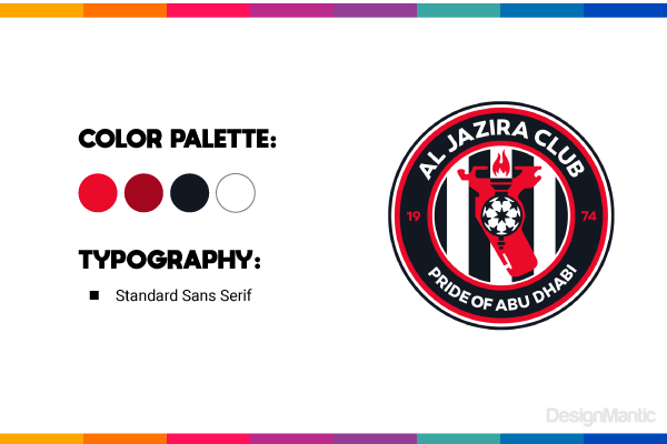
Al Jazira is an old club in the league but hasn’t been extremely lucky on the field. It has won three championships and has been a runner-up a few times, but even with recent successes, its performance in the league often leaves fans feeling lacking.
Nonetheless, in terms of pure graphics, the Al Jazira logo is one of the most engaging ones on the list. It’s the only one with an official brand slogan on its crest (Pride of Abu Dhabi) and features imagery and color choices that are bold and commanding.
Al Jazir Club is well known among the fans as Al Ankabout (The Spider).
Icon:
The logo includes a burning torch icon, above a football symbol. In the background, we see black and white stripes that are surrounded by a circular shield containing the brand name and slogan.
The unique patterns you see on the football icon represent the club’s association with the Special Olympics World Games 2019 by featuring its logo in that start-spangled shape.
Colors:
The Al Jazira club has a confident brand personality and uses red and black as its main color palette. White is used as an accent color to create balance and contrast.
Typography:
The club logo has a straightforward sans-serif typography design articulating the brand name, its slogan, and the year of the club’s foundation.
5. Al Nasr
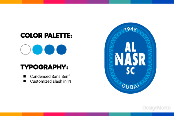
Al Nasr is the oldest football club in the UAE historically, and the oldest in the UAE Pro League, too. The name Al Nasr translates to victory in Arabic, and thus is a pretty good name for a sports team.
The club has a real-world rags-to-riches story. Founded by a group of young men in Dubai, they were used to playing in an empty playground near a high school. They kept at it for nearly three years before they decided to set up modern rules and form an official football club.
In the UAE Pro League, however, Al Nasr has not been that victorious. Except for a few great wins plus a few runner-up slots, their path to glory is still unexplored.
Icon:
If you’ve been looking for the most streamlined and minimalist UAE Pro League football club logo, this is it. Both in its overall appeal plus individual elements, the club logo sticks to a simplistic theme and understated sophistication.
The logo features an oval-shaped shield and within it, a typographic logo. Instead of relying on burning torches, cultural symbols, or regional imagery, the Al Nasr club logo is simple, pristine, and thus infinitely more appealing.
Colors:
Varying shades of blue dominate the logo of the Al Nasr club. In a league festival where teams are trying to outdo each other by grabbing the most attention-seeking shade, Al Nasr stands out as a formidable opponent through its sheer denouncing of any such effort.
Typography:
In typography too, Al Nasr is in its own league. It features a stylistic slashing in the N, creating a beautiful break in the letter and thus elevating the typeface from simple to sleek.
6. Al Wahda
The Al Wahda logo represents one of the oldest and most prestigious football clubs in the league’s history. The club holds the title of presenting the UAE in the FIFA World Cup for Clubs in 2010.
The Al Wahda Football Club logo is a combination of heritage, history, and sports. It features symbols and colors that combine the historical Abu Dhabi with its latest, most modern vision.
Icon:
The logo’s central figure is Qasr Al-Hosn, the oldest stone building in Abu Dhabi and also a historical landmark. The antelope imagery on the watch tower building is brought over from the club’s previous logo design and is used as a representation of resilience and regional pride.
Colors:
The Al Wahda logo uses maroon and beige as its official colors in the logo. Keeping true to a cultural vibe, the colors are rich, and earthy, and focus on regional heritage.
Typography:
The Al Wahda logo keeps it clean, type-wise. Instead of using both Arabic and English on the logo, the club chooses to communicate its message in the universal language and keeps things simple.
7. Al Wasl
You ask why there is that Olympic Games ring on the Al Wasl logo. It’s not because the club has any Olympic wins on its record, but it signifies the club’s commitment to sporting excellence and achievement.
In 2009, the Al Wasl Club was ranked as Club of the Century by the International Federation of Football for History and Science in UAE due to its stellar performance for the country in international events.
The Al Wasl club also stands out in connection with its rivalries with the Al Nasr and Al Ain football clubs. They are considered each other’s passionate competitors with Al Wasl once again making its mark due to its world-famous, most loyal fanbase in all over UAE.
The Al Wasl team is nicknamed Al Fuhud (The cheetahs/panthers) and has won 7 UAE Pro League Championship events.
Icon:
The Al Wasl logo is pretty busy in its design. It features Olympic rings on top of the shield to signify its commitment to sporting excellence. The two olive branches on the sides symbolize peace through sports. The open book icon with a football on top is to represent the club’s efforts to promote sporting education and training in the UAE through its clubs and other ventures.
Colors:
The logo features yellow prominently in the design, with black and green supporting its messaging. The color choices represent the club’s strength, resilience, and adaptability.
Typography:
The Al Wasl logo uses a sans serif typeface to name itself on the design. Both Arabic and English texts are present on the logo.
8. Bani Yas
Bani Yas may be at the bottom of the win tables in the UAE Pro League history but that only means they have all the room to move up and secure a respectful standing in the league. Nicknamed ‘The Sky Blues’ (Al-Smawi), they are the team that doesn’t lose heart and keeps looking to the future.
Icon:
The Bani Yas logo features a camel icon in its design. The logo is somewhat unfortunate as it lacks direction and clear meaning. While we can see what looks the depiction of a sunrise in the background, it’s in blue, which kind of defeats the purpose of looking optimistic.
Colors:
We have got a few shades of blue in the Bani Yas logo. White is the close second, with black trailing behind. Again, the color choices leave the design feeling empty and lacking.
Typography:
There is not much to say of significance here except for the need to redesign the logo immediately.
9. Emirates
We have finally arrived at the stage of UAE Pro League logo exploration where we’re going to see a bit of birds and feathers in the logo designs. The first on the list is the Emirates Club logo, showcasing the sharp beak of a falcon.
The Emirates Club is one of the oldest on this list and has gone through a few mergers to become the club it is today.
While the club has yet to see a win, it’s performed well overall and has won a UAE Super Cup and a UAE President Cup.
Icon:
The Emirates Club logo is a green and gold shield. Within it, a falcon icon is prominently placed. The flacon is designed in the negative space inside the logo.
Colors:
The color palette of the Emirates logo is bedecked in green, gold, and white. The colors are regal and suit the club named so majestically.
Typography:
Unlike most logos on this list, the Emirates Club uses a simpler version of its name on the logo and ensures to keep the text in both English and Arabic for maximum understanding.
10. Hatta
This is another soccer logo on the list featuring animal imagery on the shield. The Hatta club from UAE Pro League Games uses a triangular shield for its logo, signaling momentum and direction.
Icon:
The key image of the Hatta football logo is an eagle head icon. The eagle is known as the symbol of courage, strength, majesty, and wisdom. The spirals in the logo show movement in the design and create a beautiful sense of movement and hierarchy in the logo.
Colors:
The Hatta club colors are blue and white. Both colors signify purity, peace, and vastness. They are also colors that symbolize calmness but depth.
Typography:
If you are looking for a fantasy football logo inspiration, take a feather out of Hatta’s book. The club uses simple typography in its logo, choosing to initialize the logo for a cleaner canvas.
11. Ittihad Kalba
Ittihad Kalba, referred to by the public simply as Al-Ittihad, is another club competing in the UAE Pro League games. Their team is nicknamed The Tigers and if we could recommend a cool design for your fantasy football logo team, this would be a top contender.
Icon:
The design is situated in an ornate black shield with a yellow ring icon around it. The seven stripes — yellow and black — in the background symbolize the Emirates Federation. Two olive branches around the shield are a symbol of peace and communicate the club’s commitment to fostering cultural harmony and regional peace through sports and athletics.
Colors:
The Al-Ittihad logo colors are yellow and black, which keep showing up in most pro-league club logos as people typically relate them with power, defiance, and resistance.
Typography:
The Ittihad Kalba logo font for the English text is a simple sans serif. However, the logo also uses Arabic text on the design to ensure its wider reach.
12. Khorfakkan
The Khorfakkan Football Club was formerly known as Al Khaleej and is currently one of the key teams in the UAE Pro League games. Their team is nicknamed The Eagles (in Arabic, Al Nusur), with the mighty bird proudly displayed on their official brand seal.
The club has shown respectable performances in most games it has played. In 2019, the club won the UAE Division 1, which was their first experience in the UAE Pro League.
Icon:
The team’s football club logo is designed with a shield icon that’s slanted to the left. The unique placement allows the logo and the bald eagle’s head to display movement and direction.
A soccer ball icon serves as the eye of the eagle in the logo. The overall iconography of the theme displays courage, action, and momentum.
Colors:
Prominent colors in the logo design are green, black, and white. You can see a bit of 3D styling going on using shadows and negative space to add depth and dimension.
Typography:
So far, all UAE Pro League Club logos have shown a preference for sans serif font styles. The Khorfakkan club stays true to the script too. We’ll see if that changes in the last couple of logos on this list.
13. Shabab AlAhli
Shabab AlAhli is the second-most successful football club in the UAE Pro League and the most successful team in Dubai. The club has won 8 league titles so far and has earned a star to their name. Each start represents five title wins. Al Ain Club, with its 14 wins, is the only club to hold two gold stars to its credit.
The Shabab AlAhli logo is an ornate crest featuring horse imagery, which suits their nickname, The Red Knights.
Icon:
The football club logo can be divided into three parts — the shield, the ribbon around it, and the torso of a stallion. Together they create a brand message of strength, organization, and celebration.
Colors:
The Shabab AlAhli colors are red, golden, green, and grey, strengthening the brand message portrayed by the symbols in the logo.
Typography:
Featuring both English and Arabic, the text communicates the football club’s name, city, and the date the club was founded.
14. Sharjah
Sharjah Football Club is one of the oldest in the UAE. It’s considered a pioneer of the game in the country and is revered by the public for its achievement of being the most successful football club in the Emirate of Sharjah.
Their team is known as The Kings — which clarifies the crown symbolism in the logo.
Sharjah FC has won 6 UAE Pro League titles and has been awarded one gold star for this achievement.
Icon:
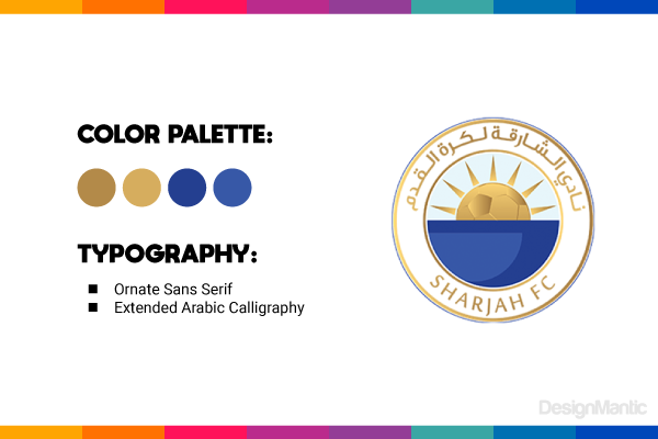
The Sharjah Football Club has one of the best-looking football logos on the list. The design is clean and simple, with a royal appeal to it. The gold shines and leaps out of the logo, with the sun imagery with its spike-like rays creating a sort of crown (shaped like a football) emerging from the sea.
The circular shield further streamlines the overall look of the Sharjah FC logo.
Colors:
The Sharjah FC logo is designed in gold, white, and blue. All the colors of the royalty. The gold has been given a metallic look to ensure the sun shines through the logo and the crest gains a grand stature.
Typography:
The Sharjah Football Club logo uses simple but ornate typography. The flow of the R and the elongated J lends the logo even more royal pedigree.
So, which is your favorite?
Let us know in the comments and use our football logo maker, powered by AI, to create great sports logo designs for your fantasy football, online gaming, and other adventure sports.
Disclaimer: All of the logo images have been sourced from the official UAE Pro League website.

