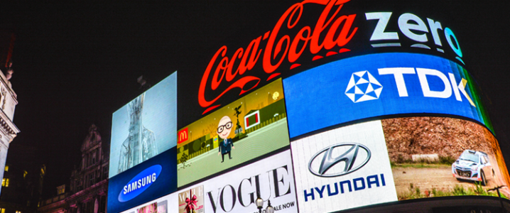
Typographical logos are the fine dining of the design world. They look the most sophisticated, elegant, and imposing styles of logo design of all. While advertising world is filled with logo designs of all kinds, we have decided to dedicate this space for discussing logo designs that use typography as their bread and butter.
These typography-based advertising logos use a great deal of knowledge to execute each of their elements with perfection. Whether you are looking at font weights, kerning, layout, or the type of font itself, you will find layers of flawless design in each of these piece.
For designers who want to up their typography game or want to become better at designing type-based logos, consider this article a handy guide. Here we will share with you 5 simple tips or design details that can help you pull off a typographical advertising logo with finesse and panache.
Unequal Weight
Weight refers to the boldness of any kind of typeface. Since type-based logos do not have icons or graphics to rely on when emphasizing different aspects of design, the weight of the font takes matter into its hands.
Using different weights of the same font or using different font styles altogether that contain distinguished weight slabs can help introduce emphasis into the design. In the examples below you can see that the main part of the brand name is highlighted using a heavier font style while other text is smaller in stature. These visual cues helps people know which part of the logo they have to pay more attention and focus to.
As design tips go, this is a very simple and easy to pull off design trick to make your type-based advertisement logo more meaningful and noteworthy.
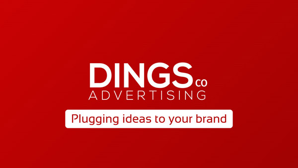
Image Source: Behance
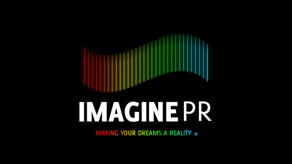
Image Source: Behance
Broken Font
Broken font or unfinished fonts are styles of typographic logos where part of the type is left unfinished or deconstructed.
It instantly makes the logo looks hundred times more modern and sophisticated. The deconstruction also lends an air of mystery to the whole design, making you look edgier, more in-the-know, and adventurous in your approach.
When using a deconstructed font style for your advertising logo, do not compromise on legibility. Make sure that people, even from a distance, can read your brand name so they can start to remember it.
Anything that you do with a logo design that adds enhances it, only makes the design look desperate and immature. So be careful when you are being creative for a client.
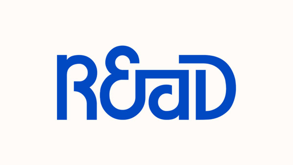
Image Source: Dribbble
Image Source: Dribbble
Minimalist Type
Majority of advertising logos use a modern and contemporary approach when designing their brand identities. Minimalist design is the favorite style of contemporary logos where you want to use subtlety and underhandedness to brand your business.
Related: Minimalism Revived: The Holy Grail Of Simple Designs
The minimalist type will usually consist of sans serif fonts but we also see some great font styles in minimalist design that are from the Serif family. The thing that you need to pay attention to, no matter which main type style you are choosing, is to first see how well it’s poised to represent your brand. For some styles and brands, an unimposing and less structured serif font will look at home on a minimalist style. But for most others, you’ll probably have to look at sans serif types to make your minimalist ad company logo shine.
Image Source: Behance
Image Source: Behance
Image Source: Dribbble
Customized Characters
There is nothing more distinct and distinguishing in type-based logos than using a custom font. An ad logo that is using an original font containing customized characters is a testimony to your creativity as an ad agency.
You can either choose to create some custom letters for the purpose of the font, or better, can convert the initial of your brand name into icons or graphics to make a much more creative and lasting impact.
Whichever way you decide to go, please know that creating a custom typeface is not that difficult of a task. You do not have to spend days and weeks working on every single glyph and character. Just pay attention to the letters in the brand name and you’re good to go.
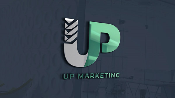
Image Source: Behance
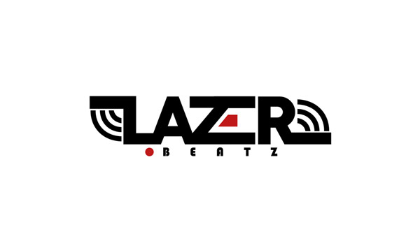
Image Source: Behance
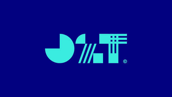
Image Source: Dribbble
Introduce The Script/Hand-Lettering
While Script type is not the most popular font style for advertising logos, but using it to add a bit of drama and interest in the otherwise flat design can make the whole thing loads better. In terms of adding dimension and details, Script fonts take the cake.
To make it work, you don’t have to use a Script font to create the complete look of your marketing logo; the thing will work even if you are just using the font sparsely and strategically. For example, just using the motion font on conjunctions in the brand name can do the job perfectly. Or you can decide to start or end the brand name with a Script-based character to decorate your design.
Look at the examples below and see more than one way of doing it.
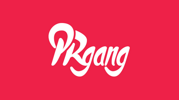
Image Source: Dribbble
Image Source: Logopond
Image Source: Logopond
Concluding
So what are your thoughts? Hopefully these simple tips will help you make your type-based ad logos more interesting and stylish.
Related: Do’s and Don’ts of Wordmark Logos: A Guide for Businesses!
If you haven’t always worked exclusively with types before, you may need some getting used to, but eventually you’ll get the hang of it. Free resources like Google Fonts, can be your starting point in getting your hands on some of the best typography on the Internet.

