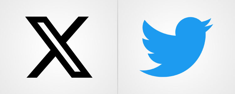
Twitter is now X.
The rebrand is accompanied by a logo that’s hilariously and chaotically bad.
Leaving much to be desired, and already a cautionary tale in marketing, this new logo is uninspiring, childish, and highly disassociated with the platform’s user base. Once a symbol of exceptional design, open discussions, and a place for online activism, the Twitter brand is now reduced to the English alphabet’s least positive letter.
The new logo looks like it belongs to a graffitied wall from a dystopian land that’s been ravaged by machines.

While this rebrand may have shocked everyone (us included), in retrospect it was always coming. And we talk about it later in the article. Right now, as we reminisce about Twitter and its glorious history, let’s start with some fun facts.
Did you know?
- Twitter’s original name was ‘twttr’ — without the vowels or a capital letter, very much like the SMS language of the era (2006). It was intentional because Jack Dorsey wanted it to be a platform where you could update your online status with an SMS!
- At one point, its early founders even considered naming it ‘smssy’. Get it? SMS-sy.
- The brand Twitter lived on for 17 years before it was rebranded as X in July 2023.
- The Blue Bird was designed (by Martin Grasser) with 15 overlapping circles!
- Twitter didn’t come up with the Hashtag — a user did. They suggested using hashtags as a way to categorize tweets on specific topics. Twitter adopted it in 2017.
- The original Larry the Bird logo faced right. But it looked weird, so they made it look left. The effect was instantly better! Have a look.
- Twitter introduced many groundbreaking features like retweeting (sharing), emoji reactions (hearting a tweet to like it), and as we mentioned above, the #.
The Twitter Logo Over the Years
While the legacy of Twitter will become the topic of case studies, research papers, and cultural discussions, today, we just focus on the visual evolution of Twitter’s logo and what it symbolizes for its legacy.
2005-2006: It started as a weird slimy green thing
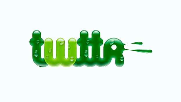
Back when Twitter was twttr — albeit for a short while — it also had a strange-looking logo. It resembled pipes, had splash-like effects at the end of the wordmark, and the letters in the logo had water droplets on them. It also had light effects and was in the reed-green color.
(If you feel put off by this green display, take heart — explore our hand-picked green color shades to restore your faith in the hue.)
I cannot think of what they were thinking with all the water imagery in the logo but the result, as you can see, was anticlimactic. It looks more suitable for a plumbing company or a company that deals with sewerage cleaning than a social media service.
The logo and the intended brand name were quickly scrapped, however, and we never had to see them again. But there you have it. The original Twitter logo and name. Humble beginnings indeed.
2006-2010: Sky blue makes an entrance as the brand’s signature hue
Welcome to Twitter’s first official logo — and the brand name. The vowels were back and so was the design sense. The new logo, though it looks a bit childish now — was on par with times with its imposed lettering and a bubble-like white outline.
The wordmark logo also used rounded letters in a bubblegum font to tell us that it was a platform where things were casual, open, and friendly. The sky-blue color became Twitter’s signature color and, having psychological associations of being a calming and trustworthy color, evolved to become a symbol of open dialogue, free thought, and fluid communication.
This new Twitter logo was designed by Linda Gavin, a graphic designer with the company that was redesigning the Twitter brand and website. Linda came up with almost 20 suggestions for the logo, and Twitter co-founder, Noah Glass, chose the sky-blue bubblegum variation.
This design will stay with the brand for the next several years, till 2010.
2010-2012: Larry the Bird was introduced
The first time we saw a bird with the Twitter logo was in 2010. Officially named, Larry the Bird (after Larry Bird, the NBA player), it was a cute icon, had a tuft of hair on its head, and its wings were poised for flight! As a mascot logo, it humanized Twitter like never before.
Everyone immediately fell in love with the bird because the concept of ‘tweets’ was initially derived from the chirpy sounds birds make when they communicate—short bursts of thoughts, with a quick back and forth.
The story goes that Larry the Bird was inspired by a simple bird graphic that a Twitter employee had stumbled upon on a stock image website and had bought for $25 in 2006. Since stock images cannot be used as official business logos and also because, in its current form, the slender bird icon wasn’t doing much for the brand vision, the graphic was simplified.
The wordmark logo was also made more readable and simpler by removing the white outline.
2012-2023: Twitter’s Blue Bird era
By 2012, with the Twitter Bird becoming more and more synonymous with the brand, Twitter knew that it was time for the wordmark to go.
The brand name was removed from the official logo and the bird was told to soar as far as it can go.
Though a tiny bird, it was a strong symbol that carried the Twitter brand extremely well and for many Twitteraris worldwide, was a symbol of free speech, hope, and progress.
Design-wise, it was much different than before. Whereas Larry the Bird was about to leap into the air, the Twitter Bird was already soaring high. Its head was up, wings and tail outward as it sailed through the air.
The new symbolism talked of a brand that was successful, confident, and ready to take on more.
2023-Present: X-ing the bird and the brand
In July 2023, Elon Musk announced to the world that Twitter is no more.
He introduced X (literally the letter) as the brand’s new name and even chose a user-submitted logo as the brand’s new sign.
Though the rebrand has come as a shock to many, in retrospect it was always coming. Logically, you should always get a new logo when you’re renaming the brand. But even without that, the Twitter Rebranding was always an eventuality.
Reason 1: Elon Musk has never given us any indication that he loves Twitter – he always talked about the things he doesn’t like about it and how he’d change them. So his finally changing the brand name and the logo was a done deal.
Reason 2: He has a weird obsession with the letter X. It pops up in everything he creates: his companies (SpaceX), cars (Tesla Model X), and even his child (X Æ A-Xii).
As far as the new X logo is concerned, we think The Atlantic’s Ian Bogost isn’t too far off the mark when he calls it juvenile and creepy. He also called it other things but we’re being nice today.
The Takeaway
As we wrap up the discussion today, my question about the rebrand is different:
Why would you name your company a letter that a sane person would think twice before googling? Unless they’re looking for trouble.
But that’s just my take. Sound off yours in the comments below!

