What do you think of when you hear someone cruelly mention Pinkberry, Applebee’s, or McDonald’s in a moment of ravenousness? Undoubtedly you will recognize the names in a jiffy, but more importantly your memory is prone to travel down the lane and conjure up an emotional response, a television commercial, or a particular mouthwatering menu item as soon as the name falls on eager ears. Regardless of whether you hate that establishment or could sell a limb to have a go at their savories, you are bound to recognize it. This is due to the fact that these eateries ingeniously incorporate branding into their core marketing philosophy.
When executed correctly and right on mark, even a four year-old without the ability to read can identify your brand. Not only they will know you, but also the kind of emotional response and food they can associate with you. When one talks about branding, all restaurant owners are acutely aware what it means to them and their customers. However, it may be something they haven’t invested much thought into since naming their restaurant and defining a scrumptious food base to cater to the diverse gastronomic palettes of their clients.
One of the most common marketing themes leveraged by all successful restaurants is the exploitation and complete use of their brand. If your restaurant only carries a “name”, and not a “brand”, you need to think again.
Branding In The Restaurant Industry
Due to the proliferation of restaurants and diners in every nook and cranny of the country, the restaurant industry has become a cut throat arena. The fast-paced industry constantly entails innovation and bringing new concepts to the table in order to survive. You want to be the restaurant that springs instantly to the minds of the customers when they are quibbling futilely over the exasperating question of “where to eat tonight”! In order to offer a top-tier dining experience, a scrumptious menu isn’t enough to cut the bill. You have to lure customers in with a promise and purpose, and to deliver on that promise.
Branding in the age of disruption is a tough nut to crack, especially when all your competitors are moving mountains to get it right. While coming up with a meticulous logo design that guarantees a Foodgasm, is indispensable to putting a face to your restaurant name, a few other elements come to play when it comes to branding your restaurant right. In order to flaunt the unique panache of your restaurant, here are a few branding elements that can help impinge the image of your restaurant “brand” in the minds of your patrons.
Paper Handshake; Designing Stellar Business Cards
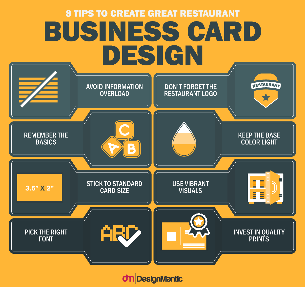
If a logo is the face of a restaurant brand, your business card is the customary greetings one ushers to a potential patron. Even in the digital age, a diligently designed business card is a road map to opportunity and success. Despite being a small tool in your restaurant marketing arsenal, even today, a business card holds a significant bearing on the success and recognition of your restaurant. Here are a few elements to make your business card truly great:
According to John Williams of Entrepreneur magazine, “Business cards, along with your manners and dress, form a client’s first impression of you.” Your business card imprints the image of your restaurant in the minds of the customers, even after they go home and find your business card stacked up in their pockets.
However, due to the profusion of restaurants leveraging this great marketing gimmick, cards which fail to make an impact find themselves crumpled up at the bottom of the trash cans. If you don’t want your business cards to meet the same fate, here are some ingenious design elements that can help your card stand out:
15 creative restaurant business card design Ideas
1. Professional And Clean
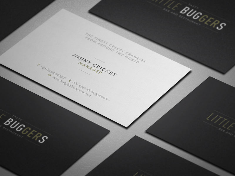
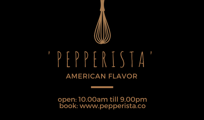
Less is more. For most restaurants, especially high-end dining eateries, simple is better. If you want your restaurant business card to appear professional and uncluttered, think about the absolutely necessary information that needs to be included and to incorporate it within your design in the scarce space available. The card design below by Ben Fearnley is relatively simple to start, yet its open and clean design, attention to detail, and easy readability really helps it stand out.
2. Explore The Unconventional
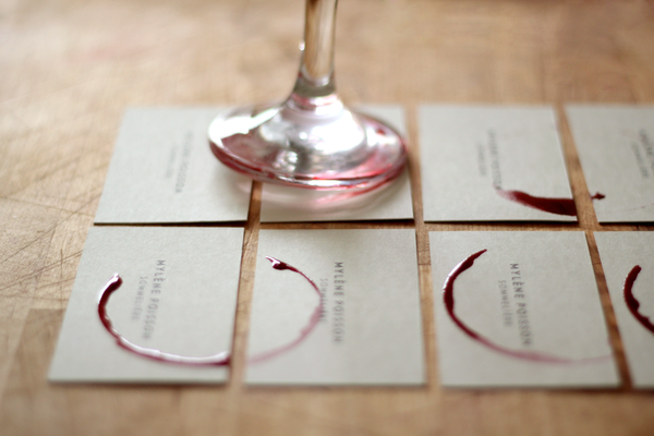
If you really want to break the ice, your restaurant business card shouldn’t just be a poor extension of your brand. Sometimes you have to tap into the unconventional horizons to really create an impact. The card design below depicts how an unconventional medium can be leveraged to create visual elements. Since no two wine rings can be duplicated deliberately, each card retains its own aura, despite fitting together cohesively.
3. Elegant Shapes
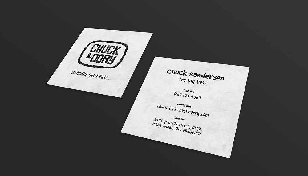
If you find that rectangular shapes are too mainstream, you can use an alternate shape to set your restaurant card apart. For instance, a square is an elegant, simple shape that can offer a great starting point for a restaurant business card.
4. Fun And Informal
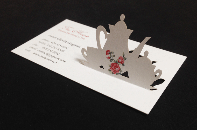
Who said business cards have to be static and flat? The pop up business card shown below is informal and fun, which offers a breath of fresh air, especially when compared to other standard card designs. Even without intricate paper mechanisms and complicated folds, the look is easily doable.
5. Depth With Symbols
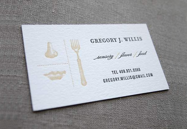
If you don’t harbor a penchant for bright pops of color, imprinting logos or symbols into your cards renders depths to your designs. Try to only incorporate icons pertaining to your restaurant offerings, or select patterns that mesh well.
6. Simple Yet Effective
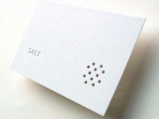
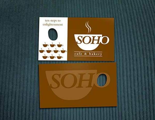
Going for minimalism doesn’t have to drain your designs of purpose if you put on your thinking cap. The restaurant business design shown below is incredibly effective, despite being simple. It leverages a die cut to breathe life into a simple graphic. The punched out holes lie in stark contrast to the raised type, and the design perfectly complements the name of the restaurant.
7. Play With Type
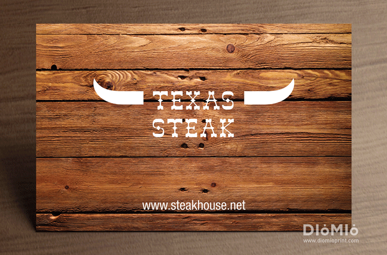
When designing a creative restaurant business card, typography can be used for both decoration and information in the place of graphics. While a few graphic elements are incorporated in this design, it is the type which really steals the limelight.
8. Typographic Texture
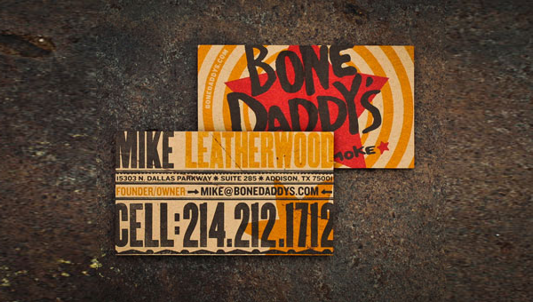
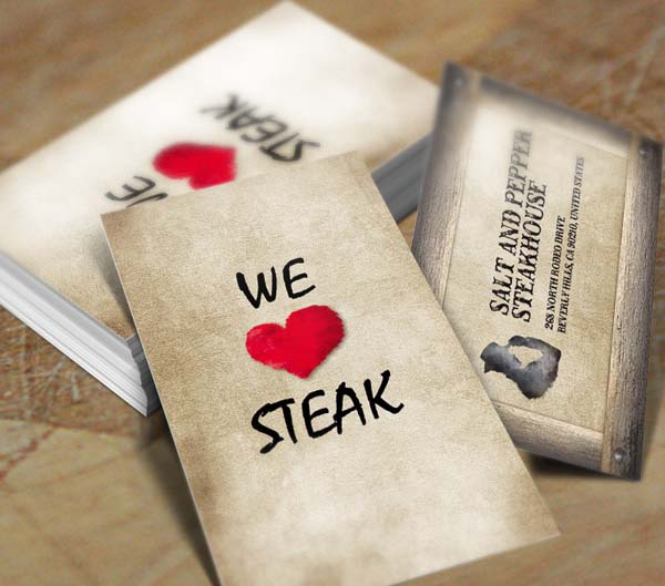
While typography plays a vital role in this restaurant business card as well, the texture lends more life to it than plain printed text. The background is a realistic image highlighting wooden texture, which offers the unique feel of wood; sense of classic and vintage, and stability.
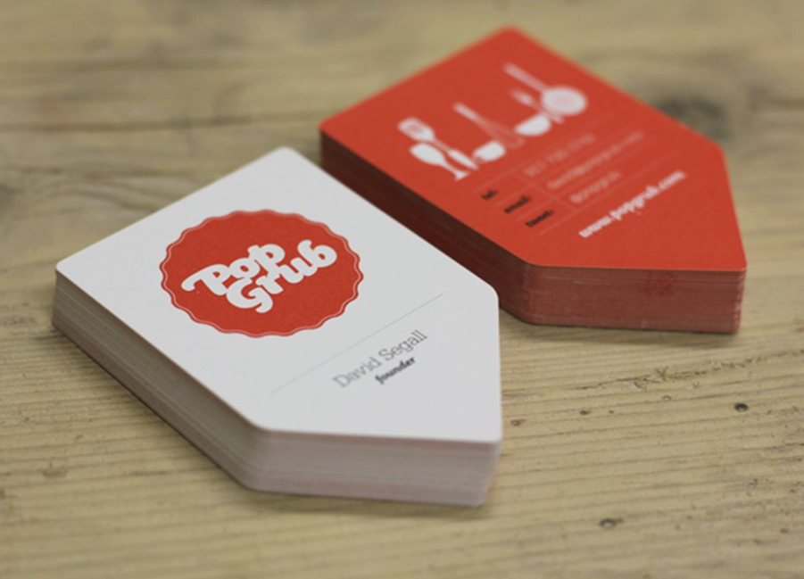
9. Ticket Cut
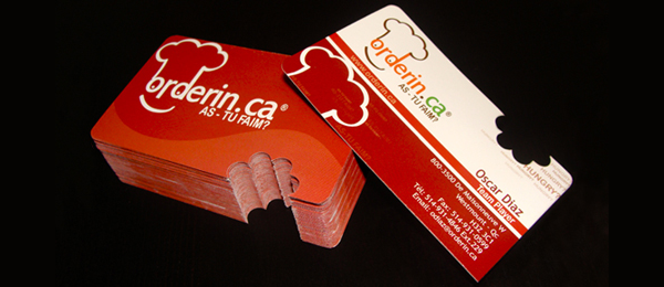
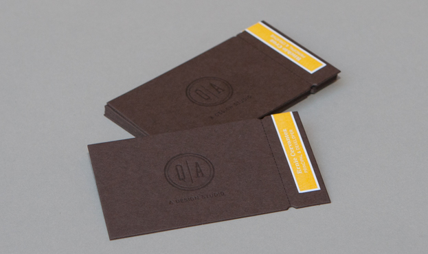
If you are wondering what a ticket cut is, it is a simple rectangular card with a few notches cut out here and there to render a more intriguing appearance than can be achieved with main-stream straight edges.
10. Design With A Twist
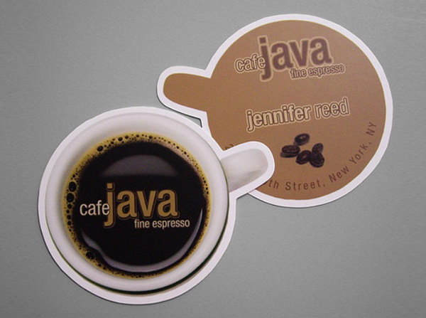
Speaking of ingenuity, you can employ aspects of your restaurant to make your card more relatable, approachable, and authentic. The design shown below is created to mimic the top of a steaming cup of coffee on the front, while incorporating contact information at the back.
11. Crafty Cut Outs
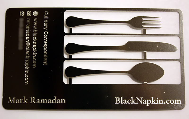
Another nifty idea is to create striking cut-outs as part of your card design, in this case, a complete set of cutlery to elucidate the finesse and high-end dining aspect of the restaurant.
12. Heat Activated
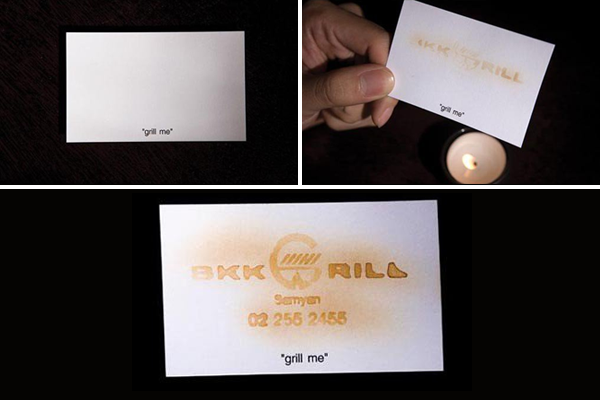
This is one restaurant card which is out of the box, despite not being functional. Heat activated ink reveals the contact information and brand name, giving it a scorched, charred effect which matches seamlessly with the gastronomic predilection of the restaurant.
13. Functional Design
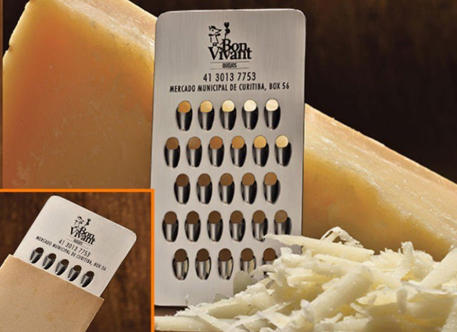
Design a business card that people can use, and you’ll never see it lying forlorn at the bottom of a waste bin. This business card gives a whole new meaning to functional. The business card of a cheese store, Bon Vivant, is fabricated from metal and doubles as a viable mini cheese grater!
14. Edible Cards
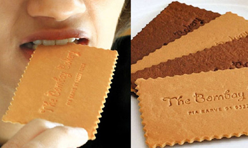
While running the risk of coming off as a little perishable, nothing can interest your patrons more than a business card that they can actually eat, to glean a glimpse into the flavor palette they are promised inside your restaurant. The chocolate coated card, and the fresh baked biscuit card of Bombay Bakery are perfect testaments to this.
15. Spill Your Heart Out
Well not literally but it’s always a good idea to incorporate a tagline at the front of your business card, which speaks directly to your patrons and lets them know what you are all about.
Letterheads Make The Most Gracious Messengers
One of the most significant printing collaterals in any restaurant business is a meticulously designed letterhead. More than a mere means of correspondence, a restaurant letterhead is the official representation and face of your restaurant in your absence. Each time you send a business letter to a customer or for official purposes, it’s akin to sending over an ambassador from your restaurant to win them over.
A good letterhead design can say a great deal about your brand image and is a vital element of your marketing communications strategy. Furthermore, a letterhead is your means of displaying professionalism in your industry and leads to credibility. Therefore, it’s highly indispensable that your restaurant stationary says all the right things.
Since your letterhead embodies the essence of your restaurant and reflects its personality, it’s important that it is assiduously designed and much thought is put in to it. Here are a few secrets of the trade that can tremendously help you gain inspiration for your letterhead designing venture:
1. Play Up Your Branding
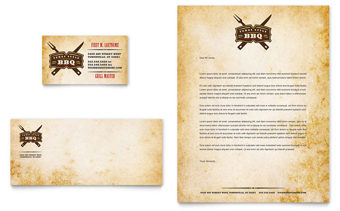
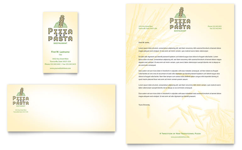
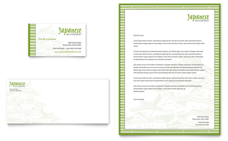
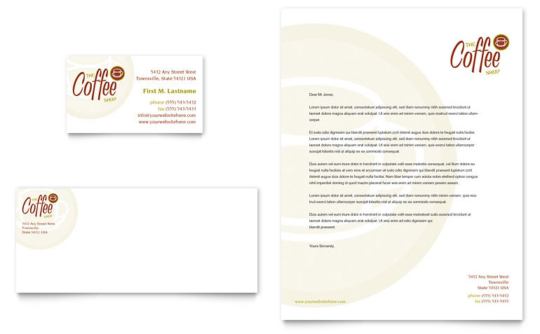
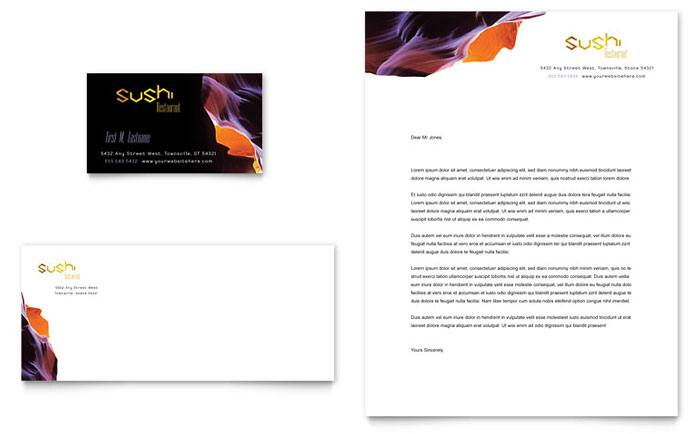
While integrating logos as part of your letterhead design to align them to your overall marketing strategy is crucial, think about more creative ways of incorporating your branding strategy in your restaurant letterhead design. In the letterhead shown below, the logo has been used on the business card, letterhead, and the envelope to ensure brand consistency. In addition, the colors of the logo are used consistently to create a visually interesting design element in the background, and the restaurant imagery is emphasized in a way that doesn’t seem repetitive or forced.
2. Keep It Simple
Even though you want your letterhead to highlight your restaurant, refrain from doing it in a way that distracts the receivers from the actual contents of the document. The letterhead design shown below is kept clean, yet highly impact, by sticking to a spacious layout and two complementary shades of green as the only accent colors.
3. Leverage Space Well
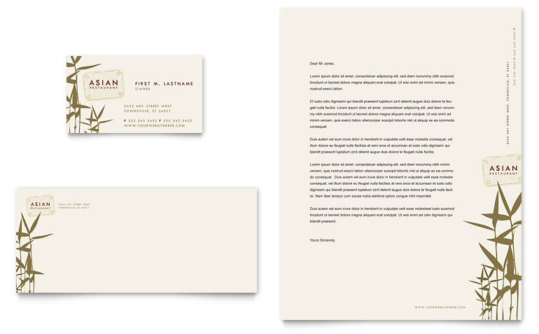
While letterhead designs are typically situated at the top of the page, it is not a rule set in stone. The letterhead design below leverages the side of the paper to fit in the vital information, such as the restaurant tagline, location, and contact information of the restaurant, leaving most of the paper free for text. The same pattern has been repeated across all the branding elements to ensure consistency.
4. Embellish It
If you aspire to make your letterheads stand out and create a lasting impact, look for printers that can accommodate a few special printing effects. Embossed or punched out stationary is hard to overlook.
5. Focus On Typography
If a particular typeface has been used everywhere else in your corporate identity, the same typeface should make up your letterhead design. In addition, as a rule of thumb, no more than a combination of two fonts should be used within your letterhead, so as not to clutter the design.
6. Use Meaningful Imagery
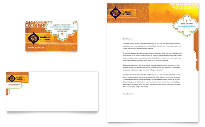
The letterhead design depicted below leverages creative use of silhouettes to incorporate imagery that is relevant to the intended audience, especially the ethnic cuisine-seeking types, and says something about the restaurant. The high-contrast white and orange color scheme renders an eye-catching element to the design.
7. Don’t Neglect The Reverse Side
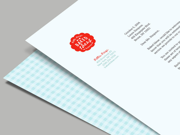
If you are intending on mailing out physical letters, printed on your restaurant stationary, don’t forget to include something on the reverse side, even if a small pattern or a solid color, to render an extra pizzazz and refinement to your letterhead. The letterhead design below decks out the back of the letter with a pattern forming a high contrast with the red of the logo.
8. Stick To Informational Hierarchy
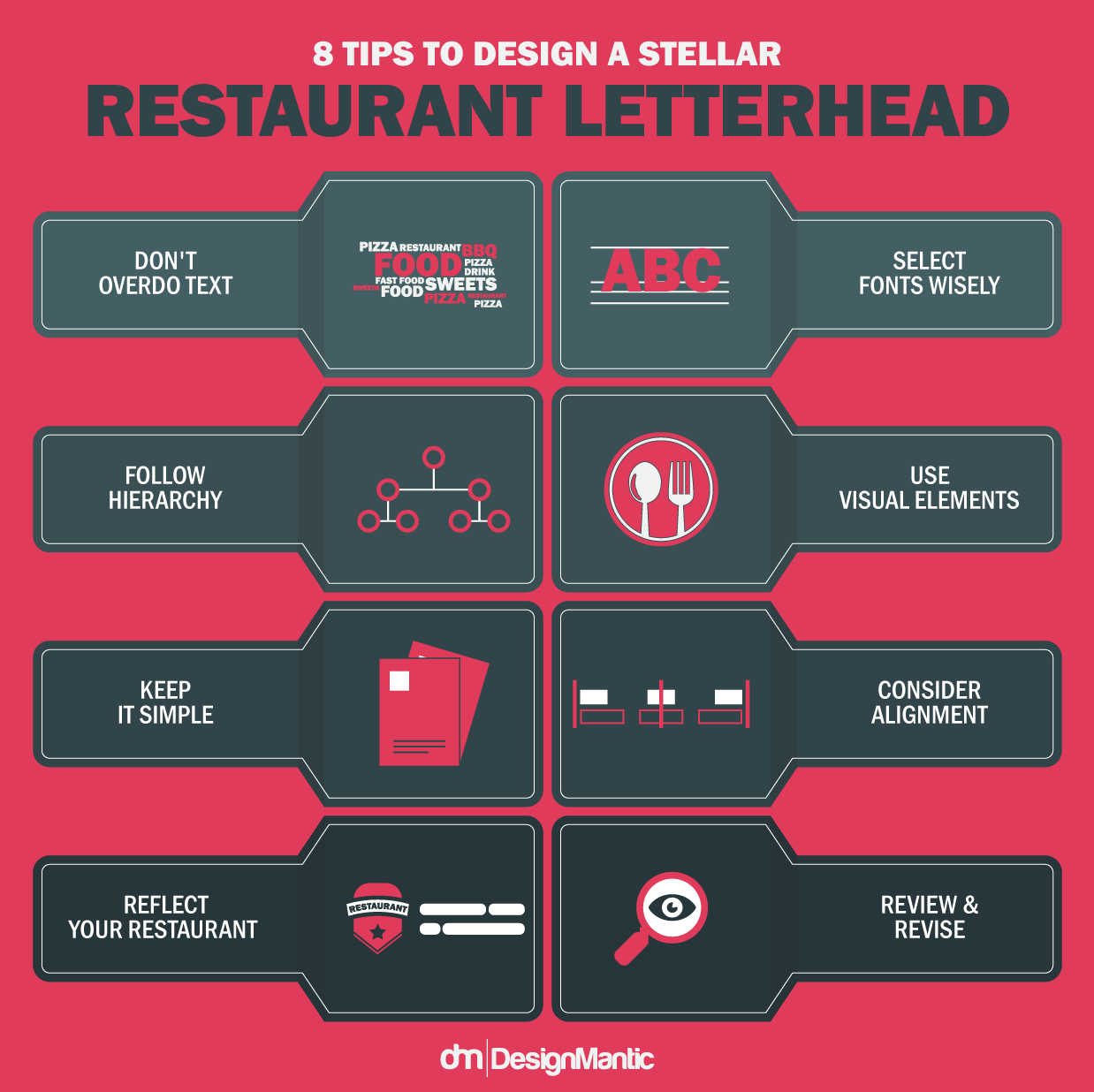
Due to the scarcity of space, it is indispensable to determine information that is absolutely quintessential for the layout. Your restaurant name and logo should be placed at the left corner in the letterhead, along with other pertinent contact details, such as the address, Email address, and the Contact information printed at the right corner. Order your information by level of prominence, so that the final design sheds appropriate light on each piece of text. Various font sizes and types can be used to make certain information more conspicuous and highlighted than others.
9. Repeat Shapes And Colors
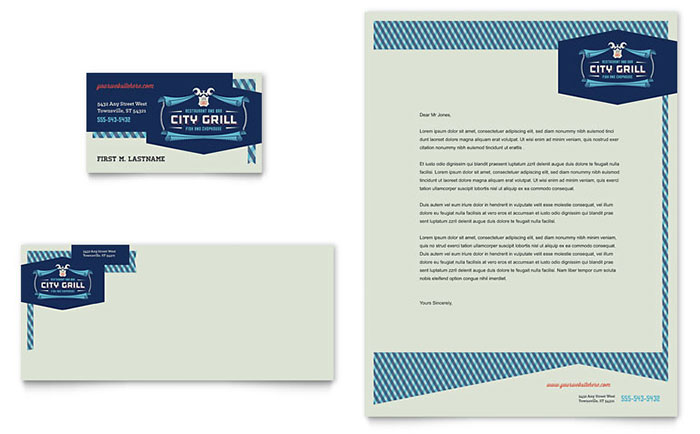
The letterhead design shown below features repetition of the diagonal lines in the contrasting colors of the logo, to create a visually engaging and cohesive business card and letterhead set.
10. Maximize Your Logo
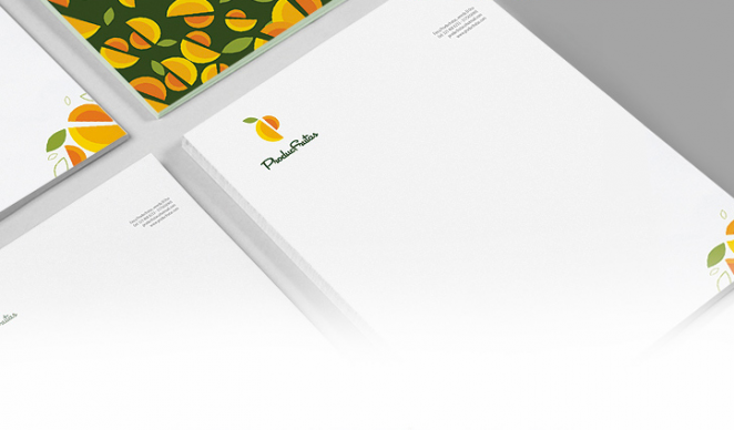
The more recognition you want for your restaurant, the more you should make sure that people see your logo. However, do it in a way that doesn’t seem to be in the face of the customers. The design below contains a nice balance by rendering the logo icon as not only a decorative element at the corner of the letterhead design, but by giving it an entirely different treatment for decking out the back of the paper.
Stunning Social Media Headers To Leave Your Customers In Awe
In the era of social media proliferation, before your customers even step in through your restaurant doors, most already harbor preconceived images and notions about their restaurant through your social media accounts. As such, your social media covers act like the gracious smiling hosts who open the gates and usher them in when they land on your social pages!
In a world where more than 40% people tout a better response to visual information than plain text, restaurants that fail to optimize their social media channels with stunning visuals and mesmerizing cover photos, fail to create a lasting impact. Sitting right at the top of your restaurant’s pages, cover photos are the most conspicuous element of your page and it is prudent to get them right by capitalizing on visual content. If you want to rock your social media covers, you need to get a lot of details right.
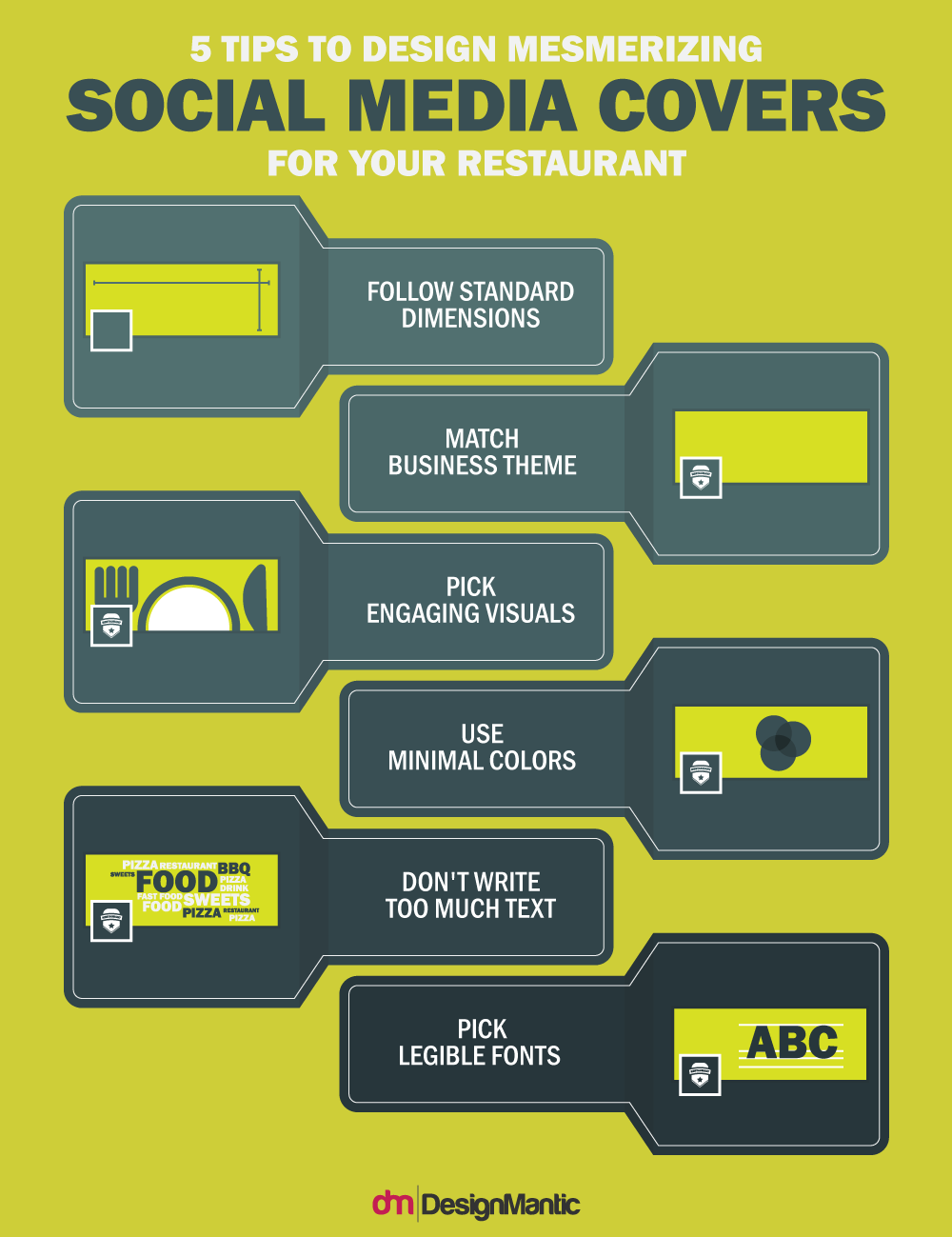
While it could be a bit intimidating for restaurants to come up with the most engaging social media headers, here are a few infallible tips and tricks to help you design the most winning social media covers which inspires more page likes, follows, and interactions:
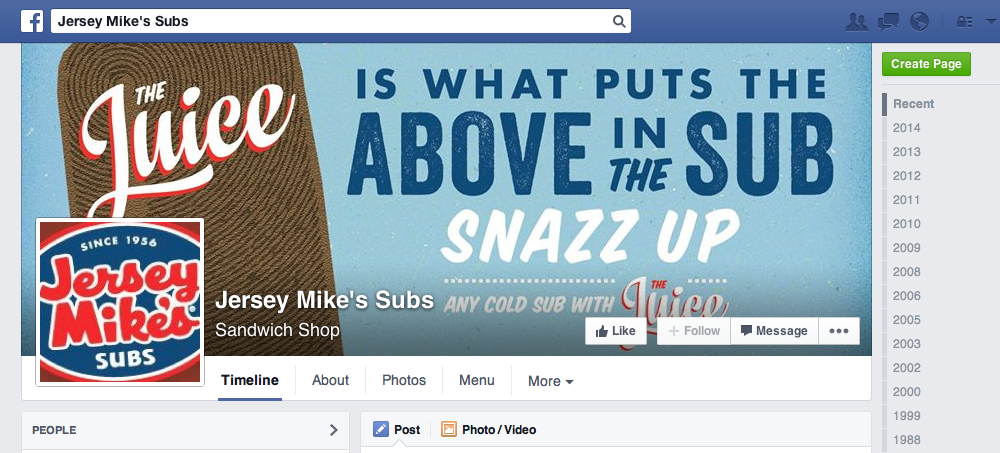
1. Incorporate Branded Messages
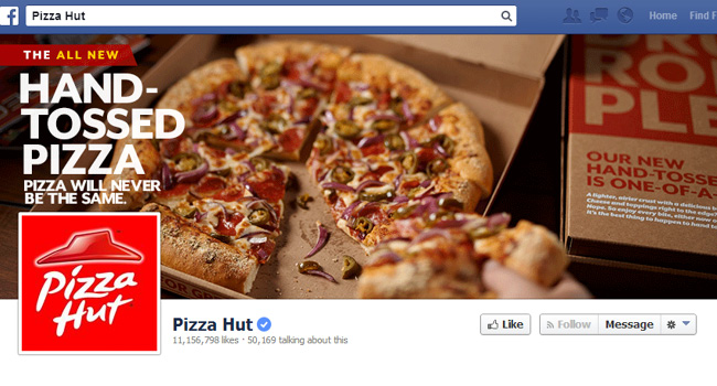
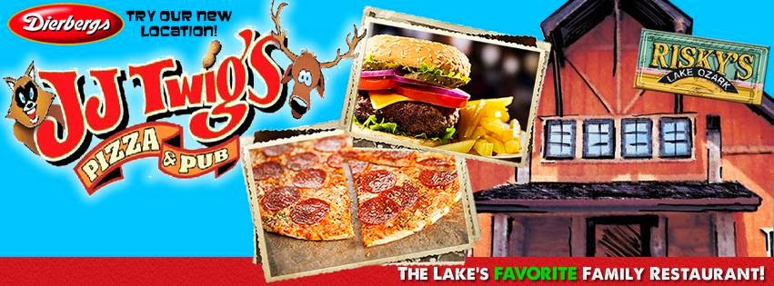
Every restaurant should have a couple of on-brand covers in their libraries. After you have overhauled your social image or if you have recently launched a rebrand campaign, you might want to kick things off a notch for a start. After the initial bouts, you’ll be in need of other additional options to incorporate in between announcements and other targeted messaging. As the social media covers continue to rotate, keeping a few on hand will ensure that your page doesn’t get stale.
2. Advertise Promotions And Specials
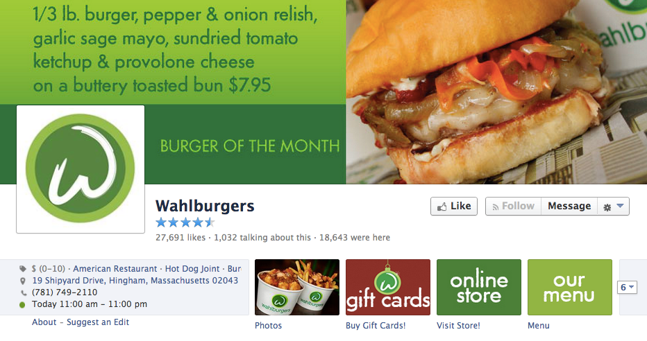
Your social media headers are the perfect place to let your patrons know about the current specials of the month/week/day, discounts, offers, programs, and other promotions. Once they know what’s in store for them for a limited time, it creates a sense of urgency which draws them in for a succulent meal!
3. A Space To Promote New Products
If you have a new venture, product line, flavor palette, milestone, location, an upcoming give-away, or a promotion that you want your patrons to know about, update your social media covers to reflect the news. In addition, a plethora of restaurants change their menus with changing seasons. This could be an opportunity to update your headers and let people know what’s new on your menu. To present these updates in a polished and engaging way, use restaurant menu templates to design visually striking menus that effectively showcase your latest offerings and seasonal changes. In addition to promoting the latest developments in your content, incorporate them seamlessly in a stunning cover to put them in the limelight.
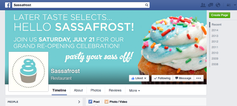
4. Create Hype For Forthcoming Events
Got a re-opening or a grandeur opening coming up? Or special events in store for your fans or your customers in general? If so, your social media covers create the perfect invitation that is hard to overlook. This is one of the best ways of promoting that savory save-the-date.
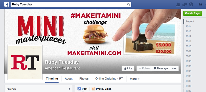
5. Promote Social Campaigns
Your restaurant page cover images are a perfect solution to launch engagement campaigns, especially those that can be shared and promoted across various social media platforms. Request photos, pop a question, propose a challenge, and integrate a hashtag to follow the results. It lets your fans interact with your brand and keeps the conversation flowing smoothly about your restaurant.
6. Flaunt Your Interiors
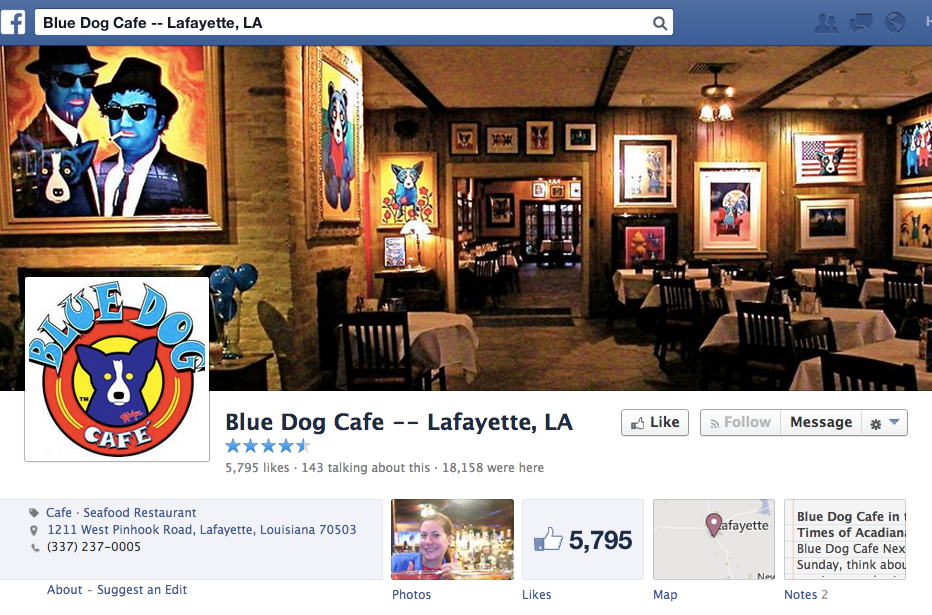
A panoramic view of your restaurant interiors is a great way to lure your customers in. A header that allows your customers to glean a sneak peek inside your restaurant, may incite them to pay you a visit sooner than they intended. In addition, what better way to flaunt your diligent décor and enticing ambience than with a stunning photograph?
7. Use The Unique Locale Of Your Restaurant As Bait
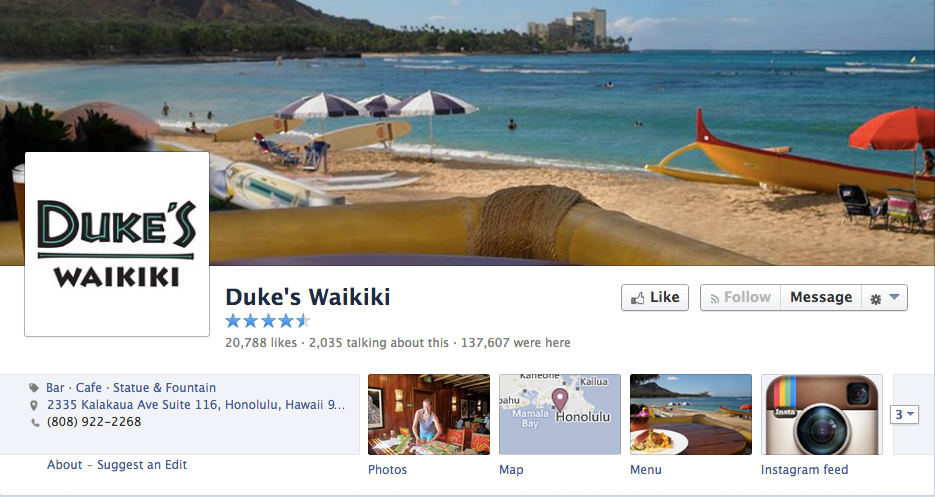
A great restaurant experience should uplift the soul, in addition to satiating the gastronomic urges. If you are lucky enough to glean a thriving or picturesque restaurant location, why not snap a panoramic shot of your vicinity or your restaurant front with the surroundings, to draw in customers with a stunning header image. This awesome cover picture below depicts the restaurant’s close proximity to the breathtaking Waikiki Beach. This strategy helps instil the right feelings in your customers that a destination-type restaurant should exhibit.
8. Change The Cover To Reflect The Season
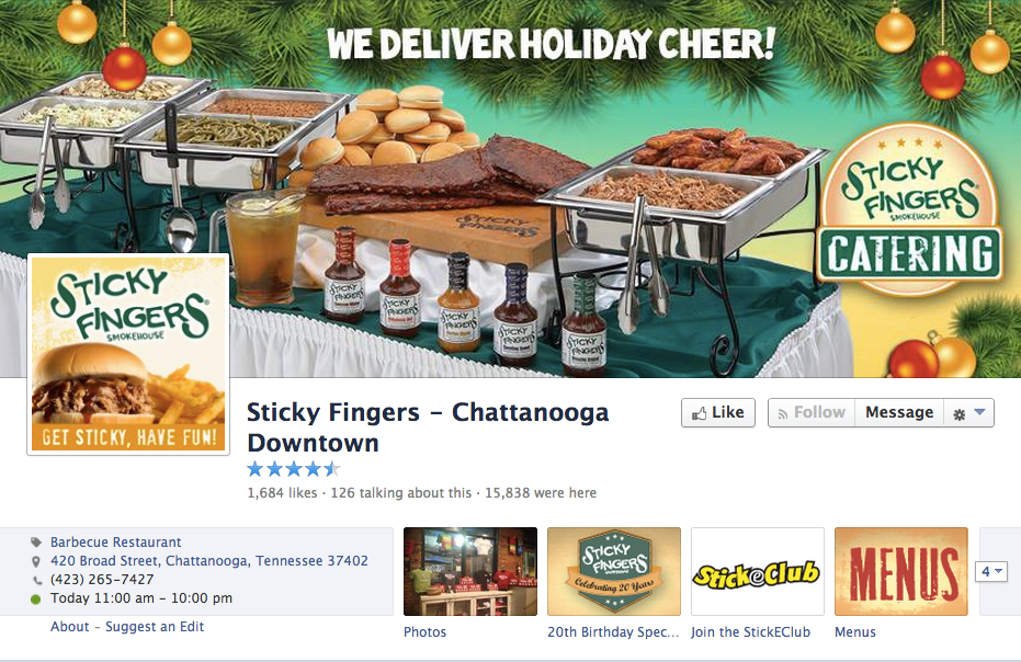
Portraying the festive and jovial side of your restaurant to your patrons depicts how updated and current your social media accounts are. It’s also a great strategy that marketers often have stowed up their sleeves to boost revenue. Learn to design cover photos that change with holidays and the changing seasons. Try adding traditional seasonal images or experiment with seasonal colors for best impact. The holiday-themed cover photo shown below incorporates a call-to-action subtly without getting in the fan’s faces.
9. Feature A New Offering
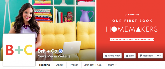
If you have an exciting offer for your fans, your cover photo is the perfect outlet to let them know about it. For instance, when Brit+co introduced their book Homemakers, they changed their Facebook cover photos to promote its pre-launch orders.
10. Focus On Fans
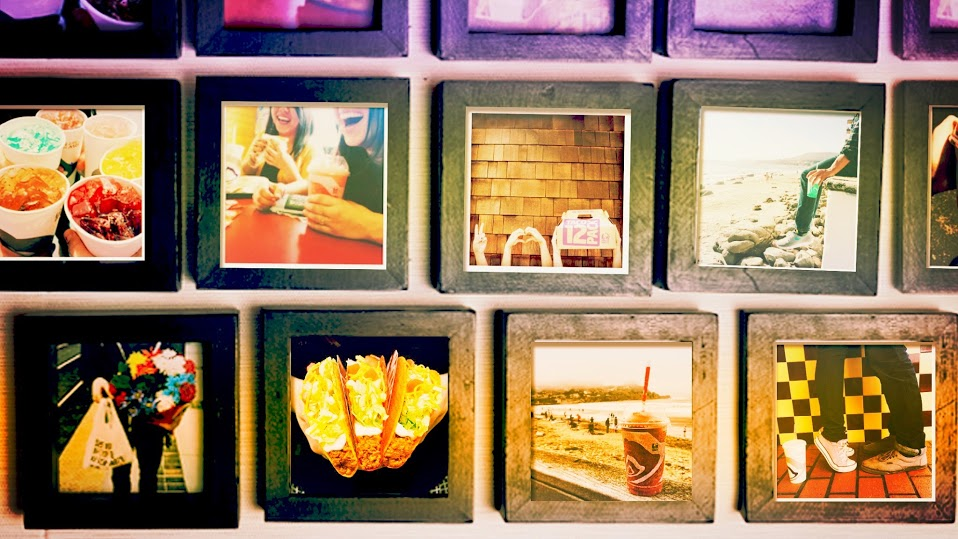
Social media is all about fostering a strong community around your restaurant. Thus, adding fan-sourced images in your cover photos is a great way to connect and build loyalty. Show off those patrons who show you off and watch them infallibly fall head over heels for you. For instance, Taco Bell created a fan wall flaunting Instagram shots of their fans recent trips to Taco Bell, and then used the wall as a Facebook cover image.
11. Get Their Mouths Watering
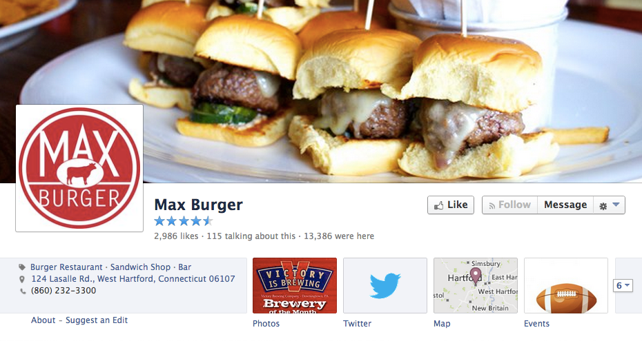
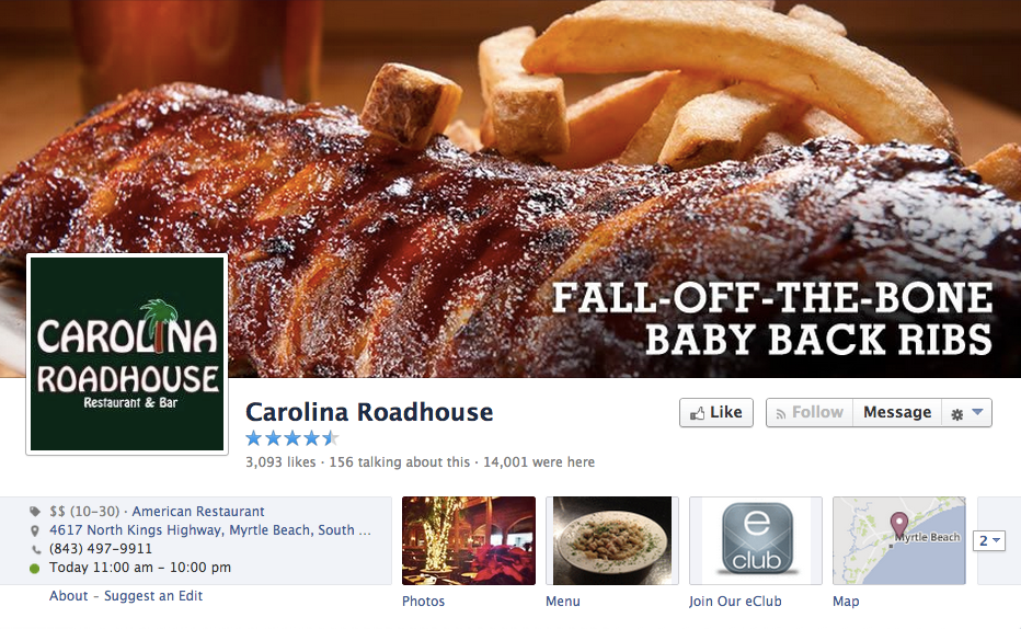
People in the restaurant industry can have people by their strings simply by putting up scrumptious, drool-instigating shots of their food. Capture high quality images of your most favorite items and use them as cover photos to trigger a sense of overpowering nostalgia in your loyal fans and a feeling of ravenousness in any fan who visits your page.
Binding It All Together In The Bigger Picture
If you aspire to stand out from your contenders, branding the face of your restaurant is the preliminary step towards success. While a plethora of restaurants in your genre may offer similar meals, ambiance, or an overall gastronomic dining restaurant, how you brand your restaurant and make an impression even before a patron has set foot inside your restaurant, is what keeps you in the limelight. This foreplay of senses is what restaurant branding is all about; that feeling of intimacy and deep recognition that your restaurant triggers in your patrons.
In lieu of the importance branding holds for your business, DesignMantic offers a complete branding package that allows restaurants to define their entire marketing strategy using viable tools available at affordable costs. Be it restaurant logo design, business cards, letterheads, business envelopes, and social media covers, DesignMantic software takes care of all. Since you are designing all your branding elements on the same platform, you can rest assured that consistency and integrity will receive a paramount position, which is what the restaurant sector stands for.



Very informative article. Great post, thanks for sharing…