Are you opening up a new cleaning business and want a logo that’ll leave the competition behind in the dirt? Well, settle down as we show you our collection of top 20 cleaning logos that are full to the brim with creative ideas and interesting ways to make a cleaning company logo look infinitely more interesting.
Our collection of logos comes in all forms. We have combination logos, combining icons, and brand names. We also have mascot cleaning logos, wordmarks for cleaning logos, and even vintage cleaning logo designs. We have collected this variety to ensure that your search for inspiration bears fruits and you leave with practical ideas on how to make your cleaning logo work its magic for a variety of cleaning businesses.
So, without further ado, let’s see what we’ve gathered up for you.
1. Make A Powerful Statement
Black and white logos look naturally more elegant and powerful. But this logo takes it up a level. By designing the zebra illustration with narrowed eyes, the brand is telling you that it doesn’t take its job lightly. A stroke of confidence right there!
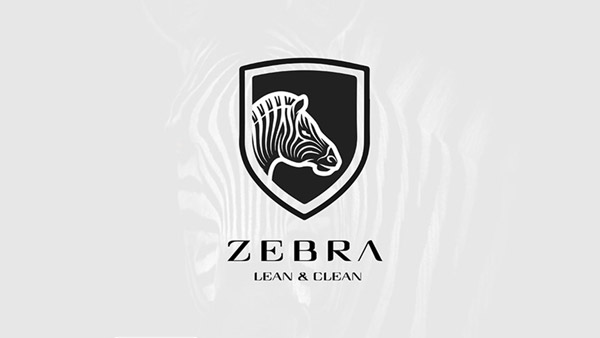
Image Source: Behance
2. An Abstract Mark
While most cleaning logos look for established icons such as brooms, wipers, bubbles, and such, you can create your mark by opting for an abstract design to send your message across.Marketing your cleaning logo can be quite successful if you’ve created an interesting design.
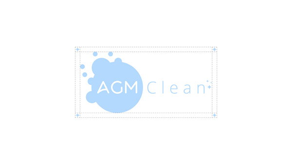
Image Source: Behance
3. Why Not A Cleaning Logo Mascot?
Mascot logos work wonders at making a brand look more human and relevant. This cleaning mascot logo makes the brand look exciting and more appealing.
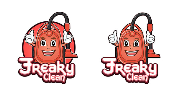
Image Source: Behance
4. Make The Negative Space Count
Negative spaces make the logo design look more professional and creative. In this cleaning logo image, the negative space works as the symbol of a wiped-service, making the logo look instantly more clever.
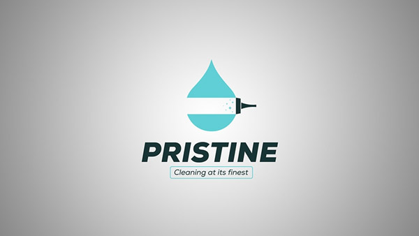
Image Source: Behance
Related: Iconography In Cleaning Logos: 10 Icon Ideas
5. Be More Open To Colors
While it’s true that green, blue, and white, etc. are more relevant color choices for cleaning logo design, but that’s no reason to box yourself in. consider soother and calmer shades of other colors to make your cleaning company logo different from all the rest.
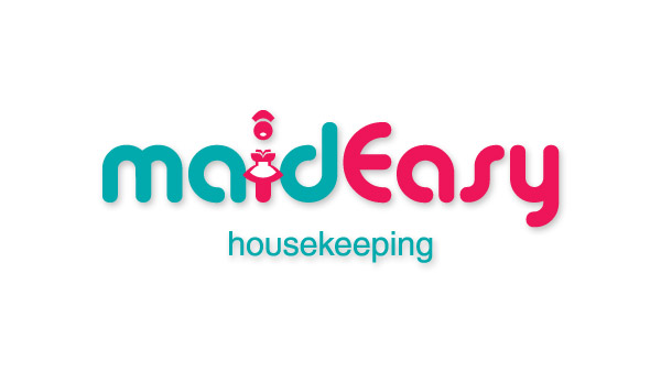
Image Source: Behance
6. Simple And To-The-Point
Look for relevant cleaning icon choices when creating business logos. A broom logo icon not only suits house cleaning services but can be used as a maid logo, a housekeeping logo, and a cleaning store logo.

Broom logo for housekeeping service
7. A Cleaning Logo To Cheer You On
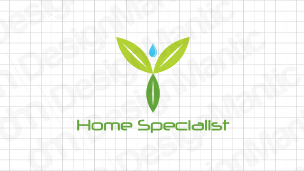
This cleaning logo looks like all of us after a hard day of cleaning up our places. The water drop acts as the head of a person silhouette and the leaves take care of the rest. The whole thing looks like a cheer squad wrapped up in a logo.
Green and blue water drop logo
8. For A Window Cleaning Business
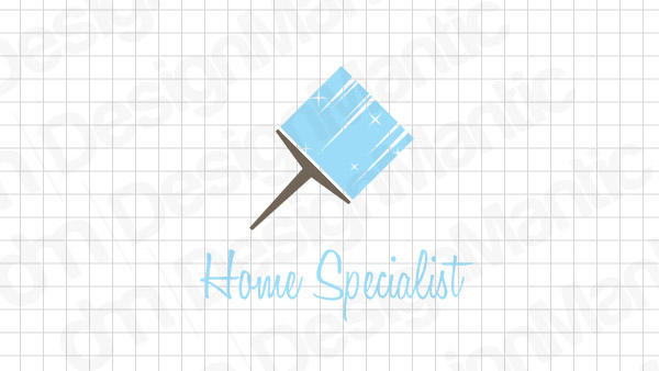
Window cleaning is a thriving sector of the cleaning industry. Using a simple icon in the wiper shape gives you a quick and effective window cleaning logo without much hassle.
Blue wiper logo for cleaning companies
9. Add A Fun Touch
This is a great and fun logo. The X has been drawn in the shape of a torso in a very simple and creative way. The wonky hat and the broomstick make the design whimsical without looking unprofessional.

X logo representing housekeeper
10. Blue And Green
You will often see blue and green in cleaning logo designs. The blue symbolizes water while the green is there to lend a fresh and ‘cleaned’ feel to the design. If you run a citywide cleaning service, leaves superimposed on your city’s skyline are a great icon choice.

Buildings in a circle logo with leaves
11. A Creative Cleaning Logo
Your drive to create a simple logo should not come at the cost of creativity. The brand initial ‘C’ in this logo has been achieved by a semi-circle wipe of the cleaning cloth – producing a rather organic design element in the logo.
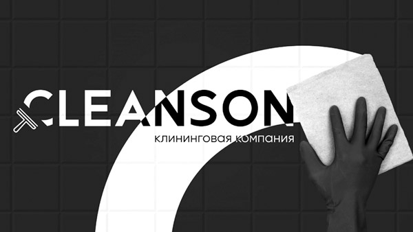
Image Source: Dribbble
12. Bee Cleaning
Green is a popular color in cleaning logo designs. In this logo, the colors of the bee have been altered to add a soothing and fresh shade of green to showcase the connection with the cleaning industry.
Image Source: Dribbble
13. A Detailed Design
Vintage has been in vogue for some time now. A vintage cleaning logo allows you to introduce more details in your design. To add the balance, use colors and fonts that are one the softer, more muted side.
Image Source: Dribbble
14. A Play On The Words
If you’ve been tasked to come up with a great cleaning brand name, don’t hold yourself back. As a designer, you understand the business too well and are in the perfect position to choose and design a brand name that isn’t hard to forget.
Image Source: Dribbble
15. Make The Brand Name Shine
If your brand name already has some spunk in it, turn it up a notch by designing a fitting cleaning company logo that does justice to its spirit. The yellow gloves are a staple of cleaning supplies. The designer has turned them into the brand initial in a simple and fun way. The heavy font makes the design look more imposing than you could have guessed.
Image Source: Dribbble
16. A Minimal Cleaning Logo
Minimal design provides the most guarantee of making your product/brand/space more easily understandable, recognizable, and memorable.

Image Source: LogoPond
17. Represent Your Brand Well
Go big if your brand calls for it. Adding interesting details to your brands can make your logo memorable. But make sure to keep it all gelled together. You know, balance is the key.
Image Source: LogoPond
18. For A Cleaning Supplies Store
Take hints from your brand name when you are designing a logo. This cleaning store logo uses a simple rendition of a leaf to symbolize the earth and helps keep the logo look modern and simple.
Image Source: LogoPond
19. Pet Cleaners And Groomers
Your cleaning logo art brief can sometimes be about a pet grooming store. Using subtle iconography and keeping the overall look minimal, Scoop’s logo is looking quite friendly and inviting as a pet cleanup service.
Image Source: LogoPond
20. Use The Right Font
With the right font, you can send your brand message more clearly. This home cleaning logo uses a simple but effective typeface with just the right amount of detail that makes the font look more breathable and fresher.
Image Source: LogoPond
Summing Up
Designing a cleaning service logo may pose a challenge as the industry is not vast enough to provide you with enough variations of icons and symbol choices. Hopefully, our small collection here has given you enough ideas to help you see that there are still ways to present a cleaning logo design without repeating yourself. And whenever you get stuck, go back to the spirit of the brand – you’ll always find inspiration there.


