Chefs spend years in training not only to learn how to cook great food, but also how to present it with panache. If a plate of food isn’t appealing enough, not many will be convinced to pay top buck for it.
In food, as in any other business, presentation is everything. If you don’t have that, your restaurant is not going to become the next big name when it comes to fancy dates, nor your catering business the choice of high-end events.
To present your catering business in the best light, a great-looking logo is a must. From its shape to its font pairings, nailing the details down is going to be essential. Your color choice will need to be immaculate. You don’t want to stuff your catering logo mark with shades and hues that do nothing for appetite. For food branding, organic and natural colors do the trick. Green, red, orange, yellow, and beige. Colors of fruits, vegetables, wheat, and rice.
In terms of icons, cutlery is a crowd-favorite, but we also see chef hats, woks, and flames adorning catering and other food logos. For shapes, circles come highly recommended. Stay away from triangles or anything too sharp – unless it’s a fork or knife on your icon. You don’t want to send a message of aggressiveness. Circles and softer shapes communicate inclusiveness, things we put food in, rounded bellies, and hearty smiles.
To fire up your inspiration, we have foraged through the internet and brought to you some of the most highly appetizing catering logo designs that’ll get you the big orders.
1. Let’s Start With The Cutlery
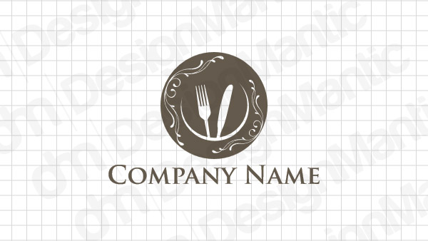
catering logo containing fork and knife icons
Cutlery icons are obvious industry symbols, but they give you the large canvas you need not to shackle yourself down to a specific cuisine or style of food. Especially when you are starting out, knowing the kind of variations available to use popular symbols can be of immense help.
2. There Are Plenty Of Ways To Present It
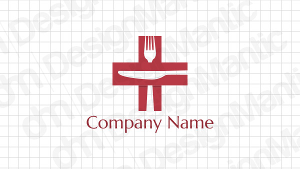
a catering logo design using cutlery within
If you have your eyes set on corporate events, a simplified brand identity will set you apart from the competition. Popular icons, industry-favorite colors, and inside symbology will help you go a long way.
3. Like I Said, Plenty
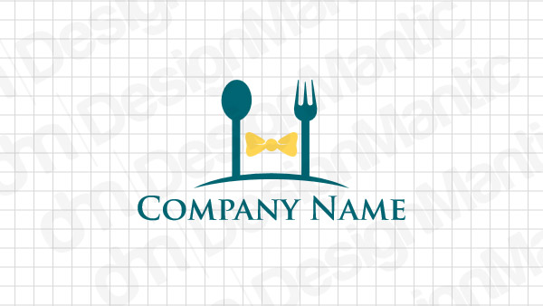
a catering logo image with bow in the middle
This catering logo idea is great for a brand that works for corporate clients, smaller offices, small-scale parties, and last-minute get-togethers.
4. We Can Use Soft Script Fonts To Highlight Sharp Imagery
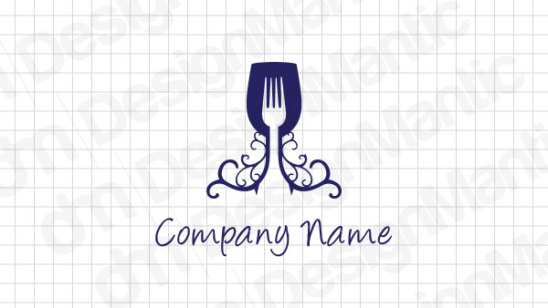
food logo with wine glass and fork
Professional logo design is all about balance – adding features that highlight each other. In this logo, the sharpness of fork is being balanced by the roundness of the glass. The script font underneath adds a whimsical and romantic touch to the logo.
5. Show The Smell Of Food Wafting Through The Logo
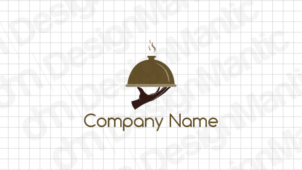
food logo with hand icon
Show evocative imagery to make your logo mean more than it does. If you think brown is boring, make it say something that other logos aren’t.
6. An Intimate Setting And A Catering Order For Two
catering or restaurant logo with two chairs
Don’t let people forget that food catering doesn’t always have to be a crowd affair. There are plenty of services helping make special moments more memorable, no matter the size of the party.
7. The Full Effect Of The Plate
food logo with plate icon
Let them in on the action. Design a whole plate, complete with the last course of coffee, and call it a day.
8. A Messy, Disruptive Design
Image Source: Dribbble
Make your logo more real. Draw original pictures, let them be imperfect, and don’t weigh down your food logo with false perfection.
9. Do You Specialize In Sea Food?
Image Source: Dribbble
It’s the little details that make the most impact. The anchor in this logo is your biggest clue of what this catering business is all about – sea food galore. Plus that signature look of sanded-down beach tables is always a giveaway.
10. Negative Space Marketing
Image Source: Dribbble
Logos that make the use of the negative space always tend to stick to your mind. Just like this one. It’s the sustainable utilization of the available real estate that does it for me. You will use these in your social media, email marketing, and other strategies. When it comes to email, you will also need to use an SPF record checker and focus on other technical points, but don’t forget about an appealing design.
11. Badges Always Do A Great Job
Image Source: Dribbble
Who doesn’t like a great emblem? They communicate authority, leadership, and exacting standard. If your catering business leads the pack in the market, why not use an emblem logo to promote it properly?
12. Bringing Food And Technology Together
Image Source: Dribbble
Primary colors, shape emerging from the gaps, a telltale name but fewer letters – what more do you expect from a logo that represents both food and technology in one design?
13. Think Different
Image Source: Dribbble
This is my favorite of the bunch. The roller pin definitely says food but why is the cat there? If you are into sewing parts of you in your brand identity work, this is the logo to rock your boat.
14. Don’t Reinvent The Wheel; Just Redesign It
Image Source: Dribbble
The knife and the fork were getting too sharp for the logo so the designer turned them inwards and re-imagined the wheel.
15. Devil Is In The Details
Image Source: Logopond
That’s another in the list that’s totally my style. It’s a retro logo makes you think of home-cooked meals, lots of laughter, great conversations, and sizzling meat on ornate plates.
16. Stick Some Food On It
Image Source: Logopond
Marks for food service logos need to show some food on the canvas, no? This one does and we are all better for it.
17. Nobody Likes A Bland Logo
Image Source: Logopond
Modern design is all about simplicity and sparseness – or so they say. Defy the norms by making your logo say more, be more, and do more, without ever overwhelming the message.
18. Get The Fonts Round And Juicy
Image Source: Logopond
On the subject of food business logos that say more, here is a food logo font that’s curvy, delicious, and meaty. Would you have it any other way?
19. A Chopping Fresh Catering Logo
Image Source: Logopond
When we talk about food icons, chopsticks are a crowd-pleaser with Asian restaurant designs. To not get it too heavy with that specific message, use fonts that are more international and have a global appeal.
20. Contrast, Cut-Out, And Catering
Image Source: Logopond
Word marks are not something you see every day on catering logo images, yet here we are with one. It’s fresh, contrasts well, and the little cut out letter makes it look more interesting (and memorable).
21. Draw Inspiration From Your Brand
Image Source: Logopond
Don’t forget your brand name when you are designing a logo. if you can, use the design details that emphasize the name and highlight its originality.
Conclusion
Catering logos shine on specific brand messages. As a caterer, much like a chef, you specialize in one particular kind of cuisine or type of food. To make big on that, include it in your catering logo design so you can attract the kind of clientele that can connect with your food. We hope these examples have been inspirational enough to showcase the kind of wide spectrum available for food service logos and branding options. Look inwards toward your catering brand to find out where on this spectrum you fall and find a logo that helps you capitalize on that.

