A logo is a visual symbol for your brand. While there are several different styles a logo design is created and presented, the combination mark logos remain the most popular and sought-after. A combination mark logo – as evident by the name – is the coming together of the logo icon and the brand name in one homogenous visual mark.
With a combination logo, you get the most mileage out of your logo. Audiences find combination mark logos easy to remember and interpret because even if the icon is perhaps a bit vague, the display of the brand name helps them know what the business is all about. In terms of remembrance and recall, business logo designs with combination of icon and text again have an impact. Because with combination logos, you get two distinct marks to remember the brand – icon and text. Even if people don’t remember one, chances are they’ll remember the other.
With so many advantages of using a combination mark logo for your business, it is important to get the technicalities of this style right. One of these important technical details is the design layout. How will the text and icon be combined to get the maximum effect?
There are four distinct ways:
• Laying Sideways
Creating a design layout where your logo mark and text is placed side-by-side is perhaps the most popular way to do it. The logo icon is usually placed on the left side to make sure it is the first thing people see about the design. However, you will also see combination logos where the icon is on the right, but that is quite rare.
With icon on the left, you can make people quickly familiarize with your graphic identity and, in time, come to completely rely on your icon alone, foregoing the text completely. This is what most prominent brands, such as Apple, Target, and Twitter have done. Some popular brands that still follow a sideway laying layout are Bank of America, Boeing, and Microsoft.
Image Source: Microsoft
Image Source: Behance
Image Source: Behance
• Stacked On Top
Another way to design the layout of your combination mark logo is to stack the text and icon on top of each other. You can either keep the text on the bottom or go the other way around. Either layout is fine.
Related: Create A Great Monogram Logo For Your Business In 5 Easy Steps
This layout is the most economical in terms of space. It doesn’t force you to shrink your logo to fit into a smaller space, nor does it compel you to choose between the icon and the text if you’ve only got room to display one of them. It is perhaps for this reason that we find popular brands such as Adidas, BP, and Toyota, all trust a stacked-on-top-of-each-other combination mark logo design.
Image Source: Wikimedia
Image Source: Behance
Image Source: DesignMantic

Image Source: GharPedia
• Integrated Together
Sometimes, we also see combination marks integrated together as one single unit. Either the text has merged with the icon or a part of the icon has taken the form of the logo font. Either way, the integrated combination marks present quite a unified picture. It also completely takes away scaling or spacing worries.
With the logo icon and text merged together, you can get a cheap logo design that has the potential to become a classic and timeless design with ample opportunities for positive triggers and recall. Some famous brands that use an integrated approach with their combination mark logos are Burger King, Budweiser, and Master Card.
Image Source: Wikimedia
Image Source: Behance
Image Source: Behance
• Inside An Emblem
An emblem serves as the distinct marker of a particular quality or characteristic. In graphic design, an emblem logo is basically a shield that encircles the entire logo design within its boundaries. Since an emblem is a historical mark, brands that want to associate feelings of prestige, opulence, or class often use emblems or shields to design their logo layouts.
UPS, Ford, and Starbucks are prime examples of combination mark logos sheltered inside a shield.
Image Source: Wikimedia

Image Source: Behance
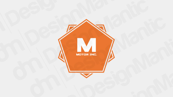
Image Source: DesignMantic
So, What Do You Think?
As we always say, there are hardly any hard-and-fast right and wrong rules in logo design. It always comes down to what works for your brand and what doesn’t. When choosing a specific layout for your combination mark logo, think of how it can help your brand reach its goals. With newer businesses, we suggest an integrated or stacked-on-top style. If you want to present your brand in a more vintage or classic style, perhaps an emblem is more appropriate for you.
Related: Past, Present And The Future Of Wordmark Logos – A Study
So in layout decisions, as well as any other design details, think of your brand and see what will work for you the best.


