Are you looking for the perfect icon to represent your communication logo? If so, you may be in for a challenge. A communication business is a vast topic. It encompasses fields such as telecom, public relations, marketing, corporate communications, reputation management, customer relations, and so many others.
Your choice of the icon will largely depend on the kind of communication services your company handles. For example, if it’s a PR firm, you might want to use a people logo icon; for a telecom company, a chat bubble sign may be a perfect choice; and for a customer service company, a phone logo or a headphone logo may be what you are looking for.
In this exploratory piece, we are going to talk about the five kinds of communication icons that we, as a graphic design company, come across the most when looking at communication logo designs. These designs represent a range of different kinds of communication businesses, from telecom to PR and from customer engagement to tech networking.
1. The Chat Bubble
The chat bubble is a nifty little versatile icon. Its application is huge. You can use it for a communication app logo, a customer service logo, a dating logo, a chatbot logo, and even as an interpersonal communication logo.
The chat bubble logo, also known as a conversation bubble icon, is not something new. It’s been present for ages in the graphic design universe and has always been used to represent dialogue and conversations. Remember the comics we used to read as kids and the dialogue clouds in them? The chat bubble is a more refined form of that. While it has always been present, it was popularized by WhatsApp and now you’ll be hard-pressed to find a chat or messaging app logo that does not use the chat icon in one form or another.
As one of the most popular communication logo images of today, the chat bubble is extensively used. But it’s this popularity that’ll ensure that your new communication logo is easily recognizable by the audience. However, a logo intends to stand out. Therefore, to create your own distinct impression, we recommend pairing up your chat logo with another icon, a custom font, or a unique color choice. Use the best of both worlds, win-win.
Image Source: Behance
Image Source: Dribbble
Speech bubble logo in two colors
2. The People Icon
A major part of the communication business industry consists of PR companies, networking companies, reputation management firms, and the like. What all these businesses have in common? They are about people. Therefore, the best symbolic representation for these services on a brand logo is using the image of a person or persons.
Related: The 10 Commandments of Visual Communication
The idea is to let people know immediately that the business handles people’s affairs. Once that part of the information is instantly communicated, the rest can be taken care of by your brand name on the logo or a catchy tagline.
Depending on your business profile, you can choose to use the people icon on its own or combine it with other imagery to add more depth or meaning to the logo. For example, a people icon unescorted by another can mean anything from a teamwork logo to a public relation logo. But combine it with a telephone receiver image and it instantly takes the meaning of a telecom logo or a customer service logo.
Image Source: Behance

Image Source: Dribbble
People logo combined with signals
3. The WiFi Symbol
On the surface, a WiFi symbol falls in the category of a technology logo. But modern technology is mostly about communication. Therefore, taking advantage of these blurry lines, you can use the efficacy of a WiFi icon to expand the reach of your digital communications logo.
This universally recognized symbol on your communication logo template can help you design a logo for a digital network firm, a marketing agency, a social media management firm, and even a business communication enterprise.
The presence of the WiFi signal on your communication brand logo not only adds meaning to the image but allows you – the business – to present your brand identity in a far more creative and imaginative way.
Image Source: Behance
Image Source: Dribbble
WiFi logo with plus sign
4. The Globe
The advancements in digital communication have rendered the geographical distances around the world almost meaningless. The availability of technology is all you need to converse with a friend in the other corner of the world, to have global networking solutions available, and to be able to provide communication services to clients sitting on seven seas far.
If you are running one such business – offering communication solutions to the global audience – consider cultivating your brand identity using the universal symbol of the world: a globe.
Most globe symbols in a communication logo icon use the networking dots to enhance the meaning of the logo. You can do that, too. Or, you can some other handy imagery to expand upon your brand intent. Some of the images are forward-moving arrows to show delivery of the message, swooshes around the globe to portray constant communication or a part of the globe ending in pixels to demonstrate your company’s digital relevance.
No matter which way you decide to go with it the creative use of the classic globe icon can help you leave a universal footprint in your market.
Image Source: Behance
Image Source: Dribbble
Globe logo with lines going around
5. The Cell Phone/Telephone
This is one of the more literal and obvious communication logo marks. It is a perfect choice for a communication brand that wants to present a to-the-point image, hence emphasizing their no-nonsense work ethics. It can also be a cheeky brand representation for an edgier and modern communication company that wants to have a more meta image.
Whichever is the case, using a cell phone as your prime image for your communication logo lends ready recognition to your design. It conveys your business intent to your target market without any ambiguity. And what you may lose in creativity, you might gain in the instant brand recall – something that brands pay top money for.
A cell phone logo icon or a telephone receiver image is also a great choice for a customer service business. Other relevant imagery can be headphones with a speaker. These are almost always used for a call center logo or a telemarketing business logo.
Image Source: Behance
Image Source: Dribbble
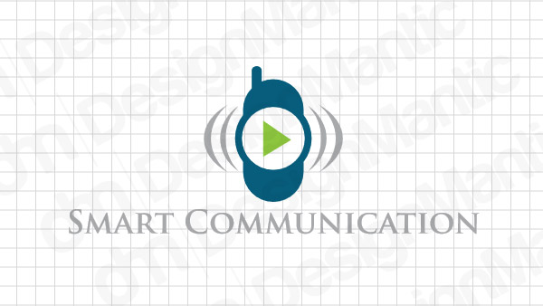
Mobile phone logo with signal marks
To Sum Up…
We hope our short discourse on the industry’s favorite communication logo icons has increased your understanding about which icons are better suited with which communication businesses. For the most part, your choice of the icon will be driven by the specific services your business offers. However, do not let that put you in a box. Think of creative ways you can present the classic and popular imagery for memorable and defining looks for your brand visuals.
Only by combining the true and tested with the new and imaginative can you make a lasting impact as a successful communication brand ideology.


