If you are a creative being, you probably know how tiresome and complicated it can be to find inspiration sometimes. This elusive being doesn’t come easy. At DesignMantic, we are making it somewhat pliable for you.
Below you will find 20 of the most aesthetically exciting beauty logo designs we’ve collected from the designers world over to enhance your branding, thanks to the multiple design communities online. All of these images are original, well thought-out, and consist of a wide range of styles, icons, color choices, and ‘feels’.
So if you feel a bit low on inspiration today, let these beautiful pieces of work help you out a little.
1. Minimalist Beauty Logo
Clean and tidy fonts, minimal use of imagery, neutral shades, and a lot of white space are staples of beauty salon logos that want to exude feelings of luxurious calm, opulence, and finesse.
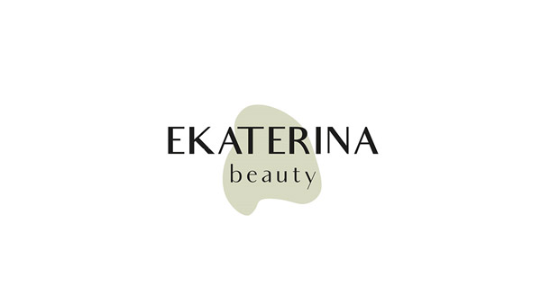
Image Source: Behance
Related: Minimalism Revived: The Holy Grail Of Simple Designs
2. Adding Native American Imagery
If you are working with a client of Native American descent, for example, using elements from the culture’s rich history is a great idea to get things going.
Image Source: Dribbble/Usama Javed
3. Stylized Lettermark
Lettermarks look really sophisticated and chic on beauty logo images. They also make the brand name more easily recognizable and word-of-mouth marketing works great for brands that have their logos speak out their names.
Image Source: Behance
4. A Circular Beauty Logo
Circular shapes inspire a wholesome, naturalistic, and organic feel to the design. As this shape occurs in nature regularly, it helps trigger emotions of calm and relaxation. That’s why circles, ellipses, and ovals are such great beauty logo markers.
Image Source: Behance
Related: The Geometry Of Logo Design – Once Upon A Shape
5. Delicate Feminine Features
Side-poses of female faces, female silhouettes, and artistic depiction of hands, feet, and curves of the female body are all popularly used in beauty logo designs. They help send quick, direct messages to the target market.
Minimal female silhouette logo
6. Ethnic Beauty
For beauty salons that specialize in natural hair or makeup brands that want to attract women of color, ethnic beauty images are great business representations. Keep in mind, however, that these icons are very specific; therefore, use them only when they truly represent your business and not just as a fad.
Beauty logo depicting African culture
7. Beauty Logotype That’s Also An Icon
Your beauty business logo will go on several different platforms to promote you: on your salon app, your website, on social media, office stationery, and so many other places. Using a logotype that can also be used as a lettermark icon is a great idea to consider.
Image Source: Behance
8. A Hair Salon Logo Simplifying Things
For a beauty brand not trying to over complicate their message, a simple icon, softer colors, and a font that looks hand-drawn sends the perfect casual vibe. Such a futuristic beauty logo is especially on-brand for a salon that operates a beach-side service.
Image Source: Behance
9. Hand-lettering Makes It Better
Another great way to add casual elements in an otherwise corporate or strictly-professional looking logo is using hand-lettering. Scripts that look hand-drawn add a wonderful intimate appeal to the design, instantly endearing the brand to its audience.
Image Source: Dribbble
10. Invest In Cultural Beauty Icons
Moon is a traditional icon symbolizing feminine beauty in many cultures. Same is true for stars, butterflies, and other pretty things. Use that when designing a beauty logo.
Image Source: LogoPond
11. Doesn’t Have To Be All-Caps
While we’re on the subject of keeping-it-casual, another way you can achieve this appeal is by using small case letters in your logotype.
Image Source: LogoPond
12. Dragonflies Are Beautiful
Among the feminine icons popular in beauty design industry are dragonflies, bees, ladybirds, and other tiny, pretty insects. Looking to instill the feminine feel in your beauty logo design, use the dragonfly magic.
Dragonfly logo for beauty businesses
13. Let The Hair Do All The Work
This beauty parlor logo uses shimmery gold strands of hair to make the K look stylish. It is a great use of the negative space with only a hint of color.
Image Source: Dribbble
Related: 10 Stunning Logo Designs Of Beauty Blogs Winning Over Fashionistas
14. Create Intimate Beauty Logo Designs
Not many people realize the power of showing somewhat intimate imagery in logo designs. A woman with her wet hair tied in a towel is an image women recognize all over the world. It is relatable, instantly understandable, and because it’s unique, it’ll help you stand-out from the rest of them.
Woman logo with pink scarf and flower
15. Use Relevant, Relatable Images
Beauty imagery is mostly delicate, exquisitely feminine, and produces a sense of womanly allure. Feel free to use such imagery in your logo designs to create relevant logo icons.
Image Source: Dribbble
16. Flowers In A Beauty Logo
Flowers in a beauty logo have always been present. Flowers are the quintessential feminine icons – though the tide is changing slowly. They also have a wide application for beauty industry. You can use them for spa logos, beauty salon logos, as well as beauty school logos.
Image Source: LogoPond
17. A Direct Approach
While the inner artist in you may want to the design to have layers and hidden meanings, a logo needs to be more direct in its approach. If you are designing for a foot care spa, using beautiful foot imagery may not be such a bad idea.
Foot and flowers in a logo
18. Use Pink
Pink used to be quietly feminine. Now it’s edgier, modern, and hardcore. Especially the bold, shocking, bright pink. If you want your beauty logo and brand to stand out among the sea of pastels, go with the bright pink to make your point.
Image Source: LogoPond
19. A Statement Element
Don’t be afraid to use a statement piece in your logo design. Just like in this example, while everything else is two-toned, the nails have multiple shades, immediately drawing the eye there, and letting the audience know what business the logo is talking about.
Image Source: LogoPond
20. Soothing Tones For Skincare
Skincare is a gentle beauty routine. Therefore, brands focus on gentle images, softer colors, and other unimposing elements to portray a calming, soothing, and peaceful environment. The same philosophy applies to spa and wellness logos, too.
Image Source: Dribbble
Related: How To Start A Home-Based Beauty Business – A Comprehensive Guide For Beauty Startups!
Over To You
Feel somewhat prepared yet? We hope so. As you start designing, keep what you’ve liked from this list in front of you for pointers or some general understanding. If you are looking for more such designs, head out to your logo gallery. Tons of originally designed beauty logo images waiting for you there.
Check Out Our Online Logo Maker:
DIY beautician logos for beauty clinics
Generate beauty parlor logo designs
Make logo for cosmetic business

