Social media has always been a visual space but that insight alone has become irrelevant.
Everyone has caught up to their significance now and brands of every size and origin invest heavily in social media visuals and digital branding. Our feeds see a crazy amount of visual content as a result. So much so that it sometimes leaves us dizzy, burnt out, or simply annoyed.
Per Survey Monkey, 74% of social media users report feeling overwhelmed by the barrage of online ads on their feeds. They find them “repetitive and irrelevant”.
Not the two words you want to be associated with your business.
On the flip side, however, ads continue to work exceptionally well. More than half of Facebook users admit to clicking on an ad on their feed and interacting with a brand.
If we go with these two numbers, a picture of a complex relationship emerges: Visuals work but people aren’t too keen on those — especially when they are ad visuals.
So how can you fix that? How can you ensure that your visuals always hit their mark, find their audience, and make the impact you want them to make? Marketing mix modeling can help optimize these decisions by analyzing the effectiveness of different marketing strategies, including WhatsApp automation, and adjusting them to improve ad performance.
We unpack all of this in this exhaustive visual content guide for 2024. The post will be split into four sections; one each for Facebook, X, Instagram, and LinkedIn. Each section will discuss the latest insights, strategies, and trends that will lead the visual content stream on that channel.
Ready to dive in? Let’s start with a size guide for all your social media graphic content so your posts are always bang on the mark when you hit publish.
Social Media Graphics Size Guide
Here are image sizes for most types of visual content on Facebook, X, Instagram, and LinkedIn:
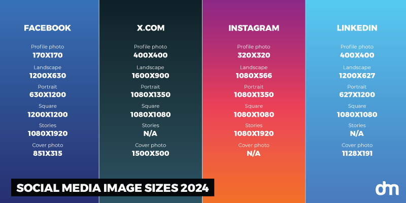
Social Media Image Size Guide 2024 – Facebook, X.com, Instagram, and LinkedIn
Social Media Visuals for Facebook
If you have heard a marketer say that Facebook is dead as a marketing platform, that’s the universe telling you not to listen to that ‘expert’ anymore.
Facebook is a pioneer in digital marketing and a fan-favorite of brand marketers. In 2023, the platform generated $135 billion in ad revenue alone. This number is projected to rise in 2024 and beyond.
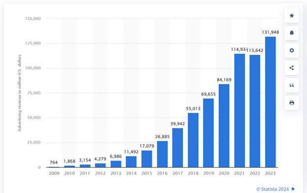
Facebook Advertising Revenue by Statista
Fun Fact: Capitalizing on the rumors about Facebook’s probable rebrand in 2020, we did an advisory piece for their design team about how we imagine the new Facebook logo to be.
Since Facebook ads rely heavily on visuals, that statistic should push you to perfect your visual marketing on Facebook.
Here are some insights, strategies, and trend alerts to help you do that.
Insights:
What is the latest data on the state of Facebook marketing?
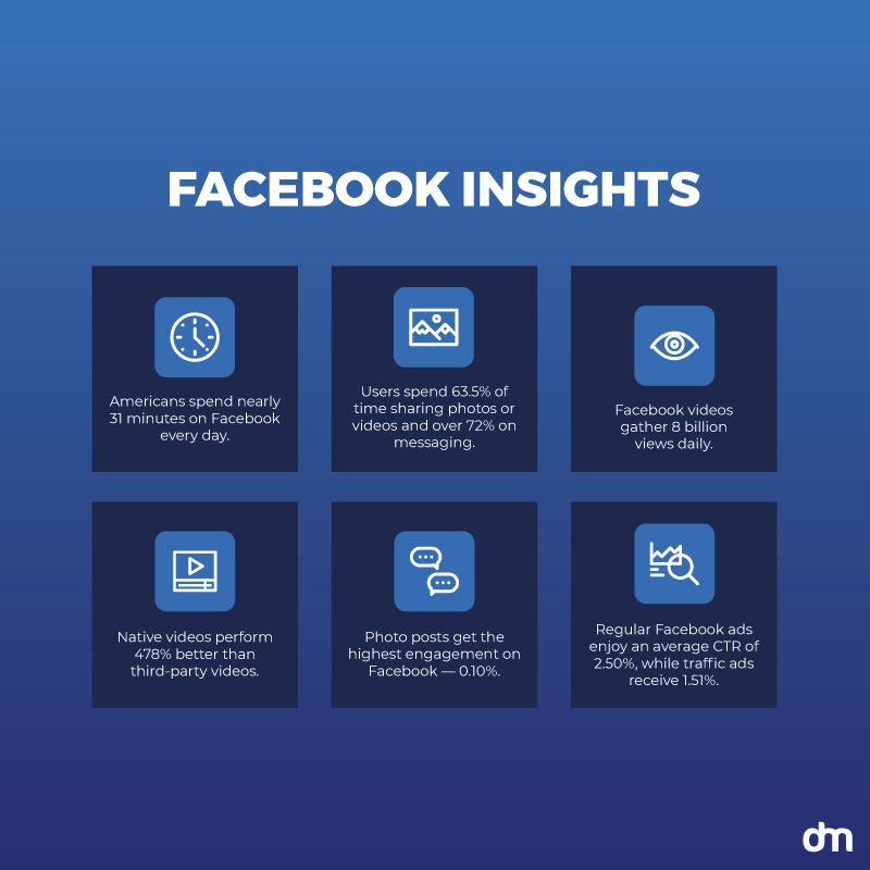
Facebook Insights 2024
- Americans spend nearly 31 minutes on Facebook every day.
- They spend most of this time sharing photos and videos — the second-most popular activity on Facebook (63.5%), right after messaging friends and family (over 72%).
- Facebook videos gather 8 billion views daily.
- Native videos perform better than third-party videos — 478% better.
- Photo posts get the highest amount of engagement on Facebook — 0.10%.
- Regarding Facebook ads, regular ads enjoy a nice CTR of 2.50% on average whereas traffic ads receive a lower rate of 1.51%.
- Compared to Gen-Z, American adults are more likely to buy directly from brands on Facebook, making the platform your must-have marketing channel if you cater to a demographic older than 25.
These stats show that Facebook is still alive and kicking as a viable marketing platform. Consider the strategies below to optimize your Facebook visual content marketing.
Strategies:
How can you make your visual content sing on Facebook? Try these creative tips.
• Sync your branded pages on Facebook and Instagram
Create your business profile on both Facebook and Instagram and synch them together. Since they are run by the same parent company, Meta, doing so will allow you cross-platform reach and brand consistency — especially if that consistency is supported by visual cohesion and thoughtful engagement, such as occasionally sharing random numbers to call for exclusive offers or digital customer service.
That means your overall look and individual posts on both platforms must have a matching visual flavor. Your Facebook cover design should supplement how your Instagram photos look, and your profile photo on both channels must bear the official brand logo of your company.
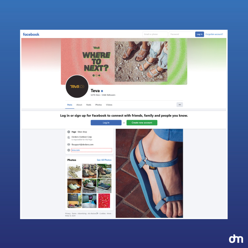
Teva – Facebook Branding
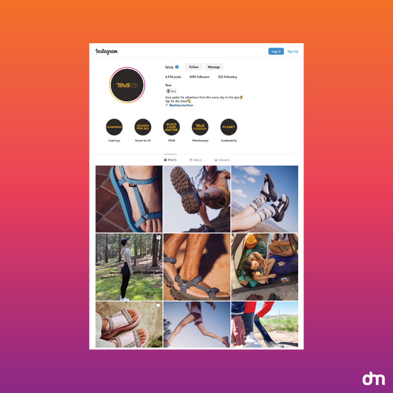
Teva – Instagram Branding
Teva keeps its brand perfectly synced on both accounts with simultaneous posting including the exact photos, captions, and more. The synched posting ensures users on both brands get the same visual experience from Teva, furthering the company’s cohesive visual identity.
• Focus on short-form videos
Short-form videos, similar to Instagram Reels, perform the best on Facebook With TikTok also becoming popular among Gen Z, you can consider that for distributing your video content. To grow Tiktok audience, it is important to create engaging videos that have a strong message and align with current TikTok trends. Create those to share what your brand is up to, the great new things you are planning, or just the daily living at your brand headquarters.
People love entertaining and informative content. Infuse the two to give your audience more of what they want in bite-sized video snacks.
Like this short video by Michigan State University. Take a quick ride around the campus in the engaging video that isn’t a boring orientation lecture or a lengthy tirade about the university’s history. Just you and us, on a fun ride together.
• Publishing time is more important than publishing frequency
Time your content publishing to suit when your audience is the most active. The importance of your visuals is only limited to how many eyes see them before the algorithm void swallows them whole.
Visit your Facebook Analytics page regularly to keep your pulse on your users’ online behavior and interests.
Schedule your posts in advance to ensure your brand is never sleeping when its users are up and awake. Analyzing social media reporting can unveil valuable insights into audience preferences and behaviors.
• Surprise Twist: Text posts break through the visual noise!
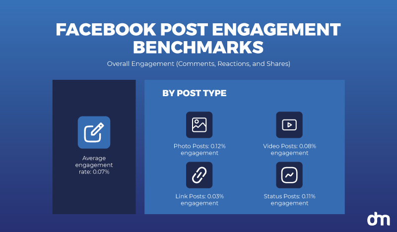
Facebook Post Engagement Benchmarks
While photo posts get the most engagement on Facebook, status posts (aka text posts) also get their fair share of user engagement.
And it makes sense.
With everyone posting lots and lots of visuals to grab the user’s attention, at some point, it all becomes white noise. Text content, particularly concise and witty, can break through this clutter and make people notice your brand.
• Run AI-enhanced Facebook ads
Leverage Meta AI to run Facebook ads that are optimized for the platform. The AI does a ton of stuff to make your Facebook campaign shine. The feature most relevant to our topic is their image generation tool.
The tool takes your original ad creative and provides variations to improve the look. You can modify any variation with text prompts, focusing on specific elements or altering major chunks of the image.
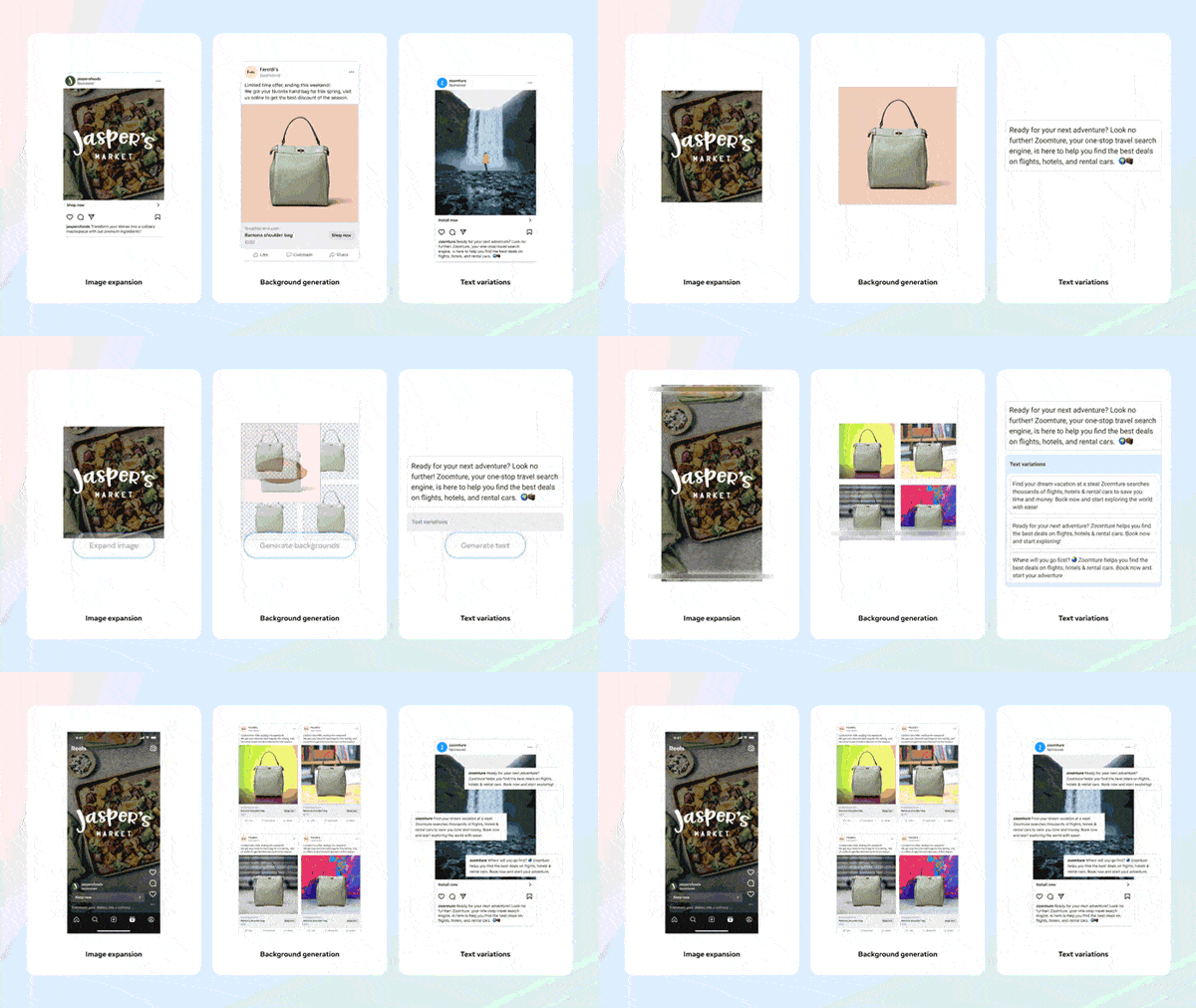
Facebook AI Ads
Their generative AI also includes image expansion, turning your horizontal ad into a vertical position, perfect for a Reel ad. You also get background generation for images where a single image can be repurposed with different backgrounds to keep things interesting.
Ad text generation allows you to improve upon your ad copy or take advantage of AI’s given variations to curate an ad that’s poised to maximize the clicks.
Facebook Marketing Trends for Visual Content
Here are the top 3 trends you need to follow to keep your Facebook marketing up to date.
- Facebook Watch is growing faster than the News Feed. As more Facebook users become enamored with video content, the platform has shifted its focus accordingly. The brand has invested heavily in Facebook Watch, as we witness by the amount of exclusive content now available on Watch than the Newsfeed.
- Native videos outperform shared videos from other channels. Facebook rewards brands that keep people on its platform. So when you video content to post, make sure to post it natively on Facebook, instead of sharing it on your Facebook brand page from your YouTube channel.
- People continue to use Facebook to share photos and videos. So, you’d be remiss to only think of it as a marketing platform. When you post branded content on Facebook, keep the sales-y offers to a minimum and instead be the brand people share with their friends and family because it posts great photos and videos.
Social Media Visuals for X:
X, or the brand we all loved as Twitter, has a unique brand story. It was the quintessential digital town square and now it’s something we are still trying to figure out. But in all this confusion, the impact of Twitter (or X) hasn’t slowed down.

Twitter vs. X.com Brand
Brands still hail it as a great avenue to connect with their audiences and people go there to run social campaigns, meme accounts, and political commentary.
So what kinds of visuals work on X? Apart from your X cover design, what else do you have to get right? Illustrations, photos, infographics, or all of the above?
Insights:
Let’s look at some statistics to clarify the picture.
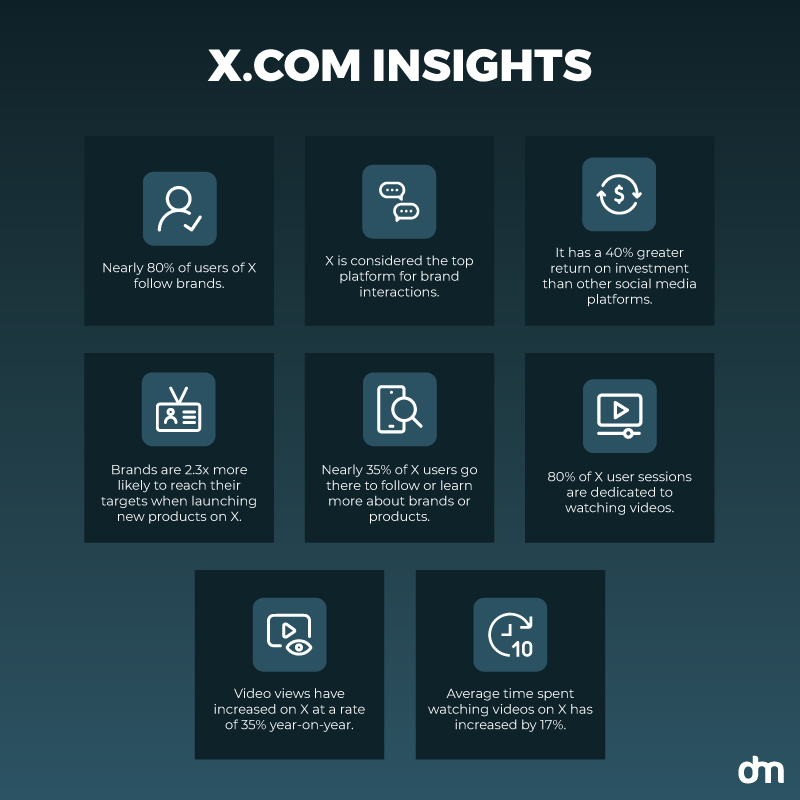
X.com Insights 2024
- Nearly 80% of users of X follow brands.
- X is considered the top platform for brand interactions.
- It has a 40% greater return on investment than other social media platforms.
- Brands are 2.3x more likely to reach their targets when launching new products on X.
- Nearly 35% of X users go there to follow or learn more about brands or products.
- 80% of X user sessions are dedicated to watching videos.
- Video views have increased on X at a rate of 35% year-on-year.
- The average time spent watching videos on X has increased by 17%.
For a platform that was always a text-focused outlet, the explosion of video content has been a great thing to witness. On the one hand, it underscores the impact of video, and on the other, it tells us that video will work no matter the platform.
Is your brand poised to deliver its Twitter (sorry, X!) fanbase what it wants?
Strategies:
Consult the strategies below to plan your X marketing with flair.
• Brand your Twitter profile
X, from its days as Twitter, has always been a great place for brands to showcase themselves to their audiences and create a rapport with them.
The strict word limit allows brands to show their fun and witty side, and earn a loyal following in the process. So what’s your first order of the business?
Create a branded X profile.
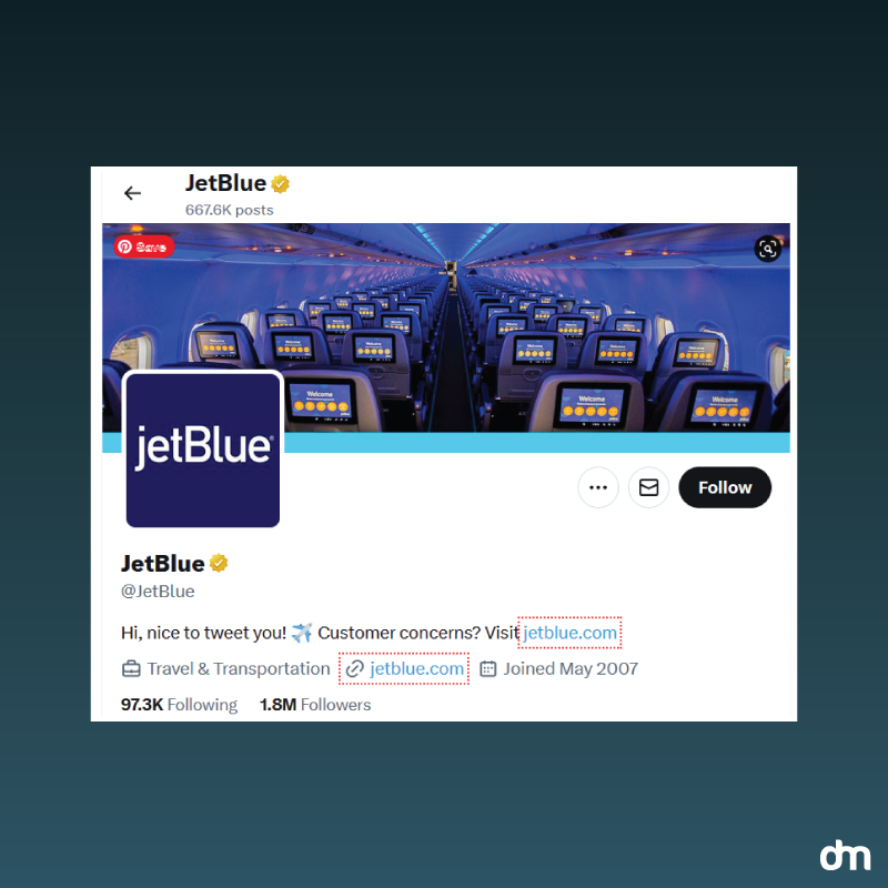
JetBlue Profile on X.com
Starts with a Twitter header design that must match your brand visuals. Much like what JetBlue has done here. Use colors and icons that mesh with your brand color and graphic palette. Use your brand logo as the profile photo, word each post (tweet) the way your brand speaks, and follow brands and personal accounts that align with your brand values.
• Diversify your visual content
Videos are experiencing a boom as the main source of engaging content on all social media platforms but with X, you need to keep things moving. Be it static posts or video content, both work very well for local social media marketing as well.
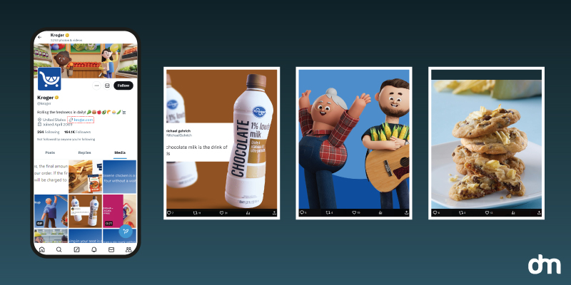
Kroger – X.com
Add multiple types of visual content to your content calendar. Images, background photos, original pictures, illustrations, and infographics. Kroger has a highly diversified visual feed with different image types — screenshots, product pictures, tip-of-the-day templates, illustrations, user-generated content, and more. You can also embed Instagram feed to enhance the visual appeal and engagement of your content.
This variety performs well on X and allows your brand to share its full range of emotions and characteristics with all its audiences.
• Stay on top of trends
Twitter is the birthplace of trends. The power of hashtags reigns supreme here and you need to stay up to date with all the trending hashtags to steer your content marketing accordingly.
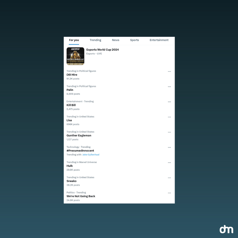
X.com Trends
Explore the latest trends under the ‘What’s happening’ tab to see if any is relevant to your brand. While not all trends will be worthy of your attention, if a spark in conversation aligns naturally with what you have to stay, no harm in merging the two and expanding your reach even more. Of course, you also need to know who your target audience is, because social media marketing Dubai can be a completely different topic from social media trends in the West. So, keep this in mind and tailor your strategies to your needs.
• Keep your branding consistent
Why would you invent the wheel every time you have to post visual content on social media? Take advantage of the many social media tools available online to create templates for all your popular visual content — videos, images, memes, and the rest.
These tools include DesignMantic, Buffer, Social Drift, and more. You can create your digital media assets with these tools, schedule your posts on multiple accounts, stay on top of the trends, and do much more with your limited resources.
• Post mentions and retweets
Don’t just rely on snazzy visuals to get your message across on X.
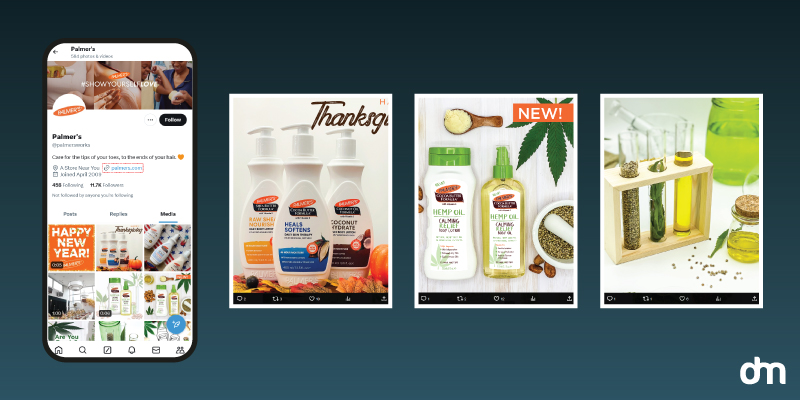
Palmer’s – X.com Profile
Look at Palmer’s consistently engaging its community and participating actively in the conversation. This is a brand that recognizes that X is a platform where your voice matters more than your visuals. So build connections with your community by retweeting the interesting things they say, mentioning them in your posts, and starting conversations around topics you all find interesting.
X Marketing Trends for Visual Content
Here are the top 3 trends you need to follow to keep our marketing on X up to date:
- Images perform better than videos. Users on X tweet images 361% more than video-based tweets. If you are a brand and wondering about the content balance between images and videos, your question just got answered.
- Infuse your corporate brand with humor. More people share tweets that are funny or entertaining (62%).
- Short, text-based tweets with a link perform the best. Links are perceived as explanations of the concept or idea shared in the tweet and are appreciated by the audience. Tweets with links should be less than 100 characters for the most impact.
Social Media Visuals for Instagram:
The most relevant visuals you need for the best branding on Instagram include your Instagram profile picture, Instagram cover design, Instagram post templates, and Instagram grid layout. The grid layout gives your Instagram page its distinct look and feel. The profile picture announces your brand and the template design gives you consistency across all posts.
Below we share insights, tips, and trends to lock your Instagram marketing for success.
Insights:
What do the numbers say about the state of visual content affairs at Instagram?
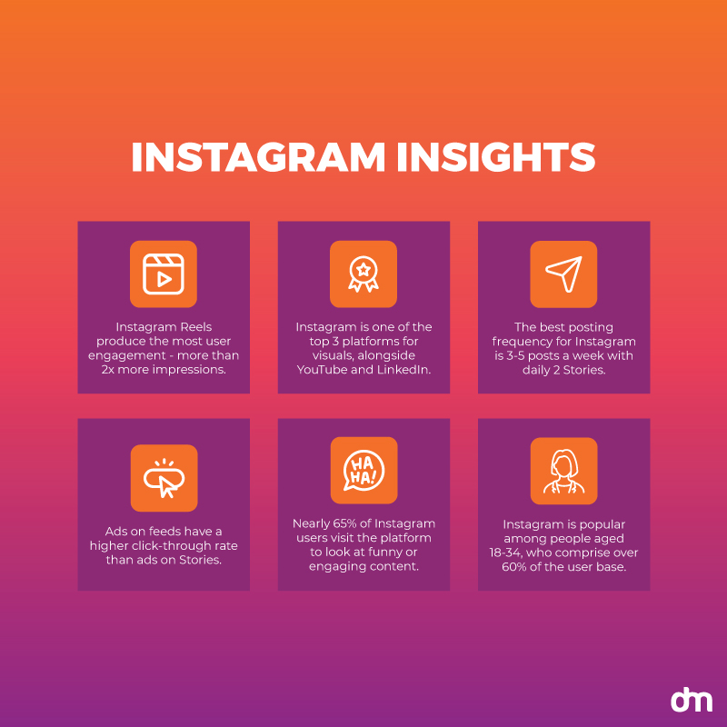
Instagram Insights 2024
- Instagram Reels produce the most user engagement — more than 2x more impressions.
- Instagram is among the top 3 platforms for which marketers create the most visual content. The other two include YouTube and LinkedIn.
- The best posting frequency for Instagram is 3-5 posts a week with daily 2 Stories.
- Ads on feeds have a higher click-through rate than ads on Stories.
- Nearly 65% of Instagram users visit the platform to look at funny or engaging content.
- Instagram is popular among people aged 18-34, who make up over 60% of the platform’s user base.
- Brands see an average conversion rate of 1% through Instagram marketing.
Your posting schedule must be fairly regular to make waves on this channel. Everyone is focused on Instagram to share their brand’s best visual moments and you have stiff competition. Plus, with multiple posts a week and daily Stories to post, you’re looking at several hours a day creating unique content for your Instagram brand account.
Fix that by investing in a design tool where you can create templates for your Insta posts. It will reduce your publishing work, ensure consistency in all Instagram post designs, and help you put the brand’s best face forward, which will attract users, enhance engagement, and increase the number of shares on Instagram.
Strategies:
What are the best methods at your disposal to break through Instagram’s visual clutter?
• Brand your Instagram business profile
A branded account ensures that when people see your posts on their feed, they recognize it as yours.
Consistency will be the key here. Leverage a consistent Instagram post design for everything you post on the platform. Paste your logo on every image and video you publish. And utilize a branded Instagram cover design for post highlights and backgrounds.
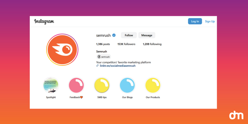
SEMRush – Instagram Highlights
Semrush uses minimal design but delightedly beautiful cover design to brand its Instagram highlights. The unique design makes the feature stand out yet has enough visual similarity to be recognized as part of the brand.
Maintaining this balance consistently will be the key to increasing your brand’s influence on people’s minds. It’ll help them start recognizing your design and spot it from a mile away, improving your brand recognition and recall, too.
• Use high-quality visuals
It should go without saying but many Instagram business accounts still focus on substandard stock imagery for their content. Utilizing image generators with the best flux prompts can help you create more striking and effective visuals.
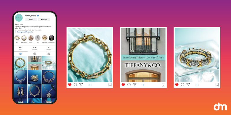
Tiffany and Co. – Instagram Profile
Shun that right now and instead focus on creating high-quality original content, even if it isn’t a lot. Tiffany, even though a multi-million dollar brand, uses minimal design image templates to show original product photography on its Insta feed.
On the one hand, it allows Tiffany to keep true to its brand look, and on the other enables its team to focus on image quality rather than quantity. The less quantity will automatically distinguish you from competitors dishing out low-quality content by the bucketload.
So, invest in a good phone camera, create an Insta post design template, take advantage of Meta’s AI, and use great visuals to help you mark your spot.
• Share the experience, not the product
Create visuals that highlight the story of your product, not the product itself. People don’t like to be sold to, but they like listening to great tales. So build narratives around your product and services. How does your product help people? What are the great ways you can use it?
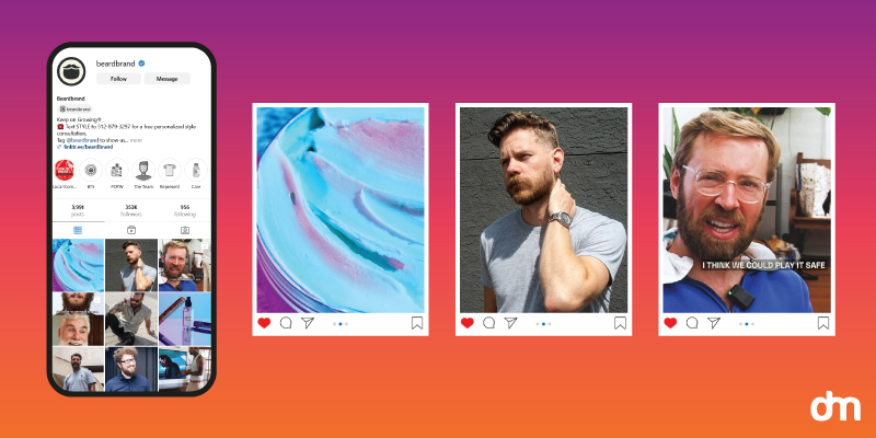
Beardbrand – Instagram
Beardbrand posts regularly about all sorts of content related to beards: transformations, styling tips, lifestyle commentary, and more. Here and there, they do their product shouts and promotions, but everything is wrapped in the beautiful packaging of brand tales and stories and we never feel like we’re being sold to. Instead, the vibe is of community and participation.
Replicate that in your visual content strategy by using illustrations, original photographs, and even memes to share your customers’ experiences using your products or the fun you had creating them.
When your brand’s story is the hero, it will likely reach a wider audience than a product ever could.
• Leverage the power of crowdsourced content
Your customers are likely to share a lot of content you can use. Every time they review your product or tag a friend in the comment section hyping your great services, that’s your chance to use those raving testimonials and share them on your page. Take a look at GoPro, a camera brand, showcasing not its camera but the exhilarating experiences its customers record with their GoPro devices.
On the one hand, the approach makes your community feel more engaged with your brand, and on the other, it reduces your workload by giving you a readymade post you can just retweet or repost.
Here’s Drew Barrymore, sharing with us what’s in her bag, and discovering two Garnier products in the process in this sponsored post.
User-generated content also has incredible persuasion powers. People who may sway with your ad campaigns, but might feel differently when they see a user just like them endorsing a product. That’s why influencer marketing always works, and more reason for you to partner with mico-influencers — those small accounts with niche sectors and loyal followings that always perform better than major influencers for up-and-coming brands.
• Stay relevant
Instagram is not the most forgiving place for brands that can’t keep up with the platform’s discerning clientele. Keep your finger on the pulse as Instagram communities go from one visual taste palette to another.
And this goes beyond matching your social media cover design to changing seasons. This requires a deep understanding of what your user wants and wondering how best you can provide that within the brand’s framework and future goals.
Years prior, Instagram was buzzing with models and influencers sporting chiseled makeup looks with exact contouring and OTT hair. Now, it’s all about dewy looks and effortless chic styles. And that’s just in one industry. From architecture to design and politics and social activism, Instagram is host to an immensely diverse market.
Use social listening tools like Brandwatch and Digimind to learn what your communities are talking about and curate your social media visuals to reflect your brand’s alignment with changing times.
Trends:
What are the top 3 trends on Instagram that should drive your content marketing on the platform?
- Videos perform better than images on Instagram. This includes all sorts of videos. Branded Shorts, longer tutorials, explainer videos, and more. Learn to work Instagram Reels or use an Instagram Reels maker to dominate your sector with your entertaining and moving video content.
- Utilize Meta AI for marketers. Do not take all the hard visual work on your own. Take advantage of Meta’s generative AI to not only create variations of your ad creatives but also to design campaigns with its intelligent recommendations.
- Run ad campaigns on Instagram. Brands are investing heavily in Instagram ad campaigns. Run your campaigns parallel to partnerships with micro-influences for the most impact. Sponsored ads will work and they may deliver great results when trustworthy influencers endorse what these campaigns are all about.
- Create a bio link page. Using a bio link page for Instagram is a great way to share multiple links, resources, and content with your audience, all from one place. Instagram only allows you to place one clickable link in your bio, so a bio link page helps you make the most of that single link by directing users to a customizable landing page with several links.
Social Media Visuals for LinkedIn:
LinkedIn is not your most traditional visual network on social media, yet it is getting there. More and more visuals are being shared on LinkedIn networks than ever before and it’s quickly becoming a battleground for brands to promote their products and attract the best talent.
Visuals on LinkedIn, therefore, serve a dual purpose. They help you present your brand personality in all its professional galore, and in the process allow you to get in touch with the right people who match your vibe.
Main LinkedIn visuals you need for a basic online presence include LinkedIn header design, LinkedIn cover design, and LinkedIn profile picture. Take things up a notch by branding all your posts — visual and text-based. Elements you need include a branded post, video, and ad templates.
Insights:
Here is how things stand currently with LinkedIn visuals:
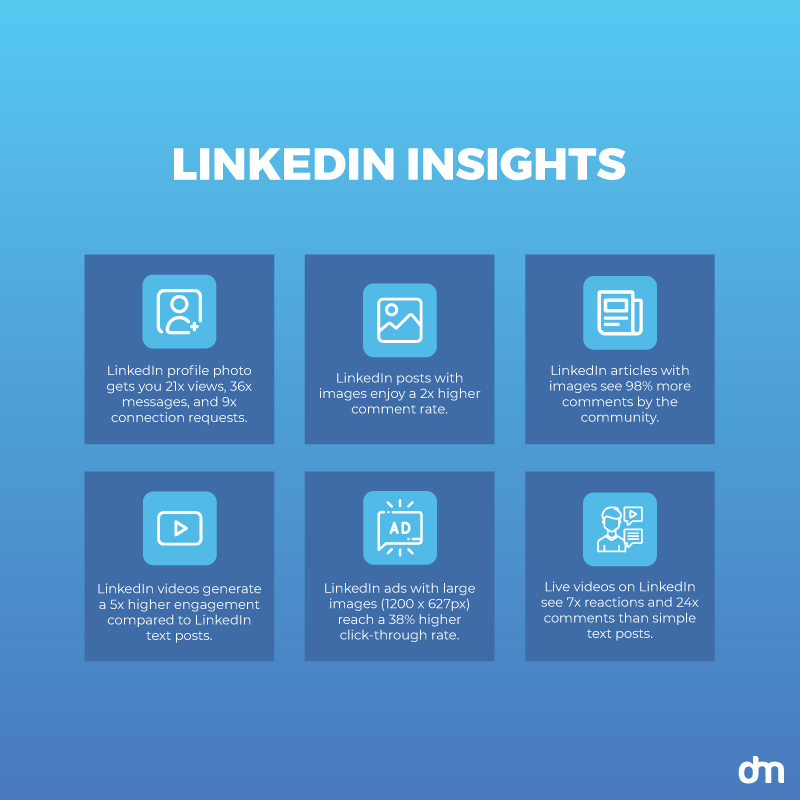
LinkedIn Insights 2024
- A profile photo on LinkedIn gets you 21x more profile views, 36x more messages, and 9x more connection requests.
- LinkedIn posts with images enjoy a 2x higher comment rate.
- LinkedIn articles with images see 98% more comments by the community.
- LinkedIn video content generates a 5x higher engagement rate compared to LinkedIn text posts.
- LinkedIn ads that use larger images (1200 x 627px) reach a 38% higher click-through rate.
- Live videos on LinkedIn see 7x more reactions and 24x more comments than simple text posts.
These statistics demonstrate the effect of LinkedIn visuals on amplifying brand voices and content. Optimize this impact by incorporating your LinkedIn brand presence with meaningful visuals that help share your narrative.
Strategies:
Employ these strategies to make the best of LinkedIn’s focus on visual content on its platform.
• Update your LinkedIn profile
As always, start by branding your LinkedIn business profile. Your brand logo will play a central role. In addition to using it as your profile picture, make it a staple of everything you post on the platform. This includes every image you post, every data visualization you present, and every video you publish.
As we have said previously, consistent design breeds strong recall. People begin to associate the design with your brand and spot it easily from there on.
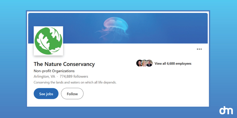
The Nature Conservancy – Linkedin Profile
The Nature Conservancy uses its logo to mark all of its image posts and has a distinct voice for its text posts too.
The LinkedIn header is another branding element to master. Maximize its potential by regularly updating the header. Never keep the same picture for too long. Refresh your visual identity by changing the header to announce a seasonal sale at the brand, a new acquisition, or a brand store opening.
• Showcase your workspace
Not enough brands are posting their workspace photos on LinkedIn. Even if you only have a corner dedicated as your office space — and most startups begin that way — take pride in what you are trying to accomplish and show off your space!
In one go, you’ll legitimize your business and open yourself up to potential clients who want to connect with authentic and real people behind the brand voices.
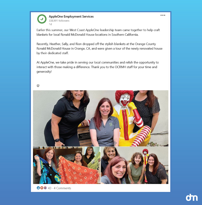
AppleOne – LinkedIn
Apple One, a staffing company in Glendale, California, shows us what they do after-hours for the community, to pay it back, and do the next kind of thing. While the company may not be showing its workspace, it’s giving you a glimpse into what its team is all about.
But showing your workspace is also a great idea. It allows everyone a chance to imagine themselves working there. If your space looks welcoming, professional, and a place people would want to come to every day, well… they might decide to do that and apply for your open posts. And isn’t that the whole point of LinkedIn? Connecting you with talent that can make your corporate dreams come true?
• Client success stories through images
Another great strategy to achieve success through meaningful visuals is to take your client’s success stories and turn them into illustrations or infographics. These mediums are highly popular on LinkedIn and effective at delivering the views and comments you want.
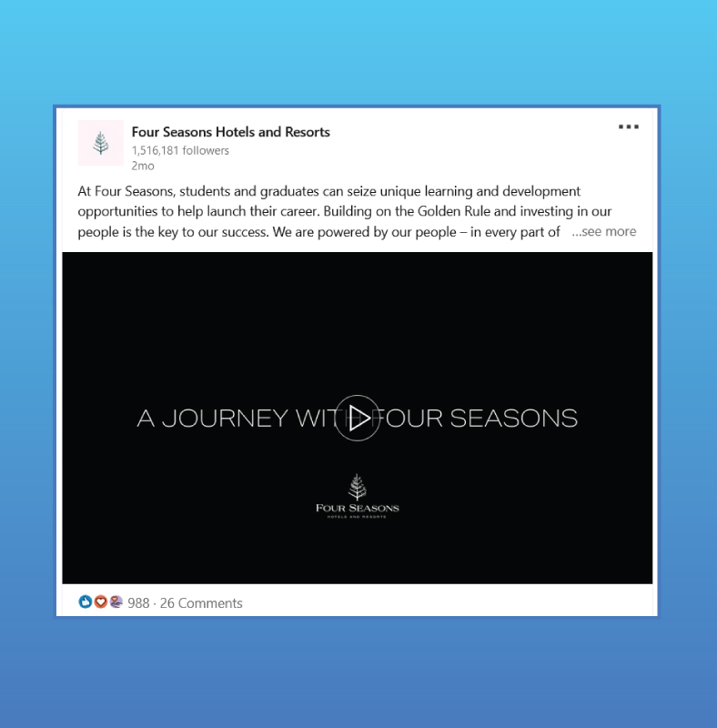
Four Seasons – LinkedIn
Four Seasons highlights its Manager in Training program not through a boring digital brochure but with an engaging video showcasing Jalen Davis, an actual employee moving ahead in his career.
Since images and visuals are more easily processed than text, these visual success stories are more likely to be shared by your followers and give you the endorsement boost you need to soar.
• Visual quotes and insights
As a business on LinkedIn, you likely have a lot of data at your disposal. Turn that data into interesting visuals to give people an insight into your brand and its mission. Infographics, charts, and graphs can help. Or you can create slideshows to tell a more detailed story.
Ensure the insights have actionable advice at the end so your followers are not merely passive receivers of the content but have clear instructions to follow and explore.
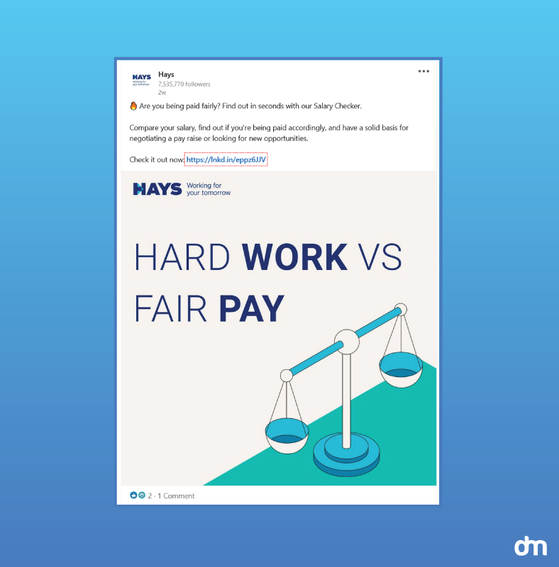
Hays – LinkedIn
This salary calculator post by Hays puts the conversation into context by pitting it against the hard work expectations that organizations have from their employees.
Visual quotes are another easy-to-do content type. Design a template, add relevant quotes from actual interviews, speeches, or interactions (nothing that’s been overdone already), and let those posts do their thing for your brand building.
• Behind-The-Scenes of a project
Another great visual content type to focus on is BTS shoots. Everyone loves to see what goes on behind the scenes as great campaigns are planned, projects are accomplished, or products are built. Use these BTS moments to take center stage in your content strategy from time to time.
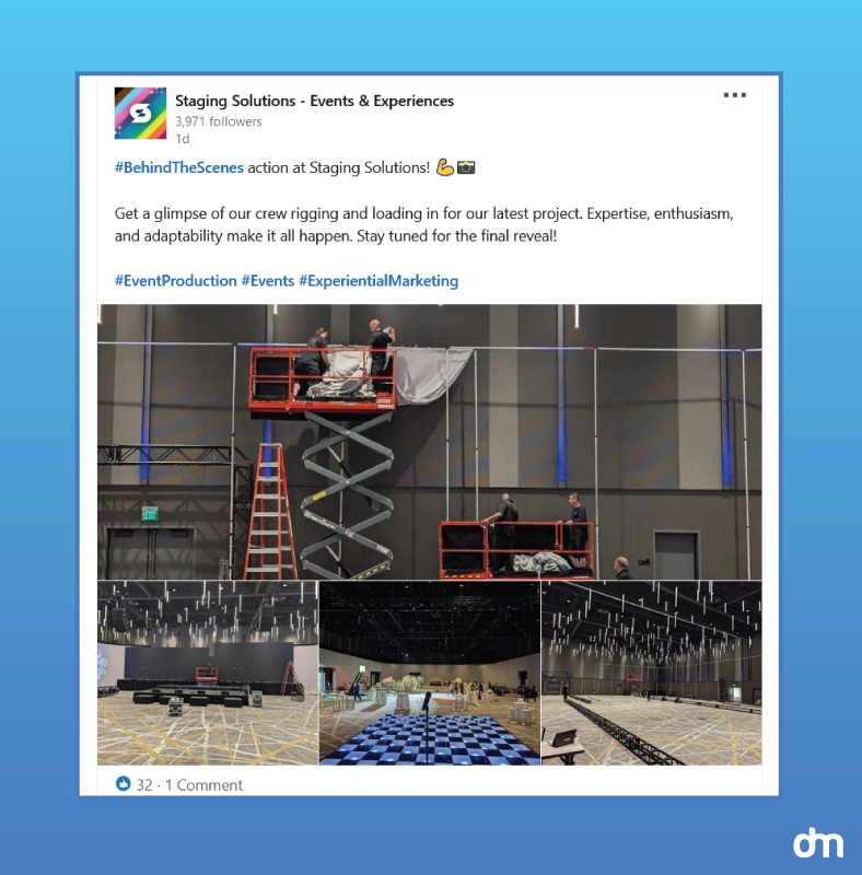
Staging Solutions – LinkedIn
Staging Solutions shares its event BTS photos to give its followers a glimpse into the inner workings of the brand and make them feel part of the event planning process.
Trends:
Below are the top 3 trends to pay attention to as you architect your LinkedIn visual marketing strategy:
- Invest in video and live content. Like most other social media, LinkedIn too is pushing video content above the rest. Give ample space to video and live content in your future LinkedIn marketing to engage with your audience.
- Build groups and communities, not just individual connections. Take part in brand communication through LinkedIn comments and communities. Join groups to share your insights and expertise and learn from others in the industry. Pepper what you say with choice visual content — data visualization, for example — to back what you have to say. These groups do more for your brand reach and influence than any individual connection you gain.
- AI and automation will spearhead the momentum. Equip your LinkedIn visuals with the latest in AI and automation. This means using design tools like logo makers and image generators to streamline your content planning, production, and publishing.
Got everything you need for a successful year on social media?
Creating social media graphics is a lot of fun but not knowing how to start it on a strong note can derail the whole thing. With this guide, you can nail your social media graphics like a pro.
This guide provides you with data-backed insights to help you strategize more clearly. Trend forecasting gives you exact ideas to focus on in the future and keeps your visual marketing focused on the goals.

