It happens to the best of us. Whether you are an entrepreneur or a designer, sometimes the right idea just eludes us, no matter how hard we try. Especially, the harder we try. So let your thoughts loose and enjoy some awesome creativity these designers were able to put in these beautiful seafood restaurant logo design works.
Designing for a seafood eatery isn’t easy. You do not have a lot of imagery to work with. But using the design cues from these beautiful pieces of art, you can see how it can be done.
Let’s start, shall we?
• Fine-Dining Seafood
Eating in a restaurant is always more about the experience than just-food. But in fine-dining, the ratio is disproportionately in favor of the overall experience. People who are willing to pay extra to dine in your exclusive seafood club aren’t doing it only for the prime quality of lobster or shrimp. They want the whole experience of enjoying nice quality food in an environment that takes care of their finer tastes.
Therefore, you have to bring in that prime factor in your seafood restaurant logo design.
Pick an element that really gets that restaurant and build your design theme around it. But keep it minimal. Nothing says luxury more than a design that is bare and chic. Keep it succinct and don’t add to it more than you need to. Your color choice in logo design must represent not only the supreme quality of food but the ambiance that the restaurant wants to project. Red, black, silver, white, mustard – keep your color palette limited.
For the typography of a fine-dining seafood restaurant, pick clean, angular, and subtle type. If you want to go for a softer and warmer type, make sure it isn’t casual or swooshy. If you want to add tendrils to your type, make sure they complement the whole look and not bring it down.
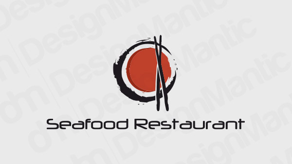
Sushi icon for a seafood logo design
Seafood restaurant logo featuring prawn on a plate
Image Source: Behance/Milarex
Image Source: Behance/Manoela Silva
Image Source: Behance/Sameh Elnahas
Related: Capture The Essence Of Mexico In Your Mexican Restaurant Logo: Tips And Techniques
• Trendy Seafood Bar
Diners visiting trendy seafood bars are also doing it more for the experience than food – but they are looking for a different kind of experience. They want the edge, the ease, and the openness of the modern culture.
To represent this contemporary aspect of trendy seafood bars, your logo design can stretch its legs and roam a bit freely around the canvas. A great way to do that would be to use the current logo design trends and incorporate them into your logo to really speak the language of your clientele. Using line art, abstract shapes, a brighter color palette, and more stylish fonts, you can absolutely nail a seafood logo design for a trendy bar.
To gain some understanding of how the current trends can influence and help your design here’s a helpful resource on graphic design trends.
Logo featuring a turtle with a dish on head
Abstract fish merged with flames logo icon
Fishtail merged with a fork logo
Fish head logo with a fork
Related: Turning Your Restaurant Into A “Brand”: Branding Elements To Get Right
• Casual Seafood Diner
Casual diners are the staples of modern city structures and cultures. These are the places you often visit, and here, it’s more about the food than anything else. You go there to enjoy some honest-to-God delicious fare, some banter with the guy at the counter you’ve known for some time now and feel a bit at home when you are eating there.
To design a new look for a casual seafood restaurant (or to launch one that you hope becomes a part of the street’s culture), you have the amplest design space to work your magic in. Make it as cute, daring, or laidback as you want. Use cutlery symbols as part of your seafood logo designs; add attention-grabbing colors, such as purple, yellow, and orange; and when it comes to font, make sure you add in the strands of the culture too. For example, if it’s a trendy neighborhood fast food chain, keep the font choice contemporary. If you want a more family-environment feel, represent it with an inviting Sans-Serif with rounder edges and easier strokes.
To upgrade your casual seafood eatery logo, pair it with a wordmark or use a more restrained color palette.
Fork and spoon logo with a fish
Fish on a plate logo for casual seafood
Related: 20 Italian Restaurant Logo Ideas To Stir Up Your Appetite
Fish silhouette with a dish logo
Whale tail logo for a seafood eatery
A crown logo featuring fishtails
• Fresh Beachside Restaurant
If the design brief that has brought you here today is about a beachside seafood restaurant logo, we have just the designs for you. Unlike anything on this list here, designing for a restaurant’s logo is always tricky. You want the design to be perceived as rugged, sandy, and adventurous but above all, fresh. And you have to make absolutely certain that combining all these together doesn’t descend the design into messy chaos.
To prevent that, be very careful in your selection of elements and keep the choice minimum. Fish on sea logos, wave icons, beach symbols – they are all fine as long as their merging is improving the design and not overcrowding it. To include the fresh feel, go with the colors of the ocean: green, blue, the watery orange of sunset. For your typefaces, go with easy fonts. Nothing too exclusive as it can make the design look pretentious. Remember, that for a successful beachside seafood logo, authenticity is your magic word.
Fish logo on waves with the sun setting
Fish with leaves logo
Dark Red logo for a beachside restaurant
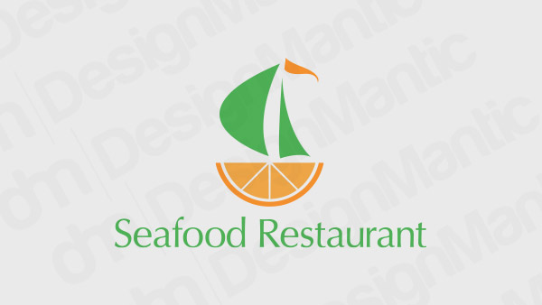
Boat logo perched on a half orange slice
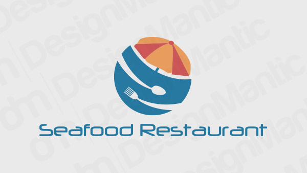
A beach umbrella logo with spoon and a fork
So Tell Us How We Did?
Do you feel inspired yet? Paraphrasing Picasso, for inspiration to exist and come visit you, it has to find you working. So just looking at these (or other) designs won’t do the trick, you’ve got to get up and start working on designing drool-worth food brands. Some come on, chop-chop.
Try Our Personalized Logo Maker:

