Whether you are a Martian from Mars or an Alien from the other world, if you are living on earth, you’d need to earn! Just don’t forget to wear your human outfit before going out to sell. Great people say that for businesses to succeed, they must have professionals working in their organization. How true this line is. A good salesman is one who is able to sell a comb to a bald man; a good marketer is one who promotes company’s products in such a way that the sales turnover hit skies!
Really?
Yes. In fact, a company’s reputation and respect is connected to its logo. This is just one of the many things that are important to maintain company’s reputation. The quality of the product is very important. Even if you have the best salesmen, your products will not earn you much if the quality isn’t good. Things will be revealed to the customers in a long run. So there are not necessarily ways one could survive without keeping safe.
• The Logo’s redesigned Over Years

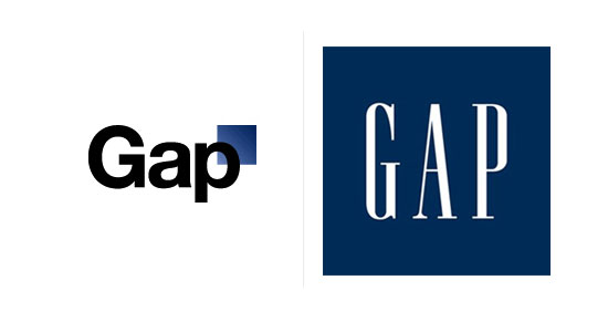
Gap’s logo was the same till 2010 when it decided to change it with a different design. This new idea was to spark a new light among the targeted audience but the change influenced quite negatively. Such was the impact on the company that they decided to revert to old logo design in about week’s time. Now was it the design, the brand identity created among people or some mystery? Common, why on earth would it be a mystery? The design did not work out, simple as that. This is reality. A good logo needs to have some vital components. They should not be missed. And this “Gap” logo, as said by experts, failed because of the design, the font and the color gradient. The sales dropped dramatically. In the end, you could only blame the design which did not work out.

Image: StarBucks
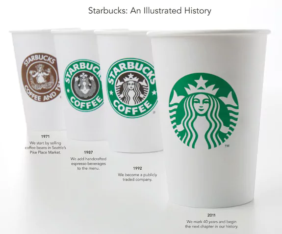
Starbucks started out in 1971 and it changed three logos. Have you realized why the company decided to change logo design, pattern and font over the years? It was because of the targeted audience. Perhaps, a specific design was not suited to people after certain time. The first logo of Starbucks had a naked siren, with its tail extended to left and right. This logo was closest to reality. The company realized in 1986 that the upper body should not be revealed so they altered the design but even then the body exposed too much. They again decided to alter the design. In 1992, they dropped hair to hide her body and changed the color from brown to green. These specific things were done after a great deal of thought. The last logo change was in 2011. The company decided to focus more on siren face so they exposed it more and removed the black color from the design.
Related: 5 Famous Brands that Peeled off their Logos in 2013
• Why are logo’s Important?
A company’s logo is an important asset which formulates an image in customers’ head. Logos are worthy of being called “Money bringers” because a great part of them is responsible for any company’s earning. Logos boost sales, increase profits and helps in creating a market grip.
• Let’s discuss how good logos can affect sales
1. Imagine a body without a backbone… lifeless huh!? This is what logos will look if they are not designed by a professional designer. This person not only recommends what to include and what not in logo design but also give suggestions on how logos can work. Moreover, you can sit with the concerned person and get the logo designed of your choice. If your designer is a professional, he/she would not have difficulty in designing it. Then what? Things might turn good for you.
2. Have you wondered why Barbie Doll’s dress is pink? Why is the packaging pink? Why is this color associated to doll? It’s because the targeted audience are girls not over teens. The manufactures know their target audience and implement new ideas accordingly. Logos must be designed according to the target audience. A manufacturing company of children toys cannot afford to get a design targeting elder women.
3. Another way logos can make impounding affect on sales is by making them more readable. Having millions of fonts installed in your computer does not mean you can just put any font and create magic. Logos should be as such that when a person views them for the first time; he is able to figure out what is written. You know what? If your logo is readable then it memorable as well. If it is memorable then get happy because your sales will increase.
Related: All that glitters is not gold: Common misconceptions of SMBs about designing their logos

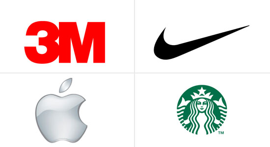
4. Another Golden tip for increasing sales is to make your logos as simple as you can. Look at the logos of Apple, Nike, Starbucks and 3M. What is common about them? They are simple and memorable and at the same time are the reasons for earning in millions. You would note one thing more in these logos that none of them reveals what they produce or sell.
Some giants in the manufacturing and service sector saw their sales dropped to a great extent in the past. What was the reason? They changed their logo design and that was when bad things started to happen.
• The hidden truth!
Logos can always work but their design, color and fonts have to be matched accurately. Moreover, the organization’s goals and objectives are key elements to make them an overall success. Just remember, design logos keeping in mind that they are a way to positively affect sales!


