Rebranding is a norm when it comes to modern business. It serves many purposes. It announces when a company is going through a major shift. It advertises new launches and fresh beginnings. It also gives insight into the company’s psychology. What the brand is thinking right now, what is it trying to achieve?
Almost always, when a brand goes through a logo change, the intent is to increase or retain the company’s market share through higher sales. Thanks to marketers and consumer psychology, it is no secret that people buy from brands that appeal to consumers’ emotions and feelings. Sure, money matters. But when it comes to brand loyalty or feeling ‘connected’ with a brand, the association is based more on emotions than anything else.
So, when a major food or beverage logo goes through a change and chooses to reuse an old one instead of forging a fresh new look, what is it trying to accomplish? Why are we suddenly seeing an influx of retro logos when it comes to food brands? Why, to repeat our original question, so many food logo designs are going retro?
It Is To Get You Nostalgic.
It’s a fact that nostalgia sells. When your present is not going as great as you had hoped, your brain takes you back in time. Since memories are always kinder than what the reality had been, you long for that time to come back. The power of retrospect tells you that you could have done better then, and things seem so much simpler than they are right now. Freud called it regression.
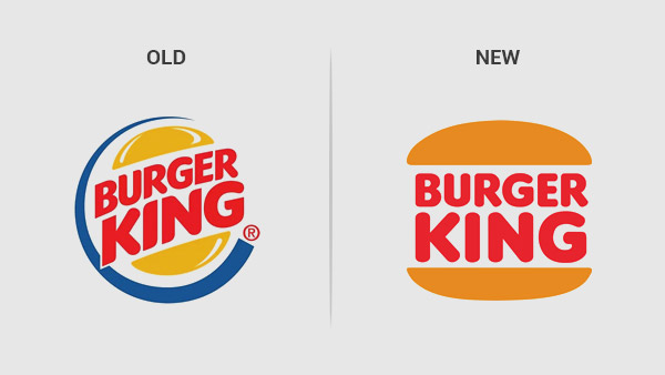
With Covid-19 ravaging economies and communities, it is no surprise that brands like Burger King, Pizza Hut, and Popeyes want to adopt brand identities that remind people of simpler, better times. Nostalgia becomes even more powerful when it takes you back to a time when you were a child and had no serious responsibilities to take care of or life-altering decisions to make. At that moment, when you spot a Burger King logo that’s similar to how it looked in your childhood, you’ll probably feel a strong connection to it, ready to forget or ignore the many scandals the brand has been involved in over the years. Instead, you may look at the logo, be reminded of your childhood, and consider the logo as less of a brand identity and more of a happy relic from your childhood.
And that’s what brands capitalize on when they decide to rebrand to visuals that are more than 20-30 years old. They want you to look at their food logo and associate it with happy memories. The same happy associations work when restaurants and food chains use cool tip jars in their services. The happier you feel, the stronger the association will be. This is another reason food brands, especially fast food brands, invest a lot of time and energy into ensuring that their young consumers remember their logos. It is not only for later recall so they can pester their parents for frequent trips, but it also so the brand can become a part of their early childhood and become a part of their happier memories.
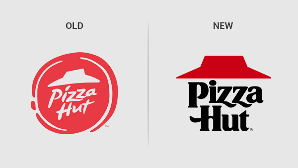
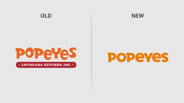
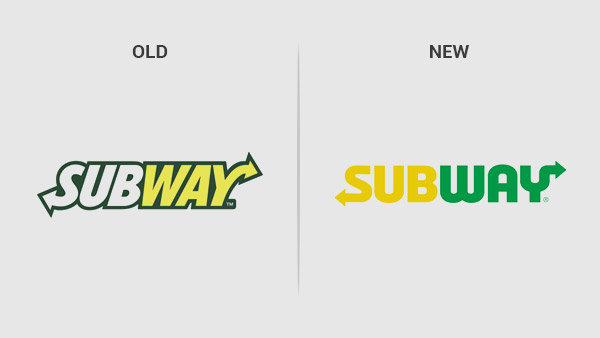
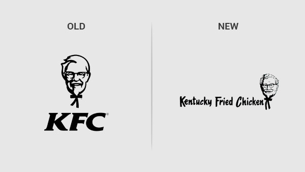
Here are a few famous food brands that have swapped their shiny logos with more comfy looks.
Burger King
Pizza Hut
Popeyes
Subway
KFC
How Does A Retro Food Logo Work?
If you run a food or beverage brand, a retro design has its advantages – other than nostalgia. Let’s list a few.
- Retro designs are simple. They get the message across and are easy to understand and recall.
- Retro designs seem more organic and real. Modern graphic design can sometimes look as if it’s trying too hard. Retro pieces, on the other hand, use round, comfortable shapes that make the brand look more earthy and relevant.
- Retro designs communicate stability and trust. With straighter fonts and more rounded edges, retro designs inspire solid foundations and greater reliability than their modern, digital counterparts.
How To Get The Retro Look Right?
Icons:
Use images and visuals that are more direct instead of containing layered meanings. Remember, you are referring to a simpler time. So, do not try to complicate your logo. If you are a BBQ joint, use a grill logo icon to represent your brand. If you are a bar or a pub, a beer glass logo would suffice. Keeping things simple is the key.
Colors:
While retro designs can refer to any era, but we are focusing on the 70s and 80s when talking about fast food retro logos. Using colors of that era, we think of saturation more than blending. Stick to a limited color palette, keep the tone flat, and focus on shades that are found in food. Red, yellow, green, and mustard are your friends.
Fonts:
Can we just say two words? Sans Serif.
You really don’t need more.
Here are 10 Retro Food and Beverage Logos to Get Your Taste Buds Working.
Image Source: Dribbble
Image Source: Dribbble
Rooster Logo In Red Background
Image Source: Dribbble
Burning Grill Logo
Image Source: Dribbble
Heart Shaped Bun Logo
Image Source: Dribbble
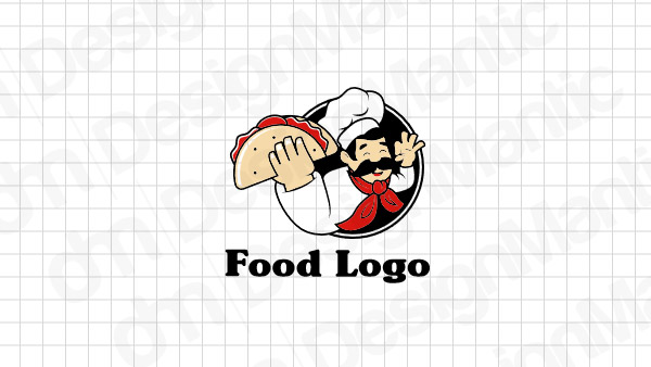
Tacos Logo with a Chef Mascot
The Takeaway
Retro designs help people associate the brand with feelings of security and fewer complications. When the future seems uncertain and the present uncomfortable, it’s the past where everything makes sense. Give your brand the power of reflection and nostalgia with a retro food and beverage logo that’s all about nice colors and dependable shapes.
To check out our food and beverage logo gallery for the retro design collection, click the link now.

