Research logo designs are some of the most devastatingly dull designs you’ll ever see. We’re not talking about the handful of the few million-dollar projects here done by the most expensive agencies in the world. We are talking about SMBs and their smaller (much smaller) budgets. If you can’t pay thousands of dollars for a ravishing research logo, should you just settle with a bunch of connected dots in your logo?
Not on our watch.
We are showing a design collection here to prove that great design does not need to break your bank. These designs are by smaller agencies, freelancers, and we have even used designs from our own database. DesignMantic’s very own and very fresh research and development logos to help you, our science and tech entrepreneurs, to enjoy the best of branding without spending all your funding on us.
So, without further ado, here goes nothing.
1. Fragmented Fonts for a Creative Brand
The most notable way to define your brand as modern is to use fragmented fonts and let the audience figure out what your brand is called. Give people something to scratch their heads about, right?

Image Source: Behance
2. A Dotted Red Draws the Eye
We have passed the dark ages when we kept our research branding on the conservative side. Today it’s all about color. Even a dot of it will suffice.

Image Source: Behance
3. Show What You Do Through Your Logo
I love logos that incorporate a bit of what the brand is all about in their logos. This take on the IRD logo accomplishes the effect beautifully by displaying the design on the backdrop of a coral reef.

Image Source: Behance
4. Simplify the Design with an Iconic Symbol
Medical research is complicated enough on its own. Let the branding breathe via a simple logo that your audience can rally behind.

Image Source: Behance
5. A 360o Logo for the A-Z of Research
Arrows following each other in this scientific research logo create a symbol of origin and evolution. Signify the full circle of life with evocative and insightful imagery.

Image Source: A circular logo design showing coming full circle
6. Show Direction and Edge
Research and development is noble as well as cutting-edge. Why not show the juxtaposition of it through a research logo that’s all edges as well as integrated shape?

Image Source: Three triangles in logo creating letter A
7. Use a Symbolic Wordmark
Let your scientific research bubble to the surface with this exciting visualization. It’s a test tube forming the letter T. How pun-tastic.
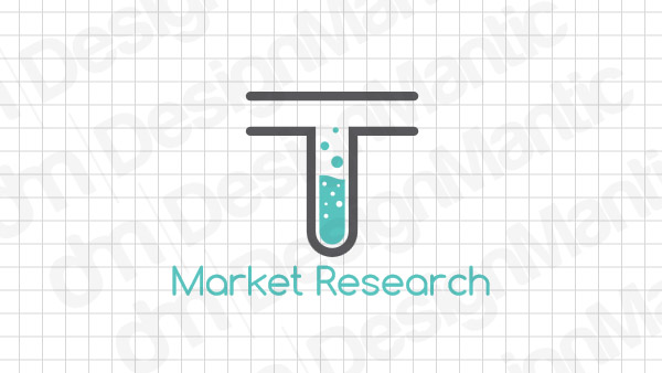
Image Source: Test tube logo in the shape of letter T
8. Create Patterns without Dots and Drips
Research, scientific or otherwise, is so much about studying patterns. Show that repetition in your logo without icons that are dull or dated.

Image Source: A globe logo design with repeated patterns
9. If You Are Looking For Something Institutional
Research labs may have become modern but let’s not forget they are institutions doing life-saving and life-changing work. If you want yours to have that traditional institutional look, we have the exact logo you are looking for.

Image Source: A Shield logo for a research institution
10. Data Tiles in Color
As a designer, you may find data analytics a whole other language. To make it interesting and attract young minds to it, here is some color to brand your tech identity with.

Image Source: Dribbble
11. From Color, We Get Right to Monochrome
It’s open, wide, and in a way makes me think of sunrise. I love the monochrome take. It forces you to think of research as a serious subject that demands your complete attention.

Image Source: Dribbble
12. Mend is for Movement; Mend is for Modern
In reality, Mend is the use of AI to help with oncology research. To elevate what the firm is doing, a fitting brand identity uses large colorful stripes in a GIF logo to keep us all excited for how close we are getting to beat the hell out of cancer.
Image Source: Dribbble
13. These Simple Columns Stand Loaded with Meaning
When you have a lot to say about your brand, distill it to something so simple that it attracts the attention and engages the mind. Need we say more about this symbolic representation of J and P? as design masterminds keep saying it over and over: keep it simple.

Image Source: Dribbble
14. An Eye for Details
This data analytics firm uses visual data – images and videos – to conduct consumer and retail research. Since its all visuals, why not use the most visual icon of all – the eye of the beholder…
Image Source: Dribbble
The Takeaway
Research is an exciting and fulfilling field of work – we imagine. People doing incredible work every day to save lives, improve society, and build a better world. We stan.
To give this brilliant industry the right identity makeover it deserves, we have brought to you this fine selection of international logo designs that are original, fresh, and exciting. Use these on your moodboard and design modern, energetic, and fun identities for science and technology brands.


