Climate change is here, and like the scientists and activists have been telling us all along, it’s not pretty. Earth has become scorching hot and any need to step out of the airconditioned indoors feels more of an affront than a necessity. One thing becomes clearer as we battle the raging sun: sustainability must become a way of life.
This not only means broader changes at the global scale but even little tweaks in the everyday things we do — for example, summer color palettes for our design projects and opting for eco-friendly features in a home such as those found in the new Collingwood condominiums.
Did you know that the richer and darker colors we use in our work, the more ink and printing resources are needed? Digital-only designs can exist in deep, rich, and dark hues. But the minute those rich digital designs are transferred on paper (for vegan packaging let’s say), you must ensure consistency. Deep green, for example, is a resource-rich color to produce on paper. So are yellow and blue — the whole world’s favorite summer colors.
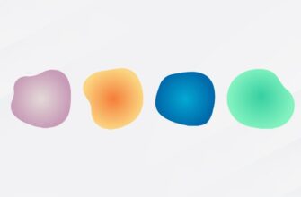
So, how do you beat the heat and practice sustainable branding in all its forms? By using light-infused tints of all the colors in the wheel. These light, bright, and breezy color tints are great for crisp summer designs. They make the work look fresh, generate an overall vibe of featherlight ease, and help you get closer to your sustainable branding goals.
15 Summer Color Themes for Your Graphic Design Inspiration
Explore these carefully curated 15 cool summer color palettes to revitalize your creativity (and save the planet)!
Note: These summer color palettes are ideal brand colors for spa and massage logos, fashion logos, beauty logos, and jewelry logos.
1. Ocean Breeze
Grab your sunglasses, beach umbrella, and loads of sunscreen. This cool summer color palette is right out of a Mauritius holiday. Feel the sand between your toes as you behold the majestic sunsets and cool green breezes!
This color palette is a thing of beauty for summer poster design. Want to make it more pastel? Switch the dark blue with turquoise and feel the cool breeze flow!

2. Vintage Beach Vibes
No summer color palette post is complete without a classic beach palette getting its fair due. The red and burnt orange here are taken directly from the California sun and should fit in for most of your vintage graphic design mood boards.

3. Plastic Daisies of Childhood Picnics
Ever noticed those tiny pink and blue plastic daises that little girls wear on beaches in old movies and TV shows? What if there was a perfect color palette for that?

4. Seaside Serenity
When you want a soft summer palette but don’t want the pink pastels there at all? This sandy and beachy summer color theme is right on the mark for a soothing graphic design piece.

5. Ocean Breeze in Azure
Blue is a versatile color palette and is one of the best colors to wear in summer. It speaks of ocean, skies, and beautiful turquoise beaches. If you want to create vast open spaces in your graphic design piece, blue in its various varieties is there to help.

6. Tropical Escape
Summers aren’t the same in all parts of the world. In harsh deserts where sandstorms are an everyday occurrence, light colors won’t do. Equip your graphic design work with a strong color theme for summer. Add pinks, burnt oranges, and deep soothing greens for a sturdy but soothing summer design.

7. Lemonade Stand
Flat colors are a delight in summer, especially in beautiful, pleasing contrasts. Color contrasts improve design accessibility and make your work a joy to engage with.

8. Sand and Sea
Strolling along the narrow streets of Italy cannot be captured in a color palette, or can it? Take a look below and tell us how close we are!

9. Castles in the Sand
Sandcastles are a unique mix of red smitten by the charm of the quiet sand. Display the emotions of this union in your design work through color themes bathed in shades of red earth.

10. Popsicles and Gumdrops
Pink and blue are quintessential summer color themes, especially in the backdrop of child-centered design. If creating artwork for a daycare or a toy store summer ad campaign, infuse your marketing with bubble pink and candy blue shades and for quick and easy access to your target market.

11. Sunkissed and Happy
Summer colors in all their light and charm are happy and delightful colors. Design a few summer-centric posts for your social media pages and refresh the feed for all your followers!

12. Summer Garden in Morocco
The summer color palettes of desert summers are unique affairs. These themes are rich in their reds and oranges and contrast beautifully with blues and whites. If your brand colors are a shade darker than what is customary for summers, establish a summer branding of your own. Make your dark tones vibrant by lightening and brightening them, and pair them with muted neutrals for soothing summer designs.

13. Tropical Punch
Tropical drinks not only taste good but also look divine. With their neat little umbrellas and peachy pink colors, they are the ultimate refresher. Translate their colors onto your graphic design work and get your audience buzzing.

14. Lilac Lagoon
Lilac is a dreamy color palette and creates beautiful feminine designs. This soft color holds the enduring power of blue at its core and creates the pleasing harmonies of blue mixed with indigo. Pair lilac with other colors in its family for a cohesive soft summer theme.

15. Watermelon Wonder
We keep talking about lemonades and peaches, but what about watermelon? Watermelon is the ultimate thirst quencher. It’s fruity, fresh, and sweet. And so is the color palette it generates. Integrate the summery goodness of watermelon in your summer-inspired design work and see the magic of red and green come about in unique shades and flares.

See these summer colors in action!
All these colors are great to look at but you don’t know how they will look in the real world. Put your worries to rest and see these colors in live action right now.
Visit our AI logo maker and try these colors in our design studio today. With each color present with its HEX code, you can ensure consistency and accuracy of each color. Use these colors in your logo design templates to see which produces the best real-world design piece.
If you like what you create, simply download the designs and use them in your branding. Our logo maker is easy to use and free to try. Give it a go!