Following a cardinal rule of modern graphic design, we always strive towards a ‘less is more’ philosophy. Clean aesthetics, minimal details, lots of negative space, and fewer features – that’s the ideal design of a modern brand identity.
But when it comes to sports – especially contact sports – the rules bite the dust.
From NBA to NFL, from sports clubs to little leagues, and from one kind of sports to another, teams and players look for sports logo images that are wild, aggressive, and dominating. Bright colors, bold logo icons, large custom typefaces, and crests – lots and lots of them – make up the bulk of professional sports logo designs.
As a designer creating streamlined and minimal design identities for other brands, it may be confusing to determine what makes a good sports logo. That’s where this article comes in. Here you will find plenty of design tips to help you nail the essentials of a sports brand logo.
So, let’s peruse these designs and the tips that come with them.
1. Metallic Design In Sports Logo
Make your sports team symbol command an even more dominating presence than before, adopt the metallic design elements to make it look rich.
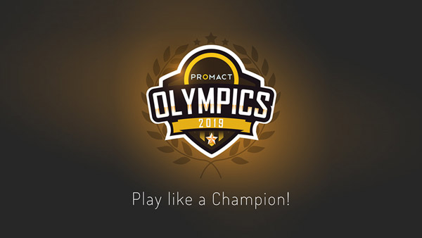
Image Source: Behance
2. A Sleek Shield
Shields and sports logo icons go way back. Use a crest symbol to make your logo look relevant to the industry.
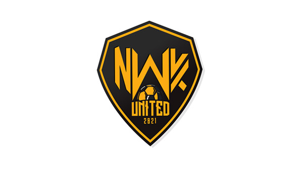
Image Source: Behance
3. Opposing Details
A custom typeface in modern design where its weight is in sharp contrast to the industry image it represents.
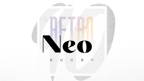
Image Source: Behance
4. A Personal Sports Coach
Create the most impact for your sports wordmark by breaking down your typeface. It makes the design look distinct.

Image Source: Behance
5. A Commanding Color Choice
Single blocks of colors in bold shades – yellow, red, green, and such – help your logo command a great presence. These colors are also great to spot from afar.
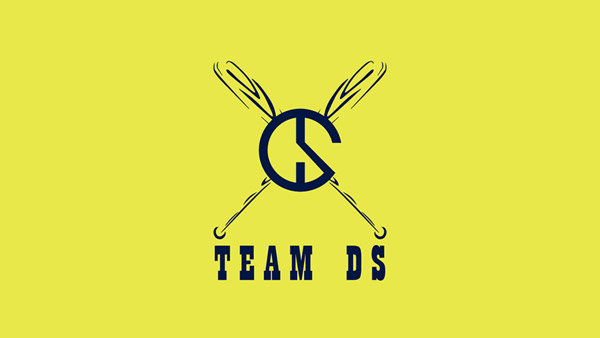
Image Source: Behance
6. Contrasting Fonts
Use a jagged custom font with a smooth and slightly slanted sans serif font. Fonts that contrast add a high amount of visual organization in the design.
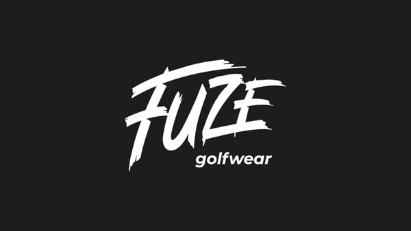
Image Source: Dribbble
7. Geometric Letter Shapes
Letters that are formed by using shapes add depth to the design. You are giving people more to look at in a single graphic.
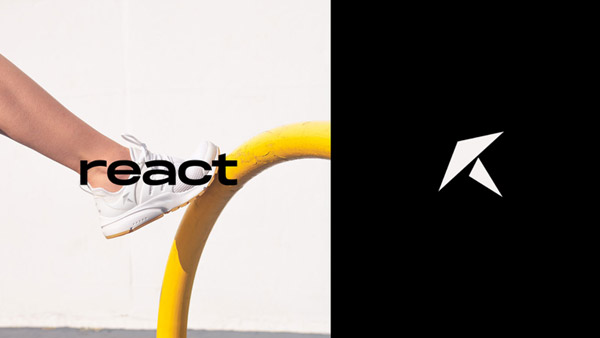
Image Source: Dribbble
8. Adventure Sports With An Abstract Logo
The ‘wild’ in the brand name gets an even more meaning when it uses as abstract shape as its symbol.

Image Source: Dribbble
9. Vibrant Colors
While sports logos are usually in bright and vibrant colors but most are too loud. This logo accomplishes a sophisticated look while still using a bright shade. The tip is to use a clean icon, simple font, and strip away the shine from the logo.
Image Source: Dribbble
10. Understated Colors With Jagged Type
When you are using a typeface that is high and mighty, balance it out by using colors that are flat in composition.
Image Source: Dribbble
11. A Statement Making Icon
Your sports logo real estate is precious. Make the most of the space available by using a single icon that is bold, commanding, and attention-worthy.
Fist logo with retro elements
12. Its All About Angles
Use lots of angles and geometry to make your sport logo look strong, resolute, and brimming full of confidence.
Eagle logo in motion
13. Focus On The Face
If you are using an animal on your sports logo design, keep the animal’s face in focus. Highlight the menacing features, the ferocious glare to drive the point home.
Animal logo for sports teams
14. Make Your Logo Move
Movement is an important part of sports logo aesthetics. Add features that show your icons in a state of action. Running, hitting, jumping—much like the energy seen in an athlete on an extra large rebounder—or design details such as flames, waves, and wings, all add movement in a sports logo image.
Athlete logo in black
15. A Playful Fitness Logo
Fitness logos have a lot in common with sports brand identities: strong icons, custom fonts, and bold colors. However, to streamline your fitness logo’s composition, choose an element that you want to highlight and keep all the other features at a minimum. In this case, the design uses two icons but only one of them is in a different color, singling it out.
16. A Fortified Logo
While shield is an impressive symbol, you can double down on it by adding fort and castle design details.
Image Source: Logopond
17. An Uneven Layout
The human brain remembers things in pattern. When you break the pattern, the oddity registers on the brain. Make use of it and create a layout anomaly that looks attractive.
Image Source: Logopond
18. A Sports Shop Logo
Sports team logos and sports logo that have anything to do with retail have quite different design guidelines. For the latter, focus on retail industry icons to create a relevant identity.

Image Source: Logopond
19. An Inverted Triangle
The upside down triangle is a symbol of femininity. It represents allure, mystique, and appeal. It can also be taken as a modern icon of location, which works for a racing management brand.
Image Source: Logopond
20. A Distinct Symbol
Use your sports team logo’s initials as the logo symbols for your brand. It makes your logo easily memorable and your team name readily recognized.
Image Source: Logopond
Wrapping It Up
Perhaps more than any other industries, the logos for sports teams have a lot riding on their (metaphorical) shoulders. They not only have to look their best but must contain details – historical connections, cultural references, and geographical links – that their fans can instantly recognize and rally behind.
The designs above have all that it takes to create such supporting brand identities. So take a look, some notes, and get down to design.

