A brand’s logo is its primary visual asset. It not only helps the audience remember the brand but develop associations with it. It also helps people form opinions about the brand and aids the brand in its image building and perception-making.
Since a brand needs to be present in a lot of places to be able to perform its functions properly, it must be clearly visible, legible, and understandable on a variety of surfaces, in different sizes, and varied spaces. To make it happen, you need to sit with your designer or design agency and discuss a long-term approach. This approach will get you different varieties of your logo design suitable for different occasions, surfaces, and sizes. A long-term strategy in the planning phase will make sure that your design remains consistent throughout the years and occasions, and isn’t damaged by haphazard attempts to meet unanticipated demand.
This post will talk about the different kinds of important variations you must consider for your brand, and see what each of these variations mean for your small business’ success.
1. Primary Logo
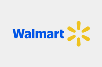
Your primary logo is the version of your logo that you most often use. It is your go-to logo. For most brands, the primary logo is in horizontal orientation – icon and text side-by-side – but some brands also favor a more vertical approach.
Either is fine as long as your design is solid. However, do keep in mind that certain spaces, like social media headers or website headers, are naturally suited for a horizontally-oriented logo design. The well-suited orientation for your brand also depends on how your icon is designed or how long your brand name is. For compact and concise icons and shorter brand names, a vertical logo can work. However, for brand monikers that are somewhat longer, a horizontal orientation for a primary logo may make more sense.
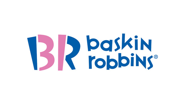
Image Source: Guff
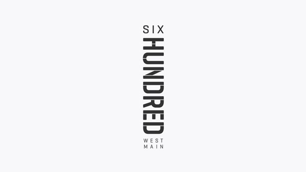
Image Source: Pinterest
Best For: Social media headers, website headers, product packaging, banners and hoardings, and official documents like letterheads, and others.
2. Stacked Logo
A stacked logo uses a squared or a grid-like orientation. As the name implies, it stacks the icon and the text in the logo on top of each other. This space-saving mechanism allows the logo to breathe in cramped advertising sections, tiny social media spaces, and even as your website favicon.
The stacked logo is usually in a squared or grid-like shape but is not perfectly square. The stacked orientation is only to make sure that the logo is still legible and understandable even when placed in tiny quarters.
Image Source: SquareSpace
Image Source: Pinterest
Best For: Social media icons, flyers and brochures, mobile app icons, and business cards, etc.
3. Submark
A submark is a logo variation that only uses the text part of your logo. For spaces that cannot accommodate your primary logo version but are still roomy enough to allow for a bit of text, it’s better to use a submark instead of a solely graphic icon.
The submark can be just your brand name or even a shorter version of it, like an acronym or just the initials. It’s better to have both variations ready to provide more suitable options as the occasion demands.
Image Source: KindPNG
Image Source: Pinterest
Best For: Website or email signatures/footers, social media profile pictures, graphical covers, and such.
4. Icons
An icon is a solely graphical variation of your brand’s official logo design. It consists of the icon and nothing else. You see it mostly displayed on t-shirts and other wearable brand assets. It also finds its place as website favicon and is perfect for social media profile spaces for better logo visibility.
Related: How to get a logo design for cheap for your business?
For typography-based logos where the logo design does not have an icon to send in its stead, an icon variation will include a submark that consists of only abbreviations or initials. One of the most famous examples of an icon-based variation of a well-known logo is the Nike swoosh. Few others include the Panda of the World Wildlife Fund, the golden arches of McDonald’s, and the iconic F of Facebook.
Image Source: Pinterest
Image Source: Wikimedia
Best For: Website favicons, social media profile pictures, on business cards, office or promotional stationery, and such.
5. Color Variations
In addition to shape-based and orientation-based variations, color-based variations are also important if you are focused on the big picture. Certain occasions call for brands to show their solidarity to events, causes, and milestones by painting their logo a certain color. The biggest examples of such occasions are the Pride month or the Black Lives Matter movement. As a conscious and aware brand, you can show your support to these human causes by replacing your official colors with the colors of the cause.
Some other examples of events that might ask for some color variation are the 4th of July, or Christmas, etc. To keep these variations handy, get your logo designed in the classic black and white as well as plan on the shades of the colors that you can use for any future occasions. With predetermined colors, even if you change your designer or are working with a collaborator, your logo will remain consistent throughout.
Some famous examples where the big brands have used color variations for their popular logos are, Coca-Cola with its distinct bottle in Pride colors or when Instagram changed its colorful gradient to all black to support the Black Lives Matter movement.
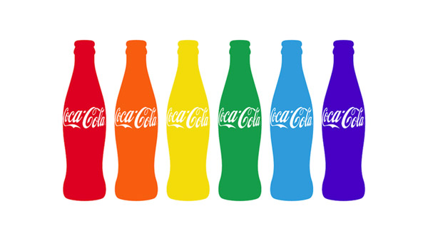
Image Source: Out.com
Image Source: Twitter
Best For: Special events and occasions, social causes, to take part in situations that are dominated by colors such as the 4th of July, and similar.
Concluding
The color variations play an important role in maintaining the consistency and uniformity of your brand logo across situations and mediums. The different ways you can add variations in your logo design make sure you have at least one version to suit a certain occasion. Often, these variations accompany slight (and appropriate) changes brand names or taglines to make the message more impactful.
Redesigning logos don’t have to be that difficult. You don’t need to have years of prior design experience to redesign your brand. Some logo creator tools are available at an inexpensive price, if not free. Or you can hop on to several freelance agencies to hire your designer in no time. Either way, redesigning logos don’t have to take a huge amount of hefty resources and time.


