Think of three car logo designs off the top of your head. What do they all have in common? Shine, simplicity, and strength are few of the most common factors you’ll find across automobile logos of various companies. The reason is that the automotive industry puts a lot of stock into strength, excellence, and simplicity, and strives to portray that through their automobile logo designs.
The five most popular car logo styles incorporate these characteristics and are therefore favored by automobile brands everywhere. While most of the car logos only follow one or the other style, you can also try to mix and match, as long as the elements are gelling well together.
Few considerations to keep in mind when choosing a particular style for your logo:
- It must be a natural/organic extension of your brand
- It should immediately convey the nature of your business
- While still being relevant to your industry, it must contain qualities that set your automobile logo apart from the competition.
Next, let’s review what the top five popular car logo styles are and which one can be the perfect match for your automobile brand.
1. Classic/Vintage Logos
Image Source: Behance
Orange and yellow vintage logo design
Image Source: Dribbble
When you think of classic car logos, think of elaborate illustrations. Shields, emblems, detailed drawings, and whatnot. From a modern design perspective, a vintage car logo can sometimes look ‘too much’. But in design, every style has its place. Therefore, if your expertise lies in vintage cars: their manufacturing, repairs, restoration, etc. a vintage car logo is the perfect style for you.
Pro Tips To Master The Classic Style:
- Add the design details but keep them on a moderate scale.
- To achieve an original classic look, avoid shine and metallic glosses.
- Rely less on design software and more on hand-drawn illustrations
2. Metallic Logos
Image Source: Behance

Image Source: Behance
Image Source: Behance
Metallic car logos are probably the most popular style there is. Mercedes-Benz, Mazda, Toyota, and many other companies sport metallic logo designs. The reason? Metal is a prominent part of the automobile industry. Metallic logos allow the brand to build on the polished sheen and class that these logos offer. Plus, a luxury car with a shiny metallic logo zooming on a city street gives a rich and sophisticated look to the whole vehicle and the brand.
Pro Tips To Master The Metallic Logo:
- Use natural metal shades for your metallic car logo: gold and silver.
- Pay attention to the incoming light source so your shine gradient is lightest near your light source.
- To make the most of your metallic logo, think of angles so the light has more places to reflect from.
Image Source: Behance
Gear logo with car steering

Image Source: Dribbble
If the shiny metals are too much for you, perhaps a more muted and minimalist logo is more up your alley. Tesla, Ford, Lexus, all favor the ‘less is more’ approach for their automobile logos. It helps you cut the noise and launch your business as a serious contender with a modern and minimalist approach to design.
A minimalist car logo is either a succinct wordmark or a standalone pictorial logo. However, brands also like to incorporate the two styles and go for combination logos but things are kept sparse. Using ample white space lets you achieve a minimalist look for your logo design.
Pro Tips To Master The Metallic Logo:
- White space is your best friend.
- Keep the color palette limited to two shades.
- Think of geometric shapes and angles to connect the design with the curves of the car.
4. Modern Logos
Image Source: Behance
Bike logo with wings
Image Source: Dribbble
Modern car logo styles allow you the opportunity to showcase that you are a modern car brand that’s in touch with the latest technologies and trends. This works especially well for automobile brands that target the younger audience.
Related: 10 Most Iconic Automobile Logos!
With a modern logo, you can give a fresh and updated look to your car business. Modern design is all about keeping it simple. Simple fonts, limited colors, and a clean layout. Most modern logo designs are flat. So, you can incorporate minimalist elements in your modern automobile logo but vintage illustrations may have no place on a modern car brand logo.
Pro Tips To Master The Modern Logo:
- Go simple on your design elements.
- Use bright spots of primary colors to make the logo pop.
- Sans serif fonts are perfect for modern logo designs.
5. Mascot Logos
Image Source: Behance
Image Source: Behance
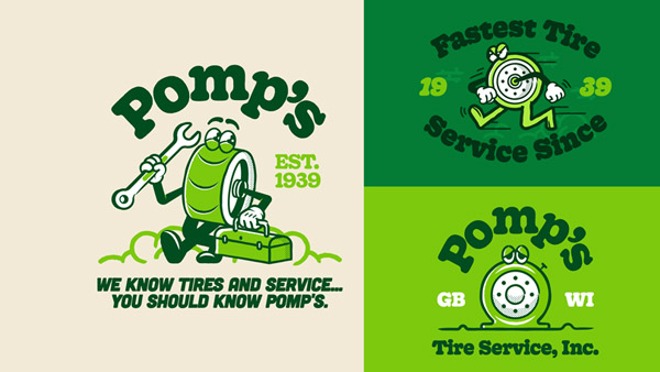
Image Source: Dribbble
While car manufacturing brands as a whole try to keep their logos more impersonal and objective, there are certain sectors of the industry that rely on more personal connections. Car repair shops, used car dealers, car detailing services, and similar thrive on creating personal connections with their customer base.
For these automobile businesses, a popular logo style – mascot logos – is a perfect choice. Mascot logos humanize the brand. They let the audience find humanistic similarities to the brand and invite them to see the brand as a relatable and intimate extension of the business. Trends of classic logos often overlap with mascot car logos.
Pro Tips To Master The Mascot Logo:
- Use the mascot logo style if you have a great brand story to tell.
- Works for service-oriented car businesses.
- When drawing your mascot, focus on a single emotion that’ll be its primary trait.
The Takeaway
Before you get started on designing the perfect logo for your brand, pay attention to if the style you’ve chosen is suitable for the type of your business. As a basic logo design rule: always design for your brand. Your favorite style from this list may not be appropriately suitable for the kind of automobile business you run. Therefore, pivoting must be your design mantra.
In the words of writing legend, Stephen King, ‘Kill your darlings’. Whatever design element isn’t working for your brand must be eliminated, no matter if it was your favorite.


