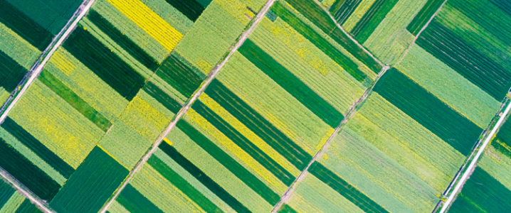
True, green is the most popular and, let’s admit, the most natural color choice when it comes to designing a farm logo image. However, when it comes to making a distinguishing impression on your audience, green is not exactly the color that can set you apart from other farmers. So what are your other options?
Luckily, there are other colors that can help you make a splash in the agriculture logo market. These colors, sometimes alone and sometimes paired with other colors in the wheel not only make the design look more relevant sometimes but also seem fresher, more unique, and having an original thought.
So, without more preambles, let’s find out what our alternate color choices are:
1. Shades Of Green
We have to get this out of the way. Sometimes designers and farm business owners do not want to let go of the immediate recognition the color green provides to an agriculture-related business. Therefore, artists have to think of unique ways to incorporate the color green in agriculture logo without making the design look too generic. That’s when the wonderful (and multiple) shades of green oblige us with their variety.
The shades of the same color not only make the design look better but add layers of creativity in it too. You can show a lot of depth and dimension in your agriculture logo ideas by cleverly picking out certain shades and hues of a single color to adorn your image.
Image Source: Behance
Tree logo with leaves and stem
Image Source: Dribbble
2. Complement It With Black & White
While green is a very soothing, calming, and welcoming color, it can also look ‘too available’. This is especially counterproductive for agriculture businesses that want their brand image to be exclusive and private.
To achieve that, the most sophisticated and luxurious color on the wheel – black – comes to the grand rescue. You can pair it with a deeper shade of green to achieve a highly stylish and classy look. Or, you can choose to go with an all black-and-white ensemble for your farming logo design.
Since the latter is rarer, it is best suited to give you that elite look that you’re looking for in your brand identity.
Image Source: Behance
Bottle and sun logo
Image Source: Dribbble
3. Other Earth Tones: Brown, Beige, & Yellow
Most farm owners are looking for logo designs that make them look more approachable, more authentic, and closer to natural farming practices. To achieve such a design without using green (or using it just as a secondary color), we have other earth tones to be thankful for.
Brown, beige, and yellow as representatives of soil, ground, and sun, help designers create agriculture logo ideas that look relevant without looking repetitive. Sometimes blue is also thrown into the mix to mimic the sky, irrigation, or rivers – water sources that are critical for agriculture. Blue is also the perfect color to use for a fish farm logo.
You can choose to use all of these colors into a single design to achieve the maximum effect, but we recommend against using more than three colors in one logo design. Unless, of course, you’re a Paul Rand-level designer and know what you are doing.
Image Source: Behance
Sun and leaf in a yellow logo
Image Source: Dribbble
4. Use Some Contrast
In design, there aren’t many things as attention-grabbing as the element of contrast. Pairing things together that don’t always go together makes people pause, look, and take notice.
Related: How to Use Contrast to Create Depth and Impact in Your Designs
Apply the same logic to your farmer logo designs when choosing colors that can set you apart from the crowd. Red is the perfect contrasting color to green. However, you can also pair green with bright pink, orange, or even purple for a striking effect.
Image Source: Behance
Fall logo with orange icon
Image Source: Dribbble
5. Something Really Unique
There aren’t many designers (or business owners) willing to take risks when it comes to designing their farm brand logos. And that is precisely why a well-executed risk has the potential to pay-off. In terms of color, this risk can be using colors that we don’t usually see on farming-related graphic design.
Colors such as pinks, reds, blues, oranges, and purples – without any green anywhere near them – can give your farming business logo a decidedly noticeable and interesting look. In a sea of greens, these colors automatically make your logo stand apart.
Image Source: Behance
Pattern logo with tiles
Image Source: Dribbble
The Takeaway
Sometimes, popular choices don’t always help us make distinct impressions. Therefore, it is okay (and necessary) to try to carve out our own unique identity, in unique ways, to stand out from the rest of them. When businesses design agriculture logos or farm logos, the most popular color choice – green – can backfire when we are trying to distinguish ourselves from other businesses. Therefore, involve some creative thinking in your creative process and use these unique color combination ideas to mark your farm one of its kind.

