It all started in the ‘50s.
Artists like Andy Warhol, Roy Lichtenstein, and James Rosenquist were gaining prominence. Their art was different. A lot different than the traditions of classic fine art which always revolved around expressions of mythology, philosophy, morality, and religion.
These artists were scoffing at all that and instead were knee-deep into creating something new. This something new was bold, popping, adventurous, and thoroughly exciting. In simplest words, their art, especially that of Andy Warhol’s, was open and electrifying experimentation of modern art’s relationship with capitalism, advertisement, and Hollywood celebrity culture.
They called it ‘Pop Art’. Art that was inspired by popular culture, mass media, and an extravagant postwar Western society.
Is Pop Art A Good Choice For Brand Designs?
In a nutshell, modern brand design is simple, utilitarian, and minimalistic. Brands want their brand names to shine, their symbols to remain visible above all else. So, if you are wondering if pop art, with its saturated colors and opulent graphics, is truly the right choice for a modern brand design, you’re not entirely wrong.
But here’s why we at DesignMantic think pop art in brand identity visuals is an exciting choice for a modern brand.
- In a sea of flat colors and single icons, pop art’s bold visuals will help your brand command instant recognition.
- Simple designs struggle with making a brand look lively and interesting. Pop art is all about high energy and can bring your brand to life.
- With its themes of repetition, pop art can help you emphasize your brand message without too much effort.
- Industries like advertisement, entertainment, fashion, retail, and early childcare are especially suited for brand designs in pop art tradition.
Here we are sharing 8 ways to use pop art in your branding and leave a first impression that can last your consumers till the ‘Check Out’ page.
1. Large & Opulent Graphics
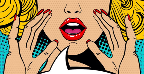
Image Source: MasterClass
Right off the bat, the most identifying feature of the pop art design is its larger-than-life images. Pictures and graphics overtake the most space and are the first to be noticed. Creating such graphics when you are designing posters, store signboards, podcast covers, and website product pages can help you direct the audience’s attention to where you want it in an instant.
While an oversized picture may not suit a logo design, you can translate this concept to typographical logos and create a type-based design that uses over large fonts.
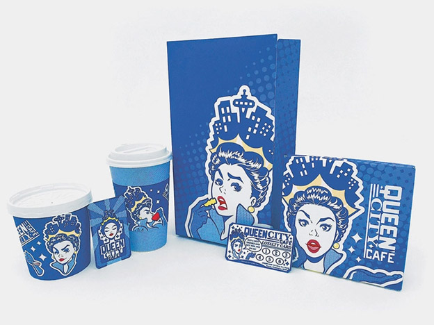
Image Source: Dribbble
Image Source: DesignMantic
2. Bring Fame & Celebrity Into It
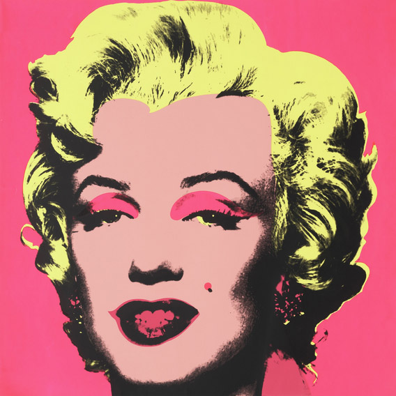
Image Source: MoMA
One of the major themes that pop art is known for is its giddy use of everything celebrity. Andy Warhol’s Marilyn Monroe painting is a famous example of it.
As a brand, you may not want to use a celebrity’s picture as your identifying symbol, but you can use these paintings and representations as inspiration to design something similar. One of the greatest advantages of using pop culture icons or their similarities in branding is the easy recognition they bring to the art.
If you choose to showcase your brand mascot as the world-famous Marilyn Diptych, instant recognition is almost guaranteed.

Image Source: Dribbble
Image Source: DesignMantic
3. Do It Like The 50s
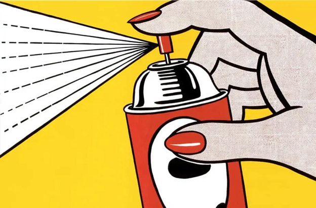
Image Source: The Artist
The 1950s and the 60s that birthed the Pop Art movement were a time of a very specific kind of style. Dominated by abundance, these styles showcased elaborate hairdos, big glasses, ruffled dresses, stretched-out cars, and full lips.
If you are a fashion, clothing, or style accessories brand, you can use these themes to create a website design, poster design, or even logo design that showcases your unique vibe. Using these designs you can elevate your brand of everyday objects and turn them into works of art.
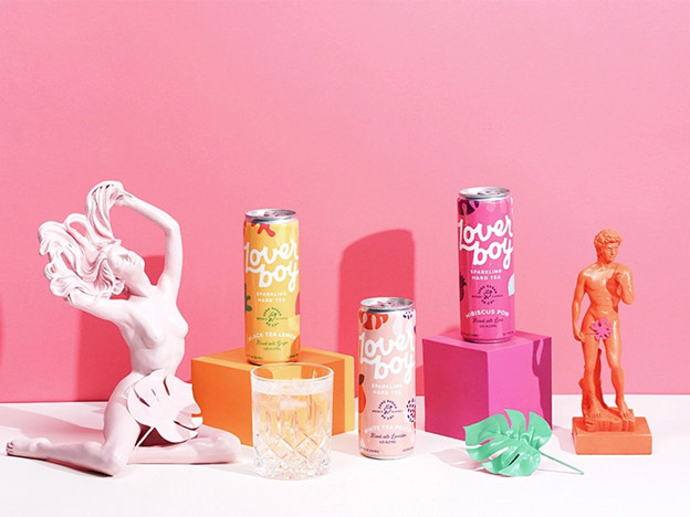
Image Source: Dribbble
Image Source: DesignMantic
4. Saturate The Colors
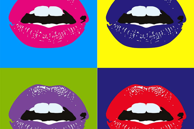
Image Source: WideWalls
‘The bolder the better’ is the philosophy of Pop Art whenever it comes to colors. In fact, colors are the most visual elements pop art always uses to say what it wants to say. Primary colors, red and yellow, are almost a staple of pop art pieces. Enhanced by dark outlines, both these colors, at their most saturated, allow the message in the art to be unmistakably clear.
As a designer, even if you are new to the field, you would be aware of how color is the most communicative element in design. Colors, in their varying shades, have the power to influence moods, emotions, and even buying decisions.
If you looking to make the most impact via colors in your branding, pop art is where you begin and end. The movement is all about bold and striking colors if nothing else.
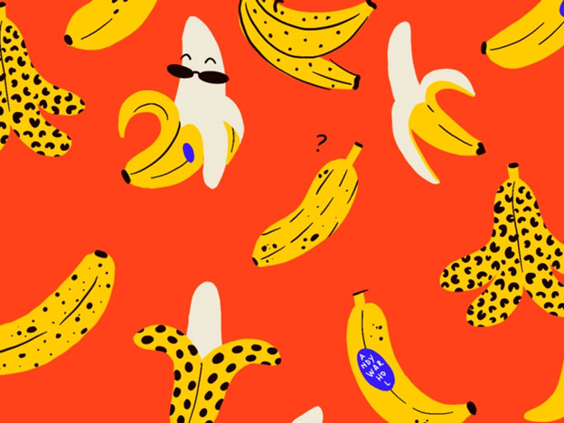
Image Source: Dribbble
Image Source: DesignMantic
5. Repeat, Combine, & Duplicate
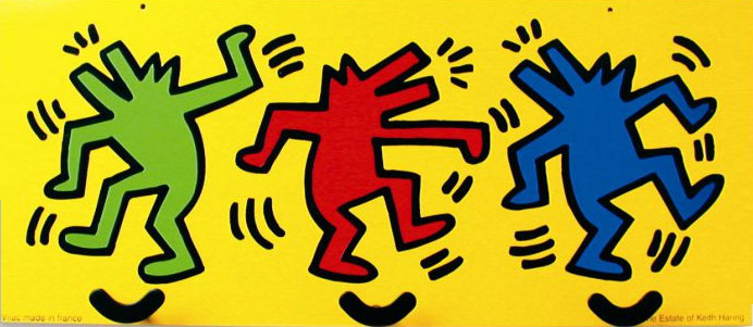
Image Source: Prospevack
Repetition is a trick that artists have been using since the dawn of time to ensure that their intended message is never lost in interpretation. Pop Art has used it to such an extent that duplication and repetition have now become synonym with this style of art.
In branding strategy, the use of repetition is done to emphasize the brand message. Using the same color in various shades, the same shape in different contexts, and the same font in various sizes are a few of the many ways we can use duplication to highlight what we have to offer.
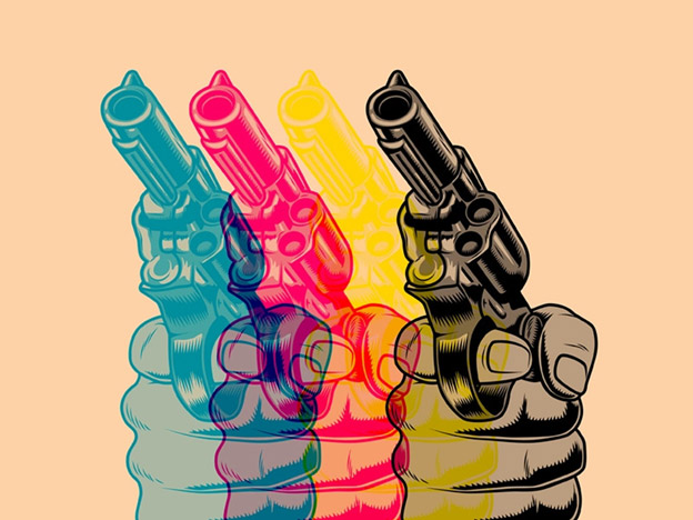
Image Source: Dribbble
Image Source: DesignMantic
6. Make It Into A Collage
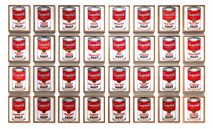
Image Source: Sotheby’s
The first famous Pop Art collage was created by Andy Warhol, again, when he painted the Campbell Soup Cans and produced a modernist masterpiece.
Since then, collage designs have been famously associated with pop art traditions. To use them in your brand identity design, the most appropriate assets would be your website, the back of your menu card, and the design of your promotional flyer. You can reproduce a collage onto a logo design but make sure the relevant industry is visual enough to have a connection with your choice.
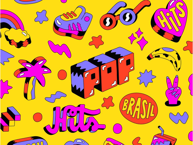
Image Source: Dribbble
Image Source: DesignMantic
7. Elaborate And Noticeable Typography
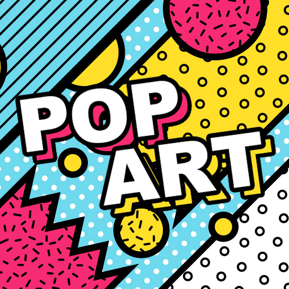
Image Source: CaseCompany
Typography is an important part of brand designs. From marketing to identity visuals, you really can’t do much for a brand without some well-chosen and well-designed words helping your cause. For typography-based designs, words and how you design them becomes the only thing that matters.
In Pop Art, it’s the graphics and images that play major roles. With typography making its most impact in pop art in comic book style renditions. So, that’s your playground when text is an integral part of your branding.
With that said, if you can bear to stride a bit further away from the most committed pop art traditions, type representations are as vast as they have always been. A bit of shadow work, some outlines, and the most popping font styles and sizes you can find and you’ll be good to go.
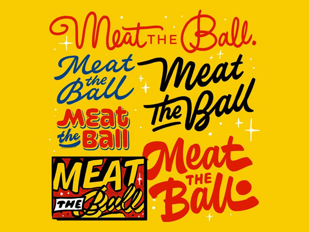
Image Source: Dribbble
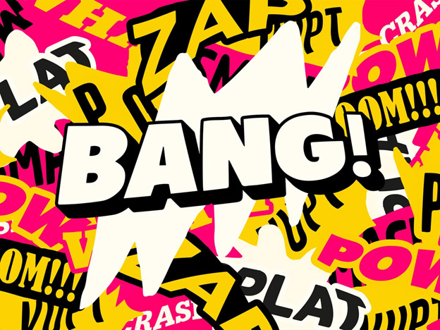
Image Source: Dribbble
8. Clear Lines And Sharp Sketches
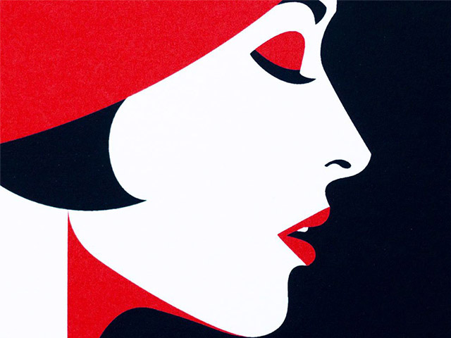
Image Source: Virtosu Art Gallery
What is a simple way to make an image pop – apart from using a striking color? Make sure that it is enclosed in some hard-to-miss outlines. The outlines draw the eyes and help us view an image or word as a whole identity separate – but still connected – from others in the picture.
Sharp and prominent drawings are an unmistakable mark of pop art culture. They usually accompany the most out-there pop art and you won’t normally see them on the subdued versions. These drawings make you think of comic book strips, newspaper cartoons, and magazine inlays.
This way of infusing pop art in your brand identity work is perfect for type-based logos the most. But you can also use these sketches to create main art for inventory pages, announcements, and even social media ads.
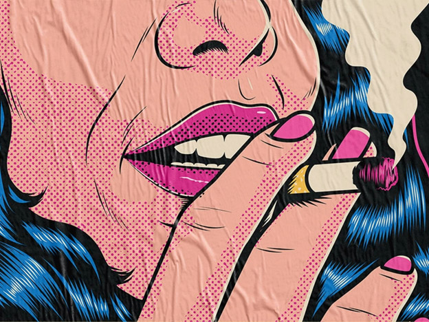
Image Source: Dribbble
Image Source: DesignMantic
The Final Word
While pop art has a rich history that you can draw from as you design your own work, remember that the underlying theme of this style is original interpretations. Look at the latest in the mass media around you, the social media, the celebrity culture, and modern consumerism, and then create designs that communicate your unique ideas.
Not only your audience but your brands will also thank you.

