“A good snapshot keeps a moment from running away.” E. Welty
This is perhaps the truest thing somebody could have said about photography. Photographs enable you to visit moments passed in time. Much like a good line of poetry that you want to read more than once. And in terms of creating lasting impressions and memories, branding is not that different from photography, or so we like to think. When done right, photography logo and branding creates characters and personalities that elicit emotional responses, make you feel things, and encourage you to take action.
As a visual artist, you know the importance of images. Visual branding is about composing an image in the form of a logo that captures your distinct artistry with a healthy dose of what sets you apart from others. And when it comes to creating emotional and alive brands, nothing conveys feelings as effectively and powerfully as colors do.
Colors In Photography Logos
We are evolutionarily and psychologically designed to associate meanings to colors. That’s why most of us start feeling a sense of serenity in nature. The abundance of calming colors like blue and green soothe our soul. And this color association is the reason we are equally mesmerized and afraid of darkness – it holds all the mysteries of the night, good and bad.
These universal color associations play a significant role in photography logo designing. As a visual artist, you want to present your best side to your potential customers, and you want them to know why it makes you different from everyone else.
A thorough review of famous photography brands – examples – tell us that there are some distinct color combinations that photographers always want to make part of their brands. As black-and-white photographs are considered the pinnacle of photographic artistry and exude class and grace, most photographers go for a black-and-white logo. Photographers who want to add a touch of adventure to their logo design, accent their black-and-white logos with reds, yellows, and blues.
Still, some truly want to create their own space and go for pinks, purples, and oranges. These photography brands want to portray a sense of adventure, joy, femininity, and fun.
Next, we have collected for you several logo designs created by our talented artists as we talk more about color choices in photography logo designs and the trends that are favored by the industry.
Sophisticated And Elegant: Black And White
Nothing can rival the sophistication and simple perfection that you can achieve by combining black and white into a design. The combination is timeless, and if you want to be known as the artistic photographer, black and white logo is for you, my friend.
The reason these are such great colors together is they complement each other’s strengths and offset each other’s flaws. Black looking too drab and one-dimensional, play it up with white space. White looking too vague and bland, add the mystery of black. The colors are literal opposites of each other and that’s why so exquisitely complementing.

Black and white camera logo

Line art cloud logo with camera and cloud

Geometric camera logo for photography brand
Luxury With A Dash Of Drama: Accented With Red
If black and white is color perfection in contemporary photography logos, well, sometimes it can be too perfect. To prevent your logo from looking coldly precise, perhaps a bit of an accent color is all you need. After all, as a photographer you know what a tiny bit of color can do to an otherwise neutral image.
Here, for your inspiration and ideas, we have chosen to show off the drama with the most dramatic color: red. But you can pick any other color you like: yellow, hot pink, bright blue, sunset orange.
But with red, you get the most impact with comparatively little effort. As you can see, our selected logo designs use red right in the middle of the logo: the camera’s lens. It’s a deliberate decision. You can choose to have it on any part of the logo you want. The idea is to make the design pop with a dash of color without upsetting the overall sophisticated concept.

Camera lens logo in red and black
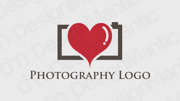
Camera with a red heart logo in the middle

Red camera lens logo for commercial photographers
Related: Ways To Go About In Designing A Photography Logo
Fun And Feminine: Purple & Pink
After black, white, and red, the colors most photographers go for are pink and purple. Combining these colors with other colors or with different hues of the two shades, you can achieve a very fun, energetic, and cheerful logo design.
This color especially suits a modern photography brand that’s embracing its feminine galore and having a lot of fun. Experimenting with different tints of pinks and purple, you can use these logos for a variety of photography businesses: music and fashion photography, wedding photography, children and pet photography, and even corporate photography for modern tech startups.
Purple and pink are especially appropriate for photographers who want to show off their daring and fearless side.
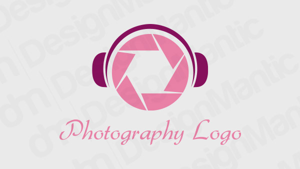
Headphone logo with camera shutters
Pink logo with the camera lens in a suitcase
Purple abstract logo for photographers
Hip & Modern: Make Sure It Has Blue
The last color combination we are going to talk about today is blue mixed with any other color. Blue, especially the turquoise side of it, is ultra-modern and highly engaging color. It’s subtle enough not to overtake the other elements and powerful enough to still leave its mark. You can use blue as the primary color in your photography logo – great for outdoor photography brand or ocean photography – or the accent color, it comes in enough shades with enough meanings to represent you as perfectly as you want.
Related: Why Social Media Sites Prefer Blue in their Logo?
On one end, it is calming, soothing, and cool to the eyes. On the other, it is mysterious, sophisticated, and electric. Depending on the shade of blue you choose for logo, it can be as youthful and as subdued as you want it.
With blue, you just simply cannot go wrong.

Camera in a suitcase logo

Blue videographer logo shooting footage

Blue line-art camera logo
Honorary Mentions
Though we have to conclude our discussion on photography logo colors here today, we cannot do it without some very honorary mentions. You won’t see these colors on photography logos every day, but when they are done with enough care and creativity, the results are simply too good not to share here.
• Black With A Dash Of Yellow
Camera icon in a black and yellow logo
• An All-Red Affair

Red heart logo for photography
• As Yellow As The Sun (Flower)
Sunflower logo for a photography brand
Related: Notch Up Your Business with Effective Photography Brand Identity
Finally, Let’s Sum Up.
Creating a visual identity for your photography brand that lasts a lifetime is as important as capturing photographs that cease moments.
Creating such an identity is not ‘creation’, it’s more like a ‘discovery’. A process very similar to soul searching:
- What is your distinct style of photography?
- What shots stir your creativity?
- What’s unique about your artistry?
Arriving at these answers brings you closer to knowing who you are as a photographer and makes it easy to know what elements and colors best represent that unique character. By choosing the best colors, you ensure that you’ll be evoking the right emotions in your clients when they look at your logo. And that’s battle half won.
Try Our Online Maker To Create:
Logo Designs For Corporate Photography Services
Logo For Children Portrait Photography
DIY Logo Maker For Photography Studio
Logo Ideas For Portrait Photographers
Wedding and Family Photographers Logo
Aerial Photographers and Surveys Logo Designs

