Colors are perhaps the trickiest detail to get right when it comes to logo design. For advertising and marketing logos – an industry that is by default design-forward – it becomes paramount to choose the exact right colors to emphasize and amplify your brand persona and message.
The decision to choose the right color depends on multiple factors. The type and nature of your business, the market or culture you are targeting, the established standards for your niche-industry, and the unique advertising logo design you’ve got to work with.
Here’s a guide to help yourself familiarize with 4 sure-fire ways to nail your ad logo design colors every time.
1. Think Of Your Brand Characteristics
What is the nature of your business? Within the ad world, where do you stand in terms of your offers and activities? Are you a local firm or an international brand? Is there a specific product-market that you cater to? What is the unique flavor of your global advertising agency? Are you adventurous, a trail-blazer, or follow the solid standards of the market?
Everything about your business and brand can have an effect on the choice of your ad logo color. An astute designer will look at the whole brand picture and pick out salient points that he/she wants to highlight. The colors will then be chosen on the merit of which shades represent those specific characteristics the best.
Related: Use Visuals In Branding To Engage And Influence Your Audience
So whether you are an entrepreneur or a designer, make sure that you know all the itty-bitty parts about the brand vision, scale, future growth, and unique character. This thorough knowledge will help you customize a color-palette to suit your brand requirements to a T.
Image Source: Behance

Headphone logo with screaming face
Image Source: Dribbble
2. Think Of The Color Characteristics
When you’ve got the low-down on the brand itself, it’s time to think of the colors that reflect your brand characteristics the best. We know that human beings are hard-wired to associate certain meanings, feelings, emotions, and moods to certain colors. For example, we associate passion and intensity with red, green makes us think of nature, and white brings to mind images of vastness and purity.
In the same way, all colors contain some inherent meanings for us. Therefore, paying attention to these inherent meanings of each color will help us figure out which colors are best-suited to represent our advertising brand the best. If we are going with daring, fun, and adventurous feel, we can go with bright pink, cheery yellow, an attractive purple, or even a dazzling shade of blue.
For a more corporate-minded marketing company, more dependable colors like beige, black, white, and muted shades of cool colors like blue and green are more suitable.
Remember, there are no hard rules about what is right and wrong in design. It all boils down to what is right and wrong for your particular brand. So keep your brand values, character, and message in mind when you are deciding about color (or other) choices for your brand logo. The more in-sync and harmonized these two sides are, the more natural and effortless the design will seem.
Image Source: Behance
TV logo in speech box
Image Source: Dribbble
3. Cultural Associations
In addition to brand character and color characteristics, it is worthwhile t note that culture plays an important role in how we associate certain feelings to certain elements. In some cultures, showing off your product with pride is considered the ‘it’ thing. However, there are those cultures and communities that prefer a more underrated style.
Think of the market you are going to tap and its culture when finalizing the color choice. More so than shapes and font, colors are what make an impression. These are the details we notice first in any design. Therefore, get your colors absolutely right. In the West, the white color is considered a representation of purity, safety, and cleanliness. In some Asian and Middle-Eastern cultures, white can be a sign of widowhood or mourning in certain contexts. Even within the same culture, one color can hold many meanings. For example, black is considered a somber color to mark mournful occasions. However, the same color is considered the epitome of elegance and fashion when it comes to high-fashion and Haute couture.
So, keep cultural associations of different colors in front of you when choosing your final color palette.

Image Source: Behance
Dragon logo in green

Image Source: Dribbble
4. Industry Trends
There are certain standards or industry best-practices that drive trends in every market; it’s true for advertising and marketing too. The industry is visionary, understands the critical role of design in business, and prides itself on taking risks and introducing trends.
When you enter this industry as a new marketing company or media buying agency, you need to make calculated decisions about how to best present your brand’s visual identity. You want to make a splash without looking garish. You want to be noticed without sounding attention-seeking. To balance these scales, logo design plays an important role. Pay attention to what the ongoing trends of the market are. Do the up-and-coming agencies going with contemporary logo designs or keeping it abstract? Are 3D logo designs in vogue? Will you be better off choosing an RGB theme or perhaps a more modern CMYK should be your thing?
Pay attention to what’s going on in the market before you make your big introduction. It will help you stay on par with the competition and will launch you as a serious contender.
Image Source: Behance
Mobile phone logo with mic and music
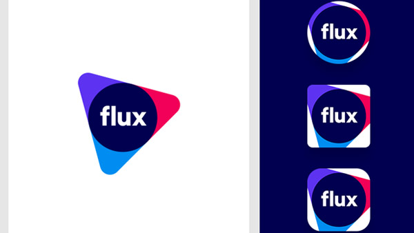
Image Source: Dribbble
Takeaway
Choosing the perfect color for your advertising brand can be tricky. But hopefully, these useful tips will help you navigate these confusing waters successfully. Focus your efforts on bringing together unifying properties between your brand and the potential colors to make a winning choice. Paying attention to color psychology principles, cultural connotations, and industry trends will also help you stay on the right course.


