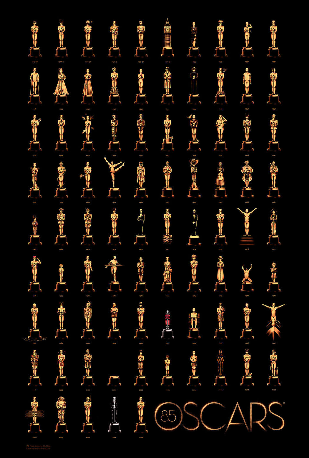
How Oscar Awards Originated? It all started back in 1927 and 1928 when the first ever Oscar was award (Statuette) was designed. This particular statuette is the symbol of Academy Awards, that’s one of the reasons why everyone who is bestowed with Oscar Award thanks Academy in the start of their speech. Initially it consisted of just 36 industry members when these awards started and now there are more than 6000 members. The Oscar was originally named as “Academy Award of Merit”.
Oscar’s Logo & Identity:
Cedric Gibbons (Art Director at MGM) designed the first Oscar statuette. The first Oscar statuette / logo featured a knight holding a sword and standing on the reel. Almost 2900 plus Oscar statuettes have been presented. There is a hidden A in the “OSCAR”. This is the strongest identity of the Oscar’s Logo. Oscar is considered as the most prestigious award in the American Film Industry.
Evolution Over Years:
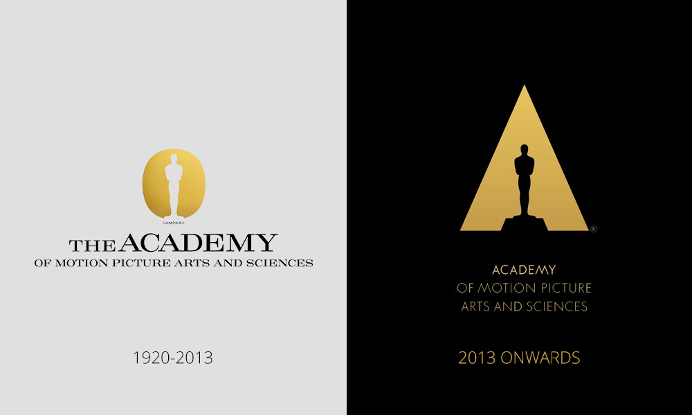
With the passage of time, the trophy and logo of Oscar impressed everyone in the field and with the strong determination the logo faced no major changes, until 2014. With just a few strokes of moderations the logo was itself very strong, dominant and substantial.
The Power Of Consistency?
The core idea behind keeping the logo of Oscar consistent and not changeable is the fact that the logo of Oscar has all the significant elements which are required and needed in a great logo. For instance, the logo is very simple and over the period of time, a huge number of people can easily relate and recognize it. This is one of the major essential element of keeping the logo consistent and not transforming hugely.
The simplistic approach always works and Oscars’ logo is the perfect example of that. The logo is easy to remember and offers great visual aura to the individuals.

Credit: Illustration By Olly Moss
What Other Brands Can Learn From Oscar?
Oscar teaches many branding lessons to other brands. Oscar preaches that branding is for appearance and experience. Following is a list of inspirations which different brands can learn from Oscar.
It’s Always About Simplicity:
A simple logo is very strong. Every designer tries to come up with simple yet unique logo, Oscar offers the same and is very impactful. Brands need to focus on keeping their logos simple, that’s it.
Strong Designs Don’t Need To Transform More Often:
If you have a strong design, then you don’t need to upgrade or innovate it. A well-conceived and thoughtful logo design is what Oscar always had and is still following with. Brands needs to understand and learn this in particular from Oscar’s logo.
Clear Message To Communicate:
The logo and trophy of Oscar pass the clear message. The message of victory and appreciation. A logo should always communicate the main message. That’s something integral in the case of Oscar’s logo.
Easy To Recall:
You can spot the logo of Oscar anywhere. No matter, wherever you see it, it can be easily recalled. This is the power of the logo of Oscar. This should be understood and learned by other brands, while designing a logo.
Pride And Esteem:
The logo of Oscar shows a pride and it is respected all over. This kind of association of pride with a logo is not easily earned. Oscar has gained repute and esteem in its domain over the year by keeping it genuine. Keep your brands genuine to reach success.


