Email marketing is thriving. With more than 4 billion active daily users, email stands as the most popular means of marketing for businesses and brands worldwide.
According to Litmus’s State of Email Marketing report, 37% of brands increased their email marketing budgets in 2022. The return on investment (ROI) in email marketing has always been higher than any other form of marketing, but it is now 36% for every dollar spent. An impressive number. The Litmus report has also declared email marketing as essential for business success. The Litmus report has deemed email marketing, along with the utilization of email marketing software, as indispensable for achieving business success.
With so much depending on your email marketing success, it stands to reason that when you design a marketing email, it should be a thing of perfection. Flawless, pristine, and action-oriented. You can use email template creators to ensure that you avoid errors. Right from the header to the last line of your signature — which brings us to the topic.
Why Is It Important To Create An Email Signature
Let’s see why:
- They’re a professional way to sign off your emails.
- They establish credibility.
- They’re an easy way to brand your business emails.
- You can use them to supply additional contact information.
- They’re your last chance to leave a lasting first impression.
- You can link your social handles in your email signature and use them for further user engagement.
- They also help with conversions.
Plus, there’s also a thing called the Recency Effect. In cognitive psychology, it’s considered a type of bias. It basically says that you remember the last thing you hear better than the first thing you hear.
Meaning, that when crafting a marketing email, your signature is as important as your email’s subject line or the intro.
10 Best Practices For Email Signature Design
Use these design tips and tricks based on your campaign goals, brand objectives, and audience preferences. Choose what works and discard the rest.
1. Optimize the Size
In design, size always matters. The blank canvas of design is considered prime real estate where not an inch of space should be given to unnecessary elements. Additionally, cluttered designs translate into heavy visuals that affect the page load speed and alert the spam filters. To ensure your signature’s branding doesn’t come at the cost of reaching the inbox, you should periodically test your email deliverability to see how various mail servers handle your visuals. And we can’t have that.
And we can’t have that.
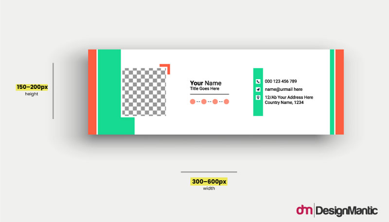
Optimize your email signature by cutting down on the clutter. Keep the size 300px–600px wide and 150px–200px high. It’ll ensure quick loading, force you to consider your content carefully so you can only add details that are important, and thus help you end your emails on a strong, well-structured note.
2. Have Contextual Signatures
You should always have more than one signature in your repositories. One for outgoing emails, one for replies or forwards, one for internal communications, and so on.
Depending on the scope of your responsibilities, you can have as many as 3-4. Having varied email signatures ensures that you can end every communication on the best note possible. For automated signature management across your organization, consider integrating with reliable transactional email services. Also, using a free email verifier ensures the accuracy of email addresses, improving the effectiveness of your outreach efforts.
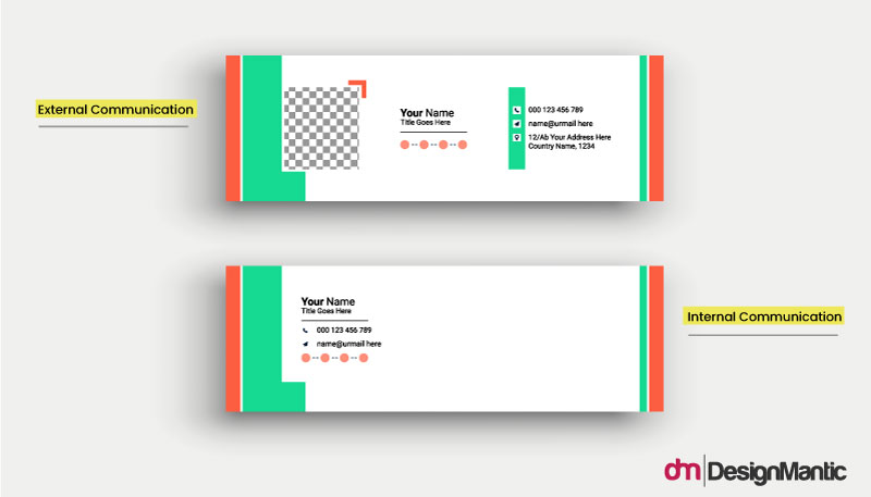
Content-wise, each of your email signatures can have a different set of information. Your main signature can have all the necessary information, including your brand logo and a headshot. But your signature for internal emails could be briefer, with just your name, position title, and contact number.
3. Provide Necessary Information
No matter how critically important a good email signature is, it’s fair to say that people won’t be reading it from start to finish with a focused mind. Most of them will just scan to look for the most relevant information.
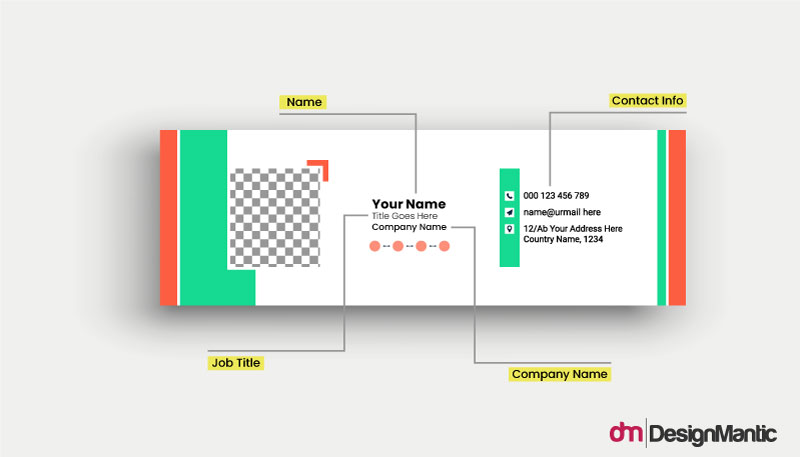
Therefore, all your email signatures should have these 4 pieces of necessary information in it:
- Your first and last names
- Job title or department
- Company
- Phone number
Don’t add any redundant information to it, like your email address. It’s already there on the top of the email and adding it will take up precious real estate on the short email signature.
4. Include a Headshot
Adding a high-quality profile picture to your email signature helps people put a face to the message. It improves your credibility as a professional and people can see that you’re a real person and not a bot.
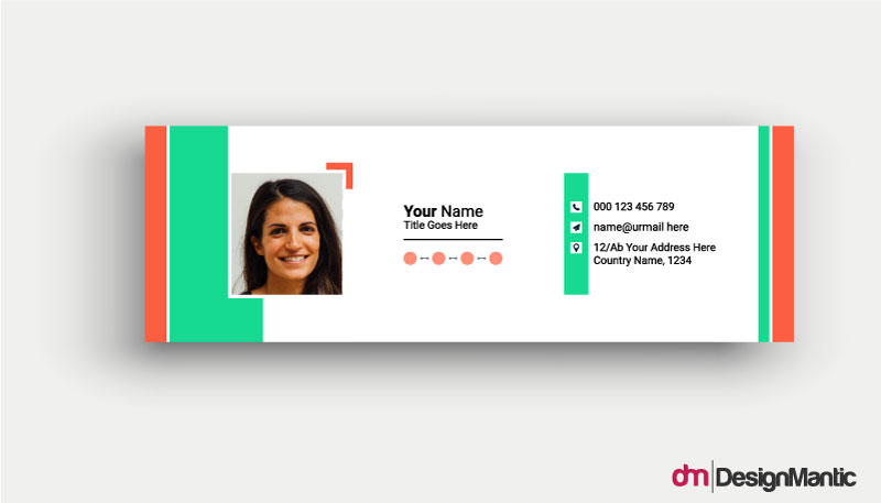
Make sure that your profile picture has a simple background with no distracting elements. Avoid cropping the edges and add a bit of background to the border of the image. Also, make sure that there is enough contrast between your face and the background. And, don’t forget to smile! People respond more positively to smiling faces.
5. Add Your Logo
Your email signature, especially your main one, must include your business logo. A high-quality logo with a width of 150px-300px.
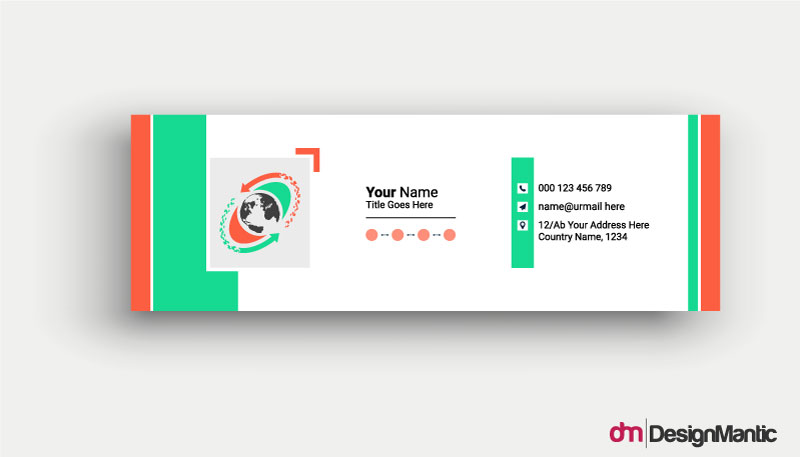
Add it alongside your company information for better viewing and brand consistency.
Please note that don’t cram your logo and profile picture in a single signature. The space there is limited so choose wisely. Use your business logo when you think it can help you establish a more credible position with your audience, and go with your photo when you want a more personalized approach.
6. Create Content Sections
To introduce some visual hierarchy to the email signature design, it’s necessary to group the information into sections and prioritize where each section would go.
While the final decision would depend on the overall design, you should ensure aim for cohesion and easy scanning.
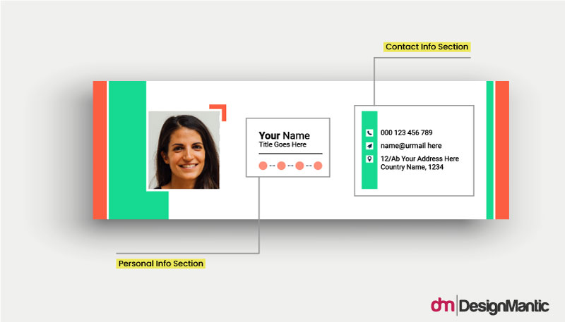
Have your job title and company name listed right next to or under your full name. Your headshot could be placed facing that section. Group all your social handles together, and end the email signature design with a purpose-driven call to action.
Sectioning off your content allows viewers to benefit from a highly organized design, and find what they are looking for almost immediately.
7. Keep the Design Brand-Consistent
Your email signature is an extension of your brand. The design elements you use to decorate your signature must be in line with your brand’s visual guidelines.
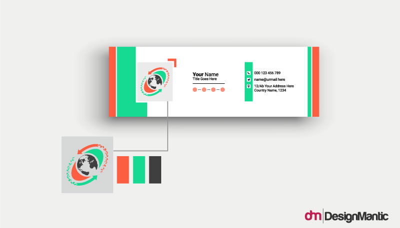
Colors and fonts must match your brand’s design palette. The overall design, minimal vs. elaborate, or something else, must also be consistent with your brand’s overarching theme.
8. Create Responsive Design
Nearly half of all emails are opened on mobile devices. If your email signature design is only optimized for desktop, and mobile users have to suffer through broken links or images that only show a red cross on them, you’re leaving money on the table.

When shortlisting your email signature design, choose the ones that look good on mobile phones, tablets, and other digital devices. A responsive design is tailor-made to adjust itself to varied screen constraints and put its best foot forward within the limits of the digital environment.
9. Showcase Your Achievements and Accreditations
If your brand or team has achieved any distinction in what they do, it’s time to put that out here through your email signature and show your audience that you’re a team of experts.
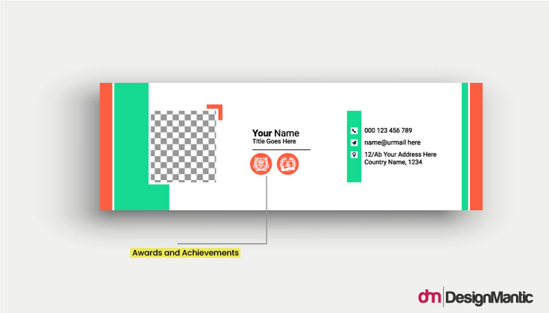
Displaying a badge that announces your special certifications or professional accreditations helps your audience trust that you have the expertise to solve the issue that you’ve promised to solve.
10. Add a Call to Action
Finalize your email signature design with a meaningful call to action. Instead of a random ‘Reach out to us’, make it more purpose-driven by tying it to a specific objective. Do you have a new book coming out? Link your CTA to a choice excerpt and build anticipation in your readers.
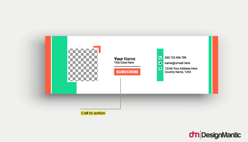
Want to direct people to more of your channels? Link your CTA to one of them and increase your traffic there.
Need to create more bookings? Give a descriptive CTA and link it to your booking software to help customers breeze through the process.
Remember that your email signature can perform more than just the basic function of displaying your contact info. Use it as a marketing tool to invite more people to your brand and use trackable links so you can A/B test your signature when you want to.
Conclusion
Your email signature may be the last thing you add to your email, but don’t let it become the last thing on your mind when it comes to your marketing goals.
This small-ish cluster of information contains a massive amount of potential to help you achieve your campaign objectives. Whether you want to gain more subscribers, announce your achievements to the world, or gain better brand equity, a well-designed email signature can play its part in your success.
Work with the design practices we’ve shared in this guide to help create goal-driven email signatures. Then use A/B testing to strengthen what works, and ax the design that does nothing for the business.


