Everyone’s favorite chocolate-covered wafers have undergone a quiet brand identity change. In August of this year, KitKat got a brand new logo and significantly improved on its old brand identity. Following in the footsteps of other brand redesigns, like the Lamborghini logo, Baskin Robbins logo, Burberry logo, and others, the new KitKat logo is a modern twist on its vintage branding.
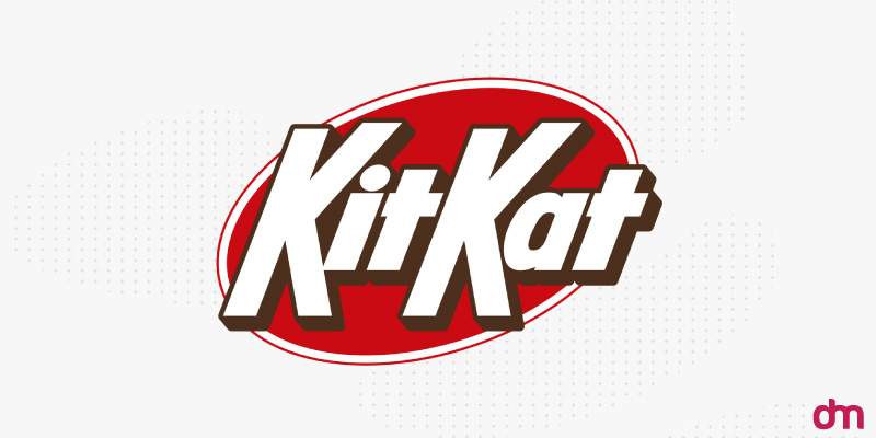
Image Source: wikimedia.org
The new KitKat logo has a familiar look, yet the revised type makes the brand name pop. The color update removes the clutter from the logo, and the shadows are finally in the right place.
While KitKat’s new logo did not receive an official unveiling from the brand, the design agency that created it gave it the hype it deserved.
Just a heads up—if you live outside the US, the KitKats in your local stores won’t be changing their logo anytime soon. This logo switch-up is only happening in the US because KitKat-US is owned by Hershey’s. In the UK and the rest of the world, Nestle is still in charge of KitKat, so their logo will stay the same.
In the sections below, we cover everything about the KitKat logo refresh. So get comfortable and cozy, and grab a KitKat.
Biting Down Into the New Logo…
So, what changed in the new KitKat logo?
• New Font
Fast food logo fonts try to mimic the food they are representing.
The golden McDonald’s arches represent its iconic potato fries.
Image Source: wikimedia.org
The round and curvy Dunkin’ logo looks deliciously similar to its donut shapes.
Image Source: wikimedia.org
Chick-fil-A’s jointed and curvy logotype design has the fun and playfulness of a chicken running around its coop.
Image Source: wikimedia.org
Following this font selection theme, the new KitKat font is sharp and compelling — mimicking its crunchy wafers.
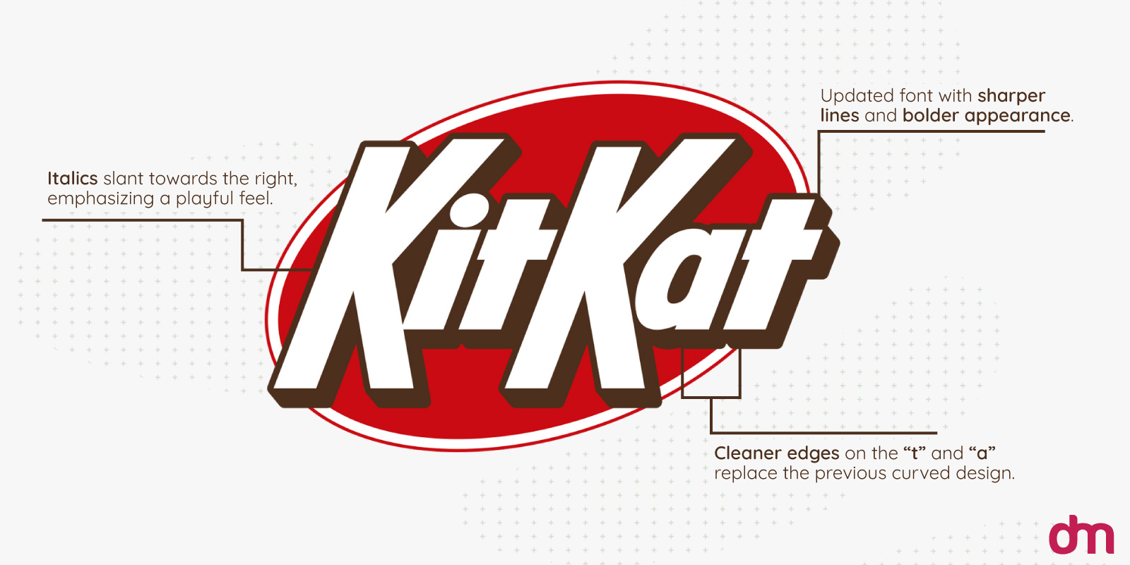
Image Source: wikimedia.org
The new font dominates the logo design with larger strokes and roomier insides. Placed over the oval shield, the wordmark stands confidently against the red background.
Lowercase A and T have both lost their curves, becoming more aligned with the new visual identity. The thinner strokes in KitKat’s old logo now look less imposing and frankly a bit weaker compared to the most confident slant of the new type.
• Drop Shadows
Drop shadows are an iconic retro design trend. They are added to make the text or other elements in the graphic stand out. Many designers have dropped drop shadows as things of the past, but everything past is brand new again. Food logos, especially, have gone retro and drop shadows deserve to become your new best friend.
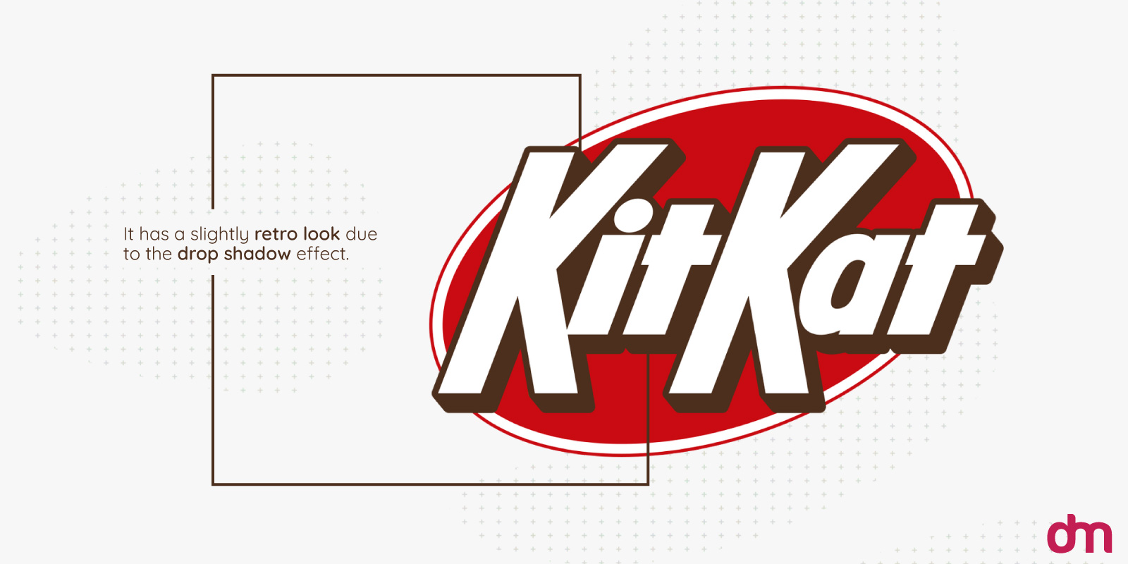
KitKat logo designers certainly know this. That’s why the new logo has gotten rid of any shadows on the inside of the type and placed them out as key features to highlight the brand name.
• Sleeker Outer Ring
Another prominent way in which the new KitKat logo differs from the old one is its sleeker outer ring.
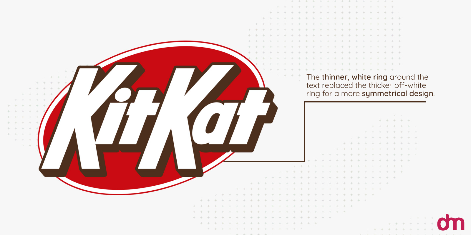
The old logo looked like it had two circles in the game—one in red and the other in yellow. But that would be an optical illusion due to the logo’s chunkier outer ring.
The refreshed branding has removed all this confusion from the new identity. The outer ring has thinned out, the yellow/creme detailing is gone, and the red circle has expanded to overtake the KitKat shield, supported by the sleek white ring.
• Tighter Kerning
If you think the KitKat letters now look closely bunched due to the change in the font, look again. The kerning (space within letters) has been reduced to make the text look more dynamic and assertive.
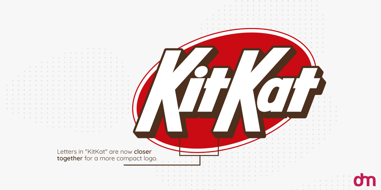
Remember that tight kerning is a staple of modern brands. It gives a sleek and clean appearance by making the design look more compact, bold, and efficient.
Aligning with these modern trends, KitKat’s new logo in 2024 eliminates all that extra space from its visual mark and opts for a contemporary and streamlined look.
A Cleaner Color Palette
For us, the most prominent change in the KitKat logo is its color palette. Knowing the influential role colors play in consumer psychology, the folks at Sterling Brands have removed the creme color altogether, reducing the visual clutter and thus giving red more room to be.
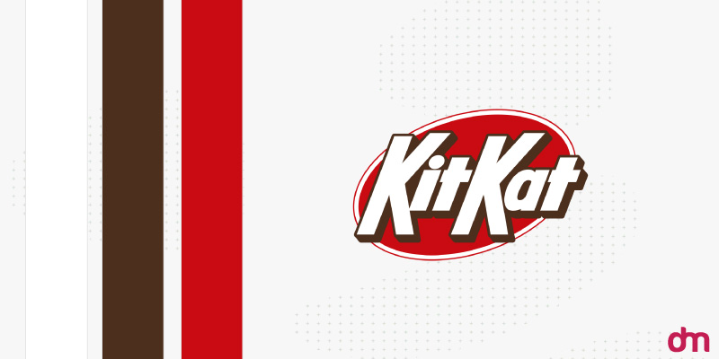
The type also has a chance to pop up brighter against the exciting red and be more visible on store shelves.
The compact color palette now looks more polished and sleek without watering down the original KitKat appeal.
KitKat Logo History
We must look to history to fully appreciate how brilliantly KitKat has managed to strike the perfect balance between legacy branding and modern updates.
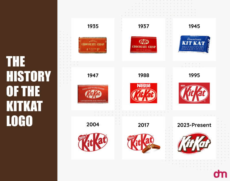
KitKat, originally a British brand (created by the candy company Rowntree and now owned by Nestle), first arrived in America in 1970. Under a licensing agreement between Nestle and The Hershey’s Company, the brand began to sell nationwide and soon transformed into a cultural snack.
The KitKat logo has remained unchanged since the ‘70s. While minor alterations kept the identity on par with the times, KitKat’s overall visual language was firmly rooted in its roots. With its energetic red color, white lettering, and creme accent for the wafer biscuits inside, the KitKat logo remained true to its original branding.
The year 2024 saw the most significant rebrand for KitKat in its history. The slanted letters are more assertive and modern, the overall look is more polished and compact, and the color palette has achieved a clean visual flavor.
As a snack logo or a confectionery logo, KitKat delivers everything you want from legacy branding with a modern twist.
The Modern Retro Logo Trend
What is the modern retro logo design trend? Doesn’t it sound very much like an oxymoron?
Actually, no.
See, the term retro does not refer to actual, real things from the past. Retro is a revision of the past with enough modernity to distinguish the contemporary from the classic.
Image Source: wikimedia.org
Coca-Cola is vintage, and the new Pepsi logo is not. While the latter does take inspiration from its vintage design roots, it uses enough new updates to keep the design firmly in the present.
Image Source: wikimedia.org
Coca-Cola, on the other hand, has not changed its logo in over 100 years. Talk about legacy branding!
Image Source: wikimedia.org
What makes KitKat similar to Pepsi and not Coke, in the visual design sense, is that KitKat has turned the clock on its branding. Instead of copying an old logo from the archives, it has just refreshed the details a bit: a change here and there in the type, some color refreshes, a dusty detail removed, and so on.
The beauty of the modern retro logo trend is this fascinating balance it allows us to have. We can walk into the past, take a look around, pick up what we like, and do enough magic of the modern that the design is a refreshing breath of vintage instead of a dusty old classic.
To pull off this feat, KitKat deserves a well-earned break and one hundred percent full marks.
Before we go, do you know anything about the KitKat logo Mandela effect?
It starts with a question:
Do you think the old KitKat logo used to have a dash in the name? Kit-Kat instead of KitKat?
If you recall seeing a KitKat logo with a dash, you are not alone. Thousands (probably way more) of people believe the KitKat logo of old used to have a dash. They even remember the exact placement of this logo even though such a logo never existed.
r/theMothmom
I remember the KitKat hyphen. It was a parallelogram. There wasn’t really a big space between Kit and Kat, and the right edge of the parallelogram overlapped the second K.
Comment
byu/FalseBodybuilder-21 from discussion
inMandelaEffect
r/senile_stoat
I remember the hyphen. It was a unique feature, the only chocolate that had the hyphen in its name which I found really interesting. I haven’t seen it in a long while now.
Comment
byu/FalseBodybuilder-21 from discussion
inMandelaEffect
r/throwawaybcimvshy
This is one where I even remember autocorrect would have the correct spelling as “Kit-Kat” in like early 2010s, since I remember being a bit uncertain for a moment, and thought back to being a young kid and reading it as just kitkat once in the early 2000s and wondered about it then as well. Anyways, I would be writing the name since I would ask about a friend’s cat sometimes, and it was named kit-kat just like candy.
Comment
byu/FalseBodybuilder-21 from discussion
inMandelaEffect
r/Ok-Doughnut-556
“Have a break, have a kit-kat” that’s what the hyphen was, literally a break in the word!!
Comment
byu/FalseBodybuilder-21 from discussion
inMandelaEffect
If you find these comments as hilarious as we do or believe that KitKat originally was Kit-Kat and this is just a simulation we are in, join in the fun. That’s what the Mandela Effect is. It is a misremembrance of an event or a memory that never existed or existed differently than you remember it.
The term Mandela effect was coined by paranormal researcher Fiona Broome in 2009 when she discovered that the South African revolutionary legend Nelson Mandela was still alive. She had vivid memories of reading about his death in prison in the ‘80s. After sharing her shock with other people, she discovered she was not alone. Many others remembered Nelson Mandela passing away during his prison sentence and even watched the news on TV.
This vivid and convincing memory of a fact that never occurred came to be known as the Mandela effect. While it has many examples in pop culture, the KitKat hyphen logo is one of the most popular. Google ‘KitKat logo Mandela effect’ now and see how extensively people have documented seeing a hyphen in the KitKat logo.

