Modern digital experience, especially when we go online, is inundated with motion graphics. Every time you sign in to your Gmail, a progress bar appears taking you from the username page to the password page.
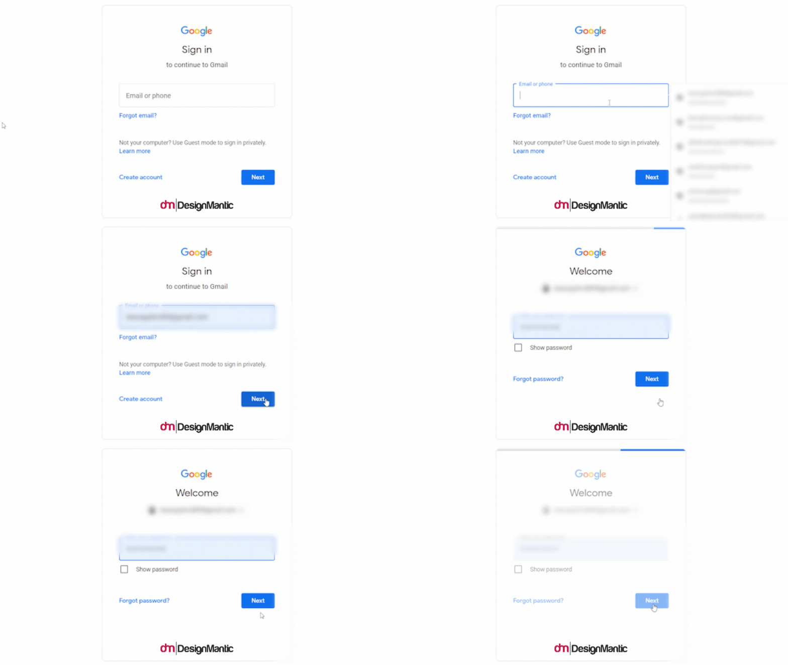
Its motion tells us something. That our request is being processed and we’ll be signed in to our account shortly. Movement is one of the essentials of design. As instant gratifications come, this animated progress bar helps us stay calm and indicates to us that we won’t have to wait for long.
The little checkmark that we see at the end of our Instagram feed is also a motion graphic. It even comes with a message to further make things clear.
![]()
There’s a reason motion graphics have taken over the internet. In the content-driven world of today’s digital marketing, survival depends on creating the most engaging, share-worthy content. Get as many eyeballs and clicks to it as you can. To do that, you have to give your content the pizzazz that sets it apart from everything else – makes people stop mid-scroll, and decide to spend time with it.
Motion graphics do that with great efficiency. Great results, every time.
But Here’s The Thing.
Just because (and specifically because) something is working doesn’t mean you have to go for the overkill. To maintain its appeal, you have to be more restrained and implement a clear motion design strategy.
In this article, we will briefly cover the basics for those new to motion design, and then we’ll jump straight to exploring purposeful and intentional uses of motion design that produce the most fantastic impact.
Let’s get the definition out of the way.
Scroll ahead if you think it’s too basic but like I said, I have to cover it for people who may be new to the whole motion graphics thing.
Motion graphics are icons, buttons, geometric images, and other graphics that come to life when animation is applied to them. Animation literally means lively, life-like. So, to produce motion graphics, we use animation techniques to make our graphics move, dance, morph, jump, slide, and do all sorts of athletics, dramatics, and theatrics. It’s quite fun.
Again, very basic, but how is motion design different from animation? In bullet points, please.
Let’s do you one better than bullet points. Here’s a pristine table to clarify everything up.
Full disclaimer: trying to form a distinction between these two is like splitting hairs, but for the sake of understanding motion graphics a bit better, here you go.
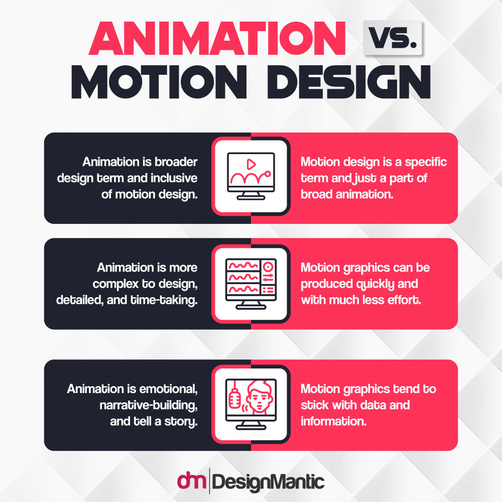
Examples of animation are cartoons, TV shows, animated movies (Lion King, Frozen, Toy Story, and such), and music videos, etc. Examples of motion graphics include movable infographic templates, logo animations, explainer videos, and advertisements, etc.
When To Use Motion Graphics To Create That A-HA! Moment
1. When You Want People To Stop And Pay Attention
When people are scrolling away on their devices, it’s hard to get their attention. Social media algorithms are designed to keep us glued to our favorite apps by bombarding us with our favorite content presented in thousands of different ways.
It’s hard to break the scroller’s stride. But with motion graphics, you have a chance.
View this post on Instagram
Your content becomes brighter, more visual. There’s emotion to it now as well, which is critical for conversion. The delivery is swift, information is now in bite-sized chunks, and much simpler. Instead of reading (skimming, more like) a 2000-word article, you now have theatrical icons and text imparting the same information in just a 10-sec video.
In a long feed of long articles, static photos, and loud videos, the brevity and perkiness of motion design helps break the monotony. So, for example, you have to produce an explainer video. You can do that by using real people with a lot of dialogue, but if make the whole thing in motion graphics, the effect is much charming, original, and again, simple to understand.
Dropbox did it back in 2009 and brought over more than 10 million signups and $48 million in revenue.
2. For Breathing Life Into Stoic Logos
As a graphic design company, we tell our clients all the time that their logos have to tell a story. The first time your audience meets your logo design, there has to be an instant connection and an immediate understanding. With stoic, still logos, it’s hard to form either. Motion graphics breathe that much-needed life in still, silent logos.
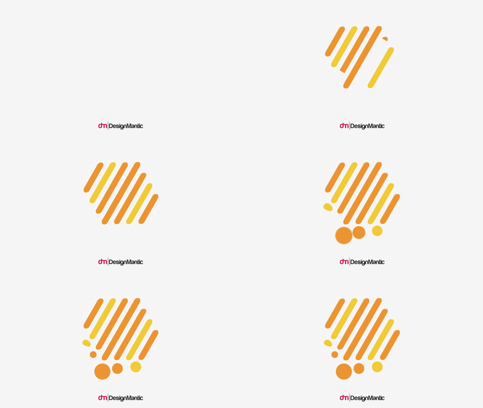
Suddenly, a simple graphic becomes more animated, more exciting. There arrives an element of surprise, joy, awe, and if you are lucky, a few happy chuckles, too.
While we all love our Apple and Nike logos, won’t it be fun to see Nike’s swoosh making that checkmark sign? Or watching that bite be taken from Apple’s logo with a satisfying crunch sound? Motion graphics also allow the brand logo to share what the company does and what it plans to deliver.
With motion graphics promising to make simple logos into brilliant pieces of engaging content, it boggles my mind how not every brand is making their logos sing and move.
3. To Illustrate A Point Or Emphasize A Fact
Basically, I’m referring to data visualization here. For many companies, the largest chunk of their content is data. Finance, medicine, non-profits, research organizations, and countless others. Data is how they get more customers, more donations, or more support. So these companies invest heavily into data visualizations to communicate their messages more clearly. Not only the data becomes much more understandable that way, but much more shareable, too.
So what happens when you throw motion design into the mix as well?
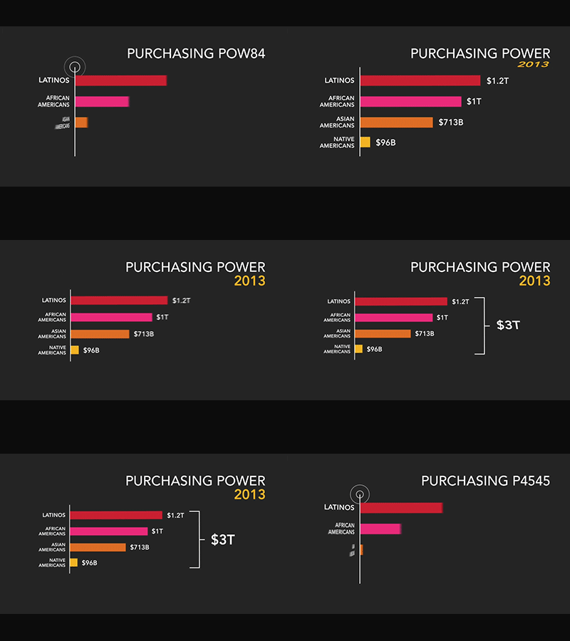
Image Source: dribbble/Dialogue Theory
The meaning becomes more simplified. There’s hierarchy added to it now. Users can look at it and understand how the information is flowing and how the facts stack up against each other in the context of importance.
There is interaction, too. Depending on how much work you’ve done on your animated data, you can invite users to click on various parts of it and see the information move, expose other data, or clarify a point.
4. Use It To Drive Home Social Justice Messages
The fact that social justice conversations are vital does not take away anything from the reality of them being heavy, emotional, raw, and draining. Systematic change doesn’t come easy, and those who fight for it also face the challenge of suffering activism fatigue and burnout.
Those who create social activism content need to remember that people are already exposed to so much of it. Making it more graphic may add to the fatigue. To keep these conversations lightweight but still impactful, motion graphics present the most efficient solution.
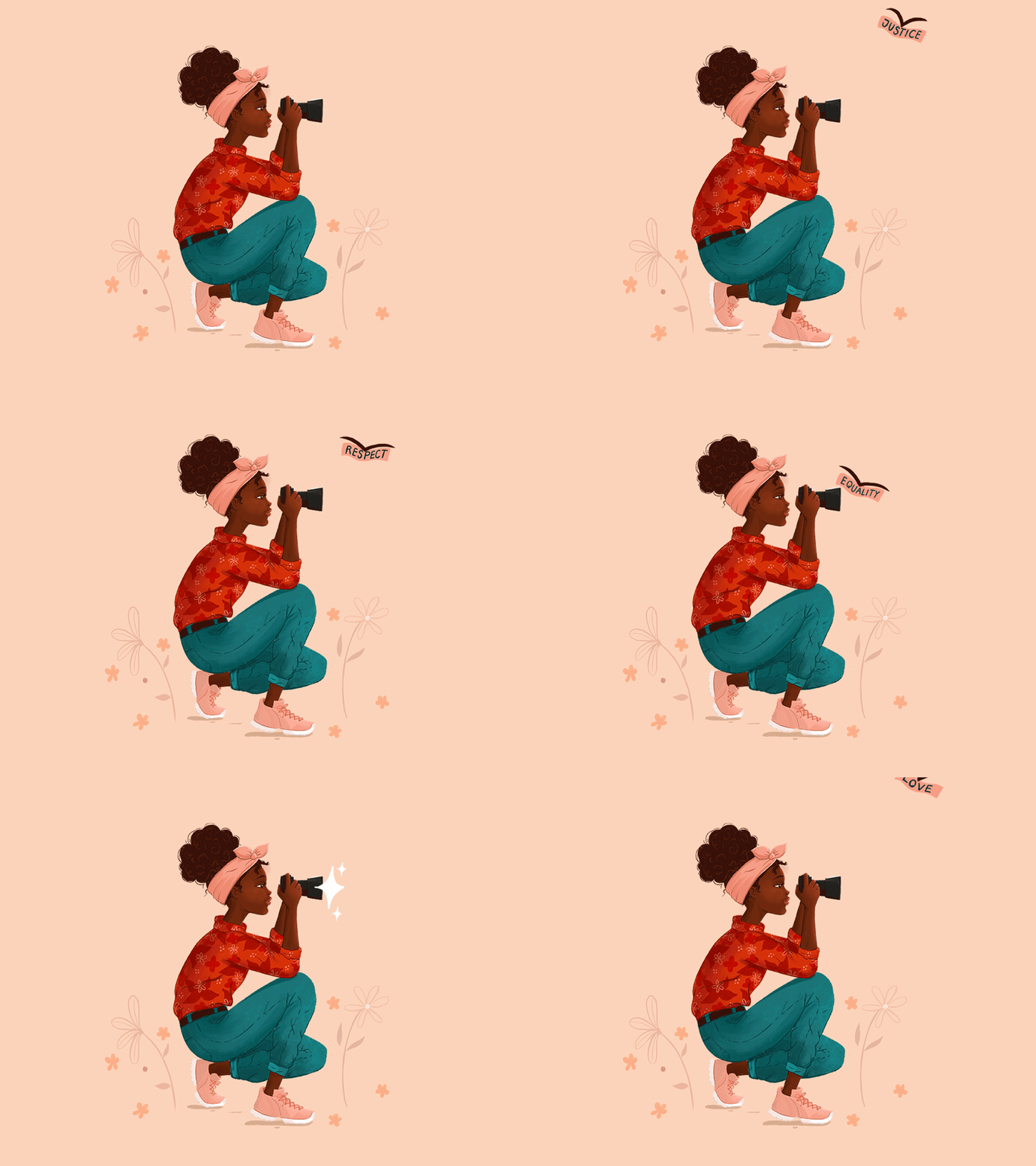
Image Source: dribbble/Lina Che
Motion in design allows the message to be more layered and nuanced. Compared to a static poster, for example, you can cover more than one angle of a social issue in a motion design graphic. In under three seconds, you can tell an entire story.
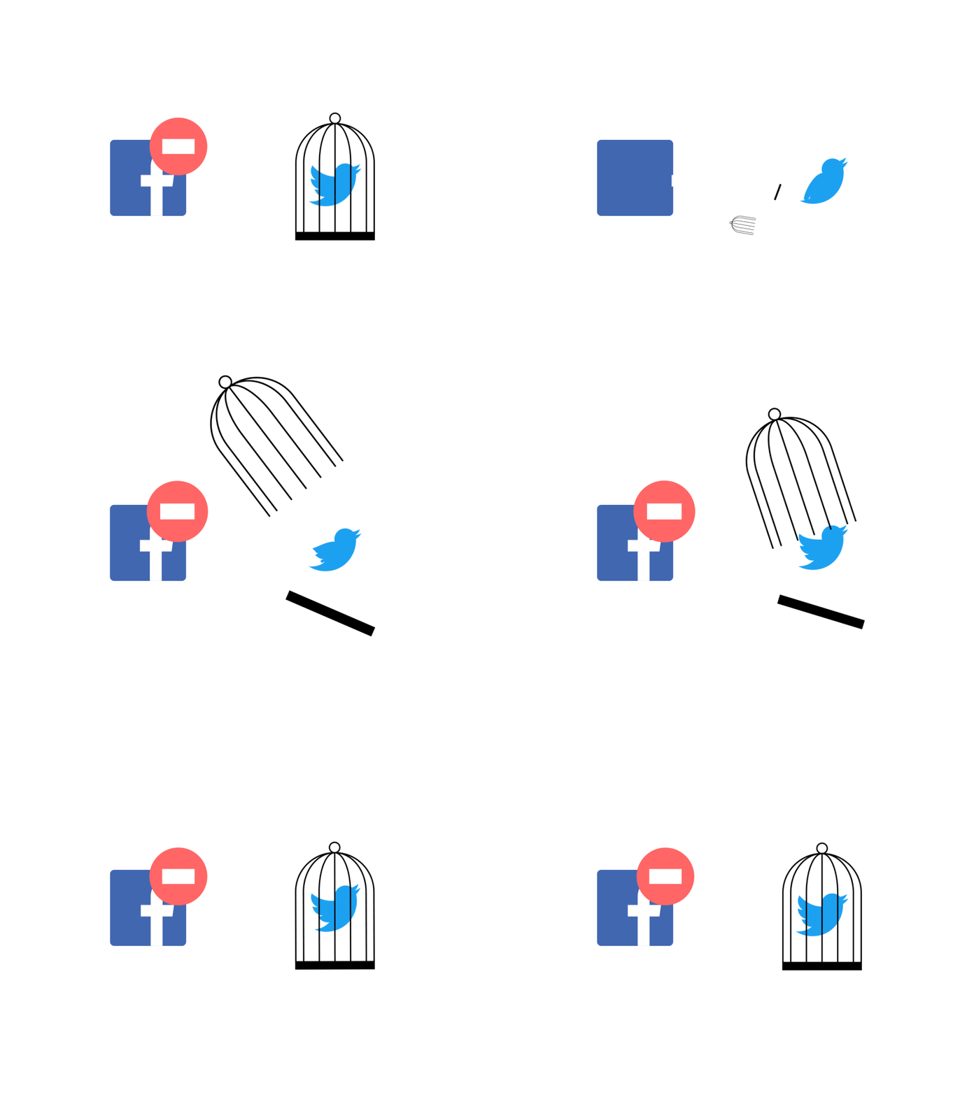
Image Source: dribbble/Jokūbas
With algorithms letting only the most shareable content rise to the top, you have to take everything you can get to make people click the heck out of the share button when they see your social justice content.
5. To Make People Laugh And Bring Longevity To Your Content
Humor is the easiest way to get people’s attention. It’s a great ice-breaker, an effective diplomacy tool, and the key to make people like you. If you can make them laugh, they’ll remember you. This stuff is gold when you apply it to content. Internet users continuously report engaging with humorous content the most. While your funny content can be perfectly motionless, won’t it be more fun to shake things up a bit – quite literally?
Image Source: dribbble/Eugene Weiss
You can also use motion design for your error messages, broken links, and other feedback communication. Turn those boring pages into fun marketing assets. You can also incorporate comedy – or just inject a bit of it – in your branding, writing, and the overall brand personality. Make it a part of who you are as a cohesive brand.
Conclusion
Everyone agrees that motion design makes the content hundred times better. But to use this potent tool for maximum impact, a more intentional approach is needed. You can’t hope to achieve the same jaw-dropping and manic-tapping of the Share button every time you release a GIF or a motion design feature on your website. Do it with restraint, keep ‘em asking for more, and continue making magic you’re your content.

