Capturing the essence of Mexico – one of the most vibrant and diverse places in the world – is not an easy task. For one thing, it’s got a lively culture that spans across regions. It’s got lip-smacking thrilling food, and great, natural landscape. Add to it the incredible variety of its regional nations, languages, and cuisines, and tell me how you’ll distill this diversity and vibrancy into a short, few, catchy words or symbols?
It is a formidable task.
But for our design purposes, specifically for creating a fitting and authentic logo for a Mexican restaurant, we’ll have to take on this formidable task and do it justice.
Here’s how we’re going to do it – we consult our three Cs:
- Colors
- Culture – taste
- Cuisine
We take bursting colors of Mexico, its rich and raw textures, its spicy and tangy foods and we try to showcase the spirit of Mexico through careful symbolism, iconology, and typography generated through these Cs.
An important point to note: as you sit down to create a logo for your Mexican restaurant, make sure that the specific design and aesthetic you choose goes beyond just the logo. It must be present in the restaurant’s ambiance, décor, environment, and most importantly, food. Only through consistency can you create a dining experience that transforms a restaurant business into a restaurant brand.
For the first Mexican restaurant logo design tip of the day, focus on the colors of Mexico.
1. The Colors Of Mexico
The color psychology of Mexico is dominated by bright and shining reds, greens, yellows, and oranges. The colors of pomegranate seeds, cilantro, a Sombrero made with straw, and the majestic sunsets against its desert landscapes.
These bright and bold colors should help you narrow down the color choices for your Mexican restaurant logo design. Whether you are going for a minimal and sleek restaurant logo or want something more rustic, you’ll need at least two colors for your logo: a primary color and an accent color. Choose your primary logo color out of these four to give your restaurant an instant Mexican connection.
However, since we are talking about logos that capture the essence of Mexico, we ask you not to be afraid of using colors. Pair green and red together with a lighter shade as an accent color for a lively restaurant logo. Yellow, orange and brown also make a striking statement – especially as they give off the perfect desert feel.
Even if you are going minimal and would rather stick to just one color or two, we say go bold and use a solid block of color as your statement-making shade.
To explain all this visually, we’ve collected a few Mexican restaurant logo designs for you:
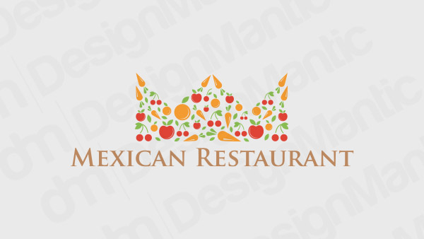
Crown logo for a Mexican restaurant
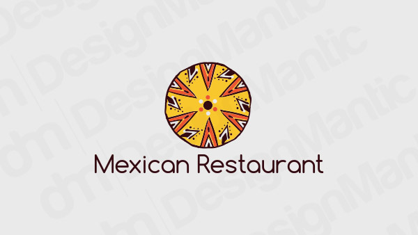
Colorful circle logo depicting Mexican Food
Shield logo with desert and sunset
Food logo containing lemon with grape vines
Fork logo for a Mexican restaurant
2. The Taste And Textures Of Mexico
The perfect way to stir up the appetite of your patrons is to use vivid food imagery that makes them feel twice as hungry as they truly are. Therefore, symbols, icons, and images that are related to food but woven in Mexican themes are great logo ideas.
In addition to imagery symbolizing taste of Mexico, we have distinct textures of Mexico too – straw hats, silks, ruggedness, and cacti – all these provide great textural stimuli that can be part of your Mexican food and restaurant logo or provide inspiration for it.
You can add a taste or textural element with a prominent color from the first point above to create a truly representative Mexican logo design for your restaurant. Pair it with some confident typology to create a truly everlasting design.
Below, you will find a few examples of how these elements can be incorporated into a coherent, single design.
Chilli logo for a restaurant
Turtle logo and a dish on its back
Skull logo sporting a sombrero
Food Truck delivery logo
Cactus logo wearing a sombrero
Related: 20 Italian Restaurant Logo Ideas To Stir Up Your Appetite
3. In Taco We Trust
Every culture has that one food that becomes its global ambassador, its national identity, and its favorite pastime all into one. For Mexico, we believe it’s the Taco.
That is why we have dedicated one whole section to talk about how differently and in the most uniquely fun ways this one symbol can be used to create Mexican restaurant logo designs for different kinds of eateries – casual hangouts, roadside cafes, specialty restaurants, and even upscale menus dedicating a whole section (much like us) to tacos!
Since the symbolic shape in such a logo design will not have much room to change, try playing with the additional details. See what different colors, other than the traditional yellow, you can use. Perhaps you can use the taco as a part of another familiar symbol of Mexico – the maraca! Or pair it with an inviting Chef symbol – something that’ll look absolutely at home on the door of a Mexican casual bar with an open feel and a welcoming air. Food font choices exuding the same feel of openness and friendliness, something like a modern Sans serif or a textural Script will look absolutely gorgeous with such an iconic logo.
Food icon logo for taco restaurant
Chef logo holding taco
Taco logo with a maraca
Green and red Sombrero logo
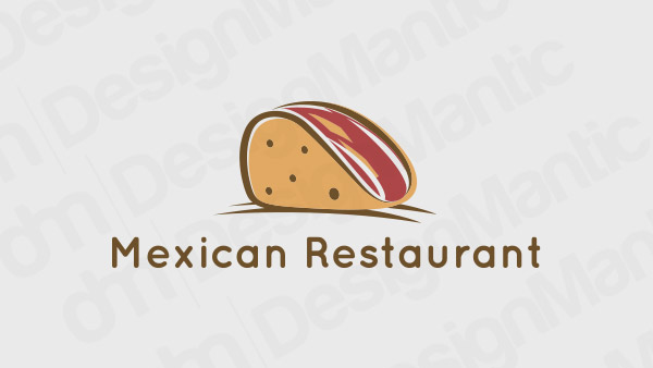
Taco in brown logo
Wrapping It Up
So here’s the handy guide on how to understand the diversity and vibrancy of Mexico and use your creativity to best represent it in the Mexican Restaurant Logo design.
Try Our DIY Logo Maker Tools To:

