Thank you to all who attended yesterday’s launch of #BeBest. I will continue focusing on ways to help children be their best selves. Please visit https://t.co/npPChhBGPT to learn more! pic.twitter.com/dMsSJHgMBs
— Melania Trump (@FLOTUS) May 8, 2018
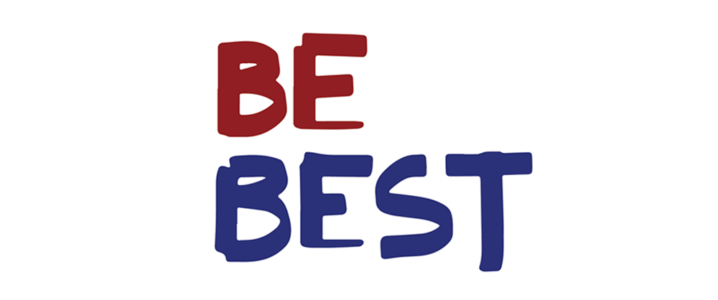
‘BE Best’ – that’s what she called her policy initiative when she inaugurated the campaign in the White House Rose Garden. The First Lady Melania Trump decided to jump into the political ring to make a good use of the powers vested in her. The campaign is focused on the issues related to the physical, social, and emotional health of children with regards to their well-being, social media use, and opioid misuse. Though much controversy surrounds the campaign itself, what provoked the angry American mob is the social campaign’s logo design.
With “Be Best” at her side, Melania Trump has vowed to raise her voice against cyberbullying – not to mention her husband being the biggest cyberbully of contemporary times. What could’ve been worse isn’t worse at all. It isn’t even that bad. Like the campaign itself, the community project logo has been bombarded with design criticism and what not.
What Do Melania And ‘Be Best’ Have In Common?
Melania and Be Best have ‘the connection’. She made it herself. With her own fingers. On her iPad (at least from what it seems like). It’s not exactly the type of thing anyone would expect from the Lady Trump, but let’s not overlook the circumstances here. They say it’s not sophisticated and is a childish approach, but what they don’t know is that this hand written logo represents a unique handwritten script in today’s digital typesetting world. So, it’s better than any cheap and overdone logo you’d find at freelancer sites.
Another common aspect that deepens the bond between Melania with her community project logo design approach is the presence of a shared goal: the welfare of children. So, the audience is basically children. It resonates with the general idea that logo designs are usually developed keeping in view the audience’s behavioral pattern and demographics. So, that seems settled, isn’t it?
#BeBest 🇺🇸 pic.twitter.com/ziI09BW4i1
— Melania Trump (@FLOTUS) May 7, 2018
As remarked by Melania Trump,
“We can and should teach children the importance of social and self-awareness, positive relationship skills and responsible decision making. Let us teach our children the difference between right and wrong, and encourage them to be best in their individual paths in life.”
Similar to the previous first ladies, who prompted goal-oriented campaigns, Melania is going to take action as well, but a comprehensive one for helping children. For instance, Lady Obama advocated fitness and nutrition, Hilary stood up for health care, Rosalyn Carter raised her voice for the removal of mental health stigma. The current first lady is setting out to help children in any way she can.
Related: 13 Logo Design Mistakes To Dodge At All Costs
Public Shows Love For Melania’s Logo Despite Controversy
The Trump administration has thrown everyone under the bus and has left the American people in a rage. But Melania has set herself apart from her husband’s unscrupulous doings. From her speech at the Rose Garden to the policies intended to be implemented, the campaign and its logo have stirred up mixed emotions in the public.
Instead of criticizing Melania’s logo design, let’s blur the lines a bit and look at some tweets encouraging and congratulating Melania on her campaign inauguration and appreciating her design effort at the least!
Melania Trump designed the “Be Best” logo herself, an East Wing official told us. She likes clean lines, the official said, & wanted something that would appeal to children pic.twitter.com/6lABdOjkHp
— Julie Davis (@juliehdavis) May 7, 2018
With Kelly Sadler hoping a war hero with cancer will die soon and Donald Trump getting a crowd to boo Barack Obama…
It is clear that Melania Trump’s “Be Best” campaign is working well.
Yay FLOTUS!
— Tony Posnanski (@tonyposnanski) May 11, 2018
I’ve got a hot take for you guys. The Melania “Be Best” logo isn’t that bad. Bad logos are usually some combination of ugly, hard to understand, have the wrong tone, or are not very functional. It’s ugly, but clear and usable.
— Jesse Tyler (@jessebtyler) May 8, 2018
gosh i wish melania’s husband wasn’t so repugnant and hateful bc i would absolutely wear a t-shirt with that ‘be best’ logo on it
— GrEMILYns (@evanopsi) May 7, 2018
What Do We Think?
While the cacophony of sarcasm, teasing, roasting, and aggression for Melania’s initiative deafens the ears of the social media public, it’s important to read between the lines and give the thought a piece of mind. Amidst all the contention and burgeoning, we support Melania’s DIY logo for the Be Best campaign wholeheartedly.
By that, we just want to remove the stigma ruling the design society that keeps targeting politics than sheer technicalities. On the other hand, we do agree that the logo design is out of place with crude typography – especially the E’s base and the T’s size.
Related: Trump’s Branding Secret Unveiled – Turn a Political Campaign into a Reality Show
We know, you still are frustrated about what President Trump has been making the American public feel, but criticizing Melania for Trump’s doing isn’t going to change things for better. Let’s give Melania a chance to see what she has up her sleeve. Plus, it’s not just Melania’s Be Best design, it’s also about the design community brutally dissecting the logo design via tweets with little to no follow up. Maybe she might come up with something better and make an impact, who knows?
DIY Your Logo Design Using Our Logo Maker:
Design Political Parties Logo Design
Make Social Clubs Logo
Create DIY Stores Logo
United States Logo Maker
Children Activity Centres Logo Designs
Childrens Safety Logo Generator
Professional NGO Logo Creator


