The laws of physics don’t apply to the digital realm. That is why most web designs are flat or devoid of any physical aspects that would show us what they really are – mere illustrations.
To make users more attuned to the physical realm, and to help designers design with perfect balance, Material Design was created. Material Design is very much similar to flat, but for a subtle difference. What’s the difference and how does it make up for the lack that flat design offers? That’s what we are about to find out.
What Is Material Design Anyway?
Material Design is a design language developed by Google with the purpose is to create a perceptiveness of physical objects in the digital world. Unlike flat design, which has been stripped of three dimensional elements, Material Design adds a little more skeumorphism back into flat design. Think of a design comprised of a couple of two dimensional planes that are floating above each other at varying levels.
UI elements stacked behind one another in Material Design
In other words, it renders all of the buttons and windows behind a screen as pieces of cardstock. All this does is make each piece catch light and cast a shadow in 3D simulated space where a user’s fingers meet a screen. However, unlike paper, Google’s innovation can split in two, ripples with color and animation.
The primary aim of Material Design is to add an intuitive feeling of physical objects in the digital environments. However, it is less bound to visual cues and lean more towards how different elements of a web or app design would behave. Elevate design of your application with the principles of Material Design, bringing a seamless blend of functionality and aesthetics to your digital products.
In order to get a better idea of this concept, here are some examples of web designs that incorporate Material Design UI brilliantly.
Nexpic.co
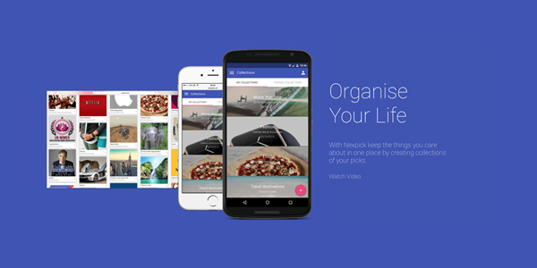
Nexpic.co is a web application that enables users to share things they care about.
Android
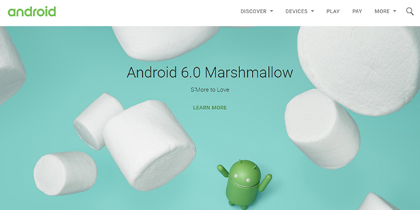
Google applied its new UI on Android Website.
Related: Learn about other Extraordinary Logo Moments
What Is Flat Design?
In order to understand how Material Design makes up for the limitations of flat design, we must understand what flat design is. As the term implies, any element of a flat design looks like it is lying flat on a surface. Basically, any design that has been stripped of all any three dimensional elements is considered flat.
Here are a few examples of flat web designs:
Hell’O Baby
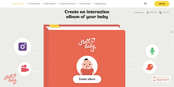
The oversimplified icons, choice of colors and rounded edges are all elements of a classic flat design on Hell’O Baby website.
Intercom
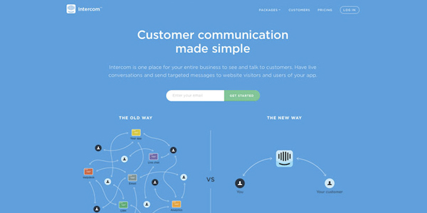
The unobtrusive typography and stylistic icons make Intercom’s website a great example of flat design
Why Material Design Comes Out On Top?
How does Material Design make up for what is lacking in flat design? If the details mentioned above are considered, it is pretty obvious that Material Design has a far more enhanced UI as compared to its flatter counterparts. There are three aspects in which Material Design trumps flat design –
• Optimization Across Multiple Platforms
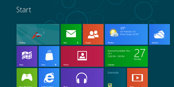
Image: Windows Blog
Windows 8 was designed indicative of flat design
Flat design is only meant for users who are attuned to digital interactions. Its main purpose is to use simple buttons, icons and color schemes to make it more efficient for users to find what they are looking for. And it does away with any sense of three dimensionality.
Material Design, on the other hand, encourages a reactive response from a user and therefore brings the design closer to its ability to connect.
Why is this important? Keep in mind, Google launched Material Design to solve its user experience problems. Before its transition from flat design, there was no practical way for users to keep up with a torrent of Google launches from Google Docs to Gmail and Google Drive. Android’s VP of design Matias Duarte sums the dilemma, “We had all these different screens sizes and platforms being considered separately. Web and mobile teams were optimizing for their one particular problems. But no one ever looked at the user journey, and how much burden they were creating.”
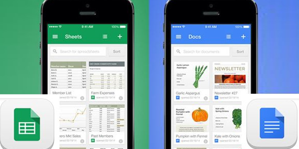
Image: Laptop Mag
Google Docs redesigned as a Material Design
By launching Material Design, Google found a way to solve this problem. How? By unifying all of its products into one platform through Material Design.
• Clickability
The main problem with a design that is completely flat, is that it makes it harder for users to find clickable elements. Clickability wasn’t a problem before flat took over and designers used visual cues like gradients, raised edges or textures to indicate buttons that can be clicked. By transitioning to flat, web designers had to come up with the same solution. However, they were limited to use shapes, colors, contextual elements and proximity to do it.
Take a look at this flat design. Can you recognize which parts are clickable? Chances are you can’t, at least not without pointing the cursor at specific spots.
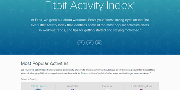
Fitbit’s website features Material Design
By utilizing the Z-axis, Material Design allows users to spot visual clues that tell them where to go or how to interact with the UI better.
Both material and flat designs incorporate minimalistic approaches. However, Material Design goes a step further since it meshes both the real and digital world by using skeumorphisms. It also does it subtly.
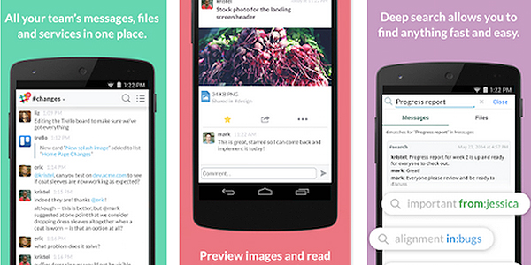
Screenshot of Slack Android App
For example, you can see the button at the lower right corner of this screen on Slack Android is clearly a button without being overly glossy. The use of light and shadow is cleverly used to achieve this effect.
• Visual Cohesiveness
User centric design is king. And the main purpose of UX design, is to maximize usability by reducing the time and effort it takes for someone to make sense of say, a web page. Unfortunately, flat design is not always able to achieve this owing to the absence of a Z-axis.
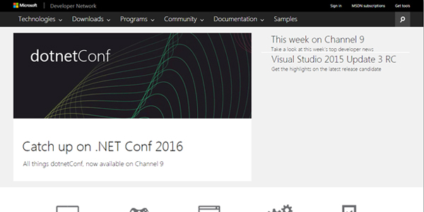
Microsoft’s Developer’s Network Website – Another example of Flat Design
As we can see from the flat design of Microsoft’s Developer’s Network, it would take a visitor more time to make sense of the different elements of this website.
Designs that adopt Material Design approach on the other hand, recognize the human ability to perceive depth and information hierarchies that are organized on a Z-axis.
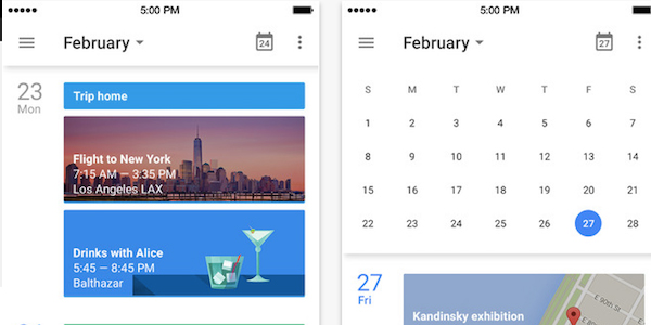
Image: Google Calendar App on iTunes
Google’s Calendar app is a good example of how Material Design prioritizes visual hierarchy better than apps that have flat designs. This app gives a vertical layout and places the current day at the very top of the page. Days that are irrelevant are condensed. This way, Google streamlines user experiences to show only what is useful.
Will Material Design Take Off?
The main difference between flat design and Material Design is depth. If we compare designs that adopt the trend and those that stick to flat design, the former clearly stands out with regards to a friendly web design, clickability and visual cohesiveness. Will it take off? That remains to be seen. I, for one, would love to see how other platforms adopt Google’s design evolution.


Nice article! enjoy to read your post.
Keep sharing & inspire us 🙂
If I have a choice between the same mobile app designed with a flat design or material design, which one is consuming less battery power?