Trends in the logo design industry change faster than a girl changes clothes; literally. Therefore, if you are looking to garner a viable logo for your business, it is indispensable to stay on top of the latest occurrences in the design industry, lest your logo seems extraneous, or god forbid, obsolete! Since your company logo becomes your surrogate voice that introduces your brand to potential customers and narrates its message and story in the simplest visual way possible, keeping abreast of the hottest trends in logo design is imperative.
However, the problem is that with such a vacillating industry, it becomes exasperating, enough to make your pull your hair out, to comply with the all the latest design conventions and trends when designing a company logo. This is one more place where online logo maker can save your skin! Credible logo makers are built in with the most up-to-the-minute design fads, so that you can glean a suave, classy, and innovative logo within 5 minutes! This not only helps you save up a fortune and hours and hours of fruitless labor, but also make sure your logo stands out amongst competitors. Here are some of the budding design trends that DesignMantic Logomaker incorporates impeccably:
1. Flat
This style is all the rage these days, albeit not being so novel. The more companies use this trend, even more notice and are influenced by it. Some major brands that employ this logo style include Netflix, Windows, Microsoft, and IHOP. All these brands have completely revamped their 3-D, bold logos of the 2000s with flatter counterparts that portray the brands in a minimal, fresh way.
Simple aesthetics isn’t the only reason for the popularity of flat designs. Bared of all exuberance, its sheer simplicity allows these logos to scale well, making them compatible with a plethora of mobile browsers and devices. Since the world is in the throes of an epic shift to responsive logo design, this factor becomes all the more crucial to enhance compatibility with tablets and smart phones.
The DesignMantic logo designs depicted below are perfect examples of what flat design is all about:
2. Minimalism
Minimalism isn’t something new. From web design to interior design, it has been gaining traction throughout the last few years in almost every area of design. Minimalism first made an appearance in site designs beginning in 2014, and it has carved a niche in the logo design industry this year due to its continued relevance. Minimalism is the holy grail of simple design, it focuses on flat designs that employ as few design elements and colors as possible to influence where a site visitor or a customer concentrates his attention.
In E-commerce, this boils down to designing your website against a white background, with nothing on your homepage except spectacular images of your products exhibited as a gallery, a transparent navigation menu donned up in black text, and a black, plain text version of your logo. This eliminates sidebars, product descriptions, product titles, prices, and any other objects that might serve to draw away customer attention from the main products or call to actions.
The principals of minimalism are also transferred to the logo design. This simple styles allow you to create straight-to-the-point designs that omit clutter to focus the customers’ attention where you intended for it to be fixated; which is your overall message and brand.
Here are some DesignMantic logo designs that embody minimalism to perfection:
3. Negative Space
While this trend isn’t a brainchild of 2016, it has gained quite some momentum this year. As the name suggests, negative space design leverages the unused white spaces ingeniously and incorporate them as a “subliminal message” within the logo design.
Employing negative spaces in logo design helps to set harmony and establish balance between the elements used, which is especially valuable for logos that feature a plethora of types and shapes. Even though you are using less in your design, negative spaces add more to them and can even be used to create striking optical illusions! Here are some designMantic logos that have made nifty use of white spaces.
4. Duotones
While not specific to 2016, we have witnessed a flood of duotone logos this year. With bold colors riding the high waves this year, using dual colors lets your logo truly speak for you. There has never been a better time to have a stab at dual coloring your logos! While your logo design has a major factor to play, keeping your logo restricted to two colors averts it from seeming too busy.
Duotone logos also make it easier for targeted markets to identify with the design quicker, not to mention that this design trend is a nice refresher as compared to plain, monotone logos. As far as your brand is concerned, there appears to be no downside to adopting this trend, bar the restriction on colors. Logos composed of dual shapes or businesses that tout compound names can really benefit from this design.
Related: The 10 commandments of Color Theory
These DesignMantic Logos have creatively used duotones to create a stronger brand message.
5. The Zoological Logos
Animal figures are in vogue, whether you are comfortable with them or not, and the trend is projected to carry over into the next year with even more fervor and zeal. Logos featuring some of the most magnificent creatures of nature aren’t going anywhere soon. From birds to beast, forthcoming years are in for lots and lots of zoological logos.
Keeping abreast of the up-to-the-minute style fads, DesignMantic has jumped on the bandwagon and features these beautiful zoological logo design templates all set to wow:
6. Pixel
In an era of RBG on-screen images, you can construe pixel as being the lowest common denominator. While abstract logos featuring pixel design elements speak to their digital pedigree, they also appear to be saying, “This is our essence.” DesignMantic is quick to pick up and flaunts these skillfully crafted logos following the pixel design pattern:
7. Stimming
You’ll hear clinicians rant incessantly about people who trace figures inadvertently with their eyes or fingers in a never ending loop. Figure eights are common in this regard, but emulating even more intricate patterns and loops will also manifest. Now, look closely at the DesignMantic Logo templates illustrated below and start tracing their loops with your eyes. Now focus on stopping where you started, that is if you can stop at all. These logos seek to create a mesmerizing continuous pathway that becomes simultaneously engaging and addictive! What a stroke of genius!
These marks can make you reminisce the motion or flow of travel, apart from their astonishingly compulsive nature. The smoother the radius, the less bumpy your ride becomes. If a brand wishes to portray the consistency or perfection of a process, this burgeoning design trend fits the bill perfectly. Such rhythmic repetition has a strange enchanting quality that fosters a fleeting affinity with a consumer, which is more than brands can ask from a mere milliseconds of exposure.
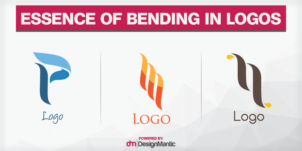
8. Benders
A growing fad of ambiguously twisted chards is gaining momentum a decade after the famous Moving Brands iconic Swisscom logo-in-motion. This creative era of ethereal floating symbols promises great potential in the years to come, and is every bit as conceptual and inspiring as can be expected from a logo.
Related: Get Your Brand Moving With Stunning Animation Logos
While you can’t expect your consumers to intuitively comprehend the essence of an industry from a simple glimpse of the mark, you can expect the public to be so enthralled by the brash vagueness of the logo that they will be hard-pressed to delve into it more, or divine a sense of personality from your mark. Bender elements in logos help to exude an agile and flexible approach to mercurial industries. These logo designs help strengthen the claim of a brand to adjust according to the shifting needs of the market. The DesignMantic logo designs perfectly capture the essence of benders in designs:
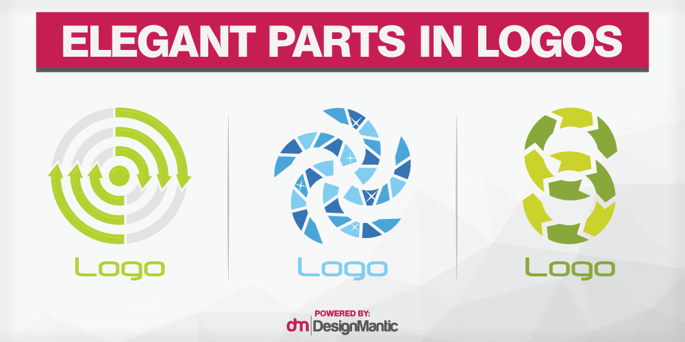
9. Parts
This raging design trend of 2016 relates to the saying, ‘one of something ugly is ugly, but many of something ugly is beautiful.’ This logo design accomplishes exactly that; it takes an ugly element, or the iconic representation of parts in this case, and assembles these beautifully into an astounding construction.
These DesignMantic logo designs are highly trending and conform well to the hottest updates in the design world:
10. Links
Here are the metaphors you must have just thought of:
- The weakest link in a chain is the strongest, because only it can break the chain.
- You’re only as strong as your weakest link, but as wise as your strongest.
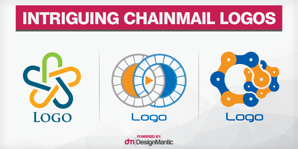
The whole concept of linkage in logo designs is brimming with similes and metaphors but more often than not, they all boil down to coupling one with another to boost capabilities. The element of linkage in logos depict a pledge to a cause and a commitment to another. These logo design marks are designed around the unity in design and strength of a union.
This logo design trend is adopted seamlessly by divergent technologies amalgamated to define a new niche or merging entities looking to rebrand! When assessed visually, remember that the chainmail in armor creates an impenetrable wall of protection, and this is what your audience sees when they look at these logos!
Here are some DesignMantic logo templates that seamlessly exemplify one of the hottest trends of 2016:
Can you think of more contemporary logo design trends that you have stumbled upon while perusing through DesignMantic logo templates? Do let us know in the comments below.

