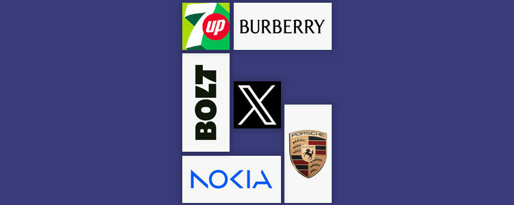
2023 has been a year of massive brand transformations! From automotive to food and beverage, fashion, social media, and e-commerce, brands from diverse industries have adopted new looks and are strutting with new vigor!
But how many of these rebrands have been successful? Are there any that have the potential to forever be added to the Redesigns Hall of Fame? Or do we have more dismal failures at hand?
Join us on this dynamic journey as we go exploring the soaring highs and stumbling pitfalls of logo redesigns.
Emerging Trends in Logo Remakes
Before we go discussing individual brand remakes, let us first view the top design trends that are emerging with these redesign patterns.
- Going back to the roots. Brands are increasingly adopting their earlier logos (or versions of them) to hint at nostalgia and remind people of simpler and easier times.
- Bright, neon colors. We are living in the Barbie era so you’re going to see a lot of neon and brighter colors pop everywhere.
- Divorcing the details. Minimalism is still reigning supreme so brands are ditching details they think are now irrelevant, and going for sleeker and simpler elements.
- Emphasizing the strengths. Though we don’t see it a lot, we applaud the brands that are staying true to their classic logos and only making them stronger and better.
- Sleeker, Sharper, Digital. Nokia’s redesign was a breakout revamp where the old logo was shelved in favor of a sleeker design, announcing a more digital identity.
6 Major Logo Redesigns of 2023
1. Twitter
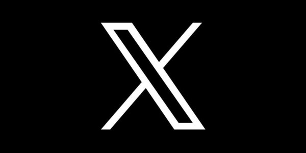
Ever since Elon Musk has taken over Twitter, the platform has gone through extreme changes. Not many of them were received warmly by the community, to put it diplomatically. But in the latest news, things have escalated much more quickly. The platform Twitter is now officially rebranded to X Corp, and Musk has gotten a new logo to match.
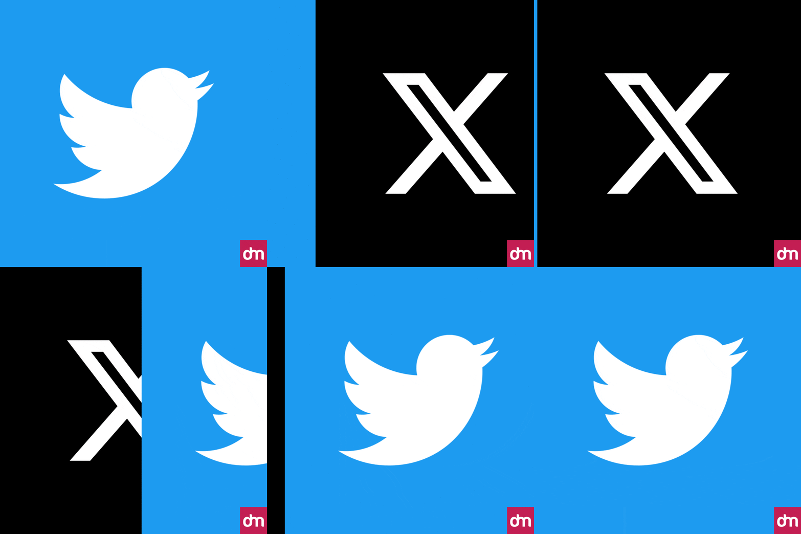
Again, not many people are happy with the change. But judging the two designs strictly on the basis of design integrity, which is better?
As much as we are sad to see the iconic bird being forced to fly away, it would have been more absurd to keep the blue bird while the rest of the brand changed to a black-and-white, very digital, X.
The verdict? It’s a fail!
It’s the worst redesign of 2023, so far.
Though Musk has called it an interim logo, hinting at a possible change in the future, it’s still a bad logo. Soulless, drab, and for some reason, menacing too? Here is what some Twitteratis are opining about the logo.
2. Burberry
Burberry, after dabbling in minimalism for a few years, has found its way back to heritage and legacy with its return to its iconic Equestrian Knight logo complete with a serif typeface.
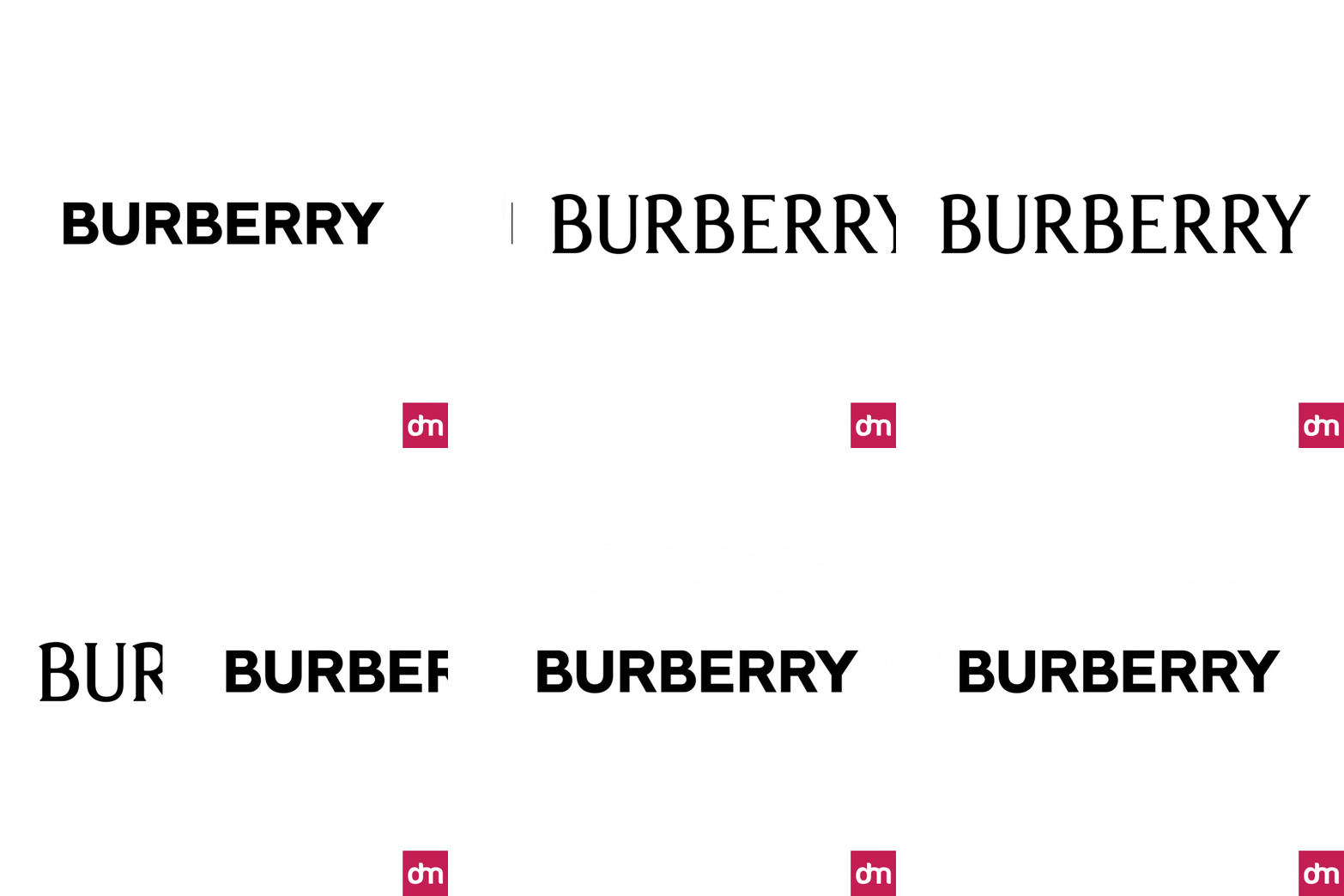
The new antique logo is redesigned with a vintage serif font and carries traces of handmade letters that are less sharp, more stable, and have variable casters. The Knight symbol has also gone through changes, where instead of ditching the details, they are made more prominent and clear.
The verdict? It’s a win!
When luxury brands ditched their serifs and intricate logos, they took away something from each of their brands. In a race to look modern and simple, they ended up looking like everyone else. With Burberry’s beautiful new logo, we can dare to hope that other fashion brands will soon follow suit and return to their archives to find their footing.
3. 7Up
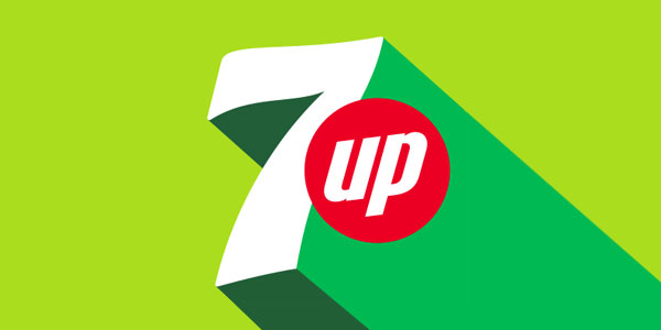
One of the major rebrands of the year has been the redesign of the 7Up logo. In an overhaul, Pepsico has created a whole new identity for its lemon-flavored soda; and has extended it to packaging, merchandise, and global marketing too.
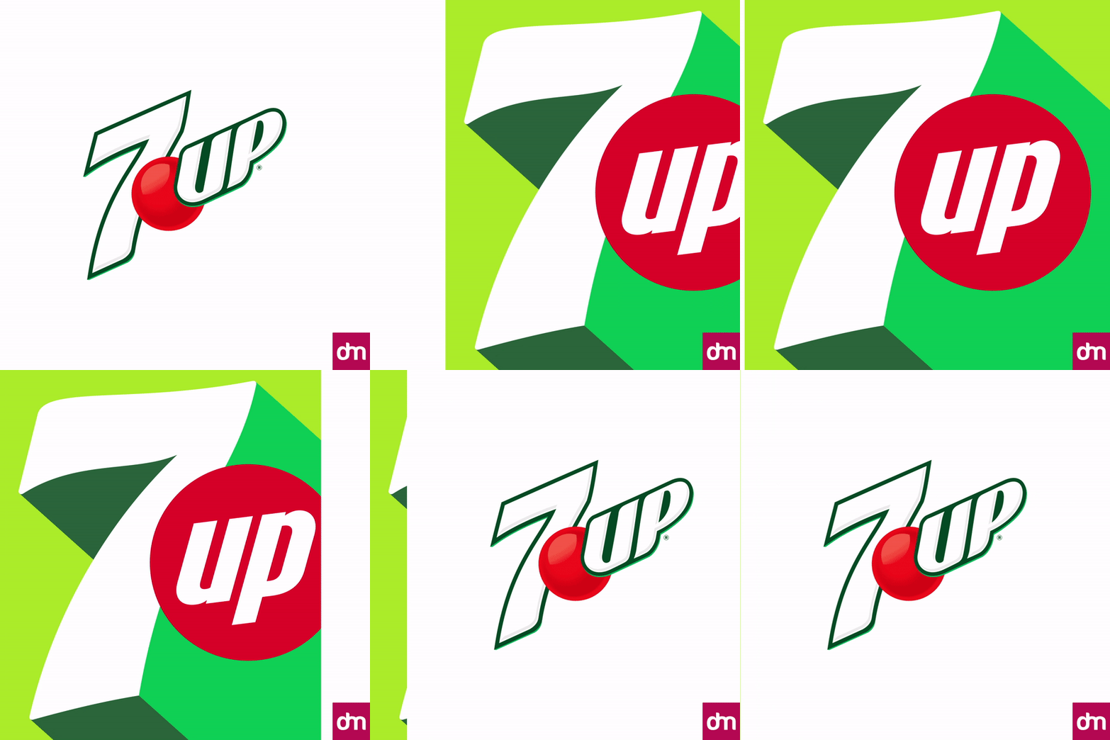
The new logo is a chasm away from the modern flat design trend. Opting for a 3D plan, the new logo shows us layers of gorgeous detailing. It has bubbles, a neon green pop, and a much smarter 7. The color palette stays true to 7Up’s signature green coloring but adds citrus tones to it to signify what the product is all about.
a>The verdict? It’s a win!
The 7Up logo is a lesson in successful rebranding. It simplifies the logo without sacrificing its essential attributes. The iconic 7 hasn’t changed much, the color palette is still familiar, and still there are enough changes to refresh the look and add a bit of punch and zing to it. Needless to say, we find the changes absolutely gorgeous, and this rebrand is going on the list of our forever favorites.
4. Nokia
If you’re a millennial like me, you probably remember Nokia clearly. The company made unbreakable mobile phones whose batteries never died. (Or something very close to it.)
But when the smartphone era came along and Nokia couldn’t evolve in time, it lost out to Apple and Samsung — pioneers of the modern phone. The Nokia logo, once a symbol of durable technology, lost its appeal and became dated. Much like the company itself.
Over time, however, Nokia has reimagined its operations and products, and it has now been officially announced with the unveiling of its brand new logo.
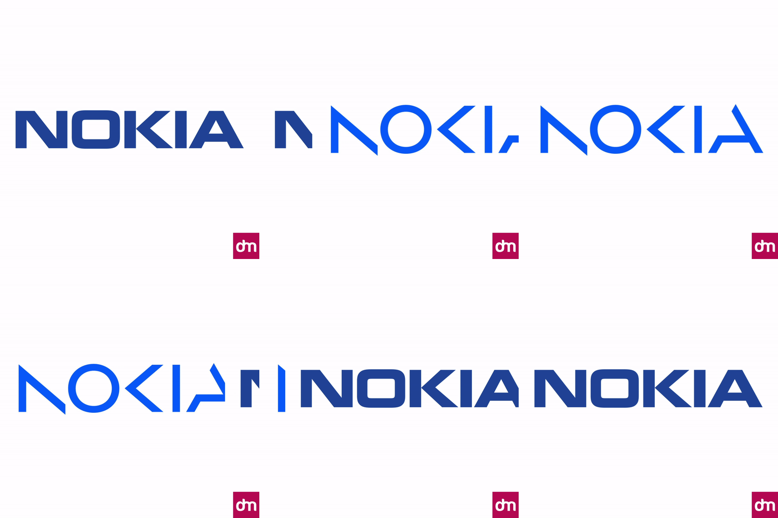
The redesigned angular logo is sharp and refreshing. With its negative space strokes, it looks futuristic and has an authenticity to it.
The verdict? It’s a win!
Significant shifts in business must always be accompanied by substantial changes in the visual identity. You want people to know that you’re doing something big? Show that with a big change in your logo design too. And Nokia has done exactly that with a gorgeous new wordmark that’s thrilling and exciting.
5. Bolt
Nokia isn’t the only rebrand on this list with beautiful negative space detailing. Bolt, the e-commerce checkout technology platform, has joined us with its flashy and fierce new logo.
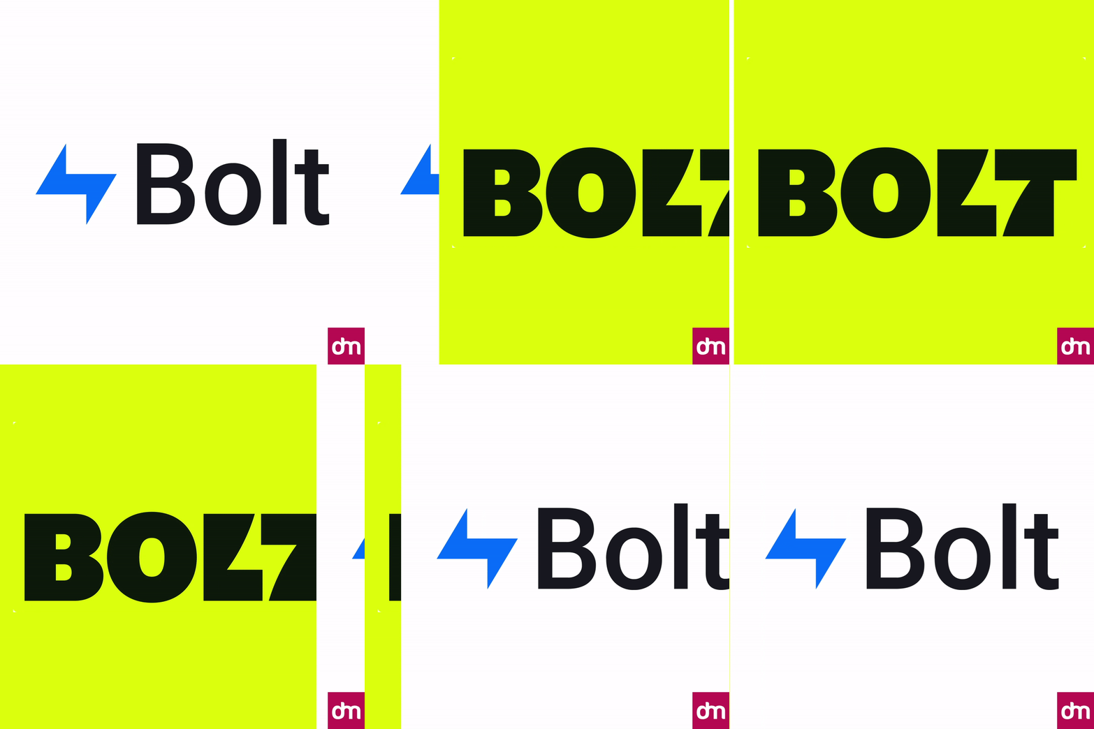
The redesigned Bolt logo is a conscious attempt on the company’s part to stay away from its e-commerce competitors. Where the other brands can’t seem to end their love affair with the blue color, Bolt has gone and given itself a makeover in neon green and black.
Both colors are confident and give the logo a bold contrast. But the best thing about the rebrand? The energized lightning bolt between the last two letters of the wordmark! It’s living in the negative space and commanding your attention with confidence.
The verdict? It’s a win!
Your logo design should never be about what everyone else is doing. Sure, you have to walk the tightrope between immediacy and distinction but never compromise in creating a unique identity for your brand. In a highly saturated e-commerce market where every other brand is another shade of blue, Bolt’s confident color palette and strong negative space detail is giving it the distinction it needed.
6. Porsche
The Porsche rebrand shows the most minimal amount of changes from the old to the new. And why not? If it ain’t broke, don’t fix it. Keeping true to that mentality, and taking pride in their legacy logo, Porsche has strengthened its colors and made its lettering more pronounced.
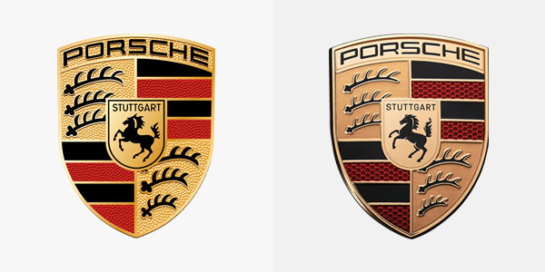
In an era where car brand logos are scrapping their smart crests and intricate shields in favor of simpler icons, Porsche is standing tall with its iconic Stuttgart emblem. The colors of the logo are deeper and more pronounced, but somewhat less spackling on the bronze.
The verdict? It’s a win!
Redesigning classic logos is never easy. People don’t like change and even the most well-designed logos may not be warmly received by all. What Porsche has done here is a great strategy in design: Don’t design for the simple sake of it. Always back your aesthetic remakes with something more substantial under the surface. Since Porsche wasn’t going through any major changes in the company, a slight refresh was all it needed, and it was all that was done.
The Takeaway
With only one fail and five wins on the list, we’re going to declare 2023 a successful year for logo remakes.
What makes this possible is a very mature realization on the part of global brands. They have learned through past mistakes and by listening to their consumers, that visual rebrands must be rooted in brand integrity. Foundational elements that have become symbols of the brand must never be compromised, and legacy icons must always be given center stage in one way or another.

