Logo design trends do not change as fast as online articles would have you believe. They certainly do not change every year. Can you imagine how chaotic and unstable the industry would be if that happened?
So why do we release a logo trends forecast every year? Think of them less as forecasts and more as past-year observations. We track logo design changes of the year prior and use the redesign decisions made by big brands and brilliant designers to try and understand the direction for the year ahead. Do all of those trend predictions come true? Thank the gods, no.
More often than not, these trend predictions highlight design themes in which popular brands are putting their stock. As smaller brands, we can learn from their wins and fails, and incorporate these lessons in our brandings to mitigate the risks.
This year again we have brought you a forecast list for logo design trends in 2024. As you can see from the title, this year we have a single, sweeping theme that underlines every trend you’ll see on the list.
Let’s unpack it.
Logo Design Dilemma 2024: Go Back To The Roots Or Look To The Future?
A few months back we covered major logo design revamps of 2023. In that discussion, we highlighted patterns that we could see popping up in all of the redesigns. A common one was, returning to the source and embracing the origins.
From Burberry to Porsche, we saw brands taking pride in their legacies and choosing traditional branding choices over utilitarian minimalist. Burberry, for example, ditched its modern sans serif logo in favor of a streamlined serif one and complemented it with its equestrian knight symbol.
Porsche, which never jumped on the minimal logo bandwagon in the first place, stood out even more by making its emblematic logo design look even more pronounced and regal with a deeper color palette.
On the other end, we have brands that cannot leave their vintage roots in the past quickly enough.
Nokia shed its weighty typeface off and got cozy with a new logo that’s way sharper and cooler than a logo design ever has the right to be. It’s sleek, modern, and exciting. As Nokia embraced its digital future, the new logo was there to tell everyone it meant business.
On a less successful note, Twitter rebranded to X and got a new futuristic logo to match. Since we don’t have a lot of good things to say about that, we’ll just leave it at that.
But for a new brand or a small brand that cannot afford huge branding mistakes, which way should you go? What small business logo trends can you follow? Find inspirations in the decades past or keep your eyes peeled for what’s to come?
Far be it from us to give you blanket, sweeping answers — but we can do the next best thing. Give you an entire list of the latest logo design trends that are all here to stay — at least for the next few years. Find your home in one of them, whatever sings closest to your brand tune, and there you put your roots for the future.
6 Logo Design Trends for a Successful 2024
Here are some bankable choices to explore.
1. Finding solace in geometry
When you decide to go back to basics, it doesn’t get more foundational than geometry. It has been around since even before 3100 BCE and plays a fundamental role in graphic design. Geometric shapes are some of the most elemental shapes found in nature. Such as circles, spheres, squares, and triangles.
To create balance and maintain hierarchy, geometric principles come to the rescue in design every time and upgrade a simple piece of design from basic to brilliant. For example, the new Fanta logo.

Image Source: The Coca-Cola Co.
In April 2023, Fanta forsake its weird-looking very busy logo and adopted a simpler design with acute emphasis on a triangle shape that kind of projects the brand name on the screen. The triangle adds the ‘playful and fun’ vibe that the brand wanted and unnecessary details have been stripped away from the design.
If you want to bet on a design shape that will never go out of style, this is an example of how geometry can help.
2. Meaningful logos that reinforce the brand message
Descriptive logos with functional components are all the rage in 2023. We expect the logo trend to continue in the next year as well.
As consumer trends keep shifting towards sustainability and authenticity, brands have to respond by adapting their visual identities to look more meaningful and transparent. Vague and abstract logos have their place, but if you are a service-focused brand or have sustainability as a core business value, your customers may respond enthusiastically if you add descriptive elements in your logo design that highlight your purpose and industry.
Something like the new Bolt logo.

Image Source: cloudinary.com
Scrapping the literal bolt icon in the logo, the designers have made clever and creative use of the white space between L and T to insert the bolt shape and hint at what the company is about.
The new design is more meaningful, without being too on the nose, and reiterates the witty ways you can make the negative space work in your favor.
3. Revisiting the archives
In 2020, we saw the tide turning towards vintage logo designs in a big way and talked about it in our 2020 logo design forecast piece.
One of the key reasons so many brands have ‘gone back to their roots’ post-pandemic is because a) nostalgia, and b) vintage never got out of style. Gen-Z just grew up and realized that the previous decades were a seriously cool era (as every generation has always done). So they made what was old new again and here we are, three years later, and vintage is stronger than ever.
Here’s an example.
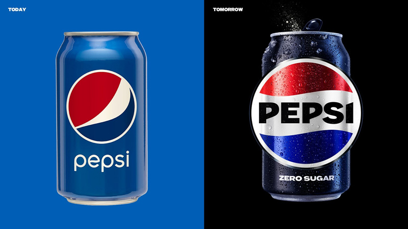
Image Source: PepsiCo
Pepsi went back to its design archives (they must be massive considering the many redesigns of the past) and chose a 1960s logo in all caps for its newest brand identity. The decision has been a resounding success. The font is authoritative, even though it’s all caps — a logo trend that retired years ago. Plus the color palette uses a metallic shade on both the colors, giving the logo a rich, electric, and thirst-satisfying feel.
To recreate this magic on your small business logo, look at the history of your brand to select details that make sense in the present. Add your modern spins on them to bring them up to date and enjoy a nostalgic logo design with a twist that’s all your own.
4. Simplifying those fancy fonts
One of the key digital trends in logo design has been the widespread adoption of sans-serif fonts. In contrast to vintage-heavy brand identities, minimal design concepts remain relevant for technology and digital brands.
Nokia has been a prominent example of this trend, but the torchbearer status goes to Johnson and Johnson. It’s not a tech brand, of course, but in the pharmaceutical landscape, the Johnsons logo redesign has been the latest that has adopted a sans-serif branding.
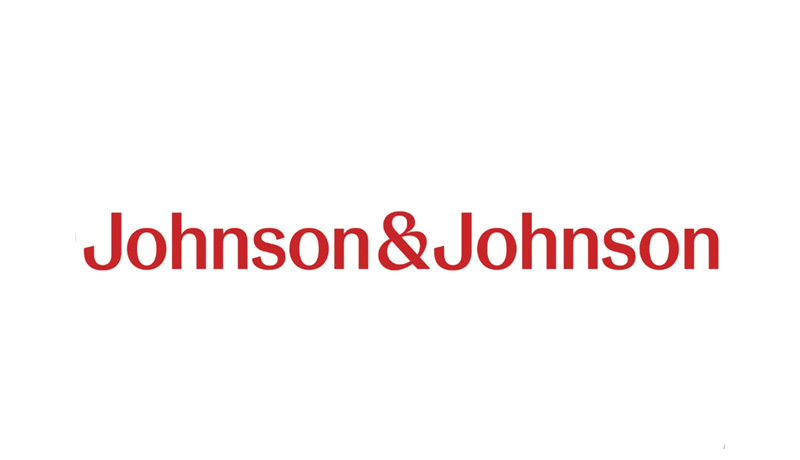
Image Source: cnbcfm.com
The brand recently switched up its visual identity from a hand-drawn script logo to a simpler sans-serif font which is both modern and functional. It works equally well on print as well as digital surfaces. Whether you use it as a favicon logo to put it in an app container, the logo stands out nicely and provides great legibility in a variety of environments.
Exploring 2024 logo trends, this one is something to watch out for. As more and more brands adopt sans-serif fonts in their logos, we might be looking at the end of the serif reign at least.
5. Logos in motion
Animated logo designs have always been present since the technology first became digitally mainstreamed. With Google’s animation-based logo redesign back in 2015, the trend was set in stone and more brands followed suit.
The wonderful thing about an animated logo design is that gives your consumers multiple ways to engage with the brand. Google’s logo, for example, takes on many forms depending on the type of actions it’s performing. It turns into a microphone as you begin to give it a voice search command. The Gmail logo animates itself into an envelope. The pulsating dots reflect Google looking up your search query. And so on.
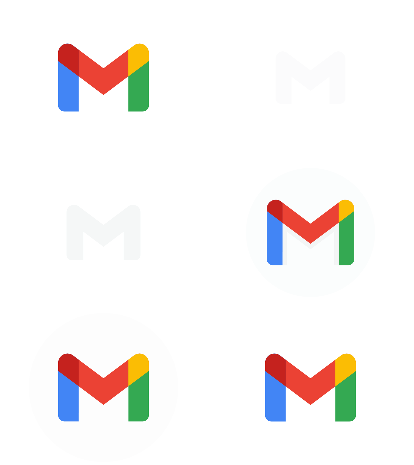
Image Source: dribbble.com/Shirfy M.
Heading into 2024, consider your digital brand severely lacking if you aren’t considering animating some of its details. That’s a ton of potential you’re leaving untapped. Brands that especially cater to the younger audience or those that are tech-savvy, are the ideal candidates to explore this rising trend and make their logo move in response to customer interactions.
6. Futuristic color palettes
We’ve talked about shapes, fonts, descriptive details, and mixing tech with design, but what about colors? Colors are one of the most impactful design elements there are and it’s necessary to know the right way to use them in your logos for the future.
We see gradients as remaining deeply relevant for years to come. As people keep moving towards retro logos or maximalist designs, color gradients will continue to have a role to play in making bold visual statements.
But in 2024, bioluminescence seems to be the hottest new logo trend — as far as colors are concerned.
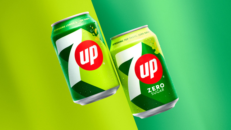
Image Source: PepsiCo
Neon, striking, and electric are some of the words you can use to describe them. They create an overall effect of belonging to the world of the future and represent a dynamic, exciting brand with its eyes focused firmly ahead.
If the description fits what your local business is aiming to do, welcome to the party. Take out your glow-in-the-dark colors and let’s play!
Summing Up
As exciting as it can be to learn about trends in logo design, know that by their very nature, trends come with shelf life. In a few years or so, they’ll become either irrelevant or less meaningful for the new crop of customers that’ll join your target audience.
Always use trends as an indicator to learn where the industry may be headed and not as a rule book to what you should be doing in the future.
Keep your brand planted firmly in its foundations so trends can serve you to remain updated, relevant, and refreshed across generations and geography.

