As we don our New Year hats, finish up the last of eggnog, and get ready to launch head-first into the next decade, what are the upcoming logo design trends that we expect will dominate the next 12 months of graphic design?
Color gradients, responsive designs, animated logos, and video graphics are going to be huge in the next year. The reason: people are looking for more. More room to engage with the design, to explore it, be charmed by it, and create a relationship with it. Designers are who are ready and willing to inject this dimension in their designs are going to be the busiest this upcoming year.
Since logo designs don’t usually allow for quick trend changes by nature – brands are looking for stable identities that enhance brand recognition and recall – said identities remain fairly stable. However, for rebrand purposes, new start-ups, and creating logo systems, knowing the latest ins and outs of business is just basic common sense.
So whether you are a graphic design professional or enrolled in a logo design course, sit back and put your feet up as we list down and share with you all the hoopla the New Year is about to bring in the logo design world.
1. KISS – Keep It Simple, Stupid!
Simple is a style statement that never goes out of style. It’s true for logo trends too. Whether you are launching a new brand or giving new life to an old one, start simple. Simpler logos – do not read ‘boring’ or ‘uninteresting’ – are easier to remember, quickly decipherable and therefore easier to recall.
Do not forget that simpler logos are more difficult to get right than business logos with too many details. You do not have a lot to rely on in the design so you have to make sure that you get all the few details right.
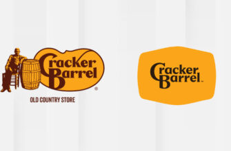
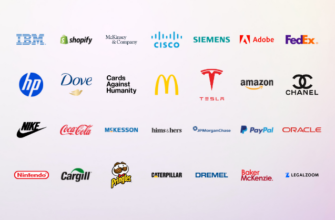
Some examples of simpler logo design for your 2020 inspiration:
Related: Minimalism Revived: The Holy Grail Of Simple Designs
2. Abstract Grids – Loosen Up the Design!
2020 is going to be all about letting the design out of the box. The grids will be loosened up, abstract, and not too structured, letting your mind engage with it a little.
The key will be to still maintain a bit of structure while letting the tiles of the grid enjoy a bit of freedom. You’ll need this structure to give the design a bit of skeleton and not let the elements fall all over the place. One way to do that will be to add the chaos in the abstract logo design with some hierarchy in mind. Adding lots of negative space so the abstract grids can still hold on to each other.
Take a look at this beauty, for your 2020 design inspiration:
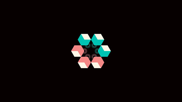
Image Source: Behance/Francesco Vittorioso
3. Negative Space – More is More!
The concept of negative space is fascinating. It’s the magical vacuum that allows you to carve out shapes, forms, and images out of literal nothingness; hence, negative space.
Utilizing negative space creatively is a work of art. A vast expanse of blankness can be intimidating, but if you can prevent yourself from getting overwhelmed, negative space becomes the perfect canvas. By drawing just the boundaries and creating lines, you can form a solid shape inside. Carving out letters differently, you can make other letters stand out.
Negative space is an important element of minimal design. It helps you create logos that are cleaner, sharper, more defined, and look infinitely more creative.
For your design inspirations, here are a few examples:
Media and communication logo featuring mobile phones in negative space
Image Source: Behance/Miraz Islam
Image Source: Behance/Tornado Design
4. Responsive Logos – Logos That Adapt!
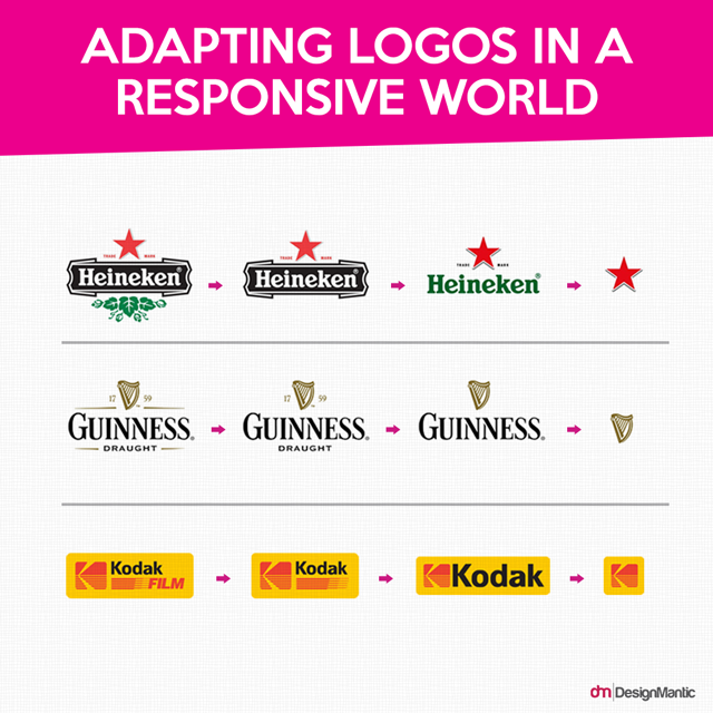
As the digital world makes a collective shift from desktop to a mobile phone, design trends that favor adaptability on smaller screens are going to have a field day in 2020. Responsive logos are no exception. As we increasingly visit websites on our mobile phones, it makes sense that brand logos on websites also have responsive versions that don’t ruin the design when viewed on a smaller screen.
Brands that showcase their responsive logos for the digital audience can establish themselves as industry experts, as people who are in the know, and who can keep up. Consider responsive logos a necessity for mobile apps, responsive websites, and for branding agencies who want to remain ahead of the curve.
Some examples for your design inspiration:
5. Video And Animated Logos – Get Moving!
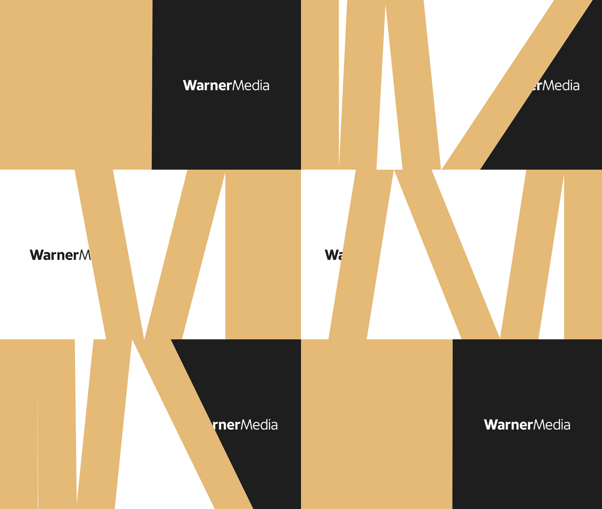
Animated and motion video logos are one of the most recent trends in the market – a trend that’s here to stay.
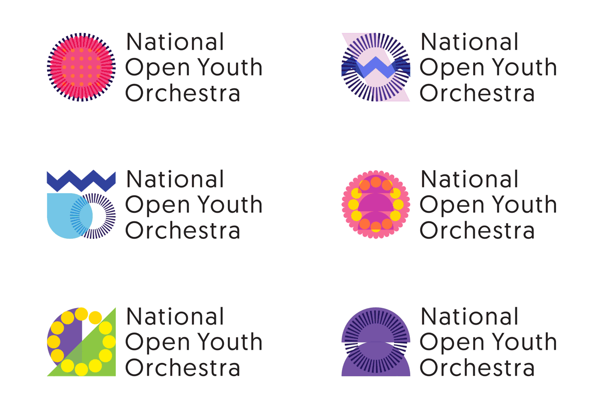
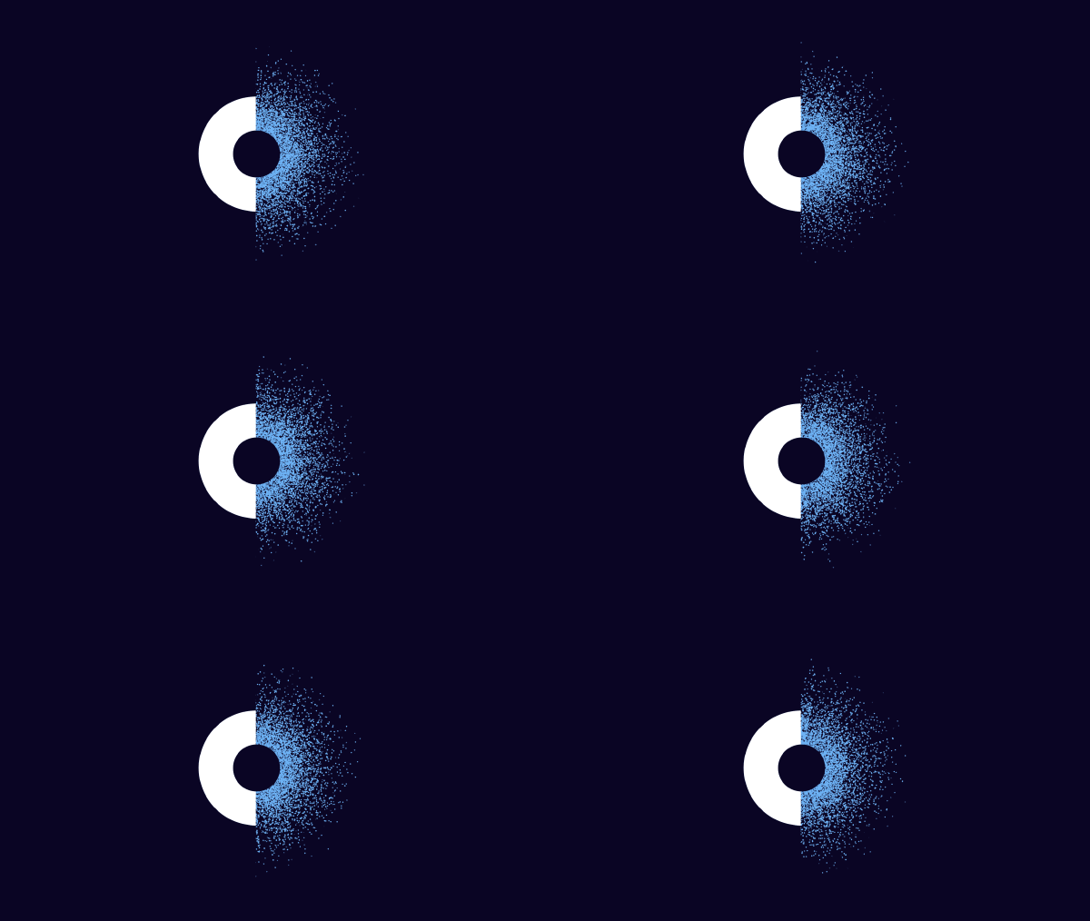
As customers demand more engaging material from their brands, companies have got to step up and deliver. An animated logo is more dynamic than a stationary one. It can tell a story in a more fun and detailed way. It is also more interesting, and you can make it an engagement point with the customers.
Using 3D principles with other design elements such as 2D, color gradients, and responsive design, you can widen the scope of your logo design possibilities. 3D animation logos add a level of depth in otherwise static, flat logos, making the design more experiential.
For your viewing pleasure and design inspirations, here are a few brands who are doing the animation right:
6. Curious Alignments And Unorthodox Layouts
A really exciting way to add more dimensions to the logo is to change its layout and alignment. Moving features from their traditional places – places where people would expect to see them – into different ones, you can instantly make the logo more interesting.
Layout and alignment are two essential design principles that play directly into the concept of hierarchy and contrast. By aligning features differently and shifting their layout, you can add contrast, notch up the organization, and make a flat surface look more appealing.
Image Source: Behance/Vladimir Lifanov
Image Source: Behance/Vladimir Lifanov
Image Source: Behance/Filipe Guimaraes
7. Color Me Gradient!
Gradient has been a graphic design staple for a few years now. We have seen it appearing on more and more mediums in recent years, and it reached new heights in 2019 when Adobe Illustrator released the app’s newest feature: ‘Freeform gradient’.
The trend was given even more fame by Mozilla’s comprehensive rebranding which featured gradient in all its beautiful glory. The bold use of colors, the ceaseless blending of it, and the way it all culminated cemented gradient’s position as a trend that will continue comfortably in 2020, and dare we say, beyond?
The fact is, gradient colors are some of the more naturalistic color trends and produce movement and harmony in design. They make flat design look instantly more interesting, and add a level of depth in an otherwise simpler design.
Image Source: Behance/Basit Khan
8. Emblems & Insignia – Say it with a Seal!
The year 2020 is going to be a year of design statements. What great way to make one other than with an emblem logo? Emblem logos or Insignia logos are a level up than monogram logos. Whereas monograms are the display of company name or brand initials, emblems are adding those displays on to seals – taking the design many levels ahead and making it more regal, classier.
Image Source: Behance/Basit Khan
Image Source: Behance/Mustafa Akülker & Marka Network
Related: Create A Great Monogram Logo For Your Business In 5 Easy Steps
9. Vintage Logos – Blast from the Past!
There’s an old saying that you’ve probably heard from one designer or another at least once in your life (if you’re lucky; more, if you’re not). We’re going to repeat it here: ‘What was once old is new again’. Trends repeat themselves and the distance makes the hearts grow fonder.
And that is the preamble of us saying: Retro is back!
Vintage logos are all the rage and we’re eager to see what designers are able and willing to do with this beauty of the old. Vintage logos look their classiest best on bars, boutiques, and bookstores. But you can also make a bold statement with a retro design logo on travel shops, restaurants, and even add its elements on hi-tech.
Image Source: Behance/Tobias Hall
Image Source: Behance/Kaniz Leema
Image Source: Behance/Dorian Avila
10. Size Matters, Sometimes
When we modify the size and scale of a few elements in logo design, the intention is to bring notice and attention to that aspect of the design. It’s done by using eye-catching colors, differing fonts, and unexpected alignment too.
Strictly in terms of size, elements can be made bigger or smaller to affect the visual hierarchy and organization of the layout. Making one element bigger and thicker in size, the attention is drawn to it. Similarly, making one smaller while everything else is the same size, the attention is brought to the minor element.
Playing around with the scale of different features of the business services logo, you can strategic in your efforts of which elements to focus the customers’ attention on.
Image Source: Behance/Dmitry Gorban
Image Source: Behance
Image Source: Behance/Alvaro Garcia
11. Thin Lines And Other Geometry
Thin lines and geometric shapes have been popular in 2019 and the trend will continue in 2020 as well. The beauty of thin lines is that it can be looped and repeated to create motifs, patterns, and continuous arrangements to be used as unique logo symbols.
In addition to thin lines, expect other geometric shapes to also make regular appearances on logo designs in 2020. Squares, semi-circles, angles, and edges make for great logo features and are going to be used extensively in tech, design, and communication logos.
Image Source: Behance/Kristina Mendigo
Image Source: Behance
12. Atypical Typography
In 2020, we are going to see a lot of innovation in typography. Think of discontinued lines in lettering, vague fading, half-finished strokes and other visual riddles that’ll heighten the intrigue and make you look at the logo for far longer than you had intended to.
Handwritten fonts, custom fonts, distressed fonts, and daring typography, in general, are going to be big in 2020. The need for brands to showcase their uniqueness and announce to the world their distinct character is driving this trend.
In the last few years, typography has evolved from a part of the logo to the whole point of the logo itself. It’s the new focal point that designers are using to build whole brand identities around. So expect to see a lot of new typeface in your 2020 logos – a typeface that is atypical, never seen before, and definitely big on personality.
Image Source: Behance/Basit Khan
Image Source: Behance/Cash Design
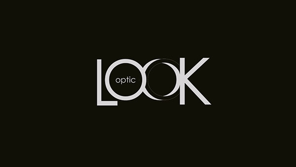
Image Source: Behance/Efy Saboutey
13. Unfinished/Imperfect Logo
Why imperfect? Because perfect is boring. The Gestalt principles in psychology tell us that our brain is wired – in its perpetual insistence to make sense of things – to close the gaps in shapes and forms that are unfinished.
By keeping the design intentionally imperfect, unfinished, and open-ended, we invite the onlooker to look at the design a bit longer, explore it, and eventually finish the design in their own heads, in their own unique ways – making the design more interesting.
Imperfect designs also look more organic and natural – something the Gen Z and Millennial customers look for in particular. Brands looking to seem adventurous, who want to portray their daring spirit, and who feel they have a natural affinity with this particular market segment, can do great with imperfect logos as their brand signage.
Some examples to feast your eyes:
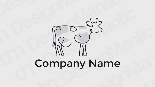
Unfinished line logo design
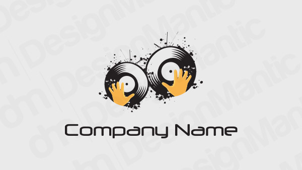
Imperfect DJ logo design
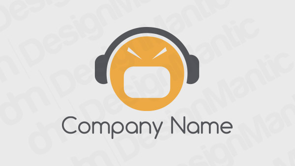
Communication logo with an angry face icon
Having said all that, when designing your brand logo, pay less attention to the latest designs and more on what holds true for your brand. In the present age of information, you will be wise not to underestimate the intelligence of your consumers. Make sure your brand identity is built on authenticity, and that it follows through on all forms of your brand communications – including, and most importantly, your brand logos.
Recap
Feel pumped to get back on your drawing board and start experimenting with these fiery trends of the next year? Good on you.
Just make sure that any of the new trends you feel like trying has a genuine place in your logo project’s art brief. New for the sake of new is not a good look, and frankly, looks misinformed and desperate. Do not go for desperate. Use only what matches with the brand essence on a spiritual level, get me? Do that, and the rest will all fall into place. You’ll see.
Try Our Online Logo Maker Tool:

