Update 3 JAN 2020 : Check out our Logo Design Trends For 2020!
Update 31 JAN 2019 : Check out our Color Trends For 2019
The year 2018 will be upon us within no time and trend predictions have already started pouring in. As we are living in a perfectly branded world, changing trends have some serious effects on the future of logo design as well. For the same reason designing gurus all over the world feel their utmost responsibility to set the rules on how the design techniques will change for the good. As for logos, 2018 will be a harbinger of giving a modern touch to the design trends from the past. According to design experts, there is a high possibility that minimalism be the holy grail of simple designs in the coming year as well but definitely with some twists for a modern, updated look.
As we are directly at the helm of design affairs, keeping a close watch on the rising and fading designing trends is our prime focus. We bring you the nitty-gritty on how the demographics of logo design will change in the coming year. So, let’s prepare for all the cool stuff the new year has in store for us and check out the following emerging logo design trends.
- Get Moving with Subtle Animation Logo
- Paint Futuristic Brand with Digital Paintbrush Logo
- Stack It Like It Is with Letterstacking Logo
- Grab Attention with Hand-Lettering in Logo
- Break Boundaries with Shadow Break Logo
- Get Ahead of the Curve With Fading Effect Logo
- Go up, up and up with Rising Color Logo
- Fly high with the Airy Logo
- Step Your Game up with a Monogram Logo
- Fine-Tune Your Brand with Tone-on-Tone Logo
1. Get Moving with Subtle Animation Logo
We can’t be wrong in saying that animated logos will be rocking the year 2018 as the latest conquering trend in the design world. Wondering why more and more brands are opting for the moving visuals in logo designs? It is because of their adaptability towards nearly every logo design that can be turned into a catchy animation using this technique. There are high chances that consumers will be bombarded with eye-grabbing billboards of their favorite brands’ logos being flashed as animated GIFs. There is another plus side: they help in an increased users’ engagement on websites and it’s easy to gauge, why – they’re slick, clever and extremely appealing.
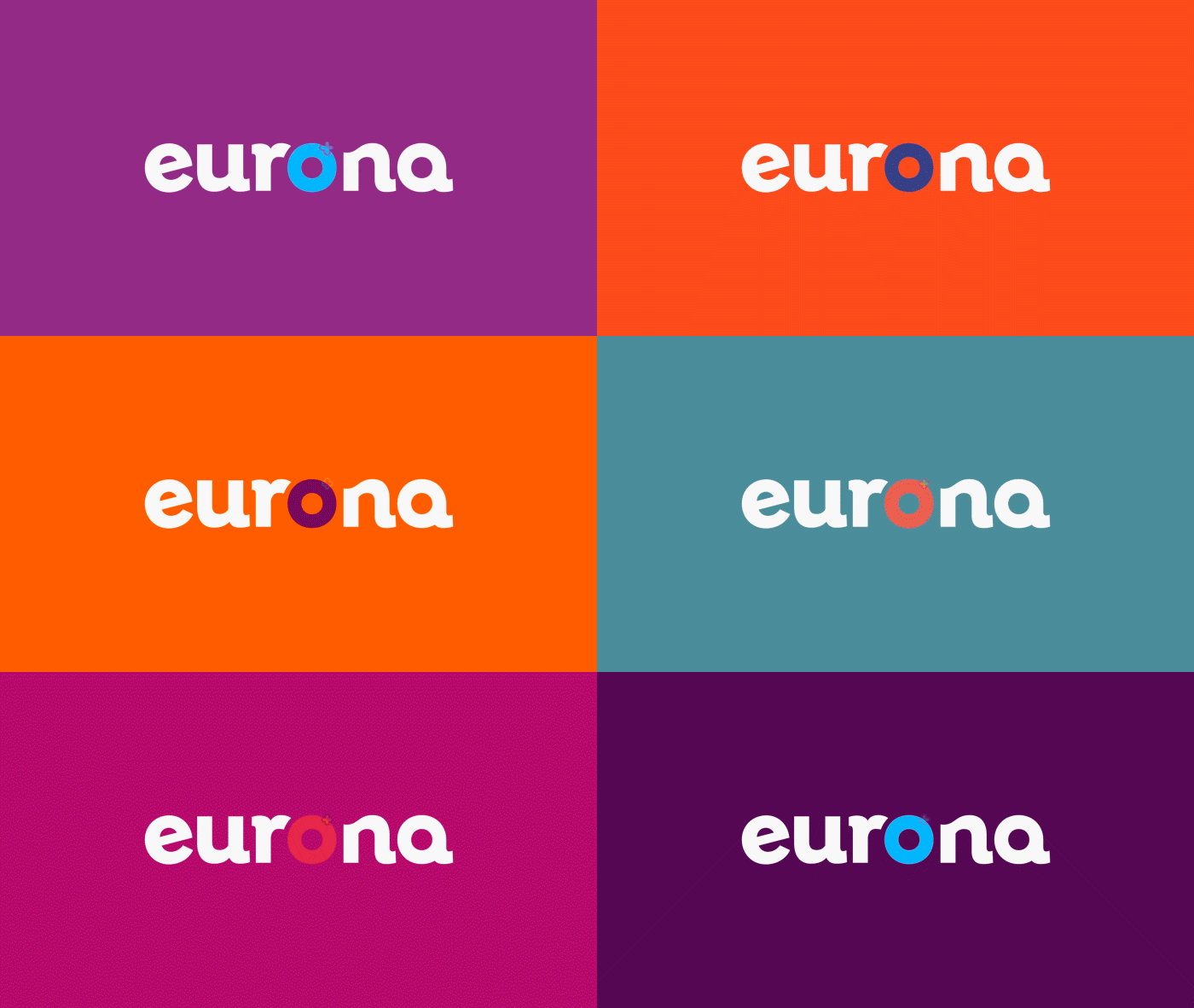
Image Source: Eurona
Related: Get Your Brand Moving With Stunning Animation Logos
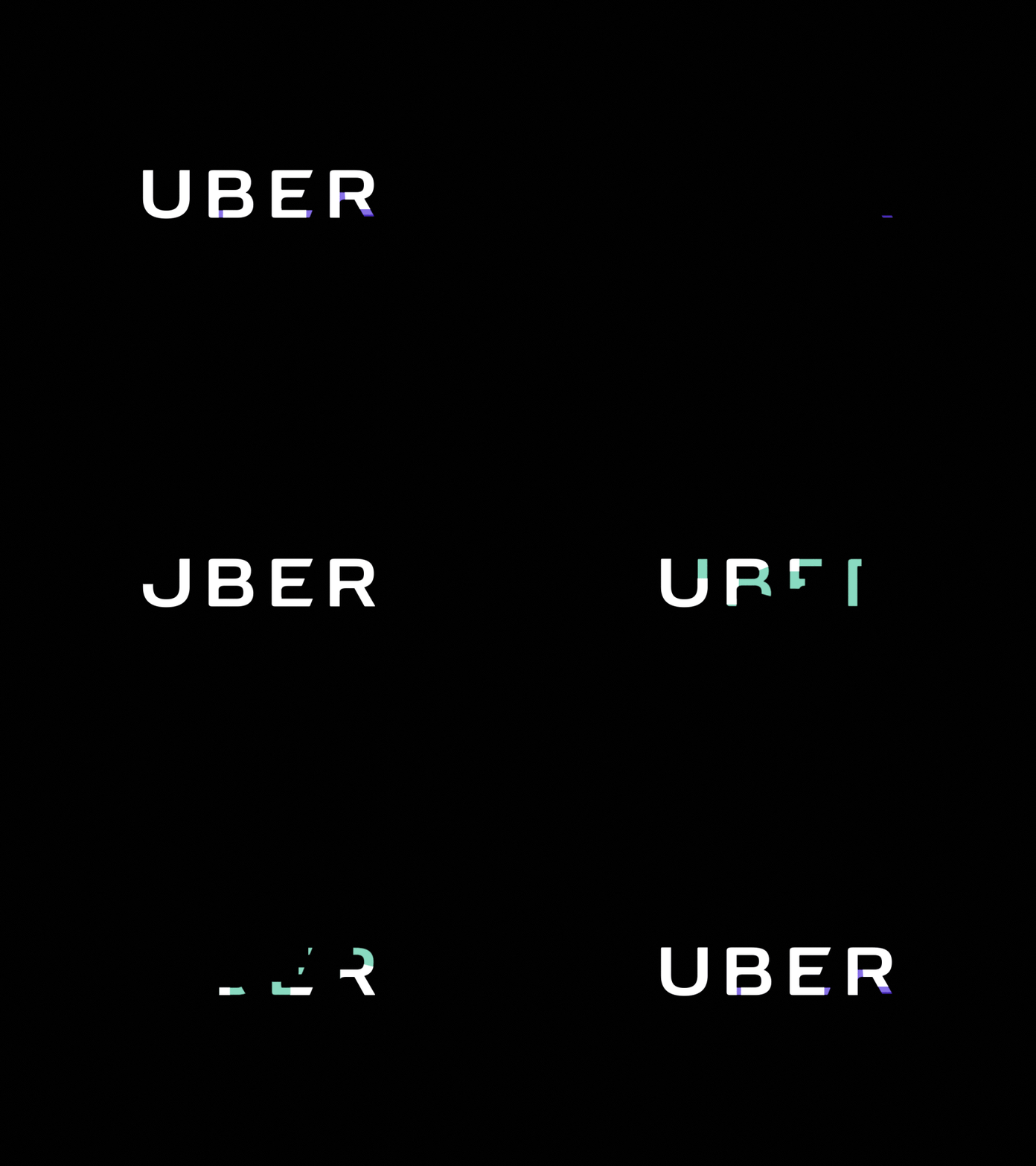
Image Source: Dribbble
Official animated wordmark for Uber. Logo Design by Nicolas Girard (Uber Brand team).
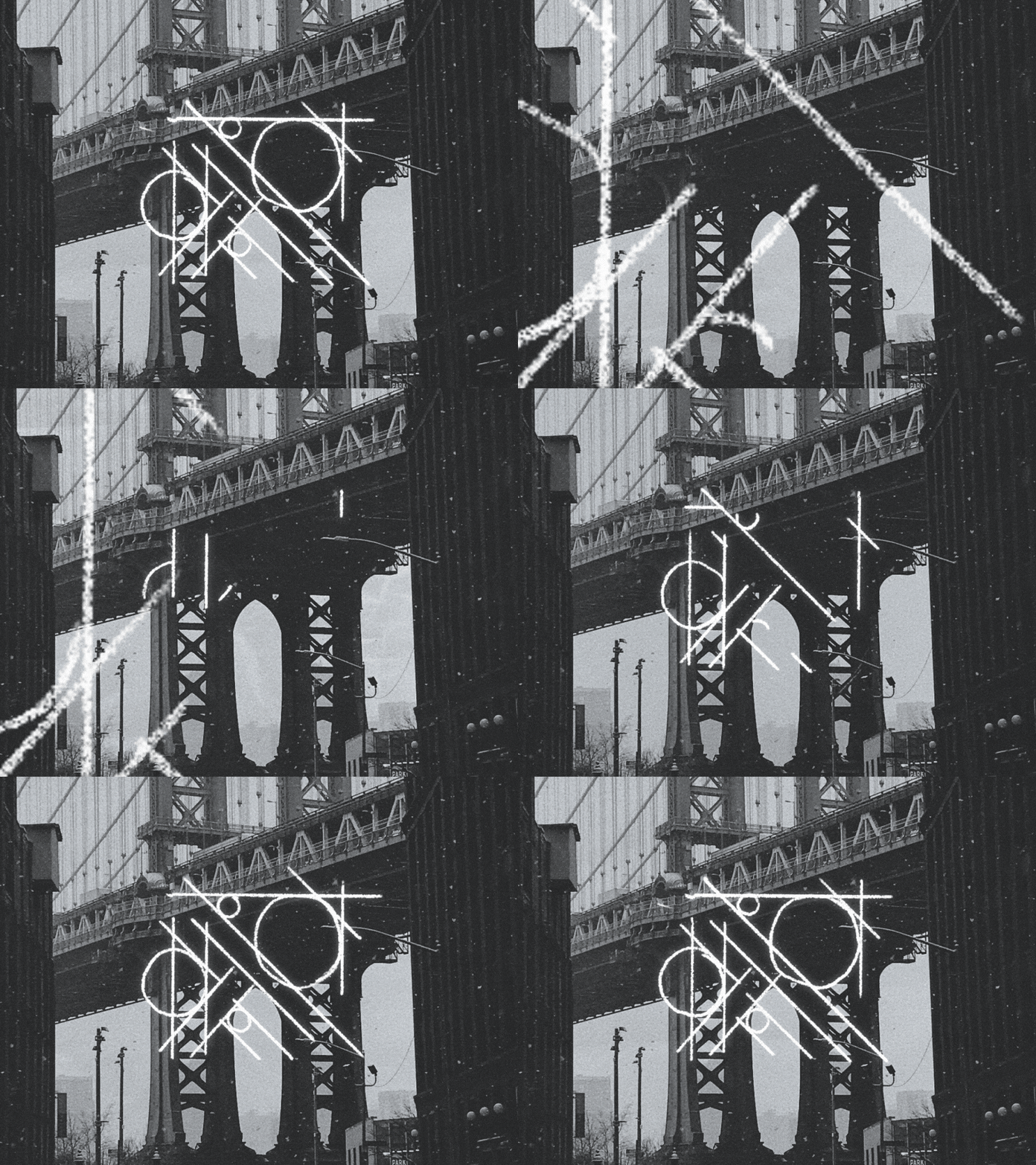
Image Source: Dribbble
Animated logo design for Recitate, a tutoring company.
2. Paint Futuristic Brand with Digital Paintbrush Logo
Now that is one of the hottest logo trends laced with all the necessary weapons to invade the territories of modern logo designing. The up side is that we are not talking anymore about the old brushes of photoshop. Digital paint brushes are cleaner, more versatile and are capable of producing a more natural effect. Most of the graphic designers have already started producing amazing letterings and logos for the brands.

Image Source: Soyougrow
Sample of digital paintbrush by David Milan
Digital paintbrush by Alex Trochut
3. Stack It Like It Is with Letterstacking Logo
Letter-stacked logos are a rare case and there is a high possibility that the trend might catch some pace in the coming year. Letter stacking is the technique where fonts and letters become the most important aspect of the branding (read wordmarks). For example, the logo designs of New York City Ballet and Film Independent have letters stacked with the lines dedicated to a specific set of words.
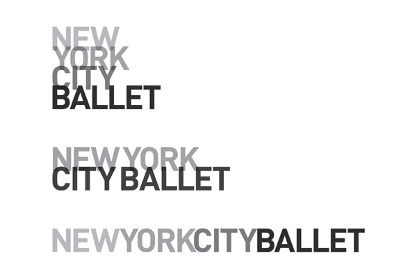
Image Source: Nycballet
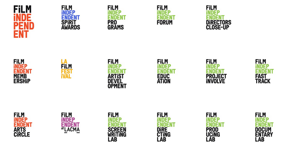
Image Source: Filmindependent
4. Grab Attention with Hand-Lettering in Logo
Regarding logo design trends as well as techniques, it is hard to pass up on typography trends. In the past couple of years, hand lettering has seen a considerable rise because of how much it pertains to simplicity, minimalism and class.
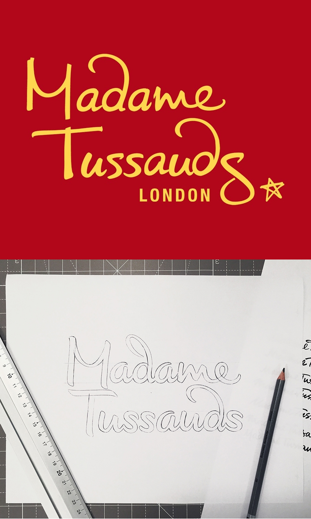
Image Source: MadameTussauds
For example, Madame Tussauds’ logo redesign was done by Alison Carmichael to keep it fresh as part of a digital makeover of the wax figure house.
“It needed to still feel like the old Madame Tussauds logo but just a more current version,” says Alison. “The whole thing needed a refresh, simplifying the forms, a bit more weight and just streamlining so that it feels more up to date.”
Related: 9 Logo Design Trends SMBs And Startups Should Look Out For
5. Break Boundaries with Shadow Break Logo
Shadow breaks do not seem to be very usual for a logo design but are important to give depth and 3D effect to a logo design. Logos that are designed using the technique of shadow breaks have all the right elements to change the face of current graphic design. Thus, chances are there that flat logos will be replaced by shadow breaks. So, mark our words and opt for a shadow break logo design in 2018. This way you will not have to get your logo redesigned for the years to come.
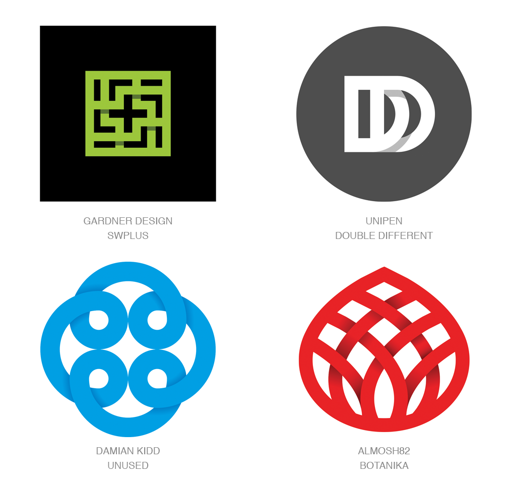
Image Source: Justcreative
6. Get Ahead of the Curve With Fading Effect Logo
In the world of branding, there are some rules to follow and some brand identity trends to be watchful of in order to be ahead of others. And logo design trends largely dictate the changing face of branding. Besides other upcoming trends, fading effect is also going to see more space in 2018. Creating a calm and peaceful effect around, logos designed based on this technique, leave you anticipating for more. As faded logo design technique befriends nearly every surface and size, it helps a logo instantly recognizable. Play with your imagination when using fading logo design trend and let the creative juices flow for some brilliant logo designs.

Image Source: Sciencemuseum
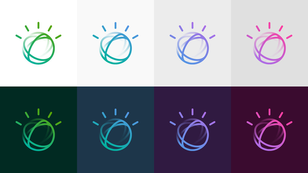
Image Source: Ibm
7. Go up, up and up with Rising Color Logo
The year 2018 offers various trends for you to get hold on so that you experiment well with the variations for your logo design. The clever use of colors can never be underestimated in logo designing. As old school color trends are so passe, rising color is a subtle approach to give a touch of depth to a logo design. As the trend is generally suitable for flat logos, it is advised that the dimension is chosen earlier so to avoid any symbolic look in the final draft.
Image Source: Mvv
Image Source: NatWest
The lettermark for Minneapolis Downtown Council starts in the lower right with a deep orange blush of color without making any shadows or line-breaks. Obviously, you won’t pull this off without the use of halftone.
8. Fly high with the Airy Logo
This specific logo design trend might cause an evolution in logo design techniques with wings and feathers making your design look like sailing up into the clouds. Though complicated, the trend will be quite relevant in the year ahead as it presents all the elements to turn your design into a dominating symbol. The result: your logo will be a memorable one and thus speaks a lot about your brand.
Image Source: Norden
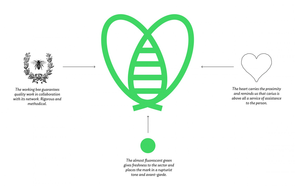
Image Source: Carius
9. Step Your Game up with a Monogram Logo
The trend of monogram logos has been around for a long time. As it is considered as the most trustworthy to play with in the art of logo design, there are reports that it will gain momentum again in 2018. Being cited as one of the major logo design trends of the coming year, the monogram might get a makeover for the better. Select your favorite font (the modern one), weave the letters and incorporate a contemporary color palette to design the monogram of your choice, it is as easy to design as it is writing how to DIY you monogram logo.
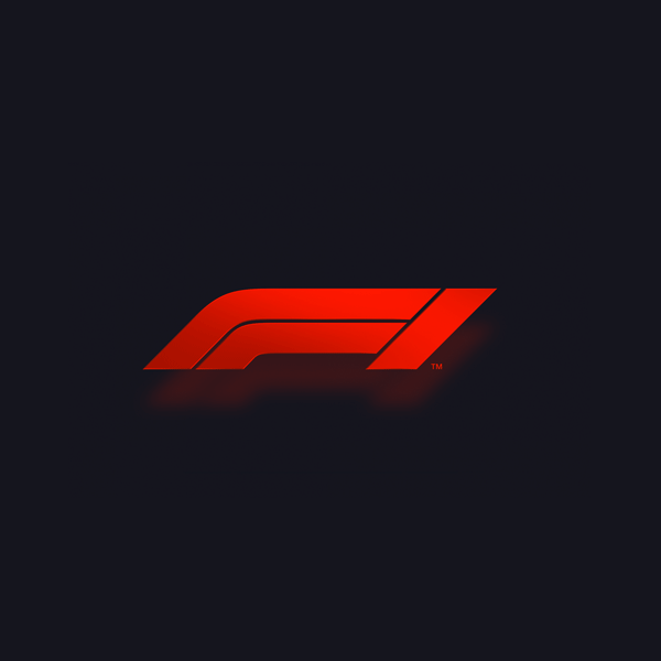
Image Source: Formula1
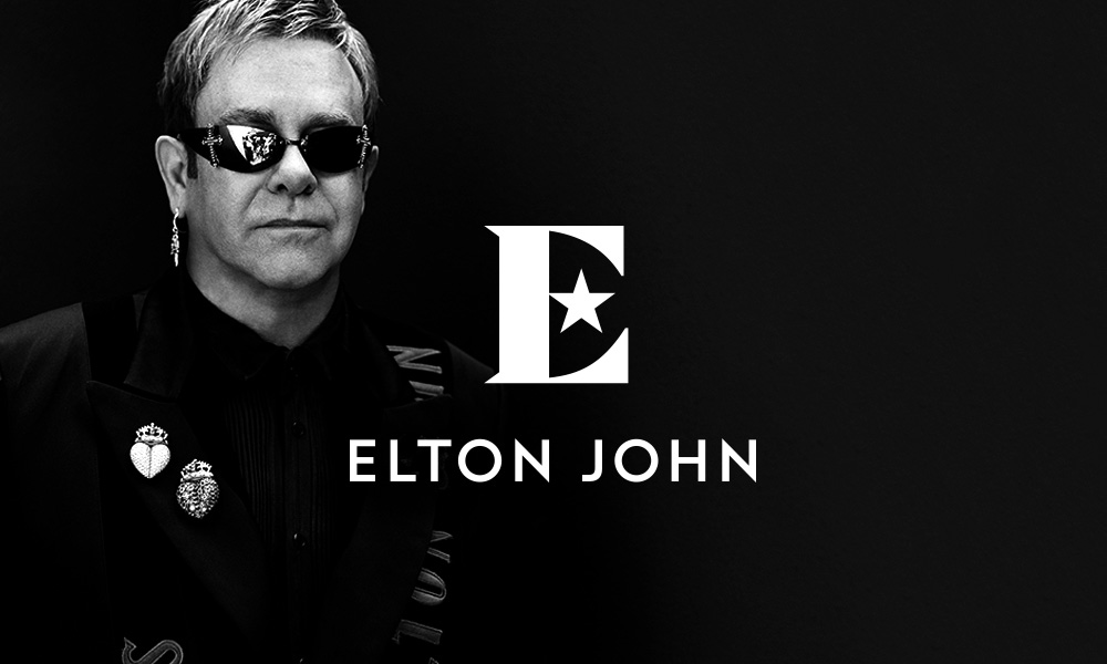
Image Source: Eltonjohn
10. Fine-Tune Your Brand with Tone-on-Tone Logo
Tone-on-tone is using different palettes of the same color and is one of the many trends to look forward to in the coming year. It is high time to say goodbye to bright/contrasting colors, especially when you own a more subtle and sophisticated brand. Keeping the design as minimal as possible using a tone-on-tone palette guarantees a logo that looks beautifully minimalistic. This way different shades can be used for background (if any), image overlays and the text. Rather than finding contrasting shades, go for a color relevant to your brand image and pull different hues from it. We bet you’ll adore the results!
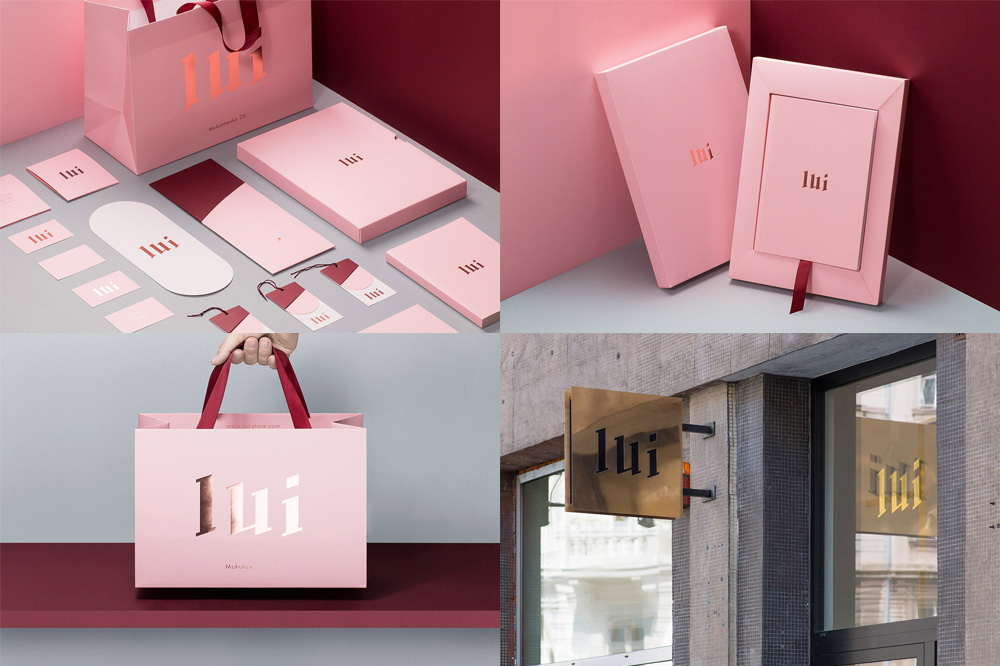
Image Source: Lui-store
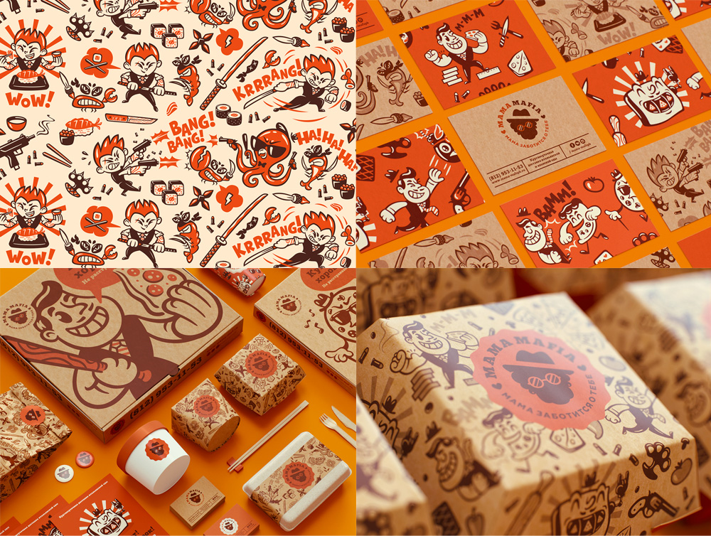
Image Source: Underconsideration
Conclusion
As much as we can predict, logo design trends 2018 would be – anything but dull. Who knows that year brings mesmerizing and engaging designs to stick to for the years to come. Step ahead and share your predictions and thoughts in the comments below.



Nice post!! Thanks for sharing your knowledge with us.
Thank you, George. Glad you liked the list.
Keep Going Evan! You are truly an inspiration for designers like us! You’re doing a great job at getting out some very useful tips and ideas for all the beginners out there. It helped me a lot for my next project with logo design. Bookmarked it for future reference.
You made my day, Amanda!
Feel free to stick around and drop comments. I would love to read your comments on future blogs too. 🙂
This is really amazing post, thank you!
Nice post!! Thanks for sharing
It’s really a nice and helpful piece of information. I simply stumbled upon your blog and wanted to say that I have really enjoyed browsing your blog post. Your blog is very informative. Keep posting and keep sharing like this.
Thank you so much for sharing your information. Very informative. As a designer, I can appreciate your hard work on writing this article. Thank you