The post-pandemic period has seen a lot of logo activity. Brands, left and right, are going through shifts large and small, and using logo redesigns to communicate the same. Amid this cacophony, there have been rebrand successes and failures. Some have gained global accolades as well as fan adulation, while others have not been that lucky.
But as students of graphic design, we have been able to learn from their triumphs as well as blunders.
In this post, we share with you the 10 logo design lessons we have learned from the greats this 2022.
1. Baskin Robbins
The beloved ice cream brand ditches its childish logo in favor of a more sophisticated and delicious brand identity.
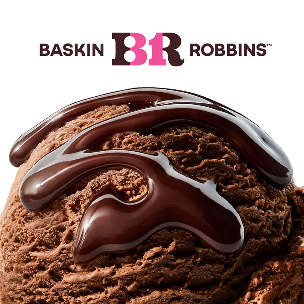
Image Source: Business Insider
Baskin-Robbins is a 77-year old company with a cult-like following, and an innovative approach to ice-cream. Over the years, the brand has served customers with 1,400 unique ice cream flavors in 52 countries worldwide.
Over the years, the brand has played with identity refreshes here and there. Mostly tweaking the colors but keeping true to its pink-and-blue palette. But no longer.
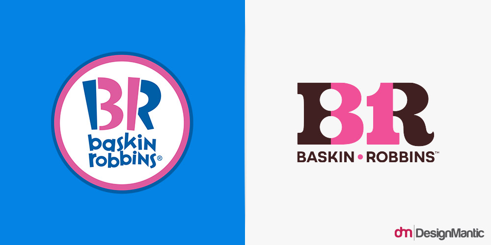
Earlier this year, Baskin Robbins had a complete identity makeover. A chunkier, more confident typeface. Brown and pink as the primary brand colors. A brand new tagline (‘seize the yay’). Plus lots of branded merchandise. And the change has been based on its history. Borrowing heavily from its roots, this new logo rebrand looks retro and is reminiscent of the company’s first-ever logo.
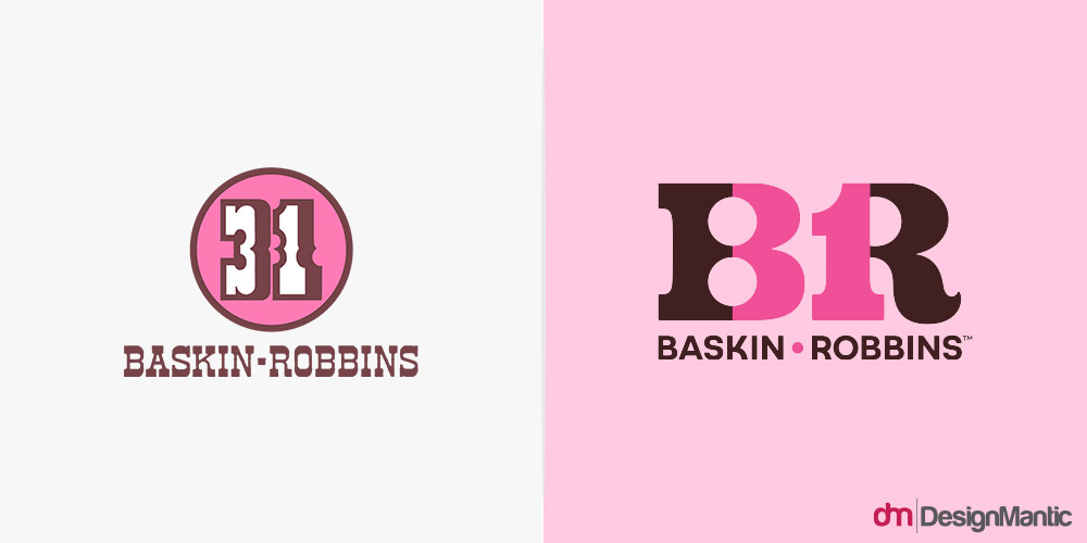
The change has been well-received. People have called it, ‘sweet’, ‘modern’, ‘cool’ and all the other good names. And for all the right reasons. The design is confident and friendly. Colors, more inviting. But the font choice takes the cake. It’s perfect for a dessert brand, with its thick swirls and heavy corners. It looks infinitely more appetizing than the former typeface with its jagged ends.
Now, a couple of lessons we can learn from this exceptional redesign.
Lesson # 1: Warmer earth tones like ‘rich, indulgent browns’ are more appropriate, than cooler tones like blue, if you want your dessert brand to seem more yummier and more luxuriant.
Lesson # 2: Visiting the roots and history of your brand will help you arrive at a more genuine and confident new identity.
2. M&M
The desexualization of the Green M&M has been a bitter pill to swallow.
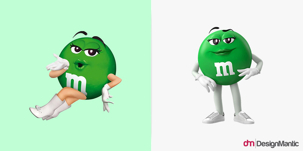
Earlier in the year, the chocolate candy brand M&M unveiled its rebrand.
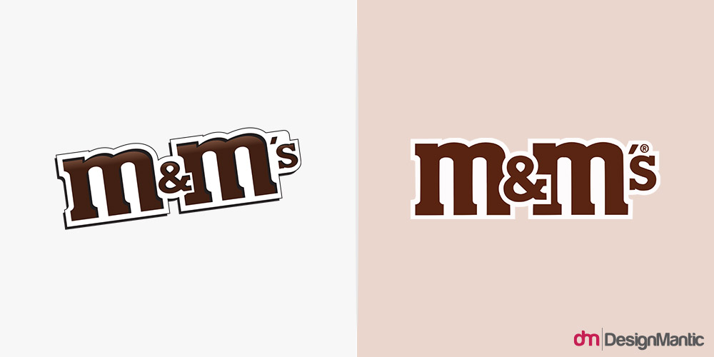
The logo design is sitting straighter now. The brown is less dark chocolate and more milk chocolate. And the ampersand more prominent. But it’s not the logo design that has brought this rebrand into our list of lessons. See, when the company tweaked its logo, it made changes to its mascot characters too. Slight changes, nothing too major. But the internet disagrees.
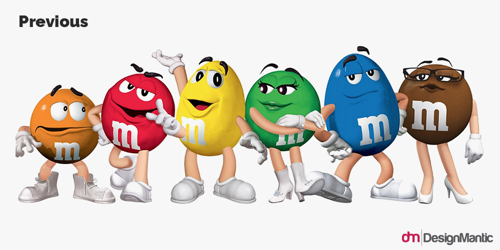
Image Source: M&M
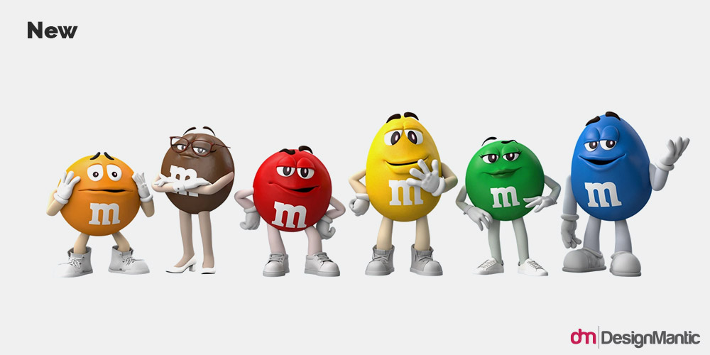
Image Source: M&M
Because as you can see, while each character looks less shiny now with less expressive eyebrows, the Green M&M has almost had a makeover. Her iconic go-go boots are gone, so are her long lashes and that luscious lip gloss.
Some are terming it as ‘reverse-yassification’ and ‘sexual erasure’. If you don’t know what it means, it’s the erasure, removal, or ignoring of somebody’s apparent sexuality. The Green M&M has been sex-positive icon for decades who has championed her sexuality proudly. Now, to rob her of it so she could look more ‘inclusive’ and ‘welcoming’ is proof for anyone that Mars Wrigleys had no idea what they were doing. In the ‘dynamic, progressive’ world of today, inclusion is about accepting every part of you, overtly sexual ones too. No erasure. No removal.
The commentary against the change was fierce enough to force M&M to respond.
Did my shoes really break the internet? pic.twitter.com/ZaisgZ9QYZ
— M&M’S (@mmschocolate) January 20, 2022
And while it didn’t force the company to reverse the change, it gained it no new fans either.
The lessons we can learn:
Lesson # 3: Never redesign your logo just to seem ‘on par with the times’. Never, do not ever, under any circumstances. Always educate yourself first.
Lesson # 4: When you make a rebrand mistake, take a step back, and work to correct it. Or risk being included in lists like these as bad rebrand examples.
3. Calendly
It’s one of those things that you, sadly, can’t unsee.

It’s also one of those things that you really didn’t have to change. I’m talking about the brand’s old logo, of course (the new one could do with another makeover). The former, calendar-shaped logo with a small-case C in the middle was a perfectly good icon. Friendly, descriptive, tells the users exactly what the app’s core idea is.
But then the brand decided that it needed a new logo, to accompany the exciting new features that the app was bringing forth. Pentagram was hired for the task and at the cost of $1.5 million, Calendly got a brand new logo that looks like a loo. Go ahead, look again, if you didn’t see it the first time. It’s the bird-eye’s view of a toilet seat.
While there have been bad logo redesigns before, this is one of the really unfortunate ones. Trying to make the logo look professional with a capitalized name, they gave up a decidedly perfect icon.
As we tell our designers always, simplicity is certainly one of the good logo design commandments, there is such a thing called going too far. It’s when you strip away crucial details from your logo to achieve a soul-deprived minimal look.
So, what can we learn from this?
Lesson # 5: Always take second (or third) opinions before you finalize a design. Or visit it a couple of days later to look at it with fresh eyes to see the things you probably missed during the design process.
Lesson # 6: Descriptive logo icons always benefit the brand as they convey the core idea immediately. Studies have been conducted with logo design questionnaire to show that consumers also look at descriptive logos more favorably.
4. Buick
Buick, the iconic American automobile, is going through a major change, and so is its logo.

Image Source: GM Authority
In June of this year, the company announced its plan to have a fully-electric portfolio by the end of 2030. The major announcement was heralded by the unveiling of a new concept EV as well as a totally refreshed brand identity.
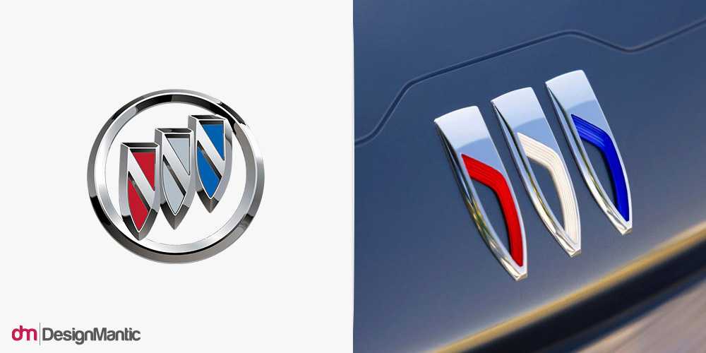
Image Source: Buick
The updated automobile logo uses Buick’s old tri-shield emblem but with prominent changes. The outer ring that housed the shields is gone, which is quite smart for an electric vehicle logo. It opens up the shields and makes the logo look more open and expansive. The look aligns well with the company’s focus on sustainable and environmentally-friendly technology. Plus, to add balance and symmetry in the logo design, the shields are no longer diagonal, rather sit more solidly on the surface, achieving a dependable looking brand logo.
As automobile logos for electric cars go, the new Buick insignia will go a long way in cementing the brand’s EV-focused strategy.
Lesson # 7: Borders in logo design can sometimes seem restrictive. If you want to create a logo for an earth-friendly brand, let it roam into the wild.
Lesson # 8: Diagonal placements look adventurous and bold, but when you want to gain people’s trust and confidence, give them balance and symmetry to count on.
5. CNET
“It’s easier to connect the dots when you can see them.”
That’s one of the taglines for CNET’s masterful new brand identity. Here are a few more.
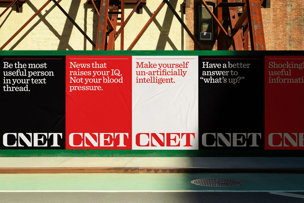
Image Source: Collins
Like Buick, CNET is also going through tectonic shifts. It’s no longer a tech news website. The new CNET is bigger, broader, and more expansive. It offers trustworthy news on technology, science, money, wellness, culture, and more. With the help of its new logo, the company wanted to showcase its commitment to genuine journalism and actionable reporting.

As you can see, the new logo has delivered. The wordmark is authoritative, yet friendly. Professional, without being inaccessible. And should be. The designers have drawn inspiration from major broadcasters of the 50s and created a typographic logo that derives its power from the strong history of American journalism.
Of all the designs we have included in this list, CNET tops the rankings, marginally beating the Baskin-Robbins logo; only because the former has truly taken a risk with a completely new logo and made it a symbol for changes at the brand’s core levels.
Lesson # 9: When you round off the corners of a font and make the slabs heavier, you can transform a serif font from conservative to friendlier, with no dent to its authority.
Lesson # 10: When you change core products of your brand, a logo redesign becomes a must to announce the changes in a more visual way.
The Rebrand Takeaway
Brands have been redesigning their logos since forever. The practice always begets designs that we love, hate, love to hate, hate to love, and everything in between.
While there are no golden rules to nailing a redesign right, understanding the working principles help. But if you have to follow one rule and leave the rest to dust, here is one that I leave you with: never redesign your logo just because others are doing it. Remain true to the roots of your brand, and you’ll never walk astray.

