Lamborghini has refreshed its brand identity in over 20 years. The new Lamborghini logo is sleek. It features a streamlined bull icon and a minimalist color palette. Take a look.
We have renewed our historic logo to adapt the brand’s visual expression with the “brave,” “unexpected,” and “authentic” values of our “Driving Humans Beyond” mission and is part of the ongoing process of evolution, initiated with our Direzione Cor Tauri strategy.#Lamborghini
— Lamborghini (@Lamborghini) March 28, 2024
But not everyone’s impressed. To be fair, when has the internet been impressed with corporate identity overhauls?
People get attached to designs, even the poor ones, and the power of nostalgia resists change. From the Subway redesign to the Netflix redesign, neither had many fans initially. But we grew to love their new logos and shudder at returning to their old unstable serifs and 3D outlines.
So, is there hope for the new Lamborghini logo?
Let’s discuss what the new design entails and whether a change was needed at all.
What’s at the heart of the Lamborghini logo change?
According to Lamborghini corporate, “The restyling is driven by a new strategy that involves adapting the brand’s visual expression to better reflect the “brave”, “unexpected” and “authentic” values of its mission, namely “Driving Humans Beyond”, a concept that translates into the intention to always go beyond the limits, standards and conventions.
This evolution is part of the broad transformation process denoted Direzione Cor Tauri, the strategy that embodies Lamborghini’s new trajectory focused on sustainability and decarbonization.”
Simplifying the corporate speech, the new logo intends to showcase Lamborghini as a sustainable automobile company. One that’s decarbonizing its manufacturing and distribution processes, and working on creating electric cars.
Now, when you think of electric cars, you don’t think of 3D styling and powerful motifs. You think futuristic, aerodynamic, and minimalist.
And that’s exactly what Lamborghini has tried to pull off with its logo redesign.
Cor Tauri is the Latin term for ‘heart of the Bull’. It also represents the brightest star in the constellation of Taurus. Direzione refers to direction.
Key details of the new Lamborghini logo
With such grand objectives to achieve, what changes were made to the Lamborghini logo?
1. A refreshed new look
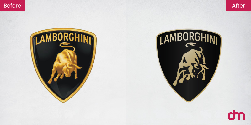
If you aren’t paying attention, the before and after versions of the logo will look quite similar. The basic shape (the badge), the icon, and even the colors are the same (only muted now).
But the devil as always is in the details.
The new bull logo has lost its shine and much of the muscle. It’s a lot leaner with silhouette highlights. The outline of the badge is also much thinner and going forward, we’re not going to see the badge at all on Lamborghini’s digital touchpoints.
It will only accompany the logo and the bull icon on corporate identity, official documentation, and vehicle bodies.
2. A broader typeface
Lamborghini has released a new custom typeface to go with its sleek new identity. The new typeface is much broader than the one before. It’s designed to echo the angular lines of its iconic luxury cars.
The typeface will replace the existing one to be used in all company communications in the future.
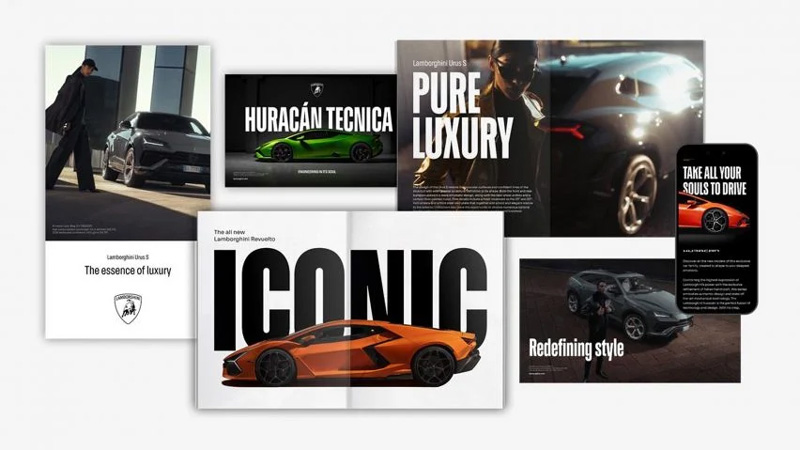
Image Source: static.dezeen.com
Truth be told, we do feel a few misgivings here. The Luxury brand building relies heavily on bespoke typefaces. And this new one by Lamborghini isn’t getting anyone excited.
3. Minimal yet bold colors
The pared-down Lamborghini logo has done away with its powerful and magnificent color palette. The company calls the new primary palette of white and black ‘bold’ but that’s just going too far.
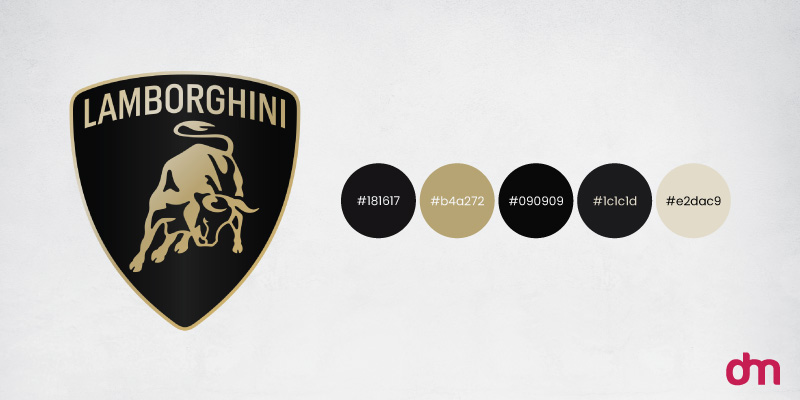
While the classic palette may help the company present itself more clearly online, the basic colors don’t do anything for the Lamborghini brand to stand out.
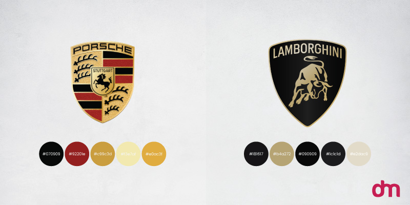
Porsche, another luxury car brand was more successful with its minimal makeover. It kept true to its historical color palette of mahogany and gold and strengthened it by removing the metallic sheen and making the colors richer and more saturated.
Lamborghini missed the mark. While it remains to be seen how its black and white bull logo will carry the legacy brand forward, we have some hope with the gold accent it has added. It may be able to help the sports brand get some of its luster back.
4. Focus on the Lamborghini bull
Lamborghini has decided to highlight its bull icon with more vigor. The company states, “For the first time, [the bull] will exist individually on the company’s digital touchpoints, separated from the classic shield to lend it even greater prominence.”
And the decision makes sense.
With their Direzione Cor Tauri philosophy guiding their design choices, giving the bull emblem a more visible and prominent platform becomes essential. It should not be contained inside a shield anymore.
But don’t worry. The Lamborghini logo on the car will still be in its complete form, including the shield.
Does the Bull win this round of redesign?
Considering that Lamborghini has unveiled its new logo after a significant gap of 20 years, you’d think people would be more receptive to it.
But the internet is a difficult audience to please.
Especially when it comes to corporate logo redesigns. Every time a company releases its new logo, the internet suffers a meltdown. Granted, some redesigns do deserve a pushback. Twitter should never have been X-ed, for example, and we have a hard time forgiving whoever thought it was a great idea to redesign the I ♥️ NY logo. You just cannot mess with a Milton Glaser icon and come out winning.
But how legitimate is the criticism of the Lamborghini logo? Sure, the changes aren’t prominent enough to merit the title of ‘evolution’ or ‘transformation’, but the restyling is rooted in purpose. It had to forgo a heavy-handed brand logo to rebrand itself as a sustainable automobile company focused on electric cars. The new Lamborghini logo is more streamlined, simpler, and cleaner — perfectly suited to the style of electric automobile logos.
But here’s a peek at what the Internet has been saying about it. Do you agree? Or think it’s bull….?
Sound off in the comments.
I prefer the new logo tbh. It looks classy and less like a toy brand
— blind ape (@xblindape) April 1, 2024
I’m really not sure what you think you’ve achieved here. It reminds me of when Royal Mail rebranded themselves as Consignia (before changing back to Royal Mail a year later).
— Dean Maisey (@DeanMaisey) March 28, 2024
There are times when old is better, this is one of those times. It looks terrible. Also, was it really necessary, or just change for change sake?
— Craig Robbo Robinson 🇦🇺🏴🇬🇧🇩🇪 (@CRobins14276534) March 28, 2024
Life hack: start a graphic design agency, convince historic companies to go with a straight-up worse version of their existing logo, then charge them an arm and a leg for it. EZ money
— Aardvark Enthusiast (@bigstonkboy) March 28, 2024
The human eye is more sensitive to brightness than to colors.
A bookseller I know said, ‘It’s the glitter on the cover that sells the book.’
You’ve killed that sparkle.— Tanzer Çakır (@tanzercakir) March 28, 2024
How do you know that they paid an agency $50M and took 5 years for them to make it
— Youssef Agnaou 👽 (@iimyzf) March 30, 2024

