When you are asked to unearth the ugliest color on the surface of the planet, where do you stop the needle while spinning the color wheel?
While all colors have the power to conjure up associations and no color is more beautiful or attractive than the rest, one particular hue has recently been discovered to have the potential to "maximize perceived harm" and “minimize appeal.” Researchers have given their verdict and identified the world’s ugliest color, and the “opaque couché has been described lovingly as “lung tar”, “baby excrement”, “dirty”, and even "death," as few of its associations.
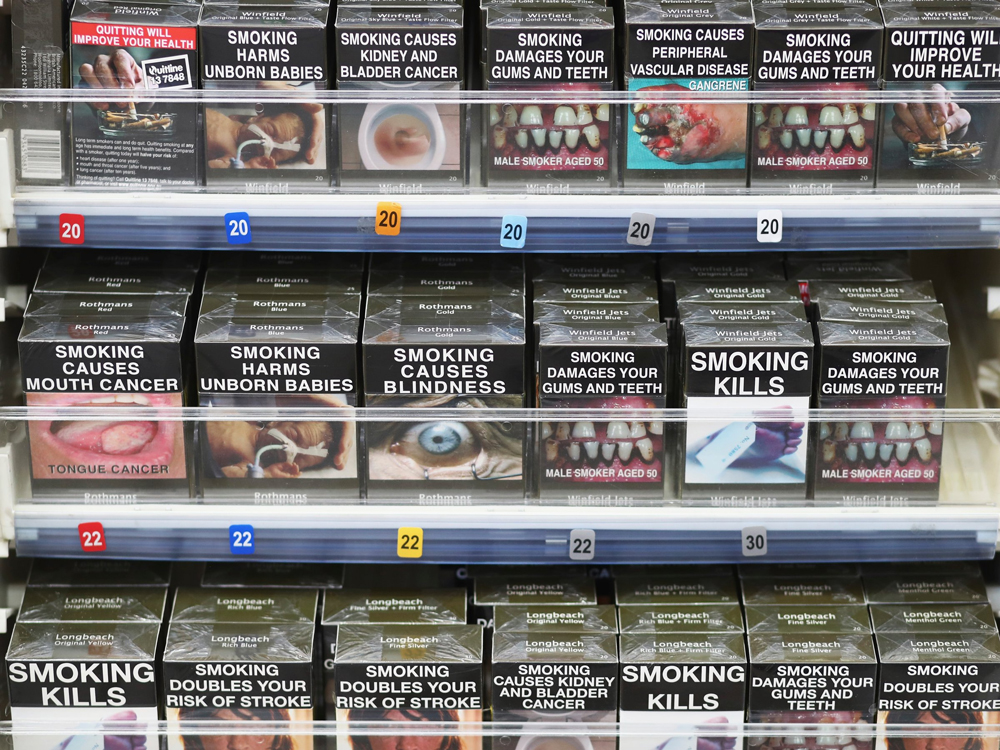
While Pantone 448C may give all the wrong vibes; it has a mission. The sewage tinged hue was deliberately selected by the research agency GfK Blue moon to deter smokers. The agency conducted a survey, asking over a thousand smokers which color in the color spectrum they find the most repulsive.
To make every package look as unappealing as possible to make people think twice about buying one, the dreadful hue fit the bill perfectly. In an effort to throttle the glamor surrounding smoking, the sludgy greenish-brown hue was mandated as the standard packaging color for all tobacco products in Australia, along with photos depicting the effects of smoking and health warnings.
To get to the gist of the matter and in defense of the poor color, Fastcodesign experts talked to designers Debbie Millman and Milton Glaser, along with Pantone VP Laurie Pressman, to glean their professional insight on this lung-brown, baby-poop hue. One thing is for certain though; Pantone 448C is not winning the “Pantone Color of the year Galore” anytime soon!


