Design has a number of connotations in various fields such as engineering, biological, game and communication. But in this context, we will simply focus on design as a form of art and principles undertaken by the artist in what makes a good design.
Design usually involves various shapes, dimensions, colors and patterns that are seen in automobiles, houses, clothing, company logos and so much more. Every single one of those design elements has a particular purpose that evokes a person’s thoughts and senses in a certain manner, which usually have to be in line with the artist’s expectations.
Related: The Geometry Of Logo Design – Once Upon A Shape
Let’s assume you’re a fresh entrepreneur or designer who wishes to grasp the attention of your audience with a riveting logo design. You might not get the right initially at first even if you pick the first four or five colors that catch your eye the most. Worst case scenario, you could end up with a design that lacks focus, creativity, motivation, purpose or is just awful to look at. When it concerns business, the first impression is usually the last impression, so you have to considerably plan your approach to design with precision, research and care.
Before you design a logo, a website, or anything else, it is important to for a designer to consider the basic principles that define design.
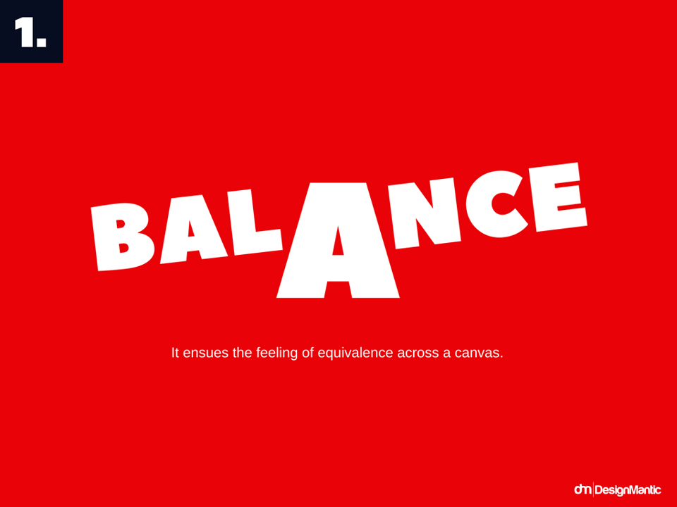
- Balance is the key. It ensues the feeling of equivalence across a canvas.
- Emphasis brings attention. It highlights important parts and make them standout.
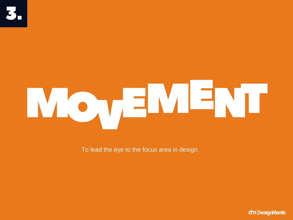
- Movement directs the eye. It leads users to the focus area in a design.
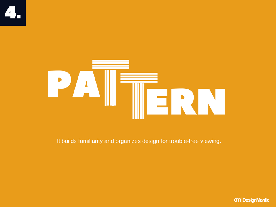
- Pattern builds course. It builds familiarity and organizes design for trouble-free viewing.
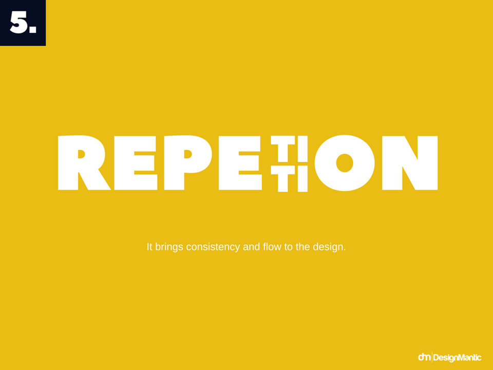
- Repetition makes design aware. It brings consistency and flow to the design.
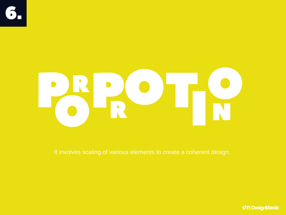
- Proportion conveys stability. It involves scaling of various elements to create a coherent design.
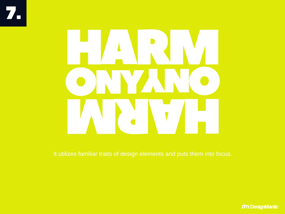
- Harmony brings elements closer. It utilizes familiar traits of design elements and puts them into focus.
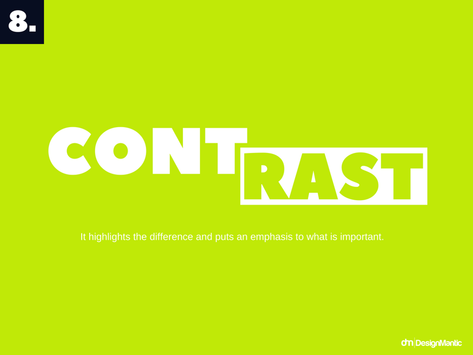
- Contrast addresses conflict. It highlights the difference and puts an emphasis to what is important.
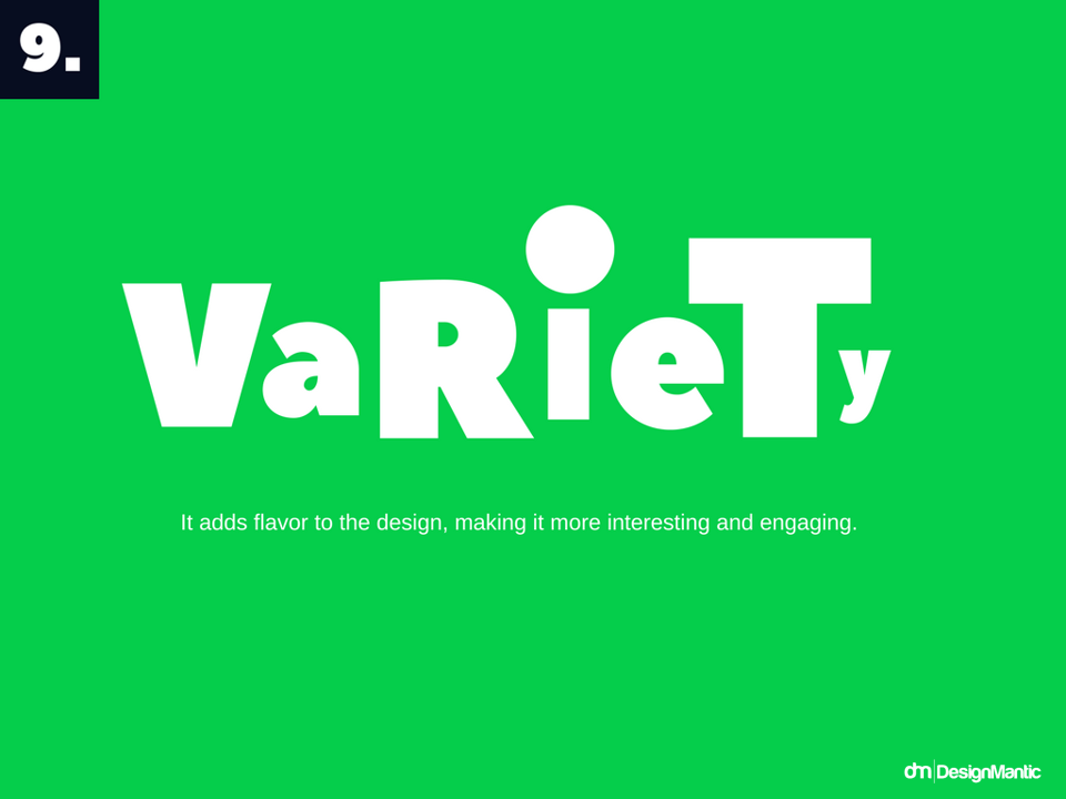
- Variety reaps attention. It adds flavor to the design, making it more interesting and engaging.
These principles are like building blocks that not only give your design balance and emphasis, but also harmony and variety. These are some of the most essential aesthetics that will be discussed in this article to enable your design to stand out greatly in the eyes of your viewers.

