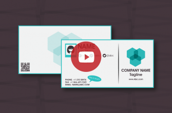
Nothing can parallel the importance of a meticulously designed business card to leaving a viable and promising first branding impression. Despite appearing seemingly subtle, a business card is one of the most imperative cost-effective weapons in the branding arsenal of your business. It helps imprint your business in the minds of your contacts, long after you have retreated from a meeting, and offers them a way to contact you again if they so wish. While the information incorporated in a business card is vital to get right, the look and feel of a card also conveys a potent message about your business. This is why it leaves us in a conundrum when perfectly stable businesses resort to poorly designed business cards without so much as a second thought about the impression they would be leaving on their potential contacts. However, not so much as companies that think business cards are dead!
The cardinal rule to creating a memorable business card is to guarantee that it reflects the image of your company. From a branding perspective, this translates into perfecting the physical aesthetics of your logo, spinning the color wheel the right way, and making sure your card is unique and attention-grabbing enough not to end up in the dumpster seconds after the visual handshake. Imagine the embarrassment of handing out faulty or ambiguous business cards at corporate events, only to be met with polite smiles, vague looks, raised eyebrows, or God Forbid, a bucket load of sarcasm! To spare you the potential branding missteps that may ensue in the light of a poorly designed business card, here are the top 10 awkward mistakes your business card may fall prey to:
P.S: Red Alarm. High Alert! Never attempt these mistakes with your business card, or it may solicit these prickly remarks that will have you cringing in design shame!


