Every time a popular brand goes through a re-design of any kind, you can bet people are going to talk about it. And may the force be with those that manage to screw it up!
Unfortunately, Instagram is one of the brands that managed to do just that.
The photo sharing platform recently changed its logo. And let’s just say that most designers were a little more than peeved at the move. In fact, you can say that the new logo design is worth a thousand words, but all the wrong ones.
Why?
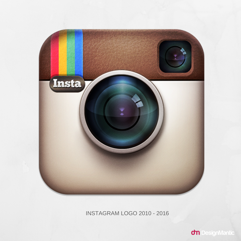
Take a look at the brand’s old logo –
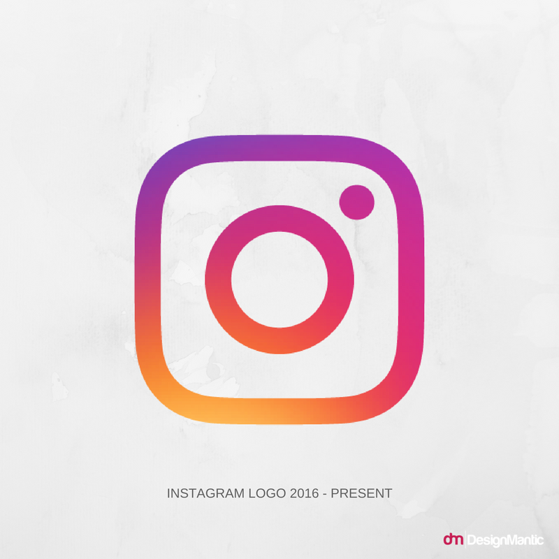
And here is the new design –
Judging from the simplistic re-design, it looks like whoever was in charge of it managed to dumb it down a wee too much. The leather clad camera that the brand flaunted since its launch five years ago is no more. In its place is an abstract, but simplistic design with a vintage color gradient.
Sure, the new logo is shinier and glossier than its predecessor. But you can’t help but notice the lack of graphics. Considering that Instagram is one of the largest photo sharing platforms on the web, the last thing you can expect from it is the lack of creativity. And its stunts like these that make people lose faith in brands. Even I lost faith in Apple after it opted for a flat web redesign, a move I didn’t expect from one of the biggest brands in tech.
Back to Instagram – the design community has a lot to say about the service’s redesigned logo. Most of its members are calling it a travesty, myself included. Let’s hear what our panelists for today have to say about it. Our commenters for today are –
Our panelists for today discuss how incorporating the singer into the ads is a smart move on Apple’s part.
- Sam Becker, Creative Director at Brand Union
- Tim Nudd, Creative Editor at Adweek
- Hannah Jane Parkinson, Journalist at The Guardian
It Could Have Been So Much More
When the company started back in 2010, the whole point of its app was to give photos a vintage feel. So, it made sense for the brand to adopt a logo that mimicked that vision. Fast forward to 2016, Instagram now caters to an audience that might relate to a design that’s more abstract. The new logo certainly seems to support this theory. However, critics like Sam Becker believes that the redesign could have been better thought out in this regard –
“This is a confident redesign but potentially a missed opportunity. It’s quite telling that the launch video seems more about convincing people that this was a rigorous undertaking rather than communicating a strong, differentiating idea that elevates the brand and connects to their past. No doubt, this is a visual system that’s more practical, usable and modern. It will serve them well, but it could have been so much more.”
A Forgettable Image
Some brands keep their logos abstract in an attempt to modernize them. Their purpose is usually to make the designs better suited for smartphone screens. Tim Nudd, however, is of the opinion that Instagram’s new logo misses the mark since its uninspired design makes it forgettable.
“Unfortunately, while it may render better in some environments, it’s a very forgettable image that will get lost on people’s phones amid the thousands of other similarly uninspired designs of most tech apps. It’s a bi baffling how this is considered an improvement – indeed, why they felt there was a need to ‘modernize’ at all.”
An Uninspired Design
Instagram has over 300 million active users, making it one of the most popular photo sharing platforms around. As a result, you really can’t expect such a popular brand to come up with a logo that looks like something that an amateur came up with. Journalist Hannah Jane Parkinson explains how the basic nature of the brand’s new logo lacks the grandeur of its predecessor.
“The previous one, a retro looking camera, and one of the most recognizable tech logos out there, has been replaced by a background swirl of sunset colours [sic] (orange, yellow, pink, purple) and a white outline of a camera. As if the camera was murdered, and chalk was drawn around its body. Murdered at sundown.”
Experts aside, the Twitter community is abuzz with criticism for the Instagram logo. And the tweets are nothing short of savage! Take a look yourself.
How I feel when I look at the new Instagram logo pic.twitter.com/CDNpAGsBVv
— Austin Swift (@austinswift7) May 16, 2016
The new Instagram logo design is far too generic. Should have kept the original design but maybe tweaked a little. It’s just….no.
— Chris Johnstone-Law (@dire_stark) May 11, 2016
I hope whoever made the new Instagram logo got the sack
— Lana (@Larrnarr) May 17, 2016
How Instagram’s new logo was made pic.twitter.com/jJU4GBYdA3
— Meredith Frost (@MeredithFrost) May 14, 2016
Instagram’s New Logo GETS AN ‘F’
To say that Instagram kind of blew it with their new logo is an understatement. No one likes it, period. The design looks like it took someone five minutes to come up with on PowerPoint. Considering the fact that the older version was beloved by all, Instagram may easily pull a ‘GAP’ and revert to its old logo.

