Logotypes are one of the most powerful and impressive ways to communicate your brand identity. Running on nothing but your brand name, logotypes put your brand name front and center — forcing everyone to take notice!
Companies seeking brand recognition and power benefit more from logotypes than any other types of logos.
In this article, we will cover logotypes in detail. We will discuss everything from logotype basics to benefits, and explore its evolution, examples, and more.
Ready for the ride?
Arriving straight to the point…
What is a logotype?
A logotype is a logo design made up only of words and letters. These words either spell out the entire company name (Facebook, Google, Dell) or take the form of letters and showcase the brand initials or acronyms (HBO or BBC).
Logotypes are also called type-based logos or typographic logos and are divided into three subcategories below:
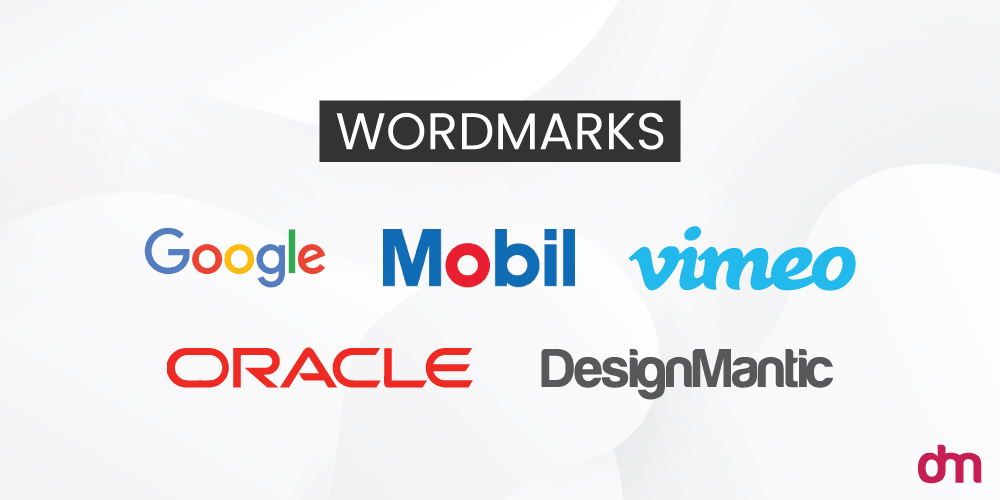
● Wordmarks: Logotypes that are made up of entire words and usually contain the full brand name such as Google or DesignMantic.
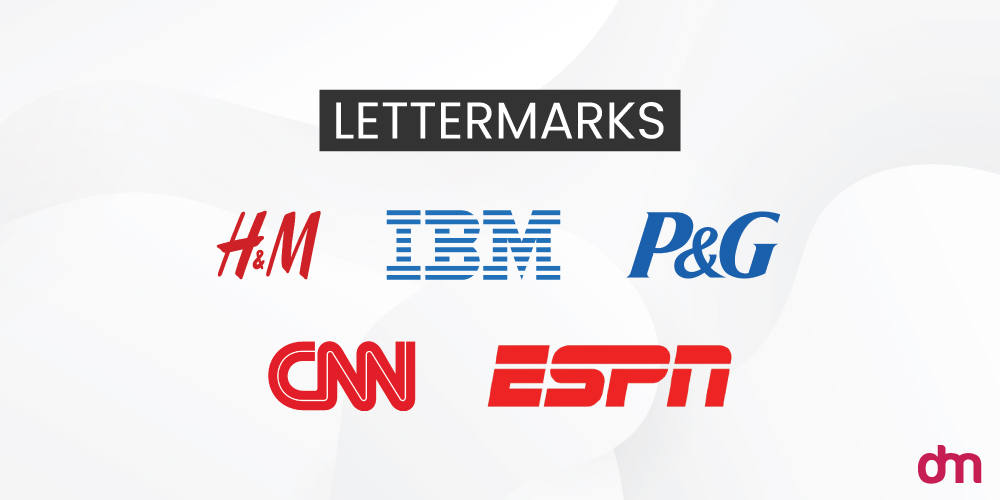
● Lettermarks: These logotypes contain brand initials or acronyms. For instance, P&G or ESPN.
● Monograms: These are letter marks but joined in a unifying graphic form, for example, Chanel’s two Cs or the Baskin Robbins new logo.
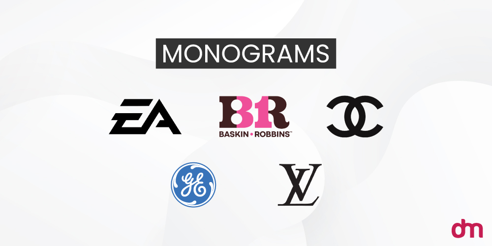
Each of these logotypes fits a certain category of brand or its needs.
- Short and unique brand names make the best wordmarks.
- Long or complicated business names find refuge in lettermarks.
- Monograms are ideal for brands who want to turn their name into a distinct symbol.
But is that all? Is the length of the brand name or their love for symbolism the only criteria for determining the right logotype for its branding?
Let’s find out.
Use cases for a logotype design
When should you choose a logotype for your brand? And how do you know which of its subcategories is the most appropriate for you?
Below are some use cases to give you an idea.
- Brand name length: one-word brand names are ideal for wordmark logos. Two-word names can also work, provided they are short and easy to say.
- Long or complicated brand names: lettermarks can take care of a clunky or generic brand name, like Cable News Network, and make it sound modern and refined (CNN).
- Language-dependent brand names: when brand names are in another language, lettermarks can retain your brand recognition by capitalizing on the initials and turning them into a logo. For example, BMW (Bayerische Motoren Werke).
- New brands: startup brands should always start with a logotype or at least a combination logo to get their brand name sufficient public awareness. They can switch to a logomark later if they want once the brand name has been cemented in public memory (Like Apple did).
- Confident brands: brands that want to be known by their name and not a symbol recognize the power of logotypes. These brands declare to the world: “This is who I am and I’m proud of my identity. I need no decorations to lend me power!”
Elements of a logotype
Below are the essential components of a successful logotype:
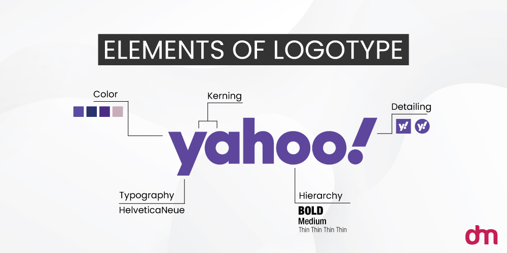
- Typography: the type of font styles or pairings you choose.
- Kerning: the spacing between individual characters in a logotype.
- Hierarchy: if you wish to assign more importance to certain characters in the logotype, hierarchical organization can help you do that.
- Color: colors help characterize a simple wordmark and personalize the brand.
- Detailing: adding distinct character features in a logotype can make it more meaningful and nuanced.
Steps to creating a logotype
Following are the 6 basic steps to creating a logotype.
1. Choose an appropriate typeface
For a type-based logo, the typography you choose is going to make the most impact. Along with representing your brand name, your font choice will also communicate your brand character and feel. Does your brand look friendly and approachable or traditional and conservative?
The font styling is going to determine that.
To choose the correct font style, we have 5 options to pick from — serif, sans serif, script, slab, and decorative/display.
Here’s how they look at their simplest:
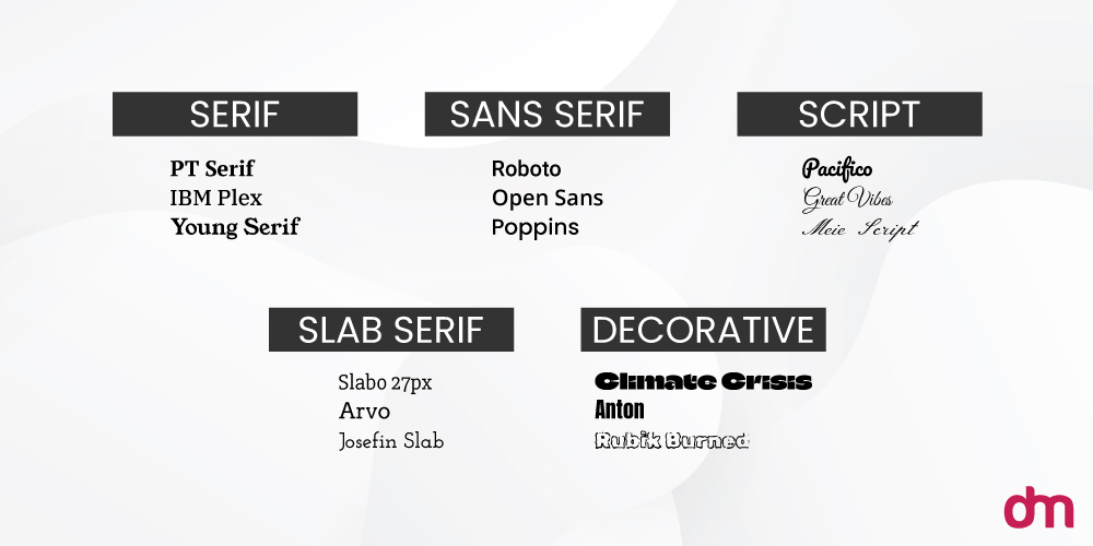
Different font styles convey different characters — and you want to make sure there’s harmony between what they convey and what you want your brand to represent.
For a friendly and personal quality in your logotype, a handwritten script font may be more ideal than something like Didot, which is a beautiful serif font but more appropriate for fashion magazines than daycare logos.
2. Customize the typeface
Whether you are designing your logotype in a generic Google font or with something more exclusive, a bit of customization is a must. It will personalize your logo design and make it look tailor-made for your brand.
Here’s a great example of what a huge impact a little customization can make on a logotype.
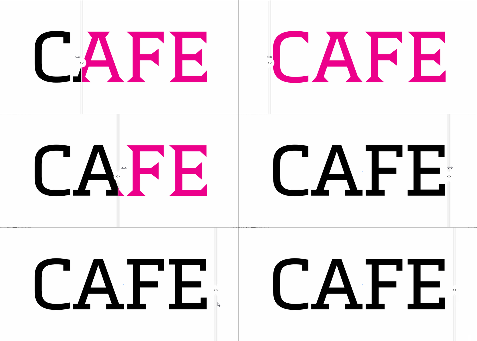
Designed by an Adobe CreativeCloud contributor, this restaurant logo design uses the simple Metronic Slab Pro font and transforms itself from plain to perfect!
3. Adjust kerning
Kerning is an integral rule in typography. It refers to the space between individual characters in a typeface. Pay attention to kerning when designing a logotype because any mistake here can make your logo look or read wrong.
For example, too tight kerning may make two words read as one. Or read it in a way that’s embarrassing for your brand.
Kerning allows clarity in the logotype and makes the design look polished and professional.
4. Use colors to communicate
Logotypes do not have a lot of graphic design features to play with. So every little detail counts — including colors.
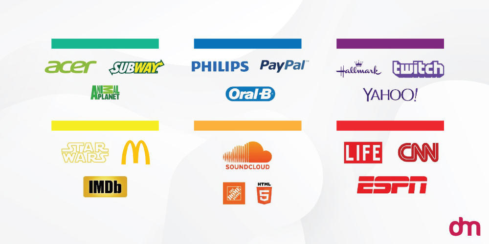
We often say that logotypes aren’t for the color-shy. If you can’t take bright, cheeky, and sexy colors, you may not be the right fit for a logotype. We say that fully aware that a large variety of logotypes are in all black (looking at you, legacy fashion brands!).
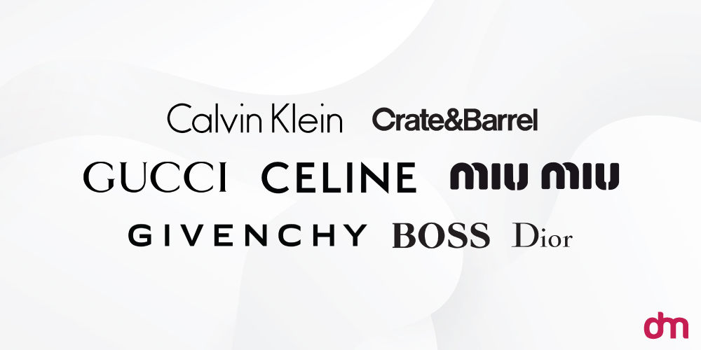
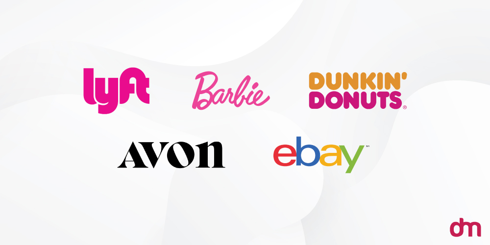
But don’t let that diminish the significance of color for logotypes. Know that while multimillion-dollar rich fashion brands may have the luxury of sporting barely-there all-black logos, you as a local startup, should take full advantage of the brand name recognition that logotypes bring, and maximize that by using striking colors in your logo.
Just like these brands have done — and they aren’t broke either!
5. Consider your letter cases
Your lettercases — title case, uppercase, or lowercase — will also have a say in your brand characterization.
While many brands choose a title case for their logotypes (Tiffany and Co. Crate & Barrel, Coca-Cola), we also have brands like Loreal or Vimeo that use all-caps or all-lowercase letters.
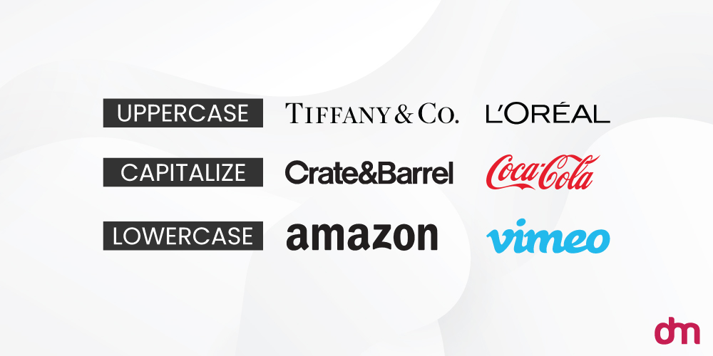
Titlecase conveys the most neutral feel in a logotype. Going by the title case alone, you can’t determine if the logo wants to convey security or charm. To add these qualifications, you have to rely on font styling and coloring.
But with both lowercase and uppercase letters, there is an inherent personality that you can assign to the logotype.
If it’s all-caps, the logo looks instantly bold and authoritative. But in lowercase, the entire look flips over and you’ll now interpret the design as being comforting or even friendly.
When choosing your logotype’s letter case, lead with the meaning you want to inspire through your logo.
Learn more about typography and letter casing to enrich your logo designs. Here’s a handy resource of 25 typography infographics we have collected. Read at your leisure.
6. Apply hierarchy
Hierarchy in logotype applies when you are adding two or more fonts or font styles in the logo.
Look at the Nook logo.
It uses two fonts in the logotype — one for ‘Nook’ and one for ‘By Barnes & Noble’.
Due to hierarchy, we can see that Nook is the main word in the logo, and the company name underneath is only supplementary information.
Hierarchy allows us to make sense of what we’re reading by using size, color, and other variations within the font styling. Big and bright things are assigned more importance while smaller text is understood to be of secondary value — at least in the organization and layout.
7. Design an alternative lettermark
For a logotype to work, it has to work everywhere — from digital to print.
A letter mark version of your logotype can represent your brand as a website favicon, a social media profile avatar, and on limited print surfaces, such as your branded headphones.
A few ways you can create a letter mark out of a logotype are discussed below:
- ● Use your brand name’s first letter as your lettermark
Disney, Facebook, Google, Pinterest, ESPN, and countless other wordmark logos use the first letter of their brand names and make that into a lettermark for adaptable versions.
- ● Turn your wordmark into a brand acronym
Johnson and Johnson, Calvin Klein, and Williams Sonoma are some of the brands that prefer transforming their entire wordmarks into brand acronyms for cramped marketing spaces.
- ● Capitalize on your logotype’s distinct details
Some logotypes are made with defining features that stand out in the logo. HBO uses a stylized O in its lettermark whereas Flickr uses two pink and blue dots as its secondary logo version.

Use these details as your brand signatures when you don’t have enough real estate to promote your full logotype.
Design add-ons for the most outstanding logotypes
So far, we have covered the fundamentals of a good logotype. But when you want an outstanding brand identity, just the basics aren’t going to cut it.
So here are 4 expert design tips to help you create a logotype with that zing quality to it.
Take a look.
– Consider handwritten fonts
When you really want to hit it out of the park, a custom font is the way to go. Specifically, the handwritten style.
Hand-lettering allows a sense of personalization to penetrate the logo — whether to refine the brand or to make it seem more approachable.
Creative industries, luxury brands, and service-based sectors especially benefit from it. If you are creating anadvertising logo, a spa logo, or a jewelry logo, for example, a handwritten custom font can elevate a simple logotype into a personal brand.
– Add character details
A major downside of creating a text-based logo is that it can sometimes look too simple. To an extent that you kinda look through it, without registering anything substantial.
Avoid that by adding visual details and features that add a bit of surprise to the logo. If you are using a logo maker tool, they will have a customization panel to allow you to make such changes.
Brands such as Braun, M&M, Visa, Mobil, Caterpillar, Marks and Spencer, and more rely on this technique to ensure their brands can stand out.
– Elevate with white space
Logotypes will teach you the sustainable use of every little element you have at your disposal. And this includes white space.
While you need white space to present your logo in a clean organized space, the creative use of white space allows you to add magic and meaning to the logo.
We all know about the hidden arrow in the white space of the FedEx logo.
But what about the brilliant use of white or negative space in the logo designs of USA Network, Mr. Cooper Ice Cream, and MyFonts?
Pretty neat, right?
– Explore shapes to add to the design
Another way to distinguish your logotype from the rest is to enclose all or some portion of it in a shape. You can use geometric shapes like circles or squares, or go for something organic like shapes found in nature.
Including meaningful shapes helps you emphasize your brand message and lets you add a further layer of understanding to the logo.
– Use contrast to draw focus
The contrast in logo design helps you attract attention, keep it, and even communicate a detail that may not be clear at first glance.
The Subway logo, for example, uses color contrast to tell you the brand has two words combined as one.
Conair logo also has contrast but it separates Con from Air by giving horizontal lines to the latter part of the logo.
Both these distinctions, in color and graphics, allow the designs to look more unique and more meaningful.
Brands and their logotype journey
Typographical logos have been the most classic form of logos. You can find them everywhere from publication and media to personal branding. The reason is their power to make the brand name the most relevant and prominent identity for the company.
In this section, we’ll share how brands have responded to the power of logotypes over the years. We’ll take a brief look at brands that evolved into logotypes but they started as something else. We’ll also see logotypes that have never changed and those that have kept pace with time.
Let’s go.
– Brands that evolved into logotypes
Businesses often start as combination logos because they are the most versatile forms of visual identities. They let you switch between a logomark and logotype as the needs fit.
But sometimes, brands recognize the impact logotypes are making, and switch to fully-formed typographical logos as they evolve. Here are a few of them.
– Brand logotypes that evolved and transformed
These are business logotypes that have gone through multiple transformations. A visual change in your brand identity is a must when you go through a major change as a company. Such as when you merge with another brand or acquire one.
Brand evolution is also critical to stay on par with times and remain relevant to new streams of consumer groups within your folds.
– Brand logotypes that have remained unchanged
These are those handful of brands that have remained loyal to their logotypes. For decades and decades — some even for a century — these brands have continued to operate with their wordmarks and lettermarks and have seen only growth from this association.
They have our deepest respect. Take a bow!
Over to you
With this exhaustive study done, we hope most of your FAQs about the wordmark logos have been answered. If you still have questions left, use the comment box!

