Your app or website is only as good as it looks. This statement resonates on multiple levels with UI designers and website developers, since, they observe firsthand how instrumental good design is to convincing people to use their product. It’s like good food. If it doesn’t look or smell nice, then it’s surely not worth taking another bite of. There’s no slightest doubt in the importance of focusing on user experience. User centric designs are created to uplift the website.This is why web designers use UX design tools to gauge user engagement and hone in on their designs to cater to the preferences of the audience.
User centric design is king when it comes to user experience, since it allows you to guide your users, making them familiar with your design and being intuitively smart in terms of the learning curve involved. UI Design is what makes your app/blog/website accessible. Aesthetics aren’t a distraction in user interface design, they seek to make your features and functions easy to use. Good design is integral to creating a compelling user-centric experience.
In addition, the logo creator can unite all the elements of UI into a cohesive design and build a brand that is both compelling and smart.
Every design element that we opt for while creating a logo design, such as, the fonts or the color palette, make a significant impact on our UI. That’s why it is best to use a good mix of font families and optimized images to make user experience seamless and hassle-free. Less is better in UI design. And nothing sours the whole user experience than a bunch of pesky errors or bugs that may arise if your product isn’t taken through the paces and tested extensively for them.
This infographic sums up the 10 commandments of User Interface design quite succinctly. No matter if you are just starting in the wondrous world of UI design, or are a veteran designer in need of a concisely helpful checklist of UI do’s and don’ts, this article is for you.
Embed in your site:
User Interface Design – Espanol Version
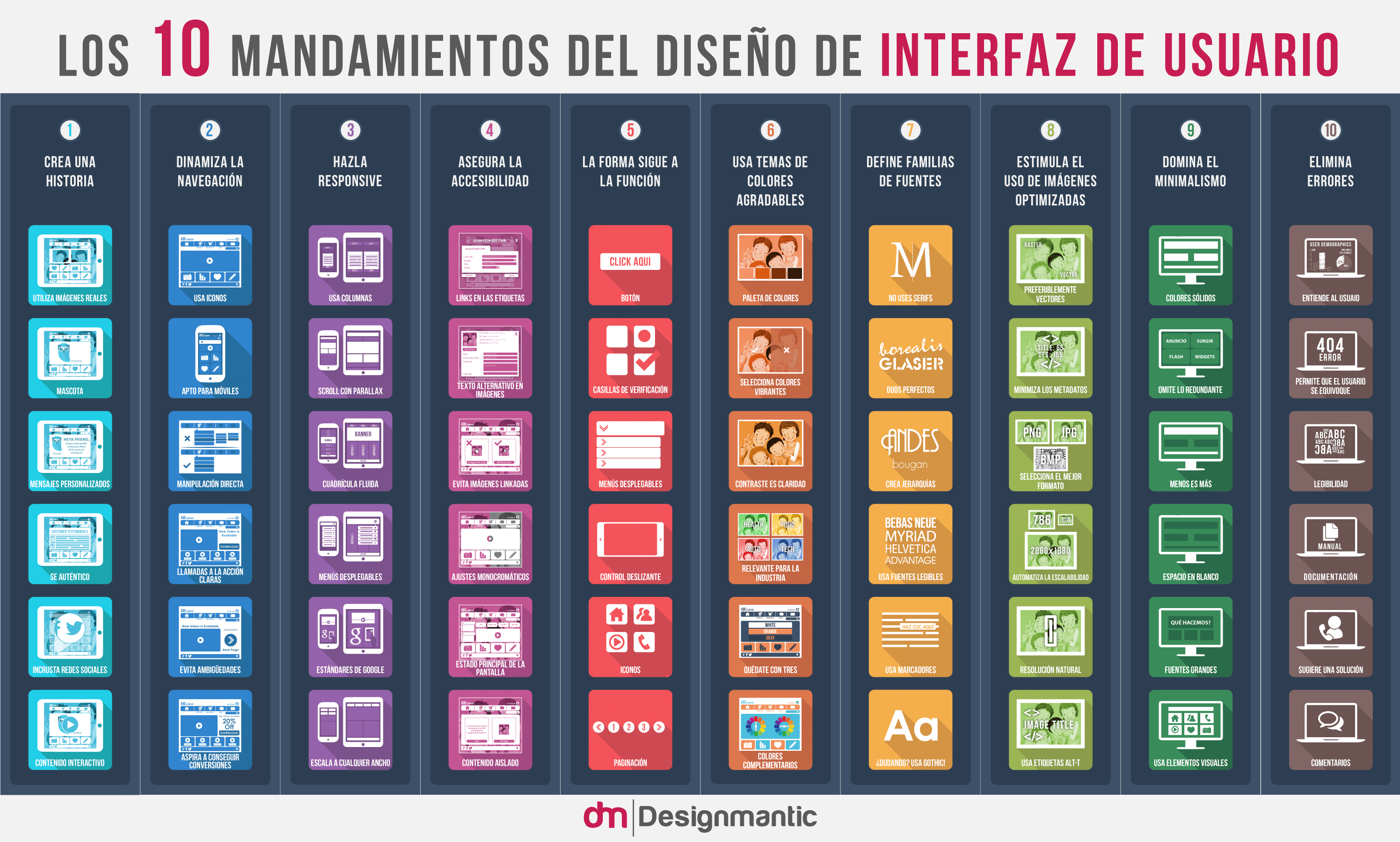
User interface design is popular the world over. After all, UI as a concept has international implications. In this respect, we have also made available our infographic in Spanish. You can see the espanol version of the infographic here:
Embed in your site:
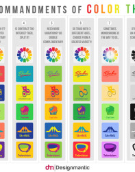
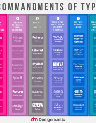
Loved the tips? Want to enjoy more of our 10 commandments Infographics? Do check ‘em out below:

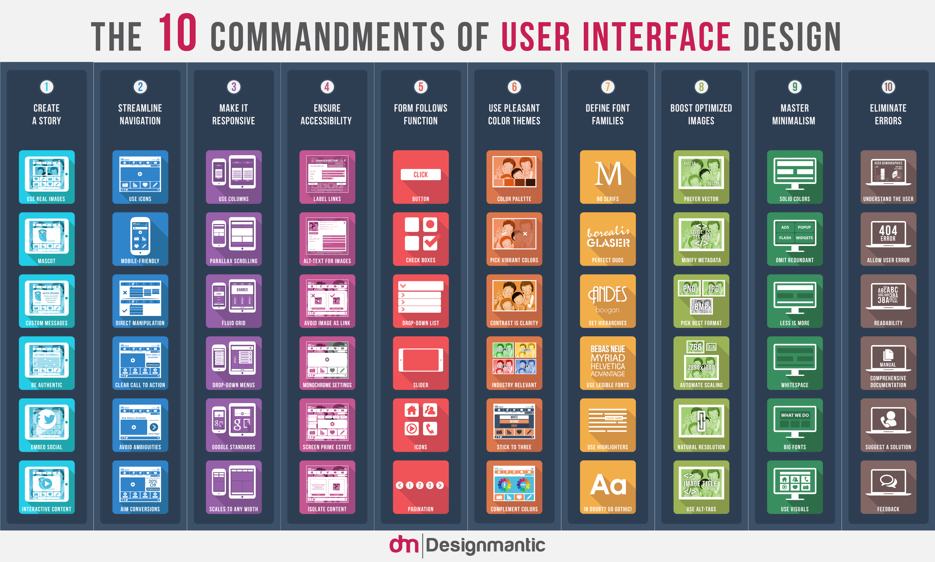


Of the 10 items listed in this infographic, seeing “ensure accessibility” as #4 is a bitter irony for those who would benefit from it. Nothing about the image is accessible. There is no alternative text of any value, there is no full-text description, even for those who *can* see it the text has insufficient contrast. In fact, the content form known as the infographic is widely known to be *inaccessible*.
If you are going to claim to educate viewers on accessibility, can you at least stipulate that the content is actually accessible, and not just paying lip service?
The entire graphic, in general, is a big miss for me. There is no context or explanation behind any of it. It might be an interesting launch point for further knowledge and learning, but as just a straight image with no way to dig into topics or explains the whys and the how, it introduces none.
Thank you to the author of this blog! I appreciate this quick reference chart, which I will download and safe to my computer. I’m sure it will come in handy. True it does not explain in depth of what each suggested practice are describing, which some have commented on this thread. But to my understanding, this chart is intended to those who already have some what of knowledge of UI/UX. I myself have novice understanding in this area, just barely getting into it. But with my limited experience and research, I still could connect of most of the suggestion this chart is implying. Since I’m a beginner, this chart will give me a quick reference to remind me of best-practice when designing.
Thank you to the author of this blog! I appreciate this quick reference chart, which I will download and safe to my computer. I’m sure it will come in handy. True it does not explain in depth of what each suggested practice are describing, which some have commented on this thread. But to my understanding, this chart is intended to those who already have some what of knowledge of UI/UX. I myself have novice understanding in this area, just barely getting into it. But with my limited experience and research, I still could connect of most of the suggestion this chart is implying. Since I’m a beginner, this chart will give me a quick reference to remind me of best-practice when designing.
For a competitive web presence, your website must be user friendly with a lot of new features that help visitors in many ways and let them have a great user experience. This means that a user interface is not just about putting stylish fonts and pretty graphics. More than that, it is about adding something unique to your website so that it helps in projecting your business as a competitive brand.
What is more, user interface is still a great way to convert your visitors of website into customers. You can significantly improve your conversion rate with some user interface tweaks.
Thank you for these rules!
Thanks for sharing such nice information.