Logo design requires deep and intricate knowledge. It involves a great deal of brainstorming, thinking process and knowhow of, if not very advanced, at least the most elementary of rules and principles governing logo design.
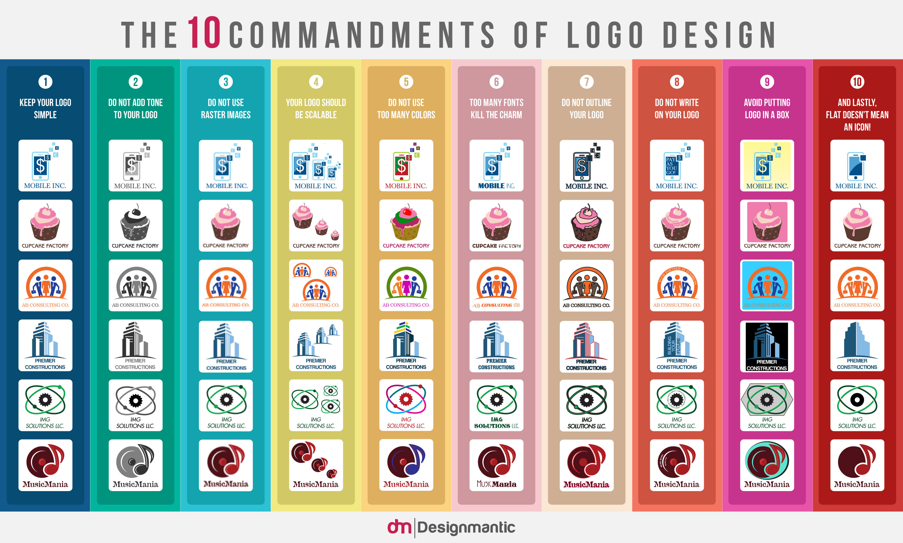
Most logos created by small businesses and startups, especially the ones created without the help of a skilled logo designer or a professional online logo design software, lack when it comes to nailing these basic principles of design. Hence, below is an infographic—a sequel of, “10 Commandments of Typography” and “10 Commandments of Color Theory”— that offers a holistic snapshot of these basic principles of logo design with the help of applied examples to make things easy peasy to grasp!
1. Keep Your Logo Simple.
A logo is all about making brand’s message clear and understandable. Simple logos do the best job in that regards. Besides, simple logos are easier to recognize and quick to adapt or scale in different environments.
2. Do Not Add Tone To Your Logo.
Tones are dark and dangerous to deal with in logo design. Tones add a sense of gloominess and can shadow the otherwise good aspects of a design. Instead of tones, work with tints to brighten up your logo design.
3. Do Not Use Raster Images.
Raster images are a big no, no in logo design. Raster images are huge in size and primarily used for printing. Hence, using a raster image logo could lead to higher load time or poor rendering on the Web.
4. Your Logo Should Be Scalable.
The world is going responsive and so are logos. Best logo designs are those that adjust and scale to fit their surroundings such as in monochrome settings, larger/smaller screens and more.
5. Do Not Use Too Many Colors.
Colors set the mood. Using too many colors in a logo could lead to chaos. Ideally, two colors are enough for a logo. That too, make sure both colors complement each other and match as expected.
6. Too Many Fonts Kill The Charm.
Like colors, fonts help define the overall mood of the design. Different fonts talk differently. Therefore, using too many fonts could be disastrous for the logo. Stick to two or maximum three complementary fonts.
7. Do Not Outline Your Logo.
Outlines may look sharp in graphic design but when designing a logo, outlines just make it difficult to read or comprehend the logo on small screens. So, avoid outlining your logo.
8. Do Not Write On Your Logo.
Logos are indeed the most significant part of the brand. But often, logos are used as an unintended reminder of a brand. From posters to websites, logo size varies and the text on becomes illegible and hard to grasp.
9. Avoid Putting The Logo In A Box.
Do not put your logo in a box. It not just limits your logo’s potential, it also makes it appear confined and off-putting. In fact, avoid confining your logo in any shape. Let it breathe and adapt to spaces without bounds.
10. Flat Does Not Mean An Icon.
Flat design is all in vogue. Flat design implies simple design that makes sense without being overly fancy. But flat does not mean outright bland logos. Do not lose the essence of your logo just to make it flat.
Please share your valuable views and suggestions on this piece…


Grateful for you distribute these 10 commandments of logo design also I was impressed after read your explanation of logo design points.
Can you elaborate on Point 2 “Do not add tone to your logo” – this really sounds very unprofessional and unclear.
yes…
I’m a nit late to the gravy train here, but I believe they’re referring to shadowing as opposed to highlights.
Nicely define infographics! It explore the information what makes a unique and attractive…
Apart from “do not use raster images” ALL the other “commandments” seem to have an “unless you know what you’re doing” tag attached to it…so that wouldn’t be much of commandments….
and lastly flat doesn’t mean an icon ?? can you please describe it more