Creating an agricultural logo design where you want to showcase the natural beauty of your landscape or produce can remain an incomplete task without the color green in it. Green is the most dominant shade of the natural habitat. It signifies new beginnings, the arrival of spring, growth, and abundance.
It has a lot of the calming qualities inherent in blue. But with green, you get something extra. The color has the cheerfulness of yellow and depending on the shade of green you’re using, the grandeur of golden.
Look at the forests, fields, gardens, and trees around you. The variety of hues and shades of green is absolutely riveting. Therefore, if you are designing an agricultural logo or a garden logo, do not consider your color palette limited to a single shade of green. Be creative. Experiment and explore. Discover the shade of green that is tailored to your business type and brand image. If you are designing a farmhouse logo, use a particular shade of green to demonstrate your prominent crop. Relying on that, you can decide whether you should choose a mint green shade, a lime green shade, or a moss green shade.
If you are designing a fruit garden logo, look at the colors of the fruit leaves and use that as inspiration to design your agriculture logo. The variety in the shades of green can send important brand messages to your audiences. The dark green shade is all about stability, standard, and steadfastness. Lighter shades are more appropriate to announce renewals, excitement, and energy.
The variety of the shades of green ensures that no matter your business type – agriculture farming, agriculture equipment, or a pretty garden shop at the corner of the street – you can get the exact tint of the color that you want for your brand.
Related: Greenery: Pantone Color of The Year 2017 Imbued In Design!
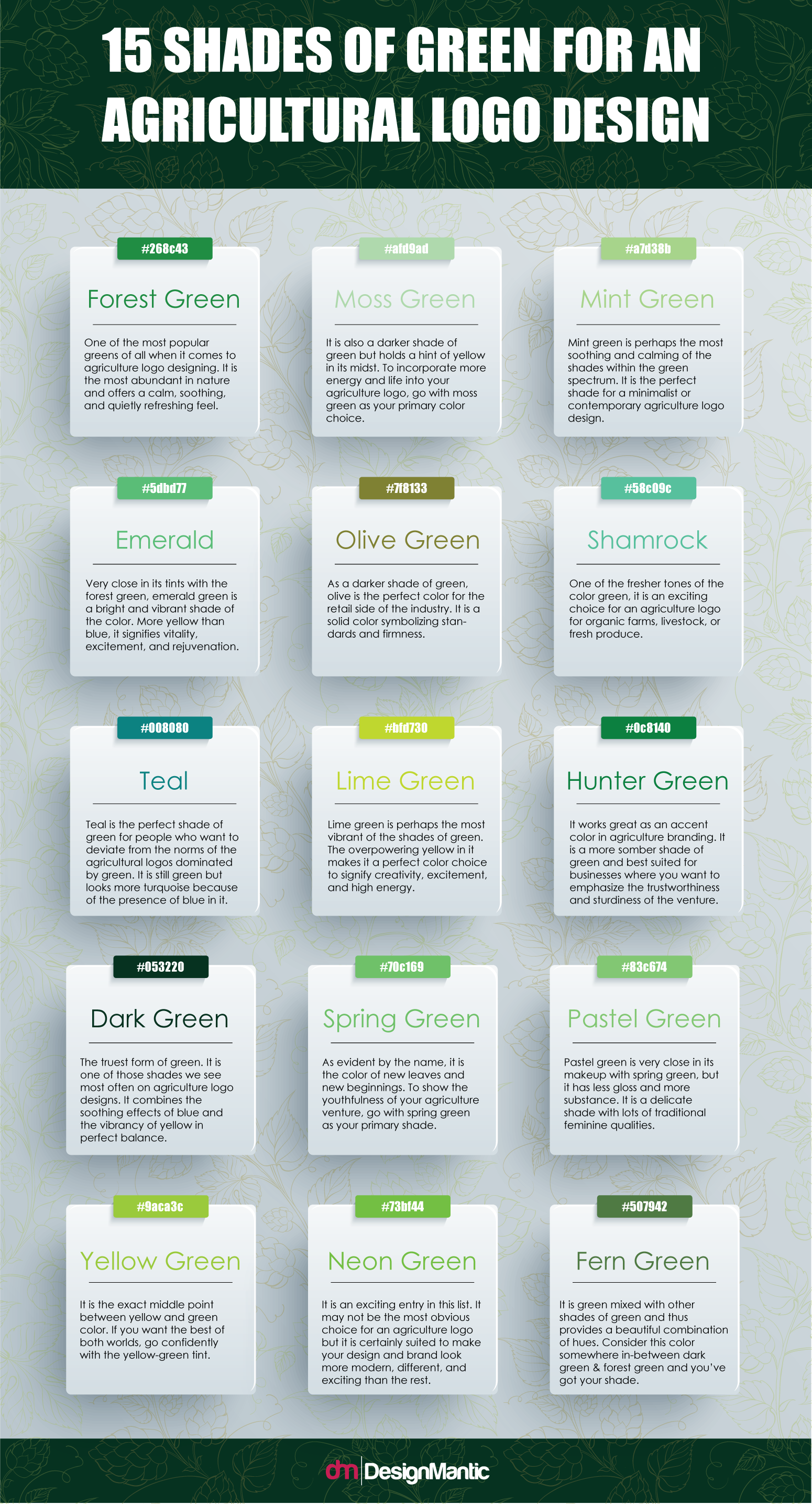
Here, we share 15 shades of green that can take care of most of your design and branding requirements for an agricultural logo design.


